Shopify Product Page Optimization: A Comprehensive Guide to Better Conversion Rates
Bad Shopify conversion rates aren’t a traffic problem or a product problem. They’re a strategy problem. This guide gives you the playbook that top stores use to optimize their Shopify product pages for conversions.
We break it all down into three layers:
- Your product’s offer: How you position and communicate what you’re selling
- The page experience: How your page removes friction and drives action
- Your store’s visibility and credibility: How search engines (and AI) find and trust your page
Conversion happens when those three work together. Let’s start with the basics.
What Is Shopify Product Page Optimization?
Shopify product page optimization is the systematic process of engineering every element on your pages to convert casual browsers into paying customers.
This goes beyond tweaking button colors or compressing images. Rather, it refines the entire decision-making experience to reduce friction, increase desire, and build trust at the point of purchase.
That includes:
- Sharpening your offer and messaging so your product aligns with what buyers care about
- Smoothing the user journey to remove distractions and roadblocks to conversion
- Boosting visibility and credibility in search to bring in more qualified traffic
It’s not one tactic. It’s not even one department. It’s the intersection of copy, design, product, customer insight, SEO, and experimentation to turn clicks and interests into real revenue.
Some brands may focus on UX quick wins and tactics, believing it will unravel the next .1% conversion improvement. But the smartest ecommerce teams know this won’t work on a product page with a weak offer or mismatched messaging. Much of the lift in product page optimization comes from clarity, i.e., giving buyers the right information, at the right time, in the right format, to help them say yes.
What Is a Good Conversion Rate for a Shopify Product Page?
Here’s a quick snapshot of what conversion rate ranges look like across Shopify stores, based on a 3,000+ store analysis from Littledata:
| Performance Tier | Conversion Rate (%) | ||||||||||
|---|---|---|---|---|---|---|---|---|---|---|---|
| Bottom 20% | < 0.3% | ||||||||||
| Median Range | 0.3% – 3.3% | ||||||||||
| Top 20% of stores | > 3.3% |
If you’re hitting 2.5%, you’re doing better than most. If you’re above 3.3%, you’re in elite territory.
But that’s the thing about average, right? It’s a word that takes everything, regardless of what makes them different, and puts them in the same pot. So, these numbers don’t really tell us anything. It’s a comparison metric.
Let’s look at the conversion rate by product category (Source: Statista):
| Industry | Conversion Rate | ||||||||||
|---|---|---|---|---|---|---|---|---|---|---|---|
| Food and Beverage | 3.10% | ||||||||||
| Beauty and Skincare | 3.00% | ||||||||||
| Toys and Learning | 2.70% | ||||||||||
| General Apparel | 2.60% | ||||||||||
| General Footwear | 2.40% | ||||||||||
| Active Apparel | 2.10% | ||||||||||
| Active Footwear | 2.10% | ||||||||||
| Beauty and Makeup | 1.90% | ||||||||||
| Health and Beauty | 1.90% | ||||||||||
| Sporting Goods | 1.70% | ||||||||||
| General Handbags and Luggage | 1.40% | ||||||||||
| Home Appliances | 1.10% | ||||||||||
| Electronics and Accessories | 1.10% |
So, is 1.10% a “bad” conversion rate for an electronic product? Not necessarily. It might be above the average for your segment.
Shift the Goalpost: From “Good” to Your Best
Benchmarks can orient you, but they shouldn’t define you. Instead of chasing average Shopify conversion rates, aim for your product page’s peak performance. That means:
- Understanding the transformation your customers want
- Removing the friction that stalls that transformation
- Using research and data to craft a compelling experience
When the product resonates, the UX feels effortless, and the traffic is qualified, conversion lifts follow naturally.
So don’t settle for “good.” Let’s optimize for great.
How To Optimize Your Product Page on Shopify
Here’s what you need to start with:
Understand Product Positioning & Page Performance
The foundation of all effective optimization lies in understanding how your product is positioned and how your page performs today.
What Is Product Positioning?
Product positioning is how your potential customers perceive your product — how it solves their problems, how it stacks up against alternatives, and whether it feels right for their needs.
Good positioning connects your product to the change customers want. Poor positioning leaves them unconvinced and/or confused.
To position your product well, ask:
- What does success look like to our customers? How will our product help them get there?
- What problems, worries, alternatives, and objections influence their buying decisions?
- What promises are we making, and do they resonate?
Use qualitative research (like review mining or surveys) to answer these questions with the customer’s own words. The goal here is to align with their desired outcome.
What Is Page Performance?
Page performance measures how effectively your product page delivers that unique selling positioning (USP) and removes friction from the buying experience. That includes:
- The loading speed and visual stability (Core Web Vitals)
- The clarity and persuasion power of your page content
- The usability and flow of the buying journey
- The alignment between your selling angle and the user’s intent

There are various factors that collide to create a conversion. For example, a well-positioned product will underperform if the user experience doesn’t support how it’s presented on the product page. Neither will a dashing website with insane speeds sell a product that feels like the wrong fit.
That is why these foundations matter. Because too many CRO guides focus on the narrow, surface-level UX tweaks like layout changes and testing conversion-boosting elements (which, often just add more code on an already slow-loading, underperforming page).
That’s why you need to zoom out before you zoom in. In the next section, we’ll show you how to measure and diagnose both positioning and performance, so you’re optimizing from a strong foundation, not just guessing.
Benchmark Your Current Product Page Performance
You’ve seen the “good Shopify conversion rate” averages earlier, but those numbers don’t reflect your unique store scenario — your prices, product type, traffic quality, or buyer journey.
Benchmarking isn’t about comparing yourself to someone else’s store. It’s about building a clear, honest view of your current performance, so you can measure actual improvements as you optimize.
Here’s how to do that.
Step #1: Define Your Key Metrics
Start by tracking conversion-related actions that matter for your product page. These could include:
- Add to Cart rate
- Initiate Checkout rate
- Purchase rate
- Scroll depth
- Time on page
- Click-through on key elements (e.g., size guide, reviews, shipping info)
For each one, segment by device. You will always get different behaviors from mobile users compared to desktop users.
If you’re using Shopify’s native analytics, you should try analytics tools with more comprehensive views of user behaviors like Elevar, Triple Whale, or Google Analytics.
Step #2: Include Your Customer Understanding
Quantitative data tells you what happened. But without qualitative insight, you’re flying blind on the why.
Use these methods to add clarity:
| Method | What It Reveals | ||||||||||
|---|---|---|---|---|---|---|---|---|---|---|---|
| Heatmaps & recordings | What gets ignored, hovered, or rage-clicked | ||||||||||
| On-page polls | What almost stopped them from buying | ||||||||||
| Review mining | What real customers actually value | ||||||||||
| Customer interviews | Why they bought (or didn’t) | ||||||||||
| Support chats/emails | Friction in the buying journey |
A single insight, like “the return policy was unclear”, can reframe your entire optimization direction.
Step #3: Spot the Gaps
Once you have the data, look for mismatches:
- Is bounce rate high, but scroll depth low? You’re losing interest early.
- Are visitors reading the description but not clicking the CTA? The offer might not land.
- Are desktop users converting well, but mobile users dropping off? You have a responsive UX issue.
This is your baseline. Your job now is to improve from here, not from a generic “industry standard”.
Step #4: Monitor Over Time, Not Just Once
Run your data collection over a consistent period. Three weeks is ideal. Also, account for external factors like seasonality or any marketing campaigns running at the time.
Then, revisit this benchmark after each major optimization cycle to evaluate actual impact. That’s what separates opinion-driven changes from performance-driven ones.
You now have a measurable starting point, clear friction points, and directional clues from customer behavior.
Now we can start optimizing. And we’ll begin where it matters most: the offer.
Part 1: Nail the Offer: Selling Angles, Positioning & Value
You can’t optimize a weak offer. Since I’ve already explained why earlier—as none of these conversion elements can work in isolation—we’ll go right to showing you how to build, validate, and test a solid offer that converts.
Selling Angle vs. Unique Selling Proposition (USP)
Your USP is what makes your product different from alternatives.
Your selling angle is how you frame that difference in a way that matters to your customer.
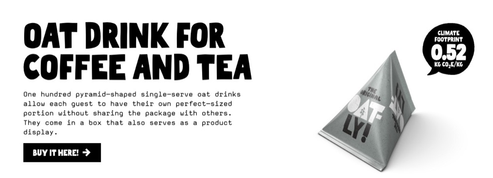
For example, a daily personal hygiene habit pollutes the planet with plastic. But a brand, Bite, is reinventing that with a plastic-free, non-polluting way to brush your teeth.
Bite’s “reinvent your routine” (in a way that’s better for the environment) is an example of a great selling angle.

USP: “Zero-waste toothpaste tablets” (Bite)
Selling angle: “Reinvent your routine to protect the planet.”
One is factual. The other is emotional. Great product pages do both: clearly state what makes the product unique and why that uniqueness solves a real customer problem.
As Rishi Rawat of Frictionless Commerce puts it:
Selling angles are marketing hooks used to connect to the needs and desires of your shoppers.
Rishi Rawat, Founder & CEO of Frictionless Commerce
Find Your Winning Angles
Here’s where most brands go wrong: they guess.
Instead, use voice-of-customer research to uncover the motivations, anxieties, and objections people already have. You’re not inventing a selling angle, you’re discovering it.
Review Mining
Mine product reviews (yours and competitors’) to find:
- What people love: Their version of the benefit
- Why they bought: The “job” they hired your product to do
- What they tried before: Their expectations and past disappointments
- Objections: What almost stopped them from purchasing
Pro tip: Filter Amazon reviews by 3-star ratings. These often contain both praise and critique, rich insights for positioning.
Forums, Reddit, and Social Media Comments
…[Dive] into forums, Reddit threads, communities to understand how existing customers talk about your product, or how prospective customers express the problems they have and the characteristics of their ideal solution.
Eden Bidani, conversion copywriter at CAPE Agency
Tools like GummySearch or just plain Reddit search can help.
Jobs-to-be-Done (JTBD) Thinking
Instead of asking “What features are important?” ask:
- What moment made someone start looking for a solution like this?
- What change are they trying to create in their life?
- What does “success” look like after buying?
This shift gives your selling angle power and relevance.
Match Your Positioning to the Buyer’s Story
Once you understand the customer’s desired transformation, shape your product’s positioning to meet it.
Avoid generic copy like “Our product is this quality and that quality.” Go for something that speaks to the buyer’s self-image, struggle, or who they want to be after using your product.
Something like:
Copywriting That Sells (Because It’s Rooted in Research)
Use the customer’s exact words in your product page copy. That includes:
- Their pain points
- Their objections
- Their outcomes
Example: If reviews say, “I hate when leggings go see-through when I squat,” don’t just say “High-quality fabric.” Say: “Squat-proof, stretch-tested leggings that stay opaque no matter how deep your reps go.”
Let the customer write your sales copy. You’re just the editor.
Test Your Angles
A/B testing selling angles isn’t just for brand campaigns. You can test different:
- Headlines
- Hero copy
- Product names
- Feature emphasis
Segment your results by device and traffic source. You might discover that one selling angle resonates with paid traffic, but another works better for organic.
Besides Bite (mentioned earlier), other examples of selling angles in action include:
Liquid Death

Product: Canned mountain water
Angle: “Death to plastic”
Why it works: Sustainability + shock value + humor
KeySmart
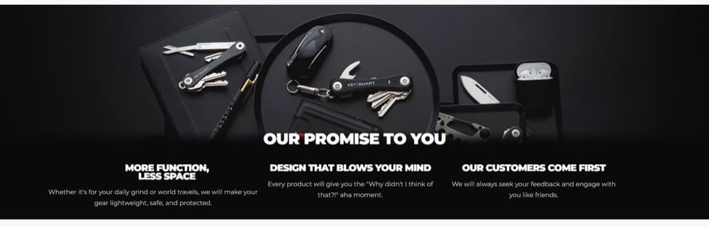
Product: Compact key organizer
Angle: “More function, less space”
Why it works: Solves a tangible annoyance with elegant design
The best selling angles frame your product as the most natural, trustworthy, or exciting solution to a real human need.
With a dialed-in offer, you now have the raw material for a product page that converts. Up next: how to optimize your Shopify product page’s UX to remove friction, build trust, and drive action.
Part 2: Optimize the User Experience of Your Product Pages
A persuasive product page removes friction, inspires confidence, and guides visitors toward a confident “yes.”
Yet too many product pages trip over the basics. They bury key information, clutter the layout, or rely on guesswork instead of tested UX principles.
In this section, we’ll cover the key user experience elements of a high-converting Shopify product page, what to include, how to present it, and how to test it.
Why UX Is Core to Shopify Product Page Optimization
User experience is how the page performs in the eyes of the shopper, not in your design review.
Great UX creates clarity. Poor UX confuses. And confusion kills conversions.
From layout to load speed to what your CTA actually says, every element shapes a visitor’s experience of your product. And whether they convert.
Let’s break down what matters most.
Elements of a Stellar Shopify Product Page
A high-converting Shopify product page combines various elements to create a seamless and engaging user experience. Here are those elements and how they work:
1. A compelling banner offer
This priceless real estate slot can compel a visitor to stick around and shop. It can feature discounts and hard-to-ignore shopping policies.

Make them time-limited offers and they’ll work even better.
Limited-time offers are based on the psychological principle of loss aversion, which states that individuals prefer to avoid losses over gaining profits.
Raghav, NaturoCure.in
2. High-quality product images that tell a story
Pictures are significant drivers of product page conversions. Buyers make decisions based on pictures. Use high-quality images, but don’t forget image optimization to keep them in their best quality while being light enough to load fast.
After watching thousands of user session recordings of product pages it’s clear that the majority of the traffic ONLY interacts with above the fold section, which is usually the product image gallery. This insight makes your product image gallery the most important asset on your store as this is the section which gets the most eyeballs.
- Product Only Image – Features the product against a simple and plain background, with great lighting.
- Highlight Variants – It gives visitors a sense of product options available to choose from.
- Group/Bundle Shot – If it’s a bundle you can do a flat lay, highlighting different products included.
- Infographics – Highlight the USPs of the product by combining text and image to deliver information quickly and efficiently.
- UGC / Lifestyle Shot – Help influence user engagement, and take brand authenticity to the next level.
- GIFs/Product Videos – These are more attention-grabbing compared to static images. They add motion to your product and help your visitors understand your product better whilst seeing it in action.
Abdul Wahab, Shopify CRO Specialist
And the SEO angle: Add alt text or alt tags to these images. When properly tagged, images can win you valuable real estate on the search engine results pages (SERPs).
In fact, when you do everything right SEO-wise, you’re also doing most of the work you need to be featured in AI Overviews and AI recommendations. More on this later.

Consider using 3D images if they provide a clearer view for your visitors to assess your product.
3. Product description with USP + selling angles
Conversion copywriting is part of optimizing UX. Here’s why: Buyers need convincing information before they let go of their beloved cash. Convincing information:
- Deletes doubts
- Obliterates objections
- Drives motivation
- Emphasizes success
When done right, your product description, working in conjunction with your selling angles (discussed above), can achieve this. You can’t leave basic copy there and expect it to win you customers. Your product title can get away with it, but not the description.
For example, Vuori doesn’t just stop at the product description. If you scroll down, you’ll find more information on product features, fabric details, and how to care for the clothing in collapsible sections.

4. Call-to-action buttons
Your CTA should be clear, concise, and visible. It should tell the customer what you want them to do, such as ‘add to cart’ or ‘buy now’.
Stephen, The Connected Narrative
If you’re using Shopify, your product page has a CTA button by default: “Buy Now”, “Add to Cart”. They clearly inform the buyer of the next step and what to do.
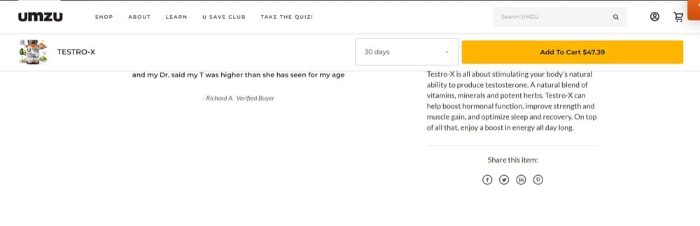
Many sites fail to capitalize on this opportunity by not keeping the CTA visible while the visitor scrolls. You can use sticky CTA buttons, like Umzu, to keep the goal top of mind. (Of course, test it first before rolling it out to the entire site.)
5. Detailed product guides (How-tos, product care manuals)
Make sure you have content on your website that shows that you are an expert in your niche. It’s super common for a business owner to not realize they need to do this.
Bruce Paulson, Determined Solutions
Yes, and you also need to show people how to use your product correctly. That or you’ll get lots of support requests for this.

Your product page can explain how to maintain the product they’re buying. That demonstrates your commitment to the post-purchase experience, fostering trust.
6. Customer reviews and ratings (+ user-generated content)
Just because you’ve said it doesn’t mean they’ll believe it. Get your customers to give you valuable word-of-mouth marketing. And the thing is, they love doing it.
Feature customer reviews on your product page. If your product is solid, this shouldn’t be scary.
We rely on social proof to help us sell our popular products. Almost all of our customers report checking out before making a purchase product reviews in our customer feedback surveys.
By split testing our product pages for our Day & Night CBD gummies, for example, we were able to increase purchases by 12% for that product by moving the “Reviews” display around. In the end, the best design put reviews front and center which convinced more customers to buy.
Although we also played with our image sliders, layout, and product description, what made the most dramatic difference to our conversions was showcasing reviews prominently.
Shawn Thomas, Pure Relief
You can also do like Cupshe and give your customers the ability to upload pictures of themselves using the product. It’s 10 times more powerful than just text reviews (which folks are becoming aware can be faked).

7. All your certifications
Are you eco-friendly? 100% organic? FDA approved? Carbon negative? What third-party proof can you offer to support your claims?
We include certifications on the pages where we display our products. On the page where it says, “Add to cart” we emphasize that our products are GMO-free which is important to our consumers. Both our USPs and certifications have helped our pages convert.
Melanie Bedwell, OLIPOP
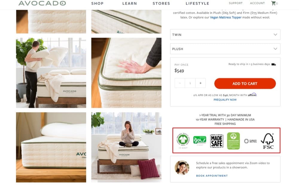
For example, it wasn’t enough for Avocado to say their latex mattress is organic. They provide the certifications right on their product pages, homepage, about us page, and site-wide footer to prove it.
8. All your trust badges
Your site’s credibility is bolstered by trust badges. They want to offer you a leg up by tying your firm to other well-known and respectable companies. Because these badges aren’t as crucial as the product itself, they’re often placed underneath the call-to-action.
If you want users to sign up for an account on your site, you may want to include a badge indicating that you utilize a trusted payment processing business, your site’s security service provider, and your BBB rating. This is a simple thing you can do that will have a tremendous impact for very little effort or time.
Kim Abrams, Abrams Roofing
You can get trust badges from review sites like Trustpilot, Google Business Profile Reviews, and others. Guarantee safe checkouts too, show the payment options you support and your easy return policy.

What about reputable publications that have featured your products? You can flex those logos too.

Test where you position these badges, but it’s pretty standard to have them featured site-wide in your footer.
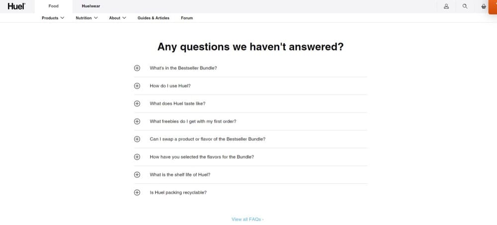
9. FAQs
Sometimes folks need a little extra assistance. Offer an abundance of frequently asked questions on your eCommerce product page. This might contain frequently asked topics like how to maintain and use your product.
Travis Lindemoen, Nexus IT Group
This can be placed at the bottom of the page for visitors who scroll down for more information and don’t find what they want in other sections.
10. Customer service options

How Can You Optimize These Shopify PDP Elements?
Your product page will already be halfway to being stellar if you include the elements from the list above. Next, optimize them. You can:
Add a detailed product comparison table
Some products, such as clothing and accessories of different colors, gadgets, and furniture, require a side-by-side comparison to make a choice.
You can test a comparison feature to aid in decision-making and assess how it enhances the customer experience.

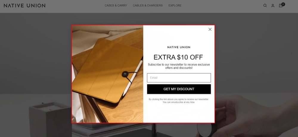
Optimize pop-ups
Customers don’t actually hate pop-ups. They hate their irrelevance. But if you master the art of relevance, pop-ups are a great way to display limited-time offers and product promotions.
Test different headlines, offers, and copy. See which is best at converting visitors that would otherwise have bounced.
Target specific product SKUs
Do you know you can run tests for a specific product by using its unique ID? You can use Convert’s advanced page tagging to run an A/B test for only one product page at a time to test how stellar product page elements perform.

Split test Shopify themes on your product pages
The truth is, some themes are more effective at converting shoppers than others. In split testing your product pages, you can set one theme against the other and see which performs best. That is, which one leads to the highest conversion rate? When the results are out, you’ll know the theme to favor.
Part 3: Make Your Product Page Visible (and Credible)
If no one sees your product page, it doesn’t convert. Your product needs to surface in search, show up and stand out in AI-generated answers/recommendations, and signal credibility fast.
We have a full guide on optimizing for the newer frontier of AI Search Optimization (AISO). Check it out.
Let’s talk about how to make that happen.
SEO: Help Search Engines Understand and Recommend Your Product
Strong SEO still matters today. The clearer your page communicates what it’s about—and how well it aligns with real search intent—the more visibility it gets on Google and other engines.

Here’s how to get this right:
1. Match Keyword Intent
Forget stuffing in the highest-volume keywords. What you need is alignment with how real people search when they’re ready to buy.
That means:
- Using commercial intent terms in your product titles, URLs, and descriptions. “Ergonomic office chair for back pain” beats “office chair.”
- Researching with SEO tools to find out the terms your buyers are actually using to find products you sell.
- And checking your bounce rate and dwell time. If people click and leave, your content likely didn’t match their intent. Fix the message before driving more traffic.
You can lower the bounce rates by ensuring that the right people visit your site. To do this, invest time and effort in keyword research and improve your SEO marketing. With a top keyword strategy, you narrow down your audience to those people who are searching for your niche. Tools like Ahrefs and Google Keyword Planner can assist you in determining the most suitable keywords and phrases for your store.
Farnam Elyasof, CEO, Flex Suits
2. Optimize Your Titles and Meta Descriptions
Title tags are often the only thing people see of your page in search results. Your meta description, which is like your pitch, is a bit less visible. But together, they set expectations and drive clicks.
- Write clear, specific titles that work for both the product and the search query.
- Use your meta description to build trust and reinforce the benefit. Think “why this product” in 160 characters.
- Make sure your titles and descriptions match what’s actually on the page, or risk high bounce rates.
Remember: Work on your collections/category pages as well. They often show up for high-volume keywords better than product pages do.
3. Add Structured Data (Schema Markup)
Schema is how you speak Google’s language. It helps your product listings show up with rich results, like star ratings, price, and availability.
- Use Product schema to give Google everything it needs.
- Add FAQ schema if you have collapsible questions on the page.
- Use JSON-LD format to keep things clean and Shopify-compatible.
- QA everything with Schema Markup Validator to make sure everything’s working.
AISO: Optimizing for AI-Generated Answers
AI search results—like Google’s AI Overviews or answers in ChatGPT and Perplexity—don’t just mirror search engine results. They summarize, synthesize, and recommend. That means your product page content needs to be both crawlable and comprehensible to LLMs.
Here’s how you can do that:
1. Be AI-Readable and AI-Citable
Think beyond keywords. AI tools pull in content that’s clear, helpful, and unambiguous. They prioritize answers that directly respond to user queries.
To optimize for this:
- Use clear, descriptive H2s and H3s that label what’s being answered.
- Turn your FAQs, specs, and support documentation into public pages. These are often cited in AI answers.
- Include “what is,” “how to,” or “best for” explanations in your description, blog, and support content.
2. Build Trust the AI Can See
If your page doesn’t explicitly mention why your product is credible, it won’t be inferred.
- State who the product is for and why it’s better.
- Add expert quotes, customer reviews, or social proof.
- Include E-E-A-T signals: experience, expertise, authoritativeness, trustworthiness.
3. Track and Monitor AI Visibility
Tracking traditional SEO is straightforward. AI search visibility isn’t—yet. Here’s how to start anyway:
- Use Ahrefs or Semrush to monitor if your content appears in AI Overviews (under “SERP Features”).
- Manually test prompts in ChatGPT, Perplexity, Claude, etc., and log appearances.
- Watch referral traffic from chat.openai.com, perplexity.ai, or similar domains in your analytics.
- Monitor branded searches (especially with modifiers like “reviews” or “pricing”) for signs of AI-fueled discovery.

4. Get Mentioned in AI Sources
AI learns from what it reads. That includes Reddit threads, blog posts, support articles, review platforms, YouTube, and more. To get mentioned:
- Pitch to industry newsletters, press, and podcasts.
- Encourage customers to review you on third-party platforms like Trustpilot or G2.
- Publish helpful “how to choose” content or comparison guides, even if they include competitors, just position yourself well.

By the way, since we’re on the topic of AI, here’s an interesting ecom idea for using AI on your Shopify product pages:
The Compound Effect of Visibility and Credibility
Visibility is one part technical, one part persuasive. You’re trying to rank, yes, but you’re also trying to make people want to click.
That’s why it’s not enough to show up. You need to show up looking like the most credible and relevant choice.
So here’s your checklist:
- Use keywords that match buyer intent
- Write titles and metas that reflect your offer and hook the reader
- Add schema markup for rich snippets and better crawlability
- Create AI-readable content with clear sections and answers
- Build review presence on your site and on third-party sources
- Track both traditional and AI-driven search visibility
- When that’s in place, your traffic quality improves. And so do your conversions.
How to A/B Test Shopify Product Page Elements
You’ve tightened your offer, cleaned up the UX, improved your visibility. But optimization doesn’t stop there.
A/B testing helps you validate changes, surface new ideas, and evolve your product pages based on data, not guesswork.
Here’s how to test what matters on Shopify product pages.
What to Test
Every element of your product page can influence conversion. But not all changes move the needle equally.
A helpful rule: Test from the top of the funnel to the point of decision.
Start with:
- The offer and message: Are you solving the right problem for the right customer?
- The hook and value proposition: Is it immediately clear what makes your product compelling?
- The CTA and buying experience: Are visitors confident and friction-free when converting?
From there, expand to:
- Product titles and descriptions
- Image sequences and video use
- Review placement or format
- Shipping or return messaging
- Page layout and hierarchy
But don’t test blindly. Use your research, bounce rate patterns, and heatmap insights to identify friction points and areas for hypothesis testing.
Tools for A/B Testing on Shopify
Shopify doesn’t offer native A/B testing for product pages, but plenty of tools fill the gap.
Top picks include:
- Convert Experiences for Shopify – Full-featured, privacy-first testing platform that works seamlessly with Shopify. Great for offer, UX, and targeting-based tests.
- Visually – Visual editor built for Shopify product pages. Great for non-technical teams.
- Optimizely – Enterprise-grade experimentation with a personalization engine.
- VWO – Full-funnel testing suite with varied features.
Want a full breakdown of pros, cons, and use cases? Check out our guide to the top Shopify A/B testing tools.
How to Know When a Test is Done
Run your tests long enough—and with enough traffic—to get reliable results.
Here’s how:
- Use statistical significance, not gut feel. Aim for 95% significance or higher.
- Watch for SRM (Sample Ratio Mismatch). If traffic allocation is uneven, your results might be invalid. This can happen from faulty tracking, bot traffic, or redirect bugs.
- Set a minimum detectable effect. If you’re trying to measure a 0.2% lift with low traffic, it’ll take forever. Start with bigger swings and narrow in over time.
Use calculators like Convert’s A/B testing calculator and Evan Miller’s A/B test calculator to plan your tests.
What to Do With a Winning Variant
Once a test ends, you have three options:
- Full rollout: Replacing the old version with the new winner across all traffic.
- Personalization: If it only worked for a specific segment, use personalization tools to make a unique experience for them.
- Retest: Use insights from one test to inspire the next. And so on.
Always log what you tested, the hypotheses, and results. This builds a testing culture and prevents redundant efforts down the line.
Testing Helps You Build a Smarter Store
Your gut may have great instincts, but the data always has the final say.
A solid testing strategy lets you:
- Improve what matters most
- De-risk bold ideas
- Discover non-obvious opportunities
- Scale insights across products and categories
And best of all, testing unlocks confidence. You don’t have to wonder what works. You’ll know.
Dig deeper into the science and winning strategies of split-testing your Shopify product pages.
Conclusion
Conversion rate optimization is the beginning.
But real revenue growth through your product pages and bestsellers comes on the back of work done to first understand, and then improve your brand expression, your offers, the UX on your product page(s), and the number of ways in which more aligned prospective buyers find them.
Frequently Asked Questions and Answers About Shopify Product Page Optimization
1. How do you know if your product page needs optimization?
Most Shopify product pages don’t scream “broken,” but they quietly underperform. Subtle indicators such as rising bounce rates, lots of traffic with few conversions, or unusually high cart abandonment are the first whispers that optimization is overdue.
Your product page likely needs optimization if you notice:
- Low add-to-cart rate
- High bounce rate on PDPs
- Cart abandonment after landing from product page
- Low average session duration on product pages
- Too much reliance on discounts and promos to drive sales
- Poor performance across key segments
2. What’s the single most impactful change I can make to improve product page conversions?
Start with product positioning. Take customer research insights (from customer reviews, surveys, and interviews) to build an understanding of what buyers care about most and why. Then, make your messaging address those desires and concerns directly.
3. How often should I update or test my product pages?
Optimization is a cycle. That’s why Microsoft introduced the A/B testing flywheel. You want to make a habit of reviewing and testing changes on your product pages monthly, for instance, especially if you’re running paid traffic. The small, continuous improvements you realize will compound over time.
4. Can I use A/B testing on Shopify product pages?
Yes, you can run statistically sound experiments on product pages. Convert is an example of a great tool for this. For a full breakdown of your options, check out our guide: Top Shopify A/B Testing Tools.

Written By
Uwemedimo Usa

Edited By
Carmen Apostu
