A/B Testing Pop-Ups: How to Improve Your Conversion Rate In 2026
Pop-ups are everywhere.
Some of the biggest brands like Amazon, Pinterest, and Adidas use pop-ups. In fact, it’s pretty hard to escape them.

We’re willing to bet you saw at least half a dozen today. Unfortunately, pop-ups aren’t the only thing that’s popular. “Hacks” to make the best pop-ups are equally rampant.
Here’s the thing: You can absolutely learn from what’s worked for your competition but blind faith is going to turn your visitors away and cost you some serious dollars.
Pop-Ups: Annoyance or Necessity?
We’ve got some hot takes from CRO experts and marketers:
Oh, they suck. They’re the absolute worst – BECAUSE people think ‘set it and forget it’ is a strategy.
Shiva Manjunath at Speero
Pop-ups are generally an annoyance. A marketer, however, creates them in a way, so the user finds them more valuable than annoying.
Arek Nowakowski, Product Designer at Spacelift
But the right answer to that question is that it depends.
Pop-ups could yield great results compared to other channels or be a totally bad move for you. You won’t know for sure until you split test pages with and without pop-ups.
The real reason pop-ups get a bad rap is bad user experience. Here’s what Amanda Natividad, VP of Marketing at SparkToro, experienced recently:
Bad user experience can lead to changed user behavior like this:
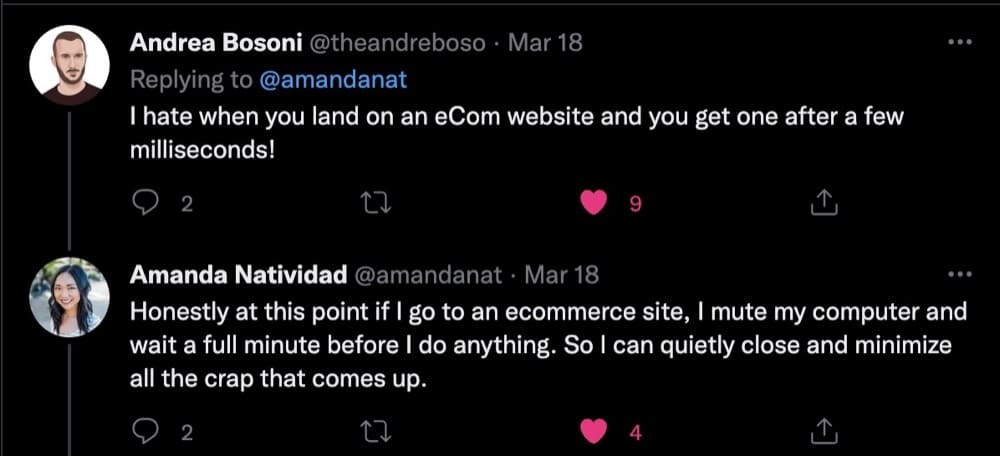
And people installing pop-up blockers to prevent them from ruining their experience (that’s the reason when you look up pop-ups, these ad blockers rank so high on Google.)
We have to acknowledge that pop-ups are still going to be annoying. But they don’t have to be annoying to everyone.
Shiva at Speero shares:
When done properly, they’re targeted, THEN become valuable. Serving it to everyone may have higher overall engagement rates and overall submissions, but the quality will likely be a lot less. And no one ever tracks the ‘detrimental’ effects to those types of pop-ups either.
You have to know how and if it impacts other secondary and guardrail metrics unfavorably.
Guardrail metrics are critical metrics that are designed to alert experimenters about a violated assumption. Guardrail metrics provide what Spitzer (2007) calls the “capacity to instigate informed action.” When a Treatment effect unexpectedly moves a guardrail metric, you may want to reduce trust in the results, or stop an experiment in cases where harm may be done to users or the organization.
Ronny Kohavi, A/B testing consultant
The Different Types of Pop-ups (with Pop-Up Conversion Rates)
The first-ever pop-up ad appeared on Tripod in the late 1990s and their inventor, Ethan Zuckerman has since apologized for the nuisance he unleashed on the internet. Throughout its turbulent history, pop-ups have gone through phases of being a marketing pariah.
Originally seen as the shiny new thing to being abused by every scammy website, pop-ups sank into obscurity faster than fidget spinners. Pop-up blindness (or banner blindness) meant that users didn’t see them as an annoyance—they became immune to it and promptly ignored it.
Pop-ups have gotten a new lease of life thanks to savvy A/B testing marketers who’ve managed to resurrect them from the dead and use their intrusiveness for the proverbial good.
Here are the different kinds of pop-ups you’ll encounter (with examples and conversion rates benchmark):
Sidebar: Pop-ups can largely be categorized into 3 buckets based on when they appear, how they appear, and what kind of content they offer. Due to this, you’ll see some articles mention over 50 different types of pop-ups but we’re sticking to the basics and what’s most relevant for eCommerce.
Entry Pop-ups
Entry pop-ups get shown to website visitors almost immediately after they land on the page. Some block the entire page from view (also known as welcome mat pop-ups) while others appear in the middle of the screen (lightbox). For instance, Wishpond uses both these types one after the other:


While these may be effective in getting users to take immediate action, setting this to be the first pop-up can also cause users to bounce instantly.
The trick here is to use a micro commitment.
Micro commitments can have a huge impact on your email opt-in engagement rates. Get the user to simply click yes to receive a discount. After that small yes, they subconsciously believe that they must be interested and will want to remain consistent as they continue to engage with the pop-up. This creates less friction for them filling out the form which requires more buy-in and decision-making brainpower. It’s the principle of commitment and consistency.
Anthony Morgan, CEO and Founder of Enavi
Click-activated Pop-ups
Akin to tool-tips, they show up when users voluntarily click a link or a visual cue. They are expected, and much less intrusive.
Click-activated pop-ups are pretty common on eCommerce stores since they allow shoppers to explore at will and offer more information when they need it.
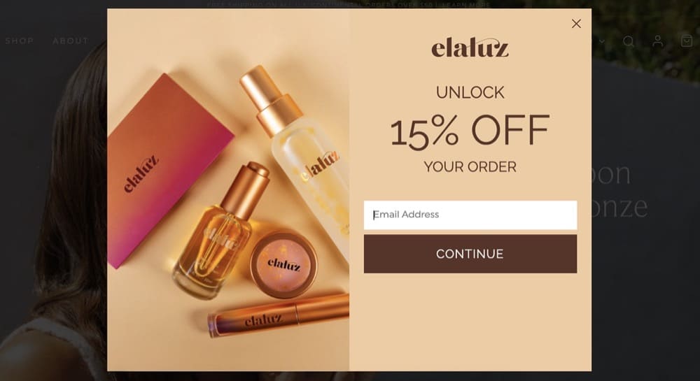
Exit-intent Pop-ups
These pop-ups get triggered when visitors attempt to leave your site—a Hail Mary to get them to convert before they abandon their cart.
On mobile, these get triggered when someone rapidly scrolls back up or presses the back button. Elauz offers a 15% discount to first-time shoppers who attempt to leave the landing page.
Timed Pop-ups
A timed pop-up appears to visitors only after a specified period. How soon after should you show that message? Again, that’s something you have to A/B test.
This pop-up from Sumo is a good example. It appears after you’ve spent a little bit of time reading the post.

Which Type of Pop-ups Converts Better?
Wisepops analyzed 1 billion displays. They have numbers going back to 2023.
Here’s the insider’s story:
- The average conversion rate for pop-ups in 2025 sat at 4.65%
- On click pop-ups convert the best — at 28.79%
- Pop-ups that trigger on hover convert at 17.37%
- The typical “on landing” pop-ups we have all come to dread convert at 4.97%
- In 2025, pop-ups captured 46.1 million email addresses, up from 19.5 million in 2023
Take these with a pinch of salt. But they do the job of giving you an idea of the report card of pop-ups, after decades of over-use and banner blindness.
Here’s a real-life example from Dave Evangelisti, Founder & CEO, TestGuide:
On one webpage we were able to increase our “Calculated Conversion Rate” (it was a goal based on funneling people to a certain page) by 1.38%. While this may not sound significant, with thousands of people, 1.38% can really move the needle.
Sleeknote scrutinized over a billion pop-ups in 2020 and here’s what they found:
- Pop-ups with images had a 3.80% conversion rate while pop-ups without images saw a 2.07% conversion rate.
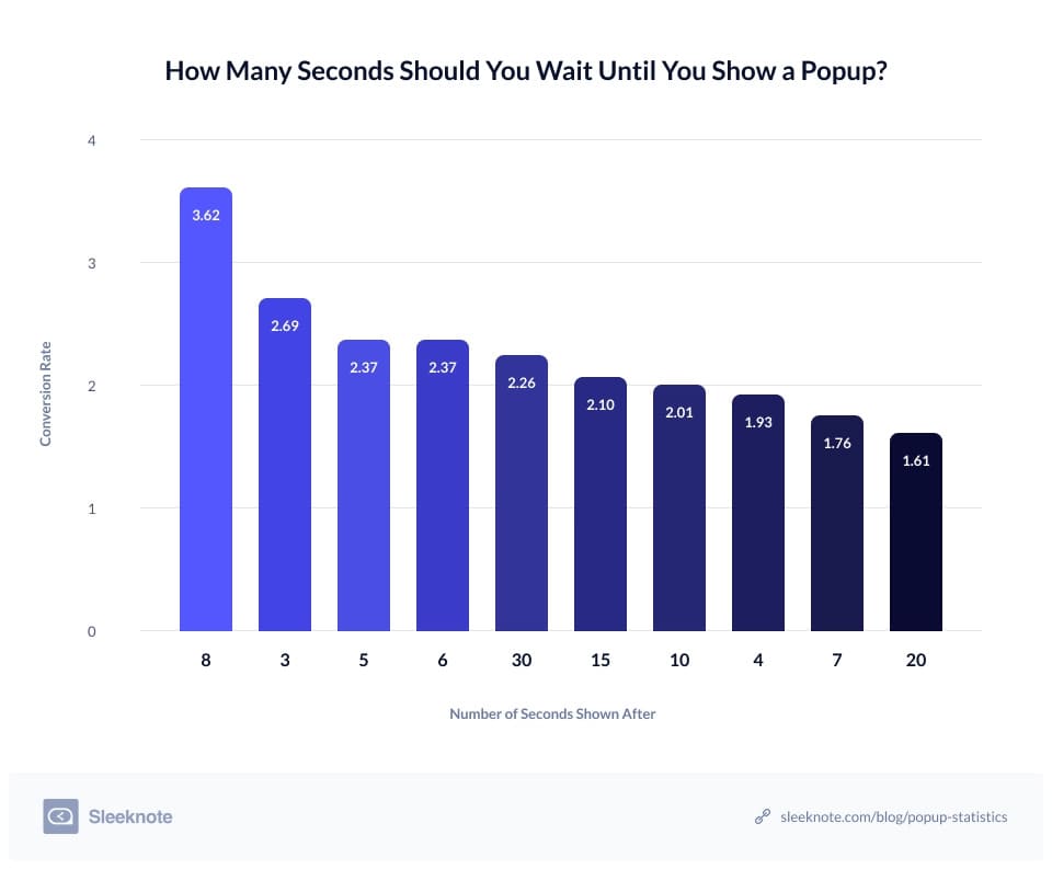
- Pop-ups set to appear after an 8-second delay had a conversion rate of 3.62% and converted better than pop-ups shown before or after
- Pop-ups with two input fields saw a higher conversion rate at 3.31% which was better compared to pop-ups with three fields that had a conversion rate of 1.08%
Like Sleeknote, OptiMonk analyzed its users’ pop-ups in 2021 to publish its findings:
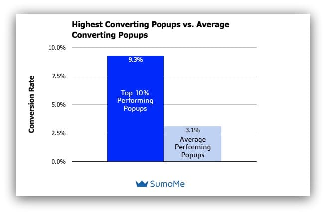
- The average rate of conversion was 11.09%
- The top 10% of pop-ups had an average conversion rate of 42.35%
- The average conversion rate for desktop was 9.69% and 11.07% for mobile
- Cart abandonment pop-ups had a 17.12% conversion rate

Note: These benchmarks come from original research and forming hypotheses that were tested and shouldn’t be used for direct comparison. But these results can give you a better insight into which elements you should test (we’ll dive into more detail below).
A/B Testing Pop-ups: Should You Do It & How?
We’re asking you to throw two assumptions away:
- Just because pop-ups work for your industry or competitor, doesn’t automatically mean they will work for you.
- Just because something works, doesn’t mean it can’t be improved.
To know for sure, you have to A/B test pop-ups.
Here’s an example from Sumo to show just how much of a difference it can make.

You might assume that Version B performed better because it follows all the “best practices” but in fact, the first pop-up outperformed by 30%.
What is A/B Testing & Split Testing for Pop-ups?
A/B testing lets you test changes to one or more elements. You can add, eliminate or modify elements and track changes to see how they boost conversions.
When A/B testing pop-ups, you create two almost identical versions and pit the variant (or challenger) against the original (control).
Although most people conflate split testing and A/B testing, these are two completely different conversion rate optimization techniques.
In split tests or split URL tests, you split the traffic evenly to send visitors to two entirely different versions hosted on different URLs. This helps you identify which version performs the best.
If you wanted to understand whether or not pop-ups are a good idea, a split test would be the best way to go. One page with a pop-up stacked against the other with a mix of elements like copy and cues to deliver the same benefits and value.
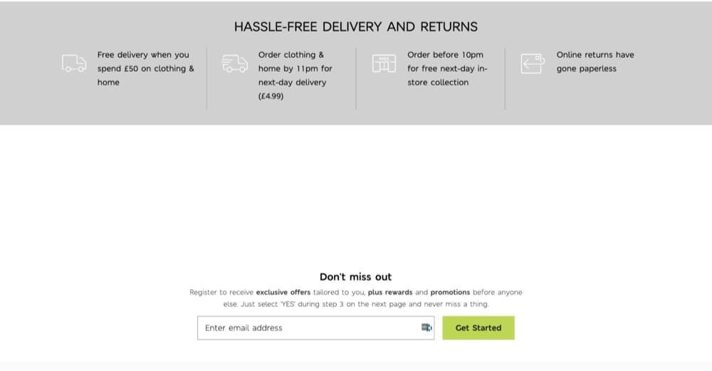
Take Marks & Spencer for example. Instead of using a pop-up to build their email list, they have a section at the bottom of the page where visitors can subscribe.
If you find out that pop-ups aren’t scaring visitors away, make one change at a time to isolate the effects of A/B testing through a series of experimentations to learn what works for your business.
Faizan Fahim, Growth Hacker at Breeze recommends avoiding some common mistakes when A/B testing pop-ups:
- Don’t show the same pop-up twice. It is insulting to the users since they ignored and closed the pop-up once, but the website is still showing them the same pop-up.
- Make the pop-up relatable to the page the visitor is on.
- If the visitor is on the cart page, show them the discount.
- If the visitor is on the comparison page, show them the ‘start trial’ pop-up.
- If the visitor is reading the article for a long time, show them the subscribe pop-up.
Arek Nowakowski, Product Designer at Spacelift warns against another common mistake:
Avoid running the A/B tests during festivals and events. The customers’ behaviors change around festivals and holidays. Run all the A/B pop-up tests when business is usual
Pop-Up A/B Tests: Different Elements to Change
You can test just about every element in your pop-up as long as you go off of conversion research.
Study user behavior, mine reviews, support tickets, watch visitor replays, and analyze current metrics before you start test planning. This will form the basis of your hypothesis so you’re not arbitrarily making changes that could hurt your business.
That said, the most common elements that are A/B tested are the copy, trigger, placement, CTA text, and different types of pop-ups.
Time of Trigger
Sleeknote’s research indicates that 8 seconds is the sweet spot you should aim for but again, you can’t know for certain unless you test it out.
But most experts seem to agree on one thing—it’s not a great idea to show your visitors a pop-up as soon as they land on a page.
Time-based triggers are A-grade ways to make sure you’re targeting the right users while not pissing off the rest.
Shiva Manjunath, Speero
One of Wise Pop’s customers tested 3 different delays—10, 20, and 40 seconds—with this pop-up:

Their testing revealed that the best time to display their offer is after 10 seconds.
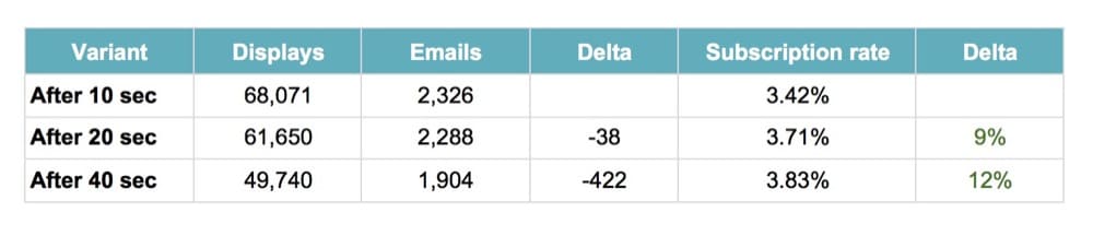
Longer delays resulted in fewer people seeing the pop-up so while the subscription rate was high, the number of emails collected wasn’t.
Make sure you don’t fall prey to false positives. Read our guide to help you correctly interpret A/B test results and improve them.
Position
Should you place your pop-up at the beginning of your page, use a welcome mat to cover the entire screen or a lightbox?
Or better yet, try a pop-up on the side of the page or a scroll-in pop-up that is less intrusive?
Using a scroll-triggered popup on a blog article is a good way to persuade users to read more of your content. This will persuade people to join up for your newsletter, which will contain helpful hints and links to fresh blog content.
Josh Pelletier, Chief Marketing Officer (CMO) at BarBend
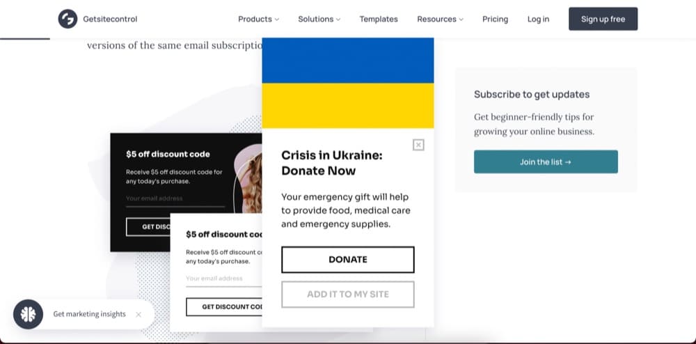
Getsitecontrol has two less intrusive pop-ups on their page that don’t block the page from view.
P.S. You’ll also want to account for mobile vs. desktop experience when thinking about the position of the pop-ups. Pay close attention to mobile since Sleeknote found that mobile pop-ups increase conversions (5.8%) compared to desktop (3.11%)
Popups for mobile phones should be designed taking into account the available screen area as well as other aspects of the mobile user experience.
Veronica Miller, Digital Marketing Manager, VPNoverview
Copy
The right copy can get your customers to take action or ignore your attempts entirely.
Copy is very important and can move the needle by a few percentage points. We try different copies all the time. We’ve changed the headlines and text of our popup blockers and reached a 30% improvement. We went from a more aggressive stop popup that negates reservations one might have to sign up, to a popup that highlights social proof and the value our roommate finder app can bring to you.
Rany Burstein, CEO & Founder, Diggz.co
You can run micro-experiments by changing the headline of your copy, varying the length or using power words.
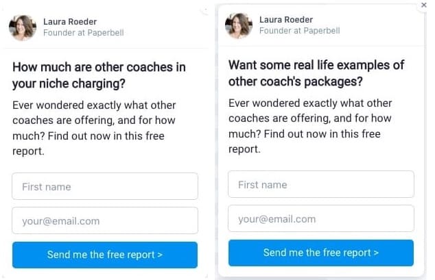
At Paperbell, Laura Roder (Founder) finds the headline is where the biggest lift lie.
You can use heatmaps and clickmaps to learn how visitors interact with the copy and what draws their attention.
Another example you can study is from Contrast, an eCommerce marketing agency:
We ran a landing page-specific email pop-up for a client of Contrast’s around the micro-yes hypothesis.
Most stores run a pop-up like “if you give us your email you can get x% off”. We wanted to run a different variant to test this idea. We changed the wording to tap into human psychology.
We ran the following message: “Would you like to save 20% on your order today?“. Because who would say no to this?
To achieve this we have 2 buttons: Yes / No
– Yes, continue to the next step to input email info.
– No, closes the pop-up
Through this A/B testing, we were able to take the email option rate from 3.3% collection to 9.1%.”
Elliot Davidson, Founder & Director of Contrast
Offer
Compare different discounts, lead magnets, and shipping information in your offer.
We tested offering free shipping through a pop-up to returning users upon website entrance and found a 73% lift in the e-commerce conversion rate for that target audience. Pairing the right offer with the right audience is crucial, not just for the pop-up to resonate but for the pop-up to contribute positively to the bottom line. The offer strategy doesn’t always have to be priced based. We have a 6% sign-up rate on our FSA/HSA page for customers to request more information on how to purchase our products with their FSA or HSA cards.
Jonathan Finegold, CRO at Medcline.com
SwissWatchExpo, an OptiMonk customer, created two versions of a cart abandonment copy to see which messaging would yield the desired results.
Version A invoked FOMO by letting users know that they had the last item available and saw a 17% increase in conversion rate.
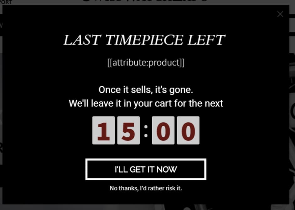
Version B offered a discount and slightly different messaging bringing in a 30%+ conversion rate.

Call To Action (CTA)
You can test the color, copy, size, and alignment of the call to action button.
It may be particularly important to check the copy of the CTA. If there’s a disconnect between what you’re offering and the CTA, users are less likely to convert.
In the pop-up below, would you click if it said “Subscribe” instead of “Yes, send me those tips”?
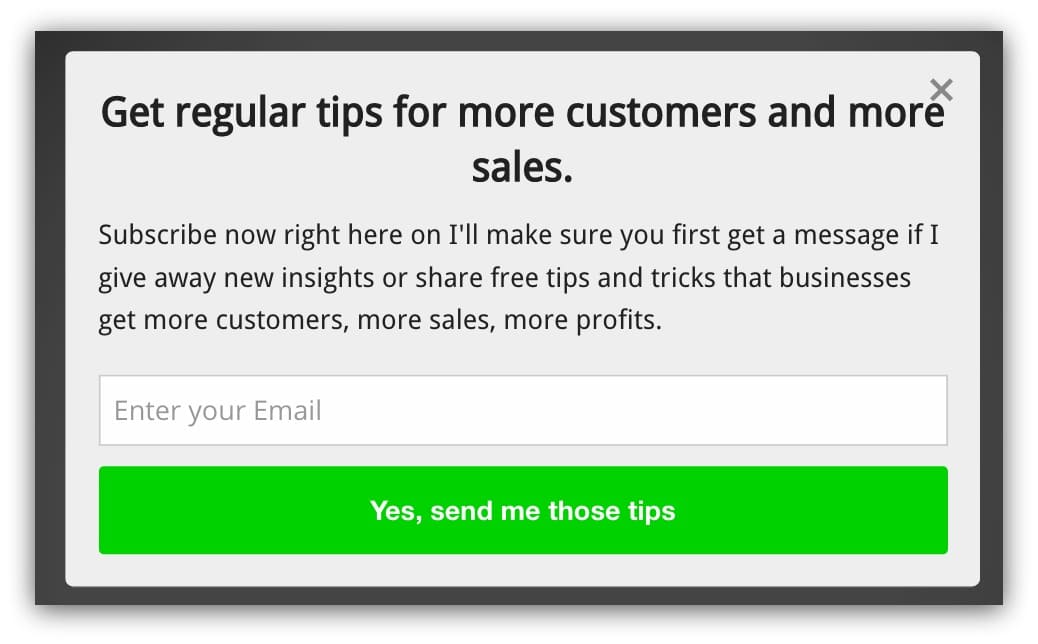
Probably not. Make sure the CTA matches the promise you’re making. And you can use this as an opportunity to shock and awe.
Take a look at Klientboost’s newsletter sign-up form:
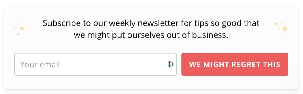
Instead of the usual “Subscribe,” the “We might regret this” is attention-grabbing.
You may also want to add or test the text users use to dismiss a pop-up.
CoSchedule’s exit intent pop-up that prompts users to try the free extension can be closed if you click on “I reject the free extension.”

We tested an exit-intent pop-up on our product pages, offering an additional discount with a unique coupon code, and found a 7% sign-up rate. In this case, the offer strategy had a large impact, with a 10% off coupon performing more than twice as well as a free shipping coupon offer (we also found an 18% increase in the offer email open rate).
Jonathan Finegold, CRO at Medcline.com
Gamification
Gamified pop-ups motivate users to take action in exchange for a reward.
Optimonk’s research found that “lucky wheels” or wheels of fortune had a 13.23% conversion rate.
But you don’t have to stop there. You can also try “pick a gift” or “scratch the” card pop-ups.


Medcline was able to increase their capture rate by 12% by running sweepstakes versus a traditional “sign-up for our newsletter” offer.
Another great example comes from Ross Kernez who only uses gamified pop-ups for their client after these results:
We tested 2 different types of gamified pop-ups. One was a spin the wheel to win a prize pop-up and the other was to select a box to see if you have won a €10 voucher.
Our previous best conversion rate was 8%. When we tested either of the gamified pop-ups our conversion rate jumped to a minimum of 14%.
Ross Kernez, Chief Consultant for Online Strategy- Ross Kernez Consulting
Best Metrics to Track When A/B Testing Pop-ups
You can’t take the winner or loser of a test at face value when A/B testing ideas since you have to understand both how and why you’ve achieved those results.
That’s where your metrics come in.
A metric is a singular data type that helps you measure the impact of A/B testing against your business objectives.
But how do you decide which ones to track?
There are some that you have to track while others depend on the type of pop-up.
Depending on the type of pop up (coupon for eCommerce, e-book, etc.), I try to go to more upstream metrics as much as I can. You always have to track ‘trigger’ rate (because that will be your denominator for the engagement metrics). However, things like ‘popup closed’ and ‘submission rates’ are extremely important to track. Combining that with getting creative with triggering heatmaps/session recordings will give you MORE insights! Bonus points for things like exit rate, though they get tricky with noise (e.g. exit rate may not be defined well UNLESS you include those who saw the pop up).
Shiva Manjunath, Speero
Karim Naufal, our in-house A/B testing expert agrees that general metrics still apply.
Yes, Conversion Rate must be measured for the popup buttons themselves for instance, and the closing X. But measuring the bounce rate, or drop-off rate is good (does it create frustration?). Also measuring the Time to Close the pop-up is probably relevant too (how much interest did it capture?).
Other click metrics such as Add to Cart remain insightful. Yet the best one to track is the undisputed Revenue per Visitor metric which measures revenue, which in itself contains the information on the Conversion Rate and Average Order Value.
Another pretty useful metric that measures user engagement is Sessions per User.
But Jonathan Finegold, CRO at Medcline.com doesn’t believe you should track revenue, and here’s why:
For our blogs, revenue is not the primary KPI, the sign-up rate is because our goal is to maximize email capture from organic traffic. Likewise, even in an e-commerce setting, revenue might not always be the best metric because at the margin the offer might be unprofitable, and so the right KPI, in this case, maybe the rate of change in margin dollars.
In a nutshell, these are the metrics you should look at when A/B testing or split testing pop-ups:
- Conversion rate
- Click-through rate
- Bounce rate
- Drop-off rate
- Session per user
- Add to cart
- Revenue per visitor
- Pop-up closed
- Submission rate
- Products per visitor
- Average order value
Connect your Google Analytics and Shopify to an A/B testing platform like Convert to accurately measure all of these metrics.
Here’s an example of what that process might look like:
For example, when testing the amount of time before a popup engages a user, we look at heatmap and Google Analytics data to discover the rate at which people close the popup.
We found that anything 15 seconds or less resulted in about an 86% rate of closure, and also contributed to an increase in bounce rate. If the timing of the popup was between 15-45 seconds from the time the user was on the site, we saw the closure rate drop to 61%, with the bounce rate reduced by 14%.
When we set the time to 1 minute, we saw the closure rate drop an additional 5%, and the bounce ratedecreased by 6%. In addition, the interaction with the CTA button increased by 40% when 1 minute was the set time. The other two intervals saw little to no change in the CTA click rate.
If we are testing the text within the CTA button, then we look at the CTR% of the CTA. When we use more direct and specific language with a time modifier (ex: now, today), we saw an increase of 14% in the CTR.
Joe Karasin, Head of Growth Marketing, CircleIt Inc.
Another metric that you may not have thought of that can have a significant impact on your business is page speed.
The best metric to track when A/B testing pop-ups is Page Speed.
You should not be surprised if the pop-up with embedded gifs and videos slows down the page. Pop-up loads from the same HTTP request as the page, affecting the page speed.
You can calculate the impact of a pop-up on the page by analyzing the waterfall chart. Run the variation of your page through the Pingdom Test, and compare the page speed. If there is a significant difference in the loading speed, your test has already failed.Website loading speed comes before the pop-ups, as the browsing experience greatly affects the conversion rate.
Arek Nowakowski, Product Designer @ Spacelift
Note: We briefly mentioned guardrail metrics before but it’s important to keep them in mind when testing pop-ups. These are core metrics that you do not want degrading when you’re testing because a dip in performance can have a huge impact on your business.
Guidelines to Keep in Mind When A/B Testing Pop-ups
When you’re ready to start A/B testing pop-ups, follow these recommendations to improve their efficacy:
- Perform pre-test calculations to ensure you have the right sample size.
If you don’t perform the test on a large enough group of people, you risk making a mistake, like believing that a false positive is real. Do your pre-test calculations to check whether you have the footfall to run through the cycle of adjustments you have in mind.
Tip: Use our A/B testing calculator to perform significance, p-value, power, sample size, and MDE calculations. - Plan a host of minute changes with small MDEs for high-traffic sites.
If you have high traffic, you can plot out a full cadence of minute changes with small MDEs (Minimum Detectable Effect). Most pop-up experiments result in only single-digit lifts. So this approach can help you understand how small changes can relate to corresponding adjustments in KPIs. The higher your traffic, the smaller the lifts you can detect and be sure of the results.
Note: MDE is simply the minimum effect size that would be worth it for us to observe, under which the cost or effort of implementing the new variant wouldn’t be worth it. - Combine changes if your pop-ups are not performing well.
If your pop-ups aren’t pulling their weight, combine several changes and roll them out at once with a larger MDE. Also, a good idea if you don’t have enough traffic since this will need less traffic to reach significance. The assumption is that any attempt at improvement should lead to tangible improvements possibly in the double digits. - Beware of false positives the more you optimize.
A false positive or a Type I error indicates that there is a difference between the control and variant when, in truth, there’s none. One way to really diminish the chances of having those, is first use a sample size calculator as mentioned above.
Tip: For mission-critical experiments, set the confidence level to 99% to reduce the chances of making such an error to 1%.
The more optimized your pop-ups get, the more mindful you have to be to ignore false positives.
A/B Testing a Pop-Up in the Convert Experiences App
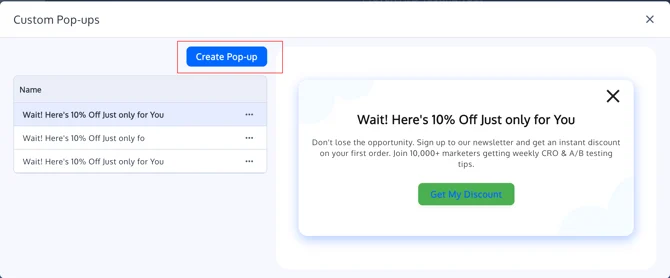
Where to Find Custom Pop-ups in the Visual Editor
- Go to your Convert dashboard.
- Open an existing Web A/B Experience or create a new one.
- In the Experience Summary, under Variations, click Edit to open the Visual Editor.
- Inside the Visual Editor, on the top Settings menu, “Custom Pop-ups” OR use the left-hand toolbar or contextual menus and look for Manage Custom Pop-ups (wording may be “Pop-ups” or similar, depending on UI version).
- Click Add Pop-up (or equivalent button) to open the Custom Pop-up Editor.


The pop-up editor opens as an overlay on top of your page so you can see how the pop-up will look in context.
Designing Your Pop-up
When you open the Custom Pop-up Editor, you can configure the content and layout of the pop-up.
1. Title / Heading
- Add a short, clear headline that explains the offer or message.
- Examples:
- “Get 10% off your first order”
- “Subscribe for product updates”
- Examples:
2. Body Text
- Use the main text area for the supporting description.
- Keep copy concise and focused on the desired action.
3. Image (Optional)
- Upload an image (product shot, illustration, logo, etc.).
- You can choose the image position, including top and bottom placements, so the layout can match your design.
- The editor shows a loading indicator when an image is uploading so you know when it’s finished.
Image uploads use the same infrastructure as other Visual Editor image uploads.
4. Close Icon (“X”)
- Every pop-up includes a standard close “X” icon.
- The “X” background is transparent for a cleaner UI and better integration with your site’s design.
- Clicking the “X” simply closes the pop-up and does not need to redirect or fire a goal (unless you add custom code for that).
5. Layout & Styling
- Basic styling (font size, alignment, spacing) follows existing Visual Editor controls.
- Use the side panel to adjust:
- Font size and weight
- Text alignment
- Padding and spacing
Configuring the Button (Optional)
Pop-ups often use a primary call-to-action (CTA) button, but the feature is intentionally flexible.
- The button is optional – you can create a purely informational pop-up with only text + close “X”.
- You can change the button text color to match your branding or improve contrast.
Button Label
Typical examples:
- “Get my discount”
- “Subscribe now”
- “Show me the deal”
Button Action Types
Choose what happens when a visitor clicks the button:
- Open URL
- Redirects the visitor to a page (checkout, category, landing page, etc.).
- Close Pop-up
- Closes the pop-up without navigating anywhere – useful for pure messaging.
- Run Custom JavaScript (Advanced)
- Instead of a URL, you can insert a JavaScript snippet to:
- Fire a custom goal
- Interact with another widget
- Trigger in-page behavior
The field accepts JavaScript but does not show a full code editor, intentionally keeping the UI lightweight while demand for advanced JS is evaluated. For more complex logic, you can combine this with Advanced Goals or integrations. Source: Advanced Goals
Setting Up Pop-up Triggers
Triggers control when and how the pop-up appears.
1. First-Visit / Page-Load Pop-ups
Use this for:
- “Welcome” discounts
- New visitor offers
- Time-limited banners (e.g. “Black Friday Sale”)
In the Trigger settings, configure:
- Trigger type: Page load / first visit
- Optionally, a delay (e.g., show after 2–3 seconds, not immediately).
2. Click Pop-ups (On Element Click)
Use click-based triggers when you want the pop-up to appear after a user clicks an element:
- “Get 10% off” badges or text links
- “More info” buttons
- Product images or banners
Workflow:
- In the Visual Editor, select an element (text, image, button).
- In the left-hand settings, choose Trigger Pop-up on Click (or equivalent option).
- Select which custom pop-up should open.
When a click trigger is attached:
- The element shows a cursor: pointer on hover to indicate it is clickable.
You can still use standard Visual Editor click tracking on these elements if you want to track clicks separately from the pop-up itself.
Source: The Visual Editor in Convert Experiences
Targeting with Locations & Audiences
Triggers work together with your experience’s Location and Audience settings:
- Use Locations to define which URLs the pop-up can appear on.
- Use Audiences to limit your pop-up to specific visitor segments (e.g., new visitors, geo, campaign).
Tracking Pop-up Performance with Goals
Custom Pop-ups become powerful when tied to goals. You can measure:
- Pop-up interaction (button clicks, custom events)
- Downstream actions (page visits, purchases, form submissions)
- Overall impact in your experiment reports
Tracking Button Clicks as Click Goals
If your pop-up has a button:
- Go to Project → Goals and create a Click Goal in your project if needed.
- In the Visual Editor, open your variation:
- Select the pop-up button
- Use the element settings to enable Click Tracking
- Assign or create a goal name
Using Custom Pop-ups with Existing Pop-up Tools
If you already use tools like Poptin or Ouibounce.js, you can:
- Use Custom Pop-ups for simple, in-experiment messaging
- Keep third-party tools for more advanced flows (e.g., multi-step forms)
- Track third-party pop-ups via goals and JS
Pop-ups Are Annoying, Intrusive, and Ineffective only if You Don’t A/B Test Them
Data shows us that proper use, placement, timing, and the copy can make a popup an effective way to drive meaningful action. In fact, one interesting finding was when we use an offer in the popup, we see that we receive more interaction than other CTA’s on the website that is otherwise the same.
Joe Karasin, Head of Growth Marketing, CircleIt Inc.
Step away from the “set it and forget it” strategy and embrace A/B testing.
Experimentation can help you identify how users react to your strategy, make adjustments, and drive desired outcomes.
As long as you steer clear of the mistakes people make when A/B testing and choose the right testing platform like Convert, you can create a win-win situation for customers and your brand.


Written By
Sneh Ratna Choudhary

Edited By
Carmen Apostu
