Make Your Product Pages Sell More: 6 Unique Product Page Optimization Tips
FADE IN:
Well, hello there!
Who are you? Based on your search, you’re likely an eCommerce entrepreneur. A little frustrated by your flatlining conversion rate, you’re blasé about the internet’s advice on how to optimize a product page.
You did everything right—ran the ads, zhushed up the page, and played nice with the algorithm. So what gives?
SNAP TO BLACK.
Netflix’s creepy Joe doesn’t have the answer, but we might.
Run-of-the-mill product page optimization tips like using high-quality images, adding customer reviews, and getting your branding in order aren’t bad advice; they’re just too basic.
You’re competing for attention, and with privacy updates like Apple’s ATT and the upcoming third-party cookie phase-out, direct-response ads don’t elicit the same reaction they used to. Plus, when you factor in the increased competition that emerged during the pandemic, selling more can feel like a distant dream.
Want to Sell More? Forget the Competition And Optimize Instead
What if the secret to increased sales is to forgo the competition? To understand what this means, let’s play a quick game.
Say the first thing that comes to mind when you hear these words.
Electric car.
Did you say, Tesla?
Okay, next one. Video call.
Zoom?
Last one. Which brand do you think of when you hear “athletic wear?”
Nike? Maybe you see where we’re going with this.
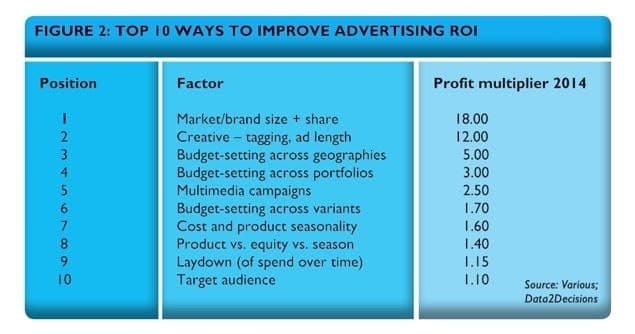
These brands sit at the top of their categories, enjoying greater market share and sales. It also disproportionately affects their ad campaign ROI. Paul Dyson from Data2Decisions found that brands #1 in their category see a whopping 18x effectiveness boost.
So unless you can outspend big brands, it’s unlikely you’ll win the competition for clicks. But what you can and should do is create your own sub-category. For example, when you hear the word “email”, you might think of Gmail, Outlook, or even AOL if you’re feeling nostalgic. But when you think of email for eCommerce, it’s Klaviyo all the way.
A slight pivot can make all the difference. But the other factor in your control—the creative and copy—can multiply your advertising ROI by 12x.
It’s not enough to have witty copy and high-quality images. The one-and-done approach leaves no room for marginal improvements.
So optimization makes sense, especially if you’ve never tried it before. Create a hypothesis, split your audience, run tests, and infuse the page with your inferences.
The best part? Selling more doesn’t mean you only have to optimize for acquisition. In this retention economy, acquisition is impacted by retention loops—ways in which existing customers drive new business through invites, referrals, or word of mouth. Optimize your online store for retention and you’ll be able to streamline your acquisition strategies simultaneously.
Before Optimizing, Respect Data
It’s hard to talk about optimization without bringing up analytics in the same breath. After all, that’s the first place you’ll want to look before you start shaking things up.
But Johnny Longden, Conversion Director at Journey Further, a performance marketing agency, says that the business world seems to have mistaken analysis with mere interrogation of data, completely overlooking the business problem and critical thinking.
Longden argues that committing this cardinal sin with analytics can lead you astray. Remember that data is not insight. You can’t dive headfirst into data without understanding the business problem or applying critical thinking to it. Interpretation must be done with great care, or you might end up making changes that hurt sales.
6 Things You Can Do Today to Make Your eCommerce Product Pages Sell More
We know you’ve been around the block a few times, so we’ll skip most of the simple advice that’s floating around the interweb and dive right into actionable advice you can implement today (backed by experts and real-life examples!)
Gauge Where You Are
“Companies will often replace a page without first understanding what was working on the original,” shares Luke Carthy, an eCommerce growth consultant.
Take stock of your eCommerce business and see how you measure up against industry benchmarks and your customer’s expectations.
Industry Benchmark
Unbounce’s Conversion Benchmark Report that analyzed over 44,000 landing pages and more than 33 million conversions lets you see how you rank in your industry.
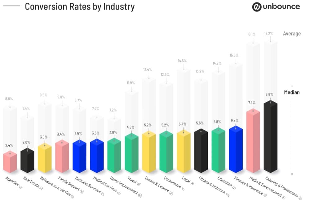
The report also looked at median rates of click-through and form-fill landing pages so you can analyze your page’s performance.

Customer Expectations
Look at what your customers are saying about your products online, on social media, in product reviews, and post-purchase feedback. Or even during the purchase process.
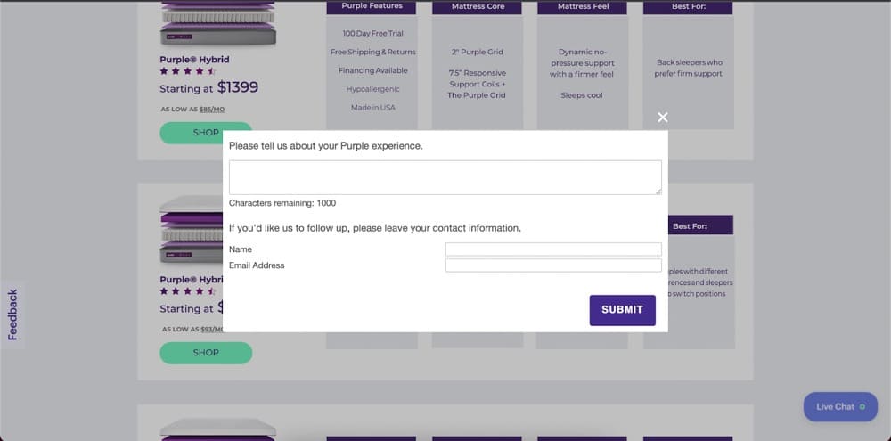
Purple, a mattress company, does just that when you land on their web page. The pop-up asks potential customers to rate their experience.

It then proceeds to ask an open-ended question: ”Please tell us about your Purple experience,” while giving visitors the option to leave their contact details if they wish to be contacted.
Is it that easy? Ask, and ye shall receive? Yes. But the real problem, according to Katelyn Bourgoin, CEO of Customer Camp, is that few brands take the time to listen.
1. Optimize Your Product Story and Product Description
Imagine you’re on the hunt for a smart baby bassinet and you land on TruBliss’s product page

In theory, they’ve done everything right—invested in fancy product photography, added product videos and kept the product information succinct.
But there’s a key piece of the puzzle missing—the buyer. Instead, TruBliss talks about how it’s “the perfect solution for all of baby’s sleeping needs” and pays no attention to the parents that are the real customers.
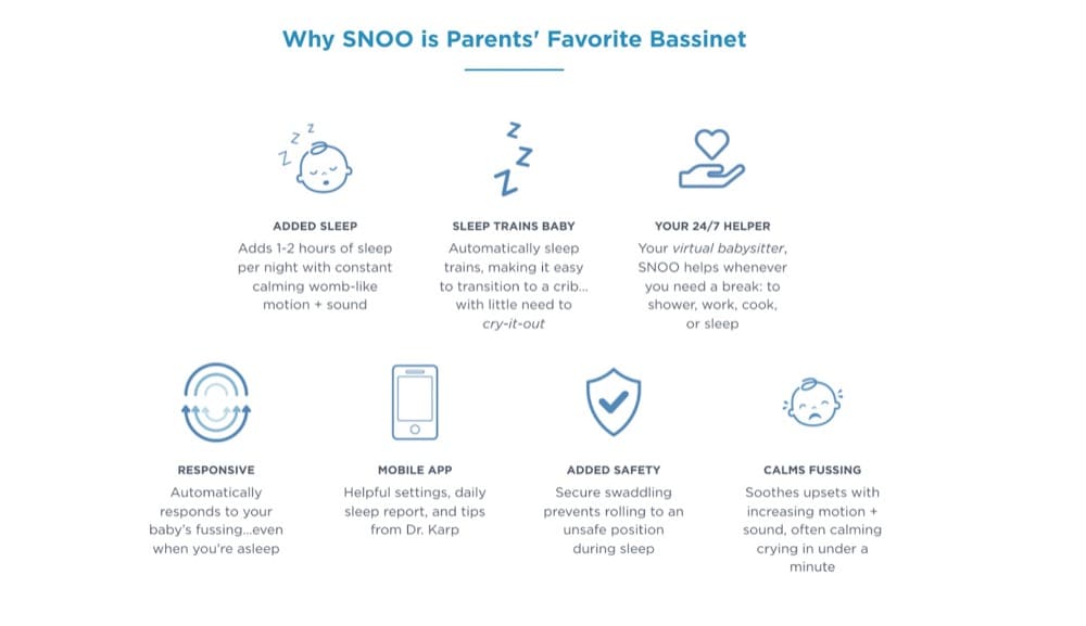
In sharp contrast, SNOO’s smart sleeper bassinet makes a great first impression because they have waded deep into the audience research to optimize its product page design. Joshua Frank, Founder of Test Triggers, analyzed the landing page and made astute observations.
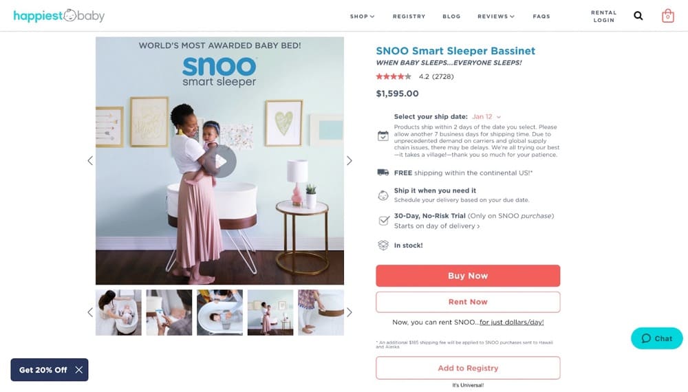
SNOO is all about selling outcomes. Their description reads, “When baby sleeps… everyone sleeps,” indicating how the bassinet can help sleep-deprived parents rest.
The product photos also feature the intended buyer instead of showing off the bassinet from 10 different angles—even the headings and micro-copy nudges you to purchase by giving you all the information upfront.
The difference in the approach becomes more apparent when you look at product details on both pages.
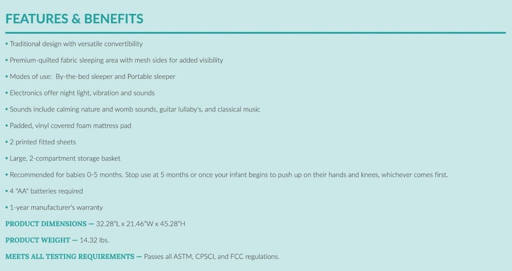
You’ll notice words like “traditional design,” “versatile convertibility,” or “premium,” which mean little to the buyer. Or SEO keywords that have been added only to appeal to search engines.
SNOO’s features section steers clear of that. Instead, by talking up the benefits for parents and avoiding jargon, they’ve made the purchasing decision easy.
2. Optimize What Your Carousel Images Say — Turn FAQs into captions
Without fail, most product page optimization tips include adding more than one product image. But how do you make it work for you?
Let’s take a look at this case study from MintMinds. A conversion optimization agency tasked with helping Lampenlicht.nl (a Dutch retailer) increase add-to-cart and revenue per visitor, MintMinds’ initial hypothesis came from diving into HotJar and Google Analytics data.
Customers were particularly interested in learning more about a product, so MintMinds ran several A/B tests where product specs were highlighted, but none of them beat the control.
Data without the right context was leading them astray. So they took to user research next and found out that customers wanted to look at a product from every conceivable angle and cared about product attributes.
The new hypothesis led them to pair product attributes with carousel images resulting in a 13% increase in the add-to-cart metric for the eCommerce store.
Control Desktop
Variant Desktop
Check 25 more tips, best practices, and test ideas you can use to optimize your images. And if you need an A/B testing tool to set up your tests, go ahead and try Convert Experiences – it’s free for 15 days.
3. Optimize Your CTAs, But Don’t Stick to 1 Call-To-Action
Good advice: Have a clear call-to-action.
Expert advice: Multiple, clear CTAs
Circling back to SNOO’s example, notice how they have 3 CTA buttons. ”Buy now,” “Rent now,” and “Add to Registry” target different audience segments through the same page.
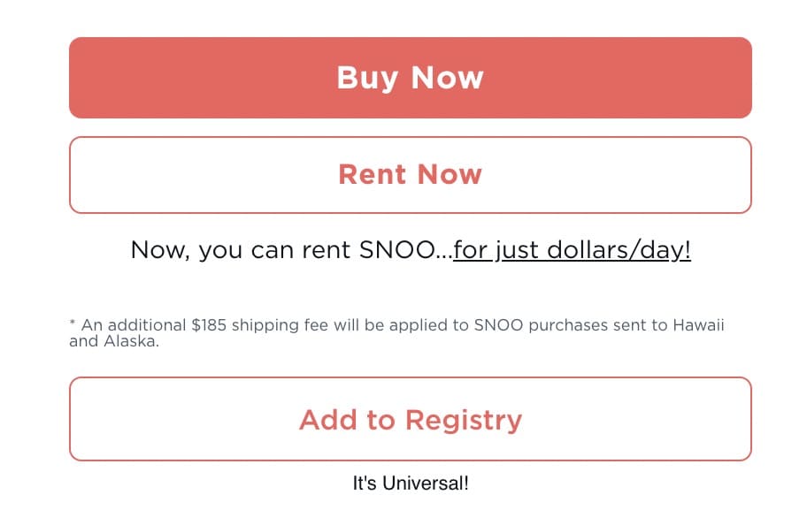
For parents that aren’t entirely convinced or don’t want to own a bassinet, SNOO offers the option to rent or lets expecting parents add the product to their registry right on their homepage to increase conversions.
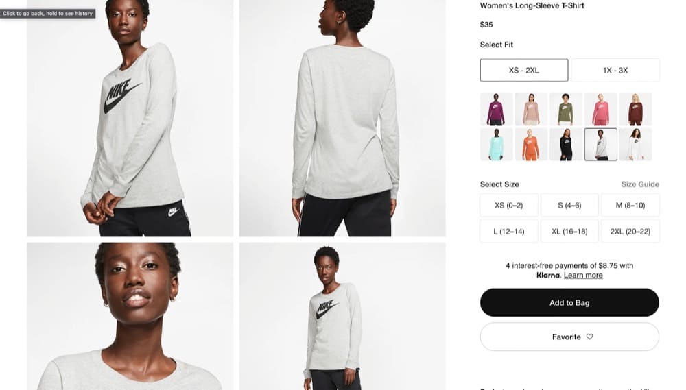
You can see something similar on Nike’s site. Shoppers can either add an item to their bag or favorite it and, in some cases, find a store near them that carries the product.
Having multiple clear CTAs is also helpful in the checkout process.
Jakub Linowski, a conversion-focused UI designer, broke down Amazon’s, Ebay’s, and Etsy’s checkout UI to identify critical elements that positively impact checkout abandonment rates.
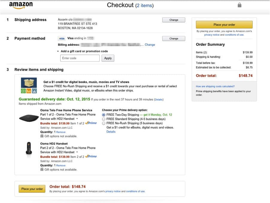
Amazon offers several different shipping options, two “Place your order” buttons, and the flexibility to change the address and payment method. You don’t have to go overboard but take inspiration from the eCommerce behemoth and try adding more than 1 CTA.
Also check out Linowski’s free Figma template to run checkout optimization tests.
4. Optimize Your Check-out Process for Mobile
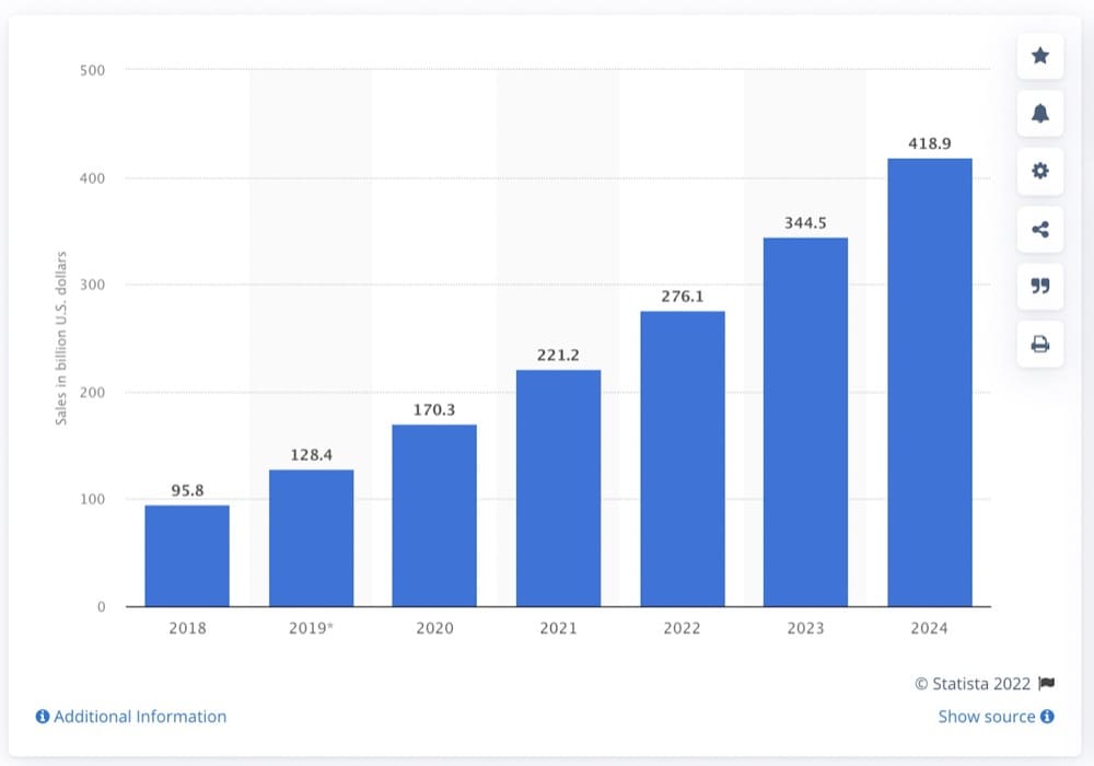
When you’re considering revamping your check-out process, don’t ignore mobile shoppers. Mobile commerce in the US is projected to surpass 423 billion USD, up from 148 billion USD in 2018.
But despite these optimistic projections, conversion rates on mobile are lower compared to desktop and tablet. That can only mean one thing—a leaky funnel that may be costing you hundreds of thousands of dollars.
Follow these nine basic steps to optimize your page for mobile:
- Optimize your site for mobile viewing
- Keep the checkout page distraction-free
- Use security seals and trust badges
- Don’t sleep on the micro-copy
- Add a guest checkout option
- Use bigger, bolder CTAs
- Show users a progress bar
- Simplify forms to avoid drop-offs
- Auto-populate customer data
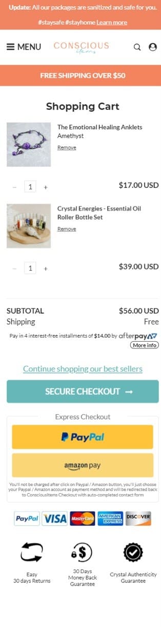
Ontrack Digital+, a CRO agency, put this into practice for their client, Conscious Items. The old checkout process had a ton of friction baked into it, so Ontrack switched from a regular cart button to using an interactive pop-up cart.
Here’s the control: A dedicated cart page that users had to return to again and again to compare deals.
And here’s the variant: The interactive slider that stayed with customers till a purchase was made.
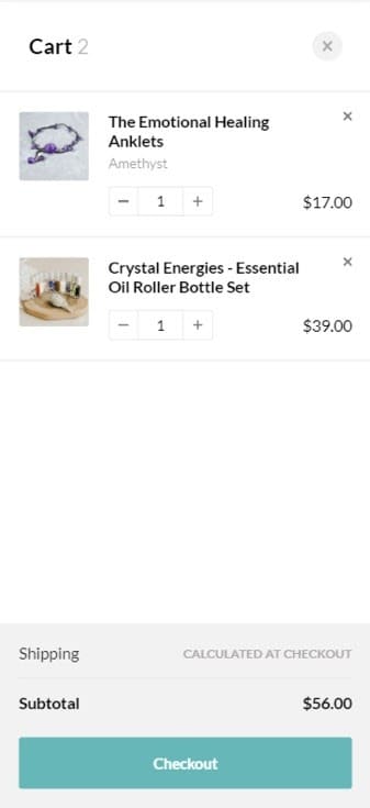
The experiment resulted in a 12% increase in the revenue per visitor metric and a 10% boost in the conversion rate.
5. Optimize for LISH (Length is Strength Heuristic)
“In copywriting, length implies strength,” shares Eddie Shleyner, founder of VeryGoodCopy and a direct-response copywriter.
Shleyner’s website has a ton of social proof—scrolling through all the 350+ testimonials can be considered a workout for your thumbs. But it’s not without good reason.
Heuristics is the process of learning through cues and shortcuts (rather than critical thinking). Our brains developed this ability because, basically, we hate thinking. Thinking deeply is hard — and sometimes it’s literally painful — so we evolved to avoid it whenever possible.
explains Shleyner
LISH is based on the assumption that longer copy, more benefits, more social proof is more likely to impress, persuade and convert.
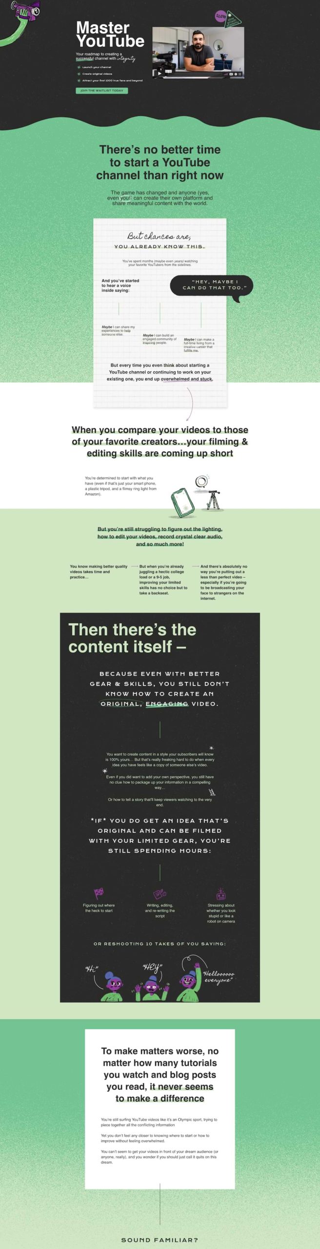
Matt D’Avella, a Netflix filmmaker, YouTuber & entrepreneur, has used LISH effectively to create a high-converting product page for his Master YouTube course. The landing page packs a ton of social proof, videos, alumni reviews, and a whole lot of copy to build trust while creating a sense of urgency.
6. Optimize for User Experience: AR but not AI
For all the advantages online shopping offers, it has one big disadvantage—buyers can’t experience the tactile nature of a product. So what you need to do is implement a try-before-you-buy marketing strategy, and depending on your brand, it can look different.
You might want to offer an extended return period like Purple, let shoppers rent the product before they’re ready to own it like SNOO, or borrow from StitchFix’s model of home try-ons where online shoppers only pay for what they decide to keep.
But if you’re looking for an immersive solution that lives on the product page, Augmented Reality is the answer.
mirrAR, an AR tech platform that helps jewelry, eyewear, and watch brands offer virtual try-ons believes that this is the answer to mitigating purchase risk for big-ticket items.
We should also address the other elephant in the room—personalization. eCommerce giants like Amazon use a machine learning algorithm to offer real-time personalized recommendations to shoppers effectively cross-selling and upselling at the same time.
But competing with the likes of Amazon is impossible and unwise.
Instead, use an A/B testing tool like Convert Experiences to make quick changes geared to a specific audience. Convert Experiences allow you to create multiple promotions for different audience segments so you can easily cater to buyer intent.
Consistently Optimized Product Pages = More Online Sales
Product pages are party central on your eCommerce site. It’s where all the visitors with transactional intent congregate.
So before you pump money into paid ads to drive cold (or warm traffic) to them, make sure to get your house in order—wade deep into audience research, make buyers central to your strategy and have the right trust builders in place.
The only way to get there? Putting the data back into data-driven marketing with consistent A/B testing.

Written By
Sneh Ratna Choudhary

Edited By
Carmen Apostu
