26 Tips To Use Images in Your A/B Tests and Increase Your Conversion Rates
Images are one of the most important aspects of selling online.
It doesn’t matter if it’s physical products, software, or even services. Having images on your site can help you connect with your audience and give context to ideas and offers.
The problem?
Far too many websites use images as an afterthought. They try to replicate their competitors’ designs with placeholder shots and stock photos, without any strategy as to why and how to best use their image.
In this guide, we’re going to walk you through 26 tips, best practices, and test ideas that you can use to improve your conversion rate—all by focusing on image optimization.
What Is Image Optimization?
If you’ve been around marketing and CRO for a while, you might think of image optimization as improving your image loading speed. The fact is, it can mean different things in different industries.
Sure, loading speed is important in CRO, but it’s not what we’re referring to today. Instead, we’re talking about tests and improvements you can implement to improve an image’s effect on the end goal for your page.
The weird thing is most CROs don’t focus on the image. In fact, image optimization seems to be more of a focus in the UX or PPC space.
UX designers use images to tie together design ideas and improve the on-page user experience.
Paid advertisers focus on the image first, as it’s the initial touchpoint that gets the audience’s attention. Improving the images CTR is the biggest lift they can optimize for before they then test other things.
We don’t seem to test images as much in CRO, yet it can directly affect our results…
What Kind of Impact Can Images Have on Optimization?
Our brains are hardwired to save energy.
When given a task, we’ll always look for the easiest way to achieve it. This is why we scan a page in 2.6 seconds, looking for key focal points to help us understand the content, and get some context before we spend too much time or effort.
We’re basically looking for signs to see if it’s worth reading or not, and that’s why images are so important. They help us scan and understand the page faster, decreasing the chance that we bounce off.
It’s not just that first touchpoint though.
Images help us learn, remember, connect ideas, answer questions, reduce complexity, visualize, and have emotional connections with the content on the page.
This can all lead to:
- Lower bounce rate,
- Further page read,
- Better user experience,
- Faster speed to association and understanding,
- Building of desire,
- And higher CTR.
Expected Vs Unexpected Results
Now, before we go through the ideas below, remember that you always need to test to see how they work for you.
A test that gives a lift for one company can cause a drop for others. The irony, of course, is that things that *should* give lift don’t always work.
Example
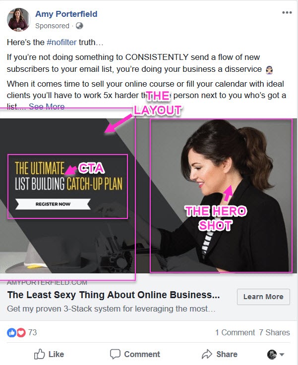
I ran a paid traffic campaign a few years back to A/B test 2 images, but by accident, I added a 3rd and went away camping for the weekend before I realized.
(Facebook allows you to upload multiple images to test at once while keeping the body copy the same.) The first 2 images hinted at the end results promised on the page, an angle that should have driven the most attention. The 3rd image was a random background that we made that just
happened to show one of our ‘About Page’ headshots.
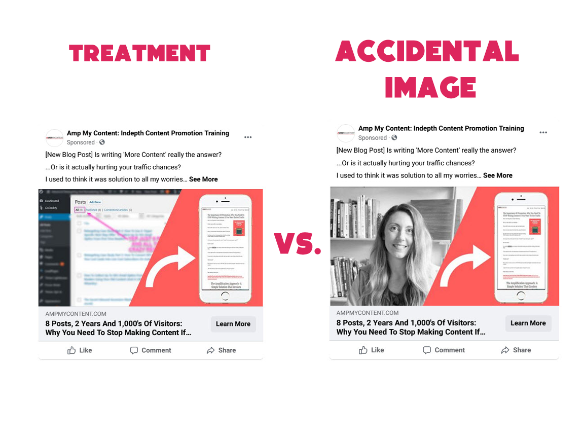
The thing is the ‘mistake’ image got almost double the CTR of the control and the hypothesized treatment.
(The fact that the image had a human face on it may have appealed more to people.)
Key Takeaway
We can’t always know what will work, so use these ideas as inspiration. Always test for yourself.
26 A/B Tests, Checks, And Tips To Improve Your Conversion Rate With Images
#1: Check How Your Audience Responds To The Image
Before you make any changes to your images, assess how your audience is responding to your page.
What are they actually doing on the page?
Heatmap the page to see where your users are focusing. If you can afford it, it might be worth running eye-tracking tests also.
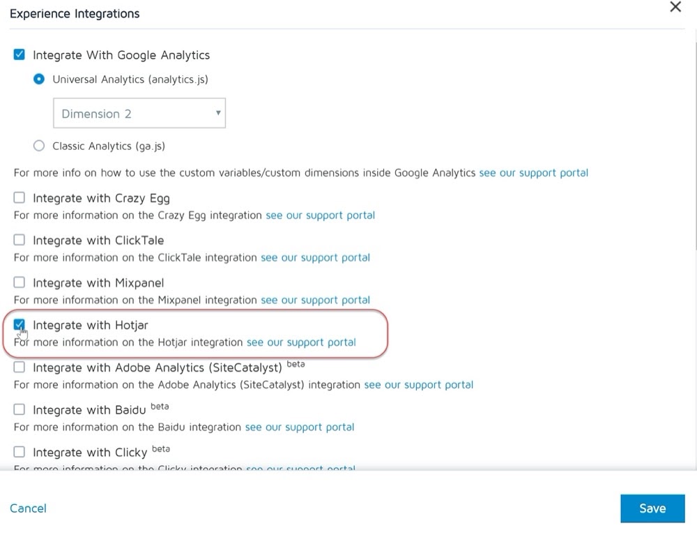
Sidenote:
We integrate with Hotjar and other heatmap tools directly in the Convert Experiences app.
OK, so now you know how your audience is interacting with your page and images, let’s walk through some improvements and ideas…
Are They Seeing Your Image But Not Paying Attention?
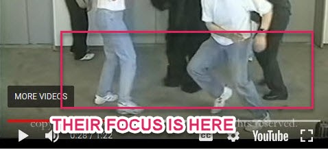
Have you ever heard of inattention or ‘change’ blindness?
It’s a phenomenon where if people are focusing on one thing, they often miss out on major changes in their own view.
The best example of this is the Gorilla test. In the video, people are asked to count how many times the players in white t-shirts are passing the basketball.
Because of this, 50% of the people who watched the video failed to see someone in a gorilla suit walk onto the middle of the field of view, beat their chest, and then walk off. All because the audience’s focus is drawn to a different location and color pattern.
They’re looking for the ball, blue jeans, and white t-shirts and ignore everything else.
Key Takeaway
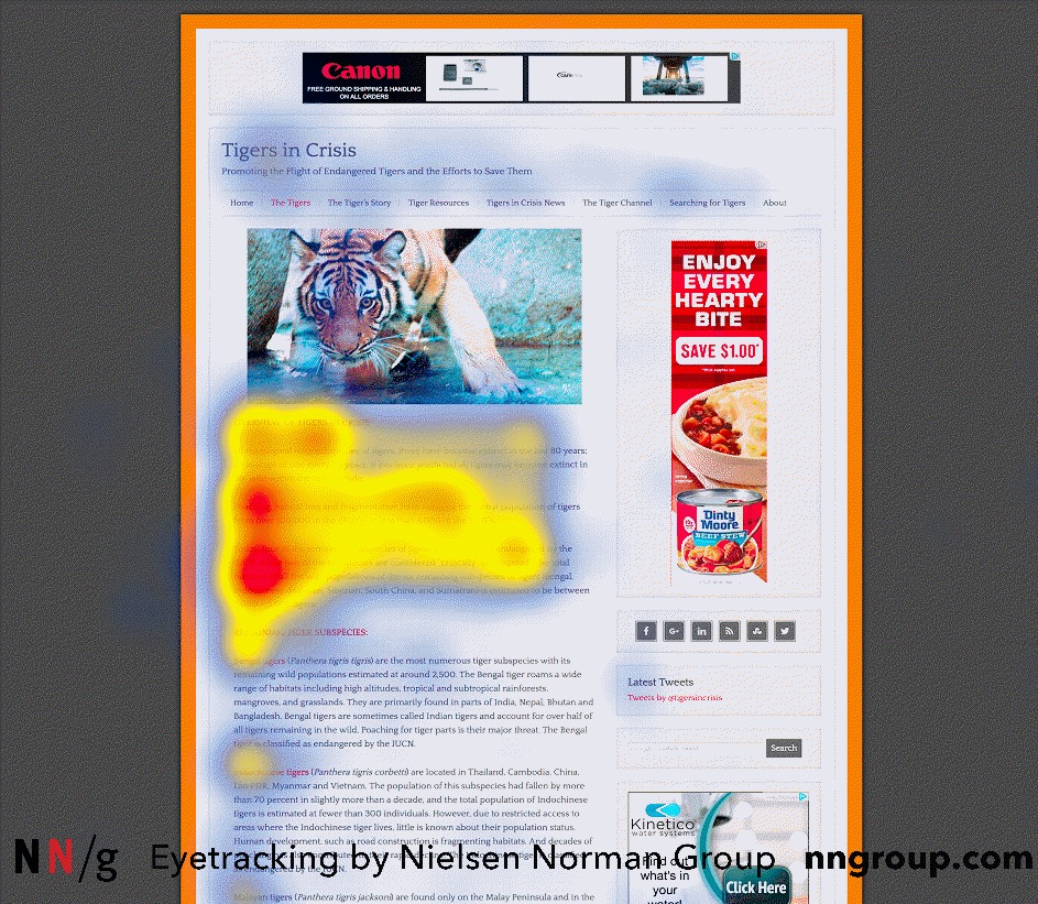
Just because you have images doesn’t mean that people are paying attention to them, so look at your heatmaps to form a hypothesis.
In this example for my blog, I can see that people are not clicking on the CTA.
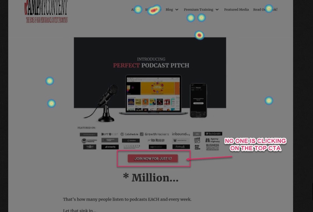
It could be that the button is just not large or clear enough to draw their attention, or perhaps, they just don’t understand that it’s a button to click on.
More on this in a second, but for now we can see that people are not paying attention to the image or the CTA.
Do They Know What They Should Be Clicking On?
If your image contains a visual CTA to click on, do they realize this and are they doing it?
There’s a concept called perceived affordances, coined in 1988 by a UX designer called Don Norman.
The idea is this. If you want people to take a specific action (such as clicking a button), they need to be able to perceive, understand and interpret what the object is and what they need to do with it.
We often look for similarities between something we have experienced before in the real world, to then teach us how to interact with something similar online.
Example
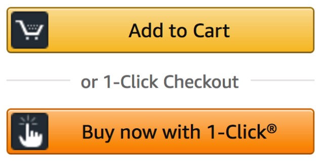
A button on a keyboard has shape, texture, and shadow. From experience, we know that we can press down or click on it.
Because people are used to seeing these ‘affordances’, designers applied them to their CTA buttons online. The problem is that a few years back people went overboard on this and you would have buttons with large shadows or exaggerated features just popping out of the screen.

This styling was used by a lot of less trustworthy sites, so there’s been a move away from this. The thing is we seem to have dialed it back too far and a lot of people are now using buttons that seem flat.

In the example above, there’s no shadow or depth to help us understand that we can click on it, which may well be affecting the CTR. Compare that to Amazon that has a slight shade below, and even a light source on the top of the button to help make it stand out.
Key Takeaway
If you use a CTA on or near your image, then it could be that your CTA design needs to be more intuitive so your user understands how to use it.
#2: Make Sure The Image (And Page) Are Speed Optimized
So now that you know how your page performs, let’s walk through some basic checks before you make sweeping changes.
Are Your Images And Page Loading Fast Enough To Keep Your Audience’s Attention, Or Are They So Slow That It’s Causing The Audience To Bounce Off Your Page?
Image and page speed optimization is not the main goal when we talk about optimizing your images for lift, but it is one of the first things you should look into before changing anything else.
Why?
Because images can be quite resource-heavy. The more you have and the higher the quality, the longer it takes for your page to load. It may not seem like much, but if your page takes longer than 3 seconds to load, then you’ll start to lose a segment of your audience before they even see the page.
In fact, the time it takes for your page to load has a direct correlation with bounce rate and will even affect your rankings in search engines, so speeding upload time is highly recommended.
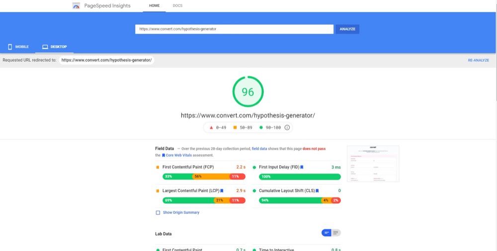
(We actually had this happen to one of our pages recently. An update elsewhere had affected the page load of our hypothesis generator tool, causing it to load only a few seconds slower, but it increased the page’s bounce rate by 5%).
If you’ve never done any work to improve your site loading speed, then speed it up now. It makes zero sense to test new images if the page is not even loading up.
What if your page is usually fast loading?
Run a quick check to see if that’s still the case. Things can happen to affect your speed that you might not be aware of. You can do this by running the page through Google’s site speed tool and then fix any issues.
#3: Find Out If The Image Is Compromised
If the page is loading fast, the next check is to see if the image is functioning properly…
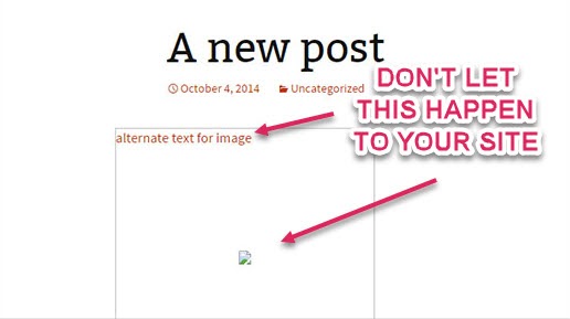
Is The Page Loading Fast, But The Image Is Now Pixelated?
It could be that some plugins have updated and changed core settings that can affect your image.
Example
I recently saw a drop in conversions on my own site and wasn’t sure why. It turned out that a new website speed plugin had decided to speed up my images by lowering their quality. This meant we now had a pixelated CTA image, which fewer people clicked on.
I fixed the image quality and the conversion rate went back up to the baseline almost immediately.
(Be sure to clear your cache as you might be seeing a saved version.)
Remember:
Just because the page and images are loading fine on your PC doesn’t mean your audience has the same experience.
Is The Image Loading Up Or Is It Showing A Broken Link?
Check for broken images from corrupt files, CDN delivery issues, or plugins causing stuff to be weird.
These are incredibly basic things to check, but because we assume they are all always working, we often forget how important they are.
#4: Make Sure The Image Is Actually Showing
Test that your audience can actually see your image AND your copy on desktop and on different devices.
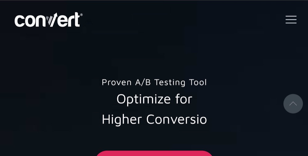
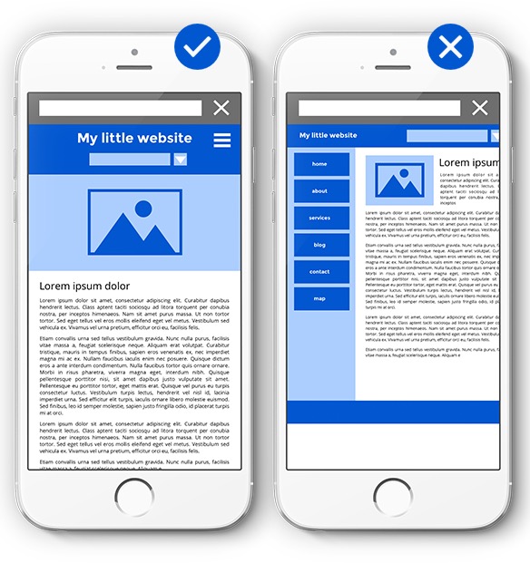
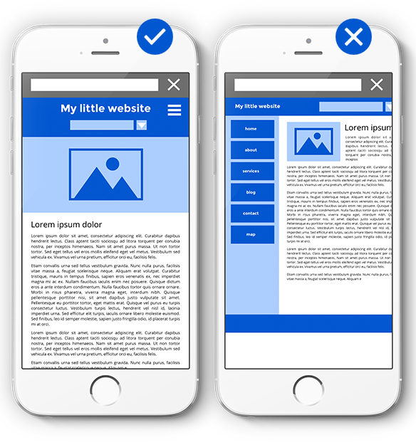
Is Your Copy And Image Being Forced Below The Fold?
Your goal with a hero image is to give your value proposition combined with a compelling image right there on the screen when the page loads.
The thing is not every site designer remembers to keep everything ‘above the fold’. Maybe they design the page based on their own monitor preferences and not their standard users, or perhaps they just forgot to create responsive versions.
This can cause the layout to be skewed, hiding important elements and making the user either bounce off or scroll down to learn more.
Example
If we had done this, then our home page might have looked like this.
So do a quick check:
If your image takes up the entire screen before scrolling, but your copy does most of the work and it’s not appearing above the fold, then reduce the size of the image, consider bringing it alongside the text or make the design responsive for different screen sizes.
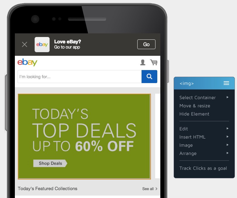
Image Size Is Inconsistent Across Different Devices
Not every image is a hero shot that takes up the whole page. Sometimes we’ll be using product shots or other images inside of our content.
If the image does the heavy lifting but is too small to see (even on a desktop), or it’s not optimized for mobile devices, then adjust the image to fit.
Product images increase sales but only if the audience can see them.
Are They Scrolling Far Enough To Even See The Image?
Another simple fix. If the image is being shown on the page, but it’s lower down than most people are scrolling to, just bring it up higher.
Seems simple, but this can help keep scanners on the page before they leave.
Example
When checking out the heatmap for one of my own products, I already know that the CTA button isn’t being clicked on.
When I check the scroll depth, I see that only 62% of my audience is even getting as far as the CTA, which is weird as I designed it to be shown above the fold…
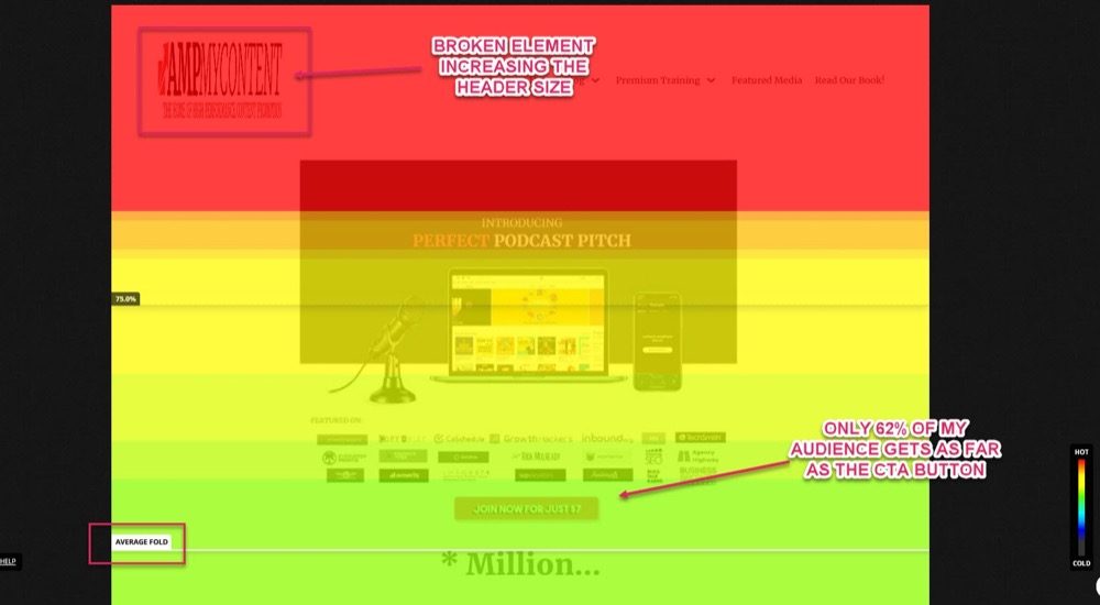
Aha!
When I load up the page via a non-cached device, I can see that I have a broken header image that’s causing the header size to increase. This is pushing my CTA button below the fold, causing 38% of my audience to miss it!
Fixing this would bring my CTA back up the screen so that 100% of my audience would actually see it. I could also look at tweaking the design by bringing the CTA button alongside the HERO shot, so that it draws more attention, like so:
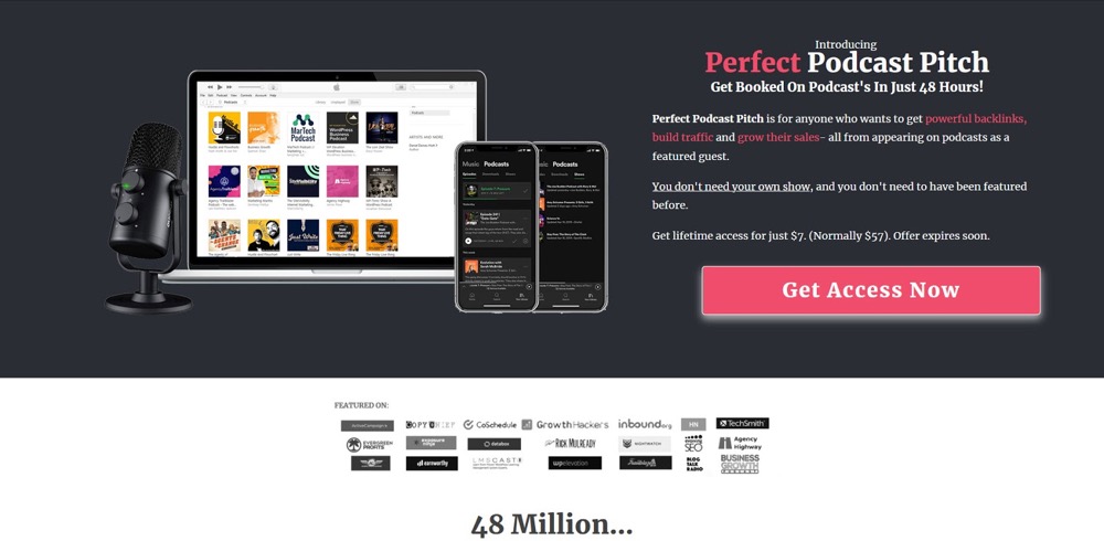
It still needs to be tested but notice how it draws focus to the CTA by bringing it up the page?
I’m almost certain when I test this that I will see a lift.
Beware of ‘Blinkers’
Be aware of how people are accustomed to seeing content on a screen and place your image either central or off-center, but never at the far edges.
People get used to having a header at the top and filler in the sidebars, so they focus their vision off-center, working their way left to right, top to bottom, but they usually blinker out the content that’s on the far edges.
This is called an ‘F’ pattern.
If the images don’t get the attention you want, try moving them away from the edges of the screen.
#5: People Assume Connections Between Things That Are Close Together
Here’s another location tip:
People associate the distance between objects on a page as being either not connected, connected, or relevant to each other.
If elements are far apart then we assume they are separate things, but if they’re close together then we assume they are connected.
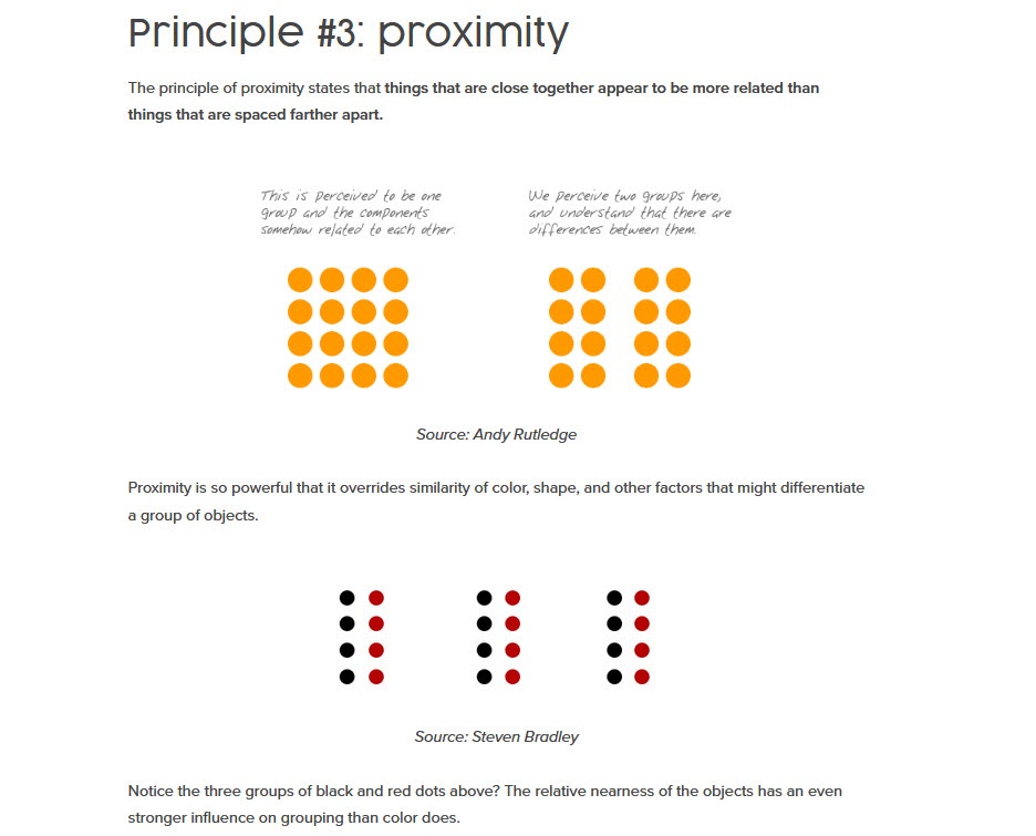
This means that if you have an image with text close to the side of it, your audience will assume it’s in reference to the image they are seeing.
This is great if you want to bring their attention to your relevant copy, but not if you have another story or offer off to the side, as they are now seeing one thing but reading about another, causing confusion.
If you find that people are not responding then you can try removing any distractions from the side OR bringing the image and its relevant text closer together, so that they associate them easier.
#6: Be Aware Of Cultural Differences When Designing Images
People scan content based on past experiences and we need to be aware of this with our image layout.
In the West, we scan left to right, meaning our image is almost always in the center or top left with text on the right. Some countries read right to left, meaning you need to flip your layout and images.
Keep this in mind for the location of your image, text, and CTA on your page.
Also, it’s interesting to learn that people in the East and West view images differently…
Take a look at these photos.

What do you see?
Depending on where you’re from, your focus and how you view an image can change.
In the West, we tend to focus our attention on the object in the foreground, while people in the East focus on the background and its context to the object in the foreground as a whole.
This means that your image background can have a large difference in performance, based on where it’s being shown or who it’s being shown to, so take this into account when you are designing or tweaking your creative.
#7: Check That The Image Aligns With The Audience, And What You Want Them To Feel
Images are great at communicating ideas or emotions with your audience. Make sure you’re helping them connect the right emotions and ideas to your offer so that you can get them to take the right action.
Ask yourself this:
- What do YOU want to communicate with your image?
- How does your image work with your page? Is it to get them to click and learn more? Is it a product shot to help make a decision?
- How do you want this image to affect your user? To associate with an emotion or use case?
- What do you want them to do on the page?
Clarity on these answers will help you see if your audience feels the same way.
Why does this matter?
As the creators of a page and product, we can be guilty of forgetting that our audience might have a knowledge gap that we don’t. What’s obvious for us is not always clear to the end-user.
Also, our intent or emotion that we want to convey can sometimes get lost in translation. This is why it’s so important to run focus group tests where possible to get live feedback from your users on how your images affect them.
Get clarity on the following questions:
- Can users clearly see the content in the image?
Not just image quality, but do they understand what the image is about, and can they see everything in the image?
If not, then this can be a sign your image needs improving or you need to show more detail.
- Does the image look credible or manipulated?
Trust is a major factor in buying online. If the image looks heavily photoshopped, people may doubt its claims.
Can they trust what they are seeing or does it seem fake?
Sometimes you can have a product that is so good that it seems too good to be true, and you need to prove it works. Back it up with other trust signals such as testimonials, badges, guarantees, and more.
- What message does the image communicate with the audience?
What does your audience think when they see your image? Is it aligned with what you want them to think, or does it make them think of something else?
- Does the image result in the desired emotional response?
If it’s not making them feel the right thing, then fewer people will take the action you want, and even worse, some might even be repelled. (More on this in a second)
- What ‘user needs’ does the audience need to see in the image? What action do they want to take after seeing the image?
What will the audience use the product/offer for? Can they see how to use it in the images? Can they see what they need in your image to help them make a decision? Do they want to buy, or are they confused and want to leave?
Your image can either support your offer or turn people away from it.
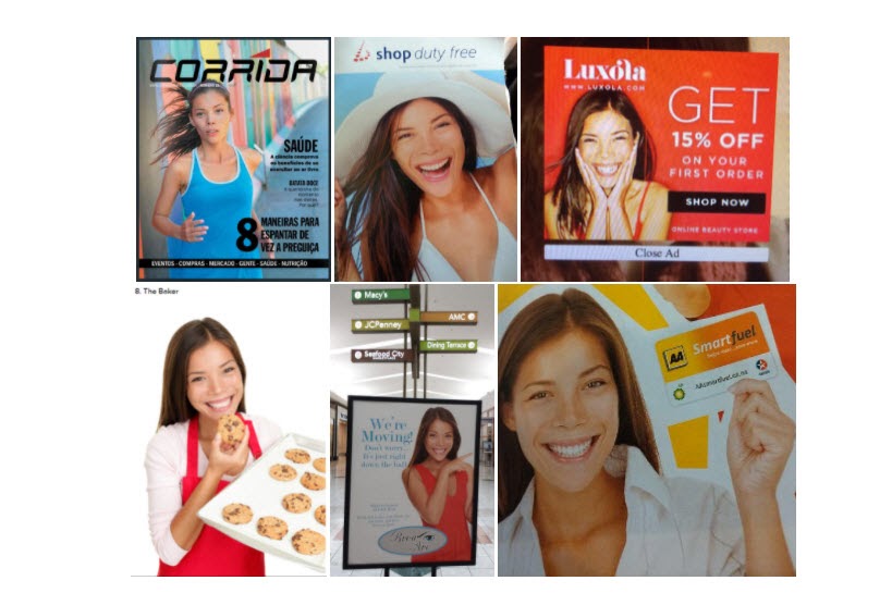
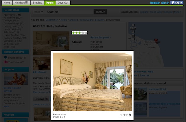
Example
In this article on UX design, the author was looking to book a hotel on a website designed to help young families book trips.
The problem with this particular hotel is that the images on display were not aligned with the user’s end goal of booking a family-friendly room that’s suitable for very young children. “It looked more like fine dining vs family-friendly.”
So, in this example, the images actually turned the user away.
He wanted to see how good the hotel and room would be for his kids, whereas the hotel wanted to show off its decor. It showed images that would have probably worked well if someone was looking for a luxury stay, but that’s not what the site was advertising or what the user was looking for.
(In all honesty, the hotel probably just added their usual pics to a different site with the hopes it would drive sales, never thinking of their different use case.)
This is why it’s so important to make sure that your image is aligned to your offer and what you want your audience to feel, think, and visualize so that they take your desired action.
The best image is not the one that YOU WANT to put there, but the one that will have the biggest impact on the mind and feelings of your viewer. It’s not about what you want to say – it’s what THEY actually see or get from the image
Craig Sullivan, Optimal Visit
#8: Be Authentic
All of the images on your site should either give further context or help convey emotion to your reader to cause a response.
Now, as you might guess, your images will struggle to do this if they seem inauthentic or fake, and it’s why I don’t recommend using stock images.
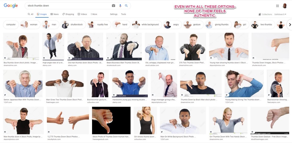
It doesn’t matter if your own images are lower quality or only ‘ok’ lighting, they will almost always outperform stock photos because stock images can feel fake, or simply don’t represent reality.
People use images to help them make a decision. If the image is of something unrelated or a different product, it can feel untrustworthy.
In fact, if you run a customer focus session, you’ll notice that stock photos may frustrate the user because it feels like the images don’t give an accurate representation of your brand or offer.
Even worse?
If you do find a stock image that works, then you run the risk of using images that multiple sites use.
This one stock photo model has been used so many times now, that there are entire Reddit threads dedicated to people sharing what new advert they find her in.
Sometimes you will even see direct competitors using the exact same model by accident…
Key Takeaway
Always invest in your own imagery where possible. You will almost always see more lift, even if it’s not professionally taken.
Sidenote:
If you outsource to a professional, be sure to ‘design for your medium’ and have your users’ needs in mind when planning the brief.
What do I mean?
Well, most traditional photography campaigns are shot for billboards and ads and the shots are usually quite different from what you might want for your website.
#9: Improve + Reshoot The Images You Have
Sometimes you can have the right idea and align with the audience, but the images you have need just a little extra oomph and a reshoot could make all the difference.
Not necessarily in terms of improving the image quality (although it never hurts), but rather improving the image messaging and capturing what the audience needs.
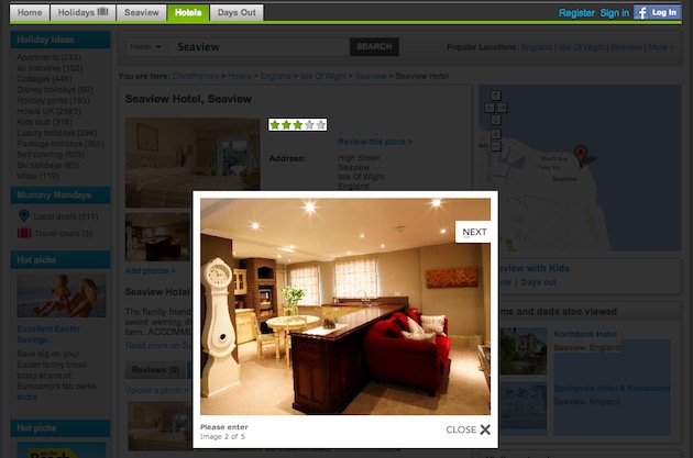
Example
Another complaint of the hotel shots in that UX article was that they didn’t give a clear enough picture.
The image size is bad enough, but it also failed to show enough information for the users’ needs. Could they fit a cot next to the bed or was the space too narrow?
This could have been resolved by retaking the shot to include more of the room, perhaps adding a second image from another angle in the room, or even showing a cot next to the bed.
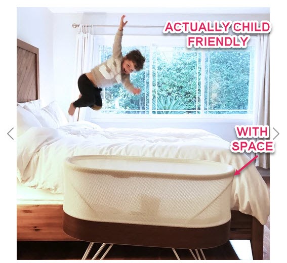
(I mean, it is a booking site for hotel rooms for people with small children. You would think they would include this, right?)
Key Takeaway
If your image idea is aligned with the audience but not getting enough lift, rethink what your audience needs to see in your images to make a decision, then retake your shots with that in mind.
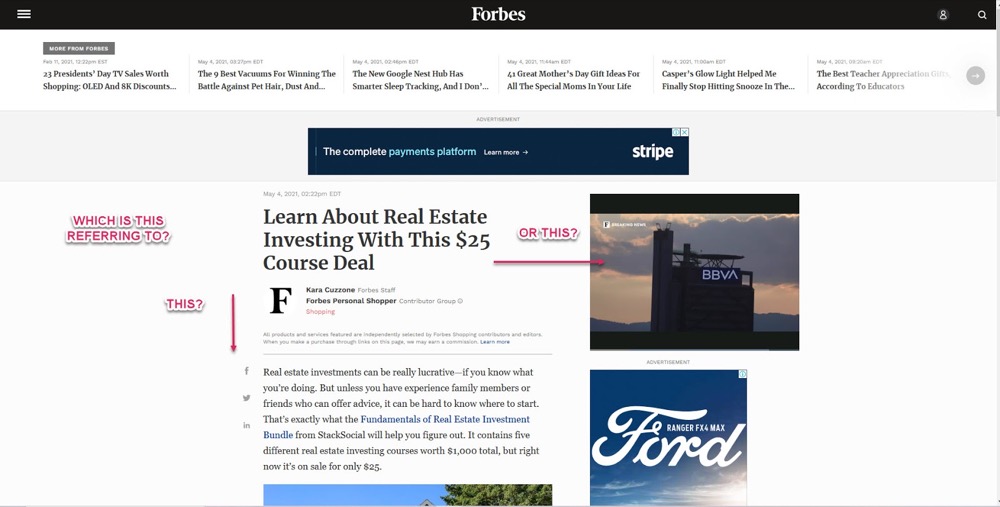
#10: Match Your Image To Your Message, To The Audience’s Intent, And To Their Journey
Is your audience bouncing when visiting your page, even though it loads fast?
It might be that you have a message-to-page mismatch, in that what drove them to your site does not align with what they find when they get there.
Example
Let’s say that a user clicked on an advert or searched in Google and landed on your page, but something feels off…
In this example, you can see a Facebook page for a company that sells ski and snowboard equipment.
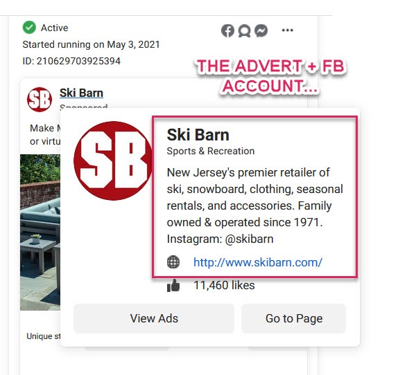
But when you click through to their site, you see that they actually sell outdoor garden furniture:
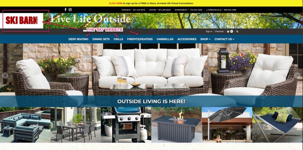
In this instance, the website has possibly been hacked, or the domain was purchased and then redesigned for a different company.
The thing is this can still happen even with a normal ad campaign or even a Google search. People click on one thing but where they land doesn’t match what they clicked.
(I can’t tell you the number of times I’ve seen a fancy ski jacket advertised in an advert, to only click through and the landing page to be for a different product instead.)
We call this ‘incongruence’.
So have a quick think about your own image use:
- What does your audience expect to see when they click through to your page?
- Does your image align with this?
- Does your page image match your featured image or ads that they might click through from?
It may not be as obvious as serving the totally wrong item, but your image may not be what they are expecting to see and could be causing them to leave.
#11: Zoom Zoom!
When shopping online, we lose out on all of our other senses. We can’t taste, we can’t smell and we can’t feel.
All we can do is look at the image to get a better idea of the product. The picture quality is incredibly important, especially when selling something where people would care about fine details (anything technical, safety-focused, or very high ticket).
Because of this, you need to shoot your images in such high definition that they can be actively zoomed in on and still maintain their quality.
Make sure your audience can see all they need to.
This way the audience can look at each point in fine detail, helping you to highlight key user needs or address any concerns they might have with the product.
“Will this fit? Will this be strong or safe enough”, etc.
Example
Happiest Baby is a company that clearly understands its users’ needs and shows that in its images.
Not only do they cover multiple shots and user cases, but every image can be zoomed in for further detail.
Yes, it’s a high ticket product but it’s more than that. Their customers want to make sure that this product is safe for their newborn child and to examine it in fine detail.
Let your audience see those details.
Every image they have gives peace of mind.
#12: Test Action Shots/In Use Shots
Being able to zoom in is great, but visualization is an even more powerful technique.
Why?
By having shots of the product in use, you can help your audience to not only visualize themselves using the product, but it actively transfers emotions from the shot to the user.
Let me explain.
The human brain is a fascinating thing with many interesting elements.
I want to talk about 3 of these:
- the Premotor cortex,
- the Primary Motor cortex
- and Mirror Neurons.
The Premotor cortex is the area of the brain that helps you plan out movement, while the Primary motor cortex is what makes that movement happen.
Let’s say that you’re about to throw a ball, but at the same time, your brain has electrodes attached to it so we can record which neurons are firing.
When you start to think about throwing the ball, the Premotor cortex lights up. It’s contemplating the action and working out what to do. Then when you throw the ball, the Primary motor cortex controls the muscles and now lights up in our readings.
If we were to watch someone else throw the ball, our own Premotor cortex would light up just as if we were planning to throw it ourselves.
The act of observing the event causes the same neurons to fire— we call these mirror neurons.
Why does this matter for image optimization?
Well, when your audience sees a photo or video of a snowboarder doing a long carved turn, they can feel similar emotions as if they were doing it themselves.

We mirror the emotion we see in others, which is great if what we’re showing in our image aligns with the emotion they want to experience.
#13: Represent Your End User
Having humans in the shot also helps your audience to connect and empathize, but be sure to test multiple models.
Why?
Well, not everyone will resonate with the person in your shot, especially if they don’t accurately represent the end user. The audience can pick up misconceptions of who the product is for, so test out various models.
In “Usability of Web Photos”, James Chudley talks about a campaign he ran for a sales page with 3 price points, each including a photo of a different model to represent different types of customers.
The test results were confusing because people were buying the cheapest and the most expensive options, but not the ‘best price’ option (which usually converts highest.)
They ran some feedback tests and it turns out that the male model used for the best price option looked a lot like Noel Gallagher. They found that the customers were put off by this representation as it didn’t align with the actual users of the product, so it wasn’t converting.
#14: Test People + Product Vs. Product Alone
If you can only ever use one image, then you need to test variations.
Sometimes, you get more lift with the product alone. Sometimes, you need clearer product shots. Other times, a page can convert better with the product in use. Sometimes, it’s other models using the product.
Be sure to test each version to see which works best with your audience.
#15: Test Gaze Direction
When using images featuring human models, test the direction they are looking.
Studies by the Journal of Consumer Research found that images with people looking in a direction helped bring the audience into the scene and visualize themselves in the moment.
These worked well for products where the audience could identify with the image and what was happening in it and also helped to direct the audience’s eyes to a CTA.

They work great for lifestyle brands.
Whereas images with people looking directly out at the audience and making eye contact and smiling helped to build trust, show competence, openness and worked great for service-based businesses.
#16: Test Your Own Images Vs. Supplied Shots
Here’s something that I don’t see that often, but the stores that are using it seem to be market leaders.
Let me explain.
Imagine you sell a product that 10,000 other retailers all sell. How do you differentiate?
Most people adjust the price and race to the margins, but smart retailers appeal to their ideal audience instead.
Rather than using the product shots that are supplied and used by all their competitors, they reshoot the products using their own models that represent their own particular audiences, helping the images to connect more effectively.
Example
North Face has seen a surge of younger customers recently.
North Face’s own imagery is aimed at hikers, climbers, and backpackers, and so their core brand imagery doesn’t really align with the 18-25 market.
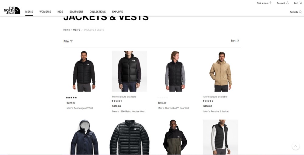
This is why Asos reshoots the products they sell using a select group of models that represents their end-user, instead of using the shots provided.
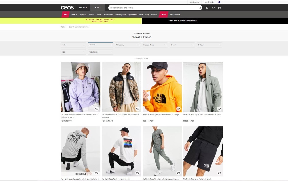
By doing this they can connect the product to their specific users far more effectively.
If you’re selling 3rd party products and competing with other sites, consider this for your own images.
#17: Test A Single Image Vs. Sequence Of Images
Sequences of images are good when you want to go into more detail, and take your audience on a “journey” of discovery.
This works especially well if the images follow the user’s thought process.
It can vary depending on your offer and industry, but it usually is something like:
- Hero shot,
- Product in use,
- Product shot,
- Fine detail shots, etc.
Example
We talked about Happiest Baby earlier and how well they know their audience.
They have:
- A video (with the thumbnail of a hero shot with the product in use),
- A shot of 2 key features,
- A whole heap of action shots matching different segments of their audience and different models,
- Each image can be zoomed in to check on technical aspects.
Design your sequences to match the users’ decision-making process.
Sequences work, but it’s important to understand how your audience completes a purchase like this, so you can model it with images.
Whatever you do, don’t make the images rotate on their own, instead let the user click through. Multiple studies and tests have shown that a rotating carousel of images is almost always far lower conversion than just a single image on its own.
So if you use a sequence, show the one image and make it obvious that they can click through for more information or details.
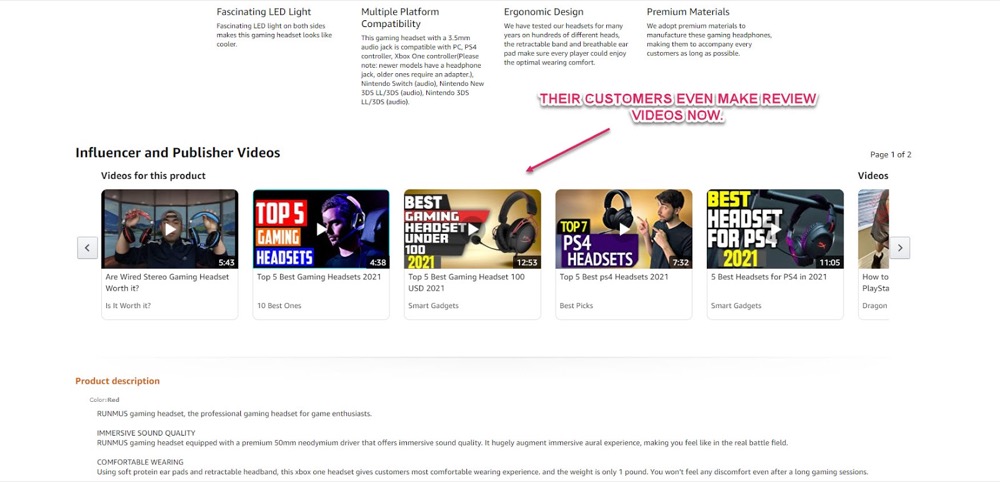
#18: Test Company Generated Content Vs. User-Generated Content
User-Generated Content (UGC) is almost like a cheat code for conversions.
Not only does it work as a testimonial, a referral, and social proof all in one, but it’s also free content. You simply allow your users to take product shots after purchase and then send them to you. (With bonus points if you set up a system to automate the whole process with follow-up emails). Amazon has been allowing this for years and are still using it and innovating on it today, so you can guess how well it works for them.
Want another example?
Boom! By Cindy Joseph is a women’s skincare brand run by a direct response marketer.
Their current revenue is in excess of $62 million and they scaled to that point by focusing on paid advertising and referrals.
They used to run all kinds of ads but nowadays it’s almost exclusively UGC video testimonials.
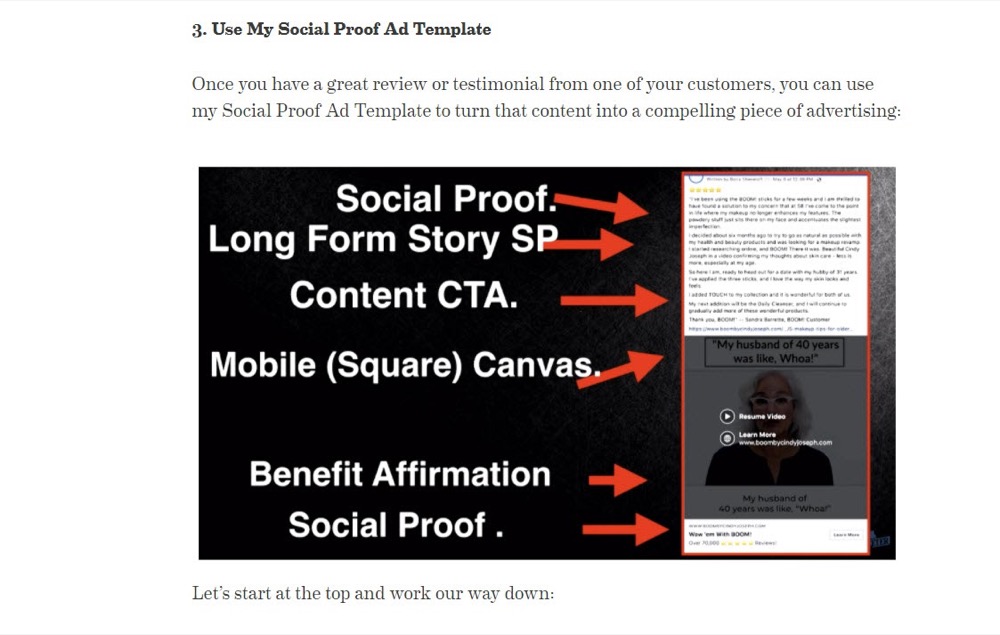
Not only does UGC build trust, but it’s also great for converting people who might be on the fence.
Affiliate marketers do this VERY well, often creating entire reviews and content guides for products from the ideal audience’s user case and point of view.
Key Takeaway
Test UGC content, either as the main touchpoint, or as a supplementary image or video, or even on 3rd party sites to drive content to you.
#19: Test Static Images Vs. Videos
Videos can often add more lift than single images and do very well as supporting content in product sequences.
(Zappos saw a 30% lift in sales on product pages where the audience watched a supporting video as well as viewed images.)
Videos do take more effort to create but they can be incredibly powerful, especially if you keep the following in mind:
- Be aware of the video quality.
Not every customer has the same quality system as you. Test your video on multiple devices, focusing on older machines and with the lowest common connections (iPhone 5 + 3G).
- Don’t autoplay the video on page load.
This is not only frustrating, but it can also increase page load time and even bounce rate.
- Be mindful of where you host the video.
Uploading it to Youtube and embedding it on your page is an easy option, but remember that the end of each Youtube video is a CTA for other content. (Some even auto-play now.) The last thing you want is a video to get people excited for your product or service, and then lose their attention to a different competitor or cat video.
You can get around this by self-hosting your videos on platforms like Vimeo and then embedding that on your site. (Vimeo will even allow you to add clickable CTAs at the end of videos for your own product offers.)
#20: Test 360 Images
If you’re selling a physical product, consider creating 360-degree images.
Although they require a specialized program to create, they can help increase lift in conversions by helping the audience fully inspect the product.
In fact, industrial tool company Grainger.com found that 360-degree images of their power tools helped them to see a boost in conversion rate by 47% vs. just standard images.
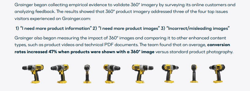
This helps to get past those missing angles issues we covered earlier, while also showing an accurate representation of the product.
It’s not just physical products though, hotels and homes can create 360 walkthrough shots.
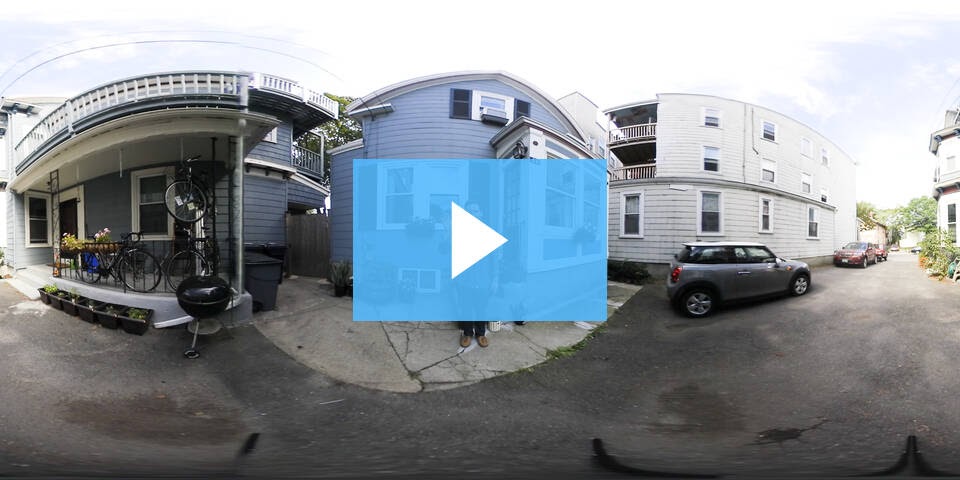
Here is a 360 Real Estate Video Example by the folks over at Wistia.
#21: Test CTAs + Information On Top Of Images + Thumbnails
This can work really well for product pages or wider product libraries where a particular item might be going out of stock, and you want to drive attention to it.
You can add a simple CTA on the thumbnail to let the audience know it’s running low or if an item is trending, causing them to want to check it.
You can even set up plugins to do this for you.
#22: Test CTA Visibility
If you are adding CTAs on top of your images, be aware that certain fonts or particular colors on specific backgrounds are harder to read, and can lower conversion rates.
For example:
- Small text
- Handwritten fonts
- White fonts on bright backgrounds
- Red text on blue backgrounds
- Blue text on red backgrounds
- Greens on yellows, and yellow on green
- Red and green, or green on red.
Sometimes it’s just that the CTA is hard to read against the backdrop, but other times it’s because of something called Chromostereopsis. It occurs when certain colors stimulate different receptors in the eye. When you combine specific ones, it makes the image hard to focus on.
It’s not just colors though. Take into account how your CTA might look on multiple devices. The screen size difference can drastically alter how easy it is to view your CTA.
Luxyhair ran a campaign where they tested their home page hero shot with a before and after image vs. the control shot of just one person.
Interestingly enough, the before and after shot converted best on desktop, but lower on mobile.
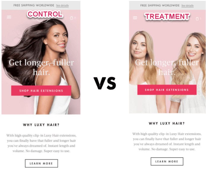
The assumption is that the before-and-after shot was harder to see on a mobile device. Personally, I think it could be a few things.
In the new variation, they tested a new model (which we know can affect results), but not only that, the text is much harder to read, as it’s overlaid on a pink backdrop.
In this example, it might have been worth testing the font color, adding a darker backdrop, and even testing a rotating image of the model before and after. That way you could read the CTA and see the difference from one version to the next.
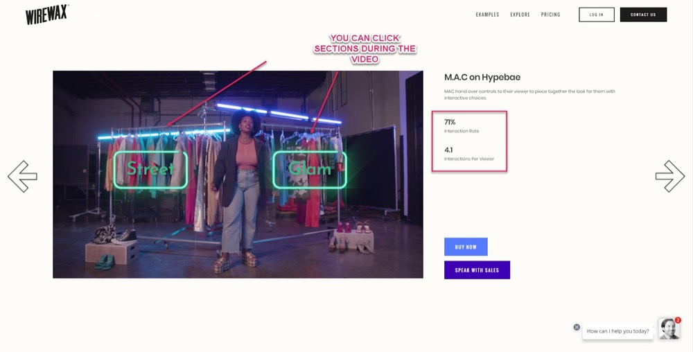
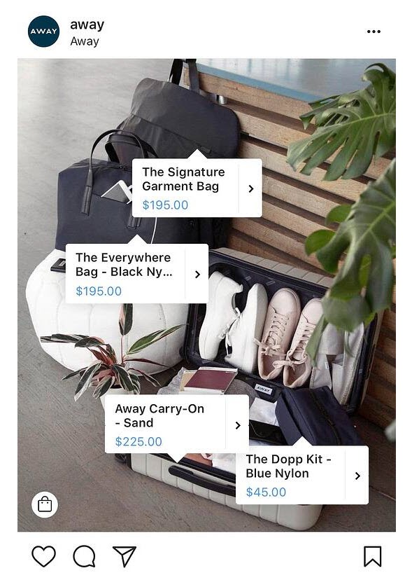
#23: Test Clickable CTA Overlays In Shoppable Videos + Images
A shoppable video or image is a piece of media with direct interactive components.
The audience can see elements in the shot or clip, click on them, and be transported directly to particular products or catalogs.
Here’s a shoppable video by Wirewax.com for one of their clients.
And here’s a plugin by Taggbox that allows you to upload images and then create clickable elements for your users to shop from.
Even social media platforms see the power in shoppable media and are allowing specific shoppable ads directly on their platforms.
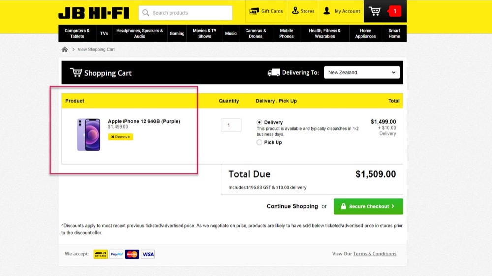
#24: Test Product Shots To Increase Cart Conversion Rate
We focus so much on the image for getting the click and the sale, we forget that we can also use it to help stop abandoned carts. According to Wordstream, approximately 81% of users abandon carts and don’t complete the sale.
Adding the image to the checkout page can help the audience clarify exactly what they are buying and increase cart conversion rate.
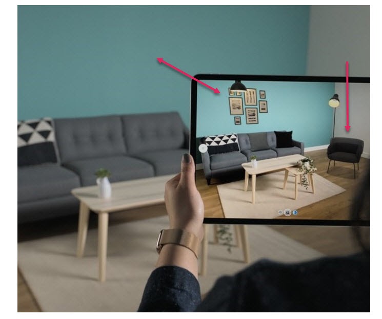
#25: Test Augmented Reality Images
We already know that a great way to get your audience past any ‘what if’ issues is to supply more imagery. More angles, better detail, etc.
Some retailers are taking this a step further and creating Augmented Reality shopping experiences.
Example
Ikea created ‘Ikea Place’, an app that allows users to take screenshots of their rooms, pick items and overlay them directly in the image.
Not only does this help people visualize their room, but it also measures the space to see if a product will fit, and then applies the room size to the product image that it imports, scaling the product image based on your room specs!
Coastal is another brand that uses an AR image tool that allows its users to digitally ‘try on’ glasses.
Users turn on their webcam and overlay the different frames on their faces to see how the products would look.
#26: Test Segmented Images
Let’s say that you have a product with a broad user base, but you know that specific segments of your audience will buy it for their own reasons.
Example
You’re a garden homeware store and want to sell more BBQs.
Maybe a section of your audience wants to purchase your BBQs to have cookouts and watch sports, but another segment might want to purchase it to create a garden feature instead.
By segmenting your images to match your audience, you’ll see a much higher lift, as the image reflects the user’s end goal.
(Similar to what Asos did with their models, but now we’re actively altering the image based on the user data for an even higher lift from all segments.)
The segmentation of the message is incredibly powerful. In fact one of our Convert users applied a test to a segment of his audience, causing a 50% lift in conversions.
Conclusion
So there you have it. Our 26 tips for image optimization to increase your conversion rates.
Almost every test that we’ve listed here, from segmentation of audience to layout tweaks and more, can be applied in the Convert Experiences app.
If you want to start testing your own images, then click the button below and take a free trial today.


Written By
Daniel Daines Hutt

Edited By
Carmen Apostu
