The Anatomy of a Shopify Product Page That Makes Purchases Roll In
Your Shopify product page is a big deal—it is one of the most important levers you can pull for conversion and optimization.
While you may want to sprinkle your USPs and selling angles all through your site, your product page is the only page that matters to a buyer. Your home page could have award winning design and copy and it still wouldn’t help you make a sale because if your product page doesn’t do the selling for you, customers ditch your site.
Here’s a quick explainer video from Rishi Rawat:
In this example, Rishi searches for a curling iron online and shows the buyer’s journey.
Let’s repeat this test so we can see the journey through the buyer’s eyes.
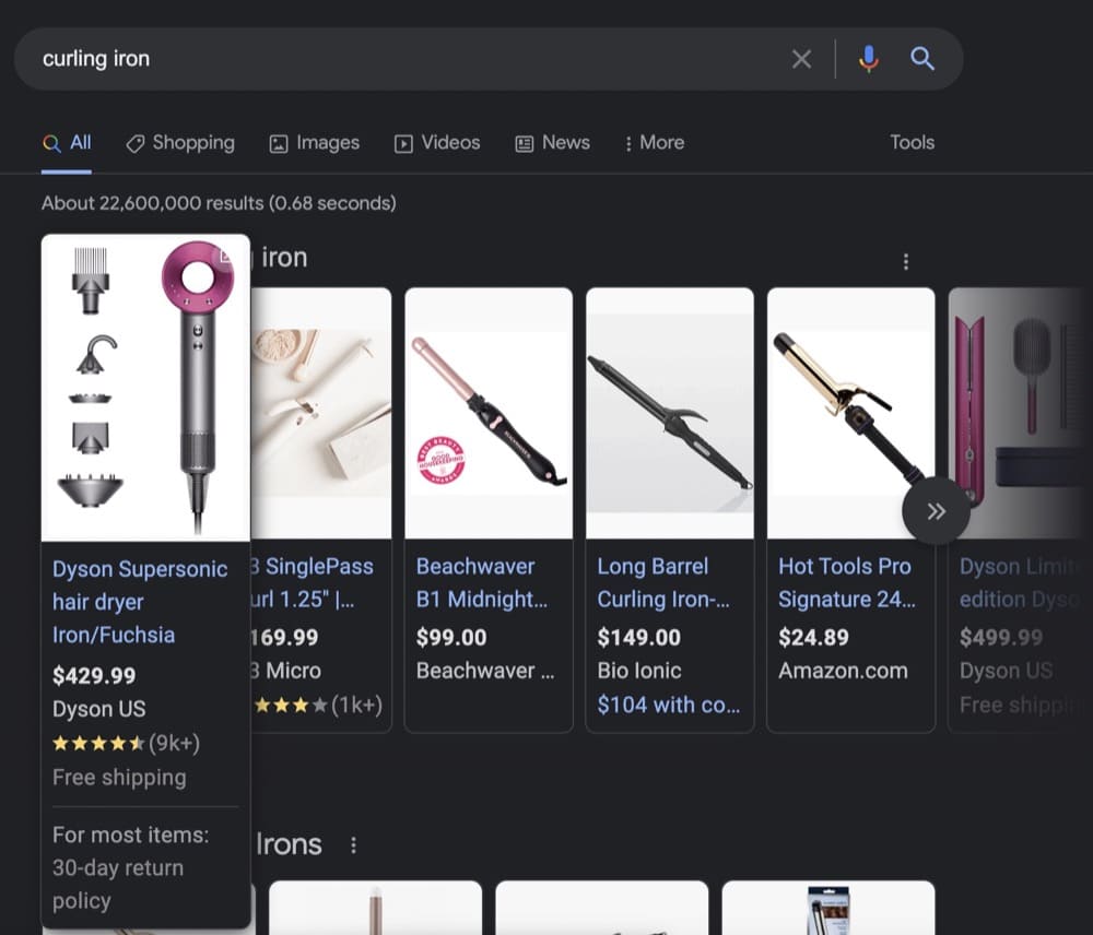
Right off the bat, you get a bunch of product information thrown at you. The search engine curates a list of products with the product title, product image, the brand name, the price, and customer ratings.
Dyson’s hair dryer (which can also double as a curling iron) is first on the list. Along with a visual of all the attachments, you can also see the 9,000 customer ratings and the free shipping and 30-day return policy.
Clicking on it takes you to this product page:
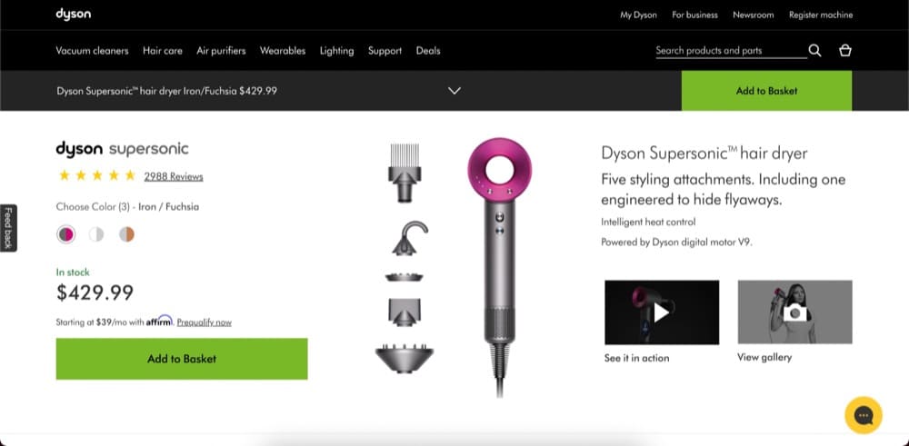
Here’s where Dyson can either turn a visitor into a customer or lose the buyer because the product page didn’t do a good job at finding selling angles.
Let’s be honest—Dyson is a well-known brand and has proven its products deserve that hype and the hefty price tag. It can get away with a less-than-perfect product page.
Your product page has the daunting task of turning skeptics into buyers.
What Makes a Stellar Shopify Product Page?
So, is there a magic formula for creating a Shopify product page that makes purchases roll in?
Um, no. Cinderella’s fairy godmother has retired and we can’t locate her.
But you can emulate what’s worked for other successful Shopify stores.
Note: There’s no one-size-fits-all situation. What’s worked for them may not work for you. That is why it’s important you conduct conversion research, create a strong hypothesis and run A/B tests.
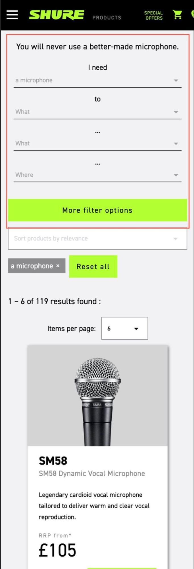
What should be included on a Shopify product page?
We asked more than 50 store owners about the elements that have improved conversions the most. Many mentioned a large & prominent CTA (with proper contrast) in one way or the other. Although this sample size is unrepresentative, it does make you think about why button color tests were so popular a decade ago.
Color psychology is important. According to a study carried out by the Seoul International Color Expo, more than 92% of people reported color plays a crucial part when making purchases. However, we’re not including colors on this list because it’s a branding exercise. As long as you have a contrast and your buy button is visible, you should be good to go. If you are convinced that changing colors can help with conversion, try A/B testing your hypothesis.
What page elements are the store owners’ must-haves? Here are the elements experts deem important:
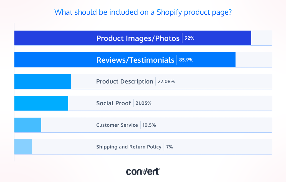
All the elements you need on a Shopify product page (Save this checklist 💾)
- Great banner offer
- High quality product images that tell a story
- Product description with USP + selling angles
- Call-to-action (CTA) buttons
- Detailed product guides (How-tos, product care manual)
- Customer reviews and ratings (+ user generated content)
- All your certifications
- All your trust badges
- Frequently Asked Questions (FAQs)
- Customer service options
Great banner offer
Whether you offer discounts or free shipping, consider adding a banner to showcase that to up your conversions.
Erin Neumann, Sacred Space Organizing explains how discount thresholds help:
The premise for these thresholds is straightforward: you offer either a dollar amount or a percentage of the customer’s total purchase if they spend a certain amount in a single transaction. For instance, you could cut 10% off their entire bill if they spend any amount above $100.
Offering discount thresholds helps negative customer apprehension regarding their purchase decisions. You also increase the Average Order Value (AOV) through this tactic. The real trick is to develop a suitable threshold that helps boost your long-term profits.
Practically, every successful site has a banner offer in the header. Here’s an example from Then I Met You:
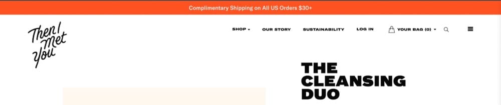
The banner is also a great place to introduce time-bound offers.
Limited-time offers are based on the psychological principle of loss aversion, which states that individuals prefer to avoid losses over gaining profits.
Raghav, NaturoCure.in
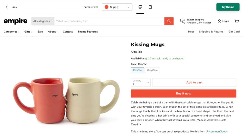
High quality product photos that tell a story
How important is it for you to invest in good-quality product images? As it turns out, it’s pretty important.
A March 2018 study by Field Agent found that 83% of US consumers reported product images were either “very” or “extremely” influential in their purchase decision.
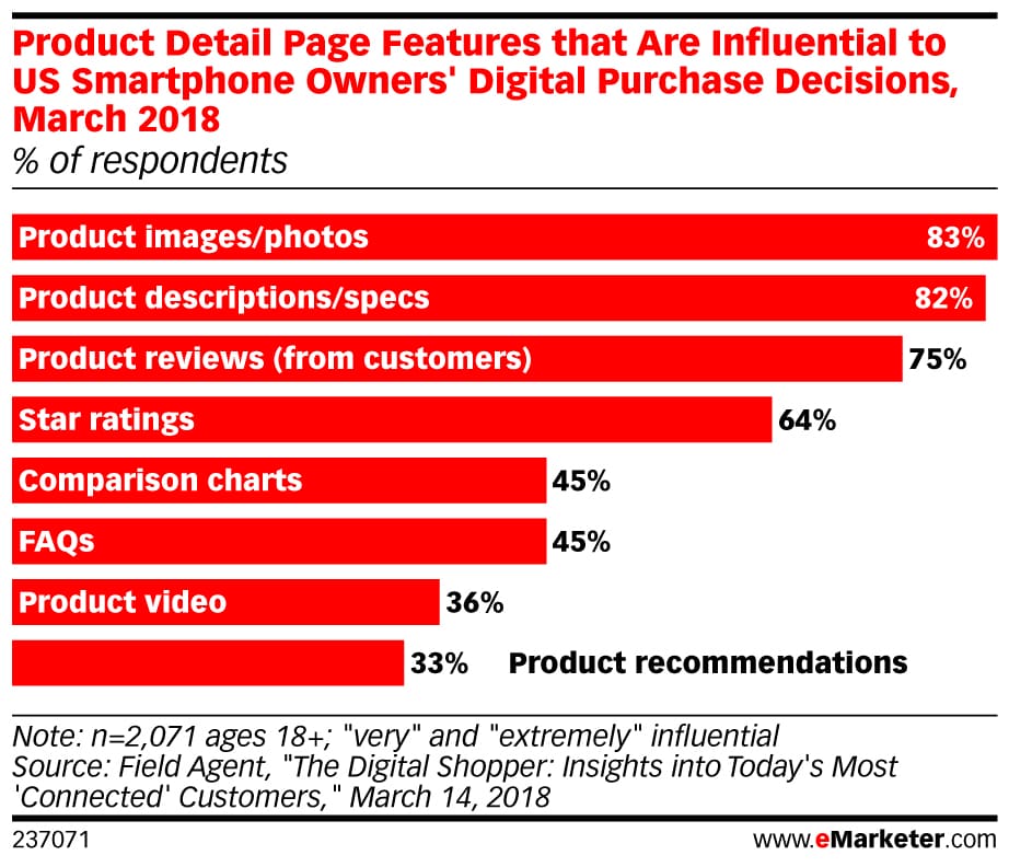
This study’s findings were substantiated by a February 2018 survey from Salsify—60% of online shoppers wanted to see at least 3 or 4 images on average. Another 13% wanted to see 5 or more.
And as far as the format of the images goes, the Field Agent survey respondents reported that standard product images are sufficient. Only 29% preferred a 360-degree photo because it allowed them to see the product from all conceivable angles.
Sumit Bansal, an Excel Pro and owner of the site TrumpExcel, shares a few tips you can use to capture great product photos:
- Invest in a DSLR camera or a good smartphone to shoot photos in high resolution
- Improve picture quality by adjusting the contrast and lighting
- Avoid using filters so customers can see the true appearance of goods
- Consider using a white backdrop. This makes it easier to edit afterward.
- Take pictures from all angles
- Consider depicting the product how it’s used in the real world
DIY Tutorial Video: How To Take Product Photography At Home With A Smartphone
Campbell Walker and Felicity Handley, owners of the creative brand, Struthless, have perhaps mastered the art of great product photos.
The product page for “ignorant style pants” features different people wearing the pants, close-up shots of the fabric, and showing off the garment in different postures and different lighting.
One of the disclaimers most apparel brands issue is the color of the material. Since they use artificial studio lighting, they warn the clothes may look a different shade. Here you can see what the pants look like in natural light which is a brilliant move to win over buyers.

The second part of the equation is how you use these images to tell a story.
After watching thousands of user session recordings of product pages it’s clear that the majority of the traffic ONLY interacts with above the fold section, which is usually the product image gallery. This insight makes your product image gallery the most important asset on your store as this is the section which gets the most eyeballs.
- Product Only Image – Features the product against a simple and plain background, with great lighting.
- Highlight Variants – It gives visitors a sense of product options available to choose from.
- Group/Bundle Shot – If it’s a bundle you can do a flat lay, highlighting different products included.
- Infographics – Highlight the USPs of the product by combining text and image to deliver information quickly and efficiently.
- UGC / Lifestyle Shot – Help influence user engagement, and take brand authenticity to the next level.
- GIFs/Product Videos – These are more attention-grabbing compared to static images. They add motion to your product and help your visitors understand your product better whilst seeing it in action.
Product description with USP + selling angles
Your product description and the specs are just as important as the product images. Here’s where you can demonstrate your USP and convince the customer they need the product with a selling angle.
According to the Field Net survey, 82% of US consumers report that product description and specs influence their purchase decision.
Here’s a great example of how to get this right: Partake Foods’ crunchy chocolate chip cookies page dives into great details about the product, the ingredients used, and the nutritional information.
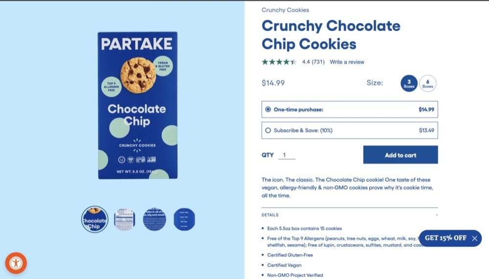
The descriptions and specs are packed with powerful selling angles. These cookies are vegan, allergy-friendly, and made with non-GMO ingredients.
If the search for a vegan-friendly, organic, and allergy-free cookie led a visitor to this product page, they would be convinced they’ve hit the jackpot.
Call-to-action (CTA) buttons
Your CTA should be clear, concise, and visible. It should tell the customer what you want them to do, such as ‘add to cart’ or ‘buy now’.
Stephen, The Connected Narrative
But should you have only one CTA or sprinkle them all over the page?
You’ll often find a call to action button in every fold or a sticky add to cart button that follows you as you keep scrolling down.
Here’s an example from Made In’s cookware product page –
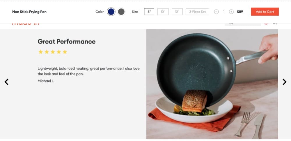
The sticky bar also includes color and size options.
You may want to test using different copy and positions for your CTA buttons.
Detailed product guides
Demonstrate your product expertise with detailed guides like Critter Depot does.
Make sure you have content on your website that shows that you are an expert in your niche. It’s super common for a business owner to not realize they need to do this.
Bruce Paulson, Determined Solutions
On their product pages, visitors can learn everything they need to know about the product, how it’s packaged and shipped and what their pets can eat besides critters.
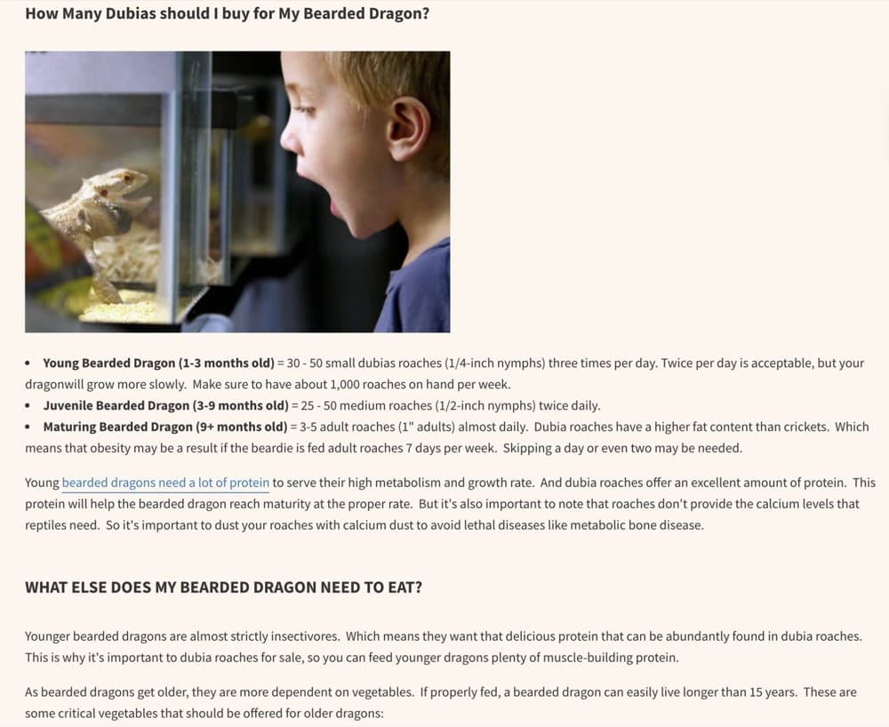
On your product page, you can take a similar approach by educating potential buyers about the best way to use the product, how to care for it, and what they should be aware of as first-time buyers.
For Critter Depot these guides also serve a secondary purpose—a method to acquire customers who didn’t know they could buy critters online.
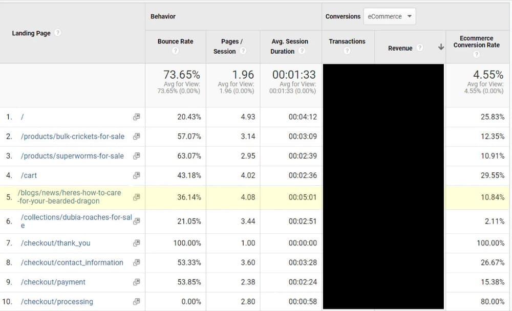
What we did to boost our conversion rate was create supplemental articles that complimented the roaches we sell. These care guides brought in a whole new group of people that were unaware they could buy crickets online. When they discovered our content, they then discovered they could buy from our store, which led to a very low 36% bounce rate, and a whopping 10% ecommerce conversion rate.
Jeff Neal, Critter Depot
Here’s their Google Analytics:
Customer reviews and ratings (+ user generated content)
A 2022 study conducted by Dixa found that 93% of customers read online reviews before making a purchase. But we’ve known that reviews are important for a while so you probably already have them displayed on your site.
But what is the best way to leverage these customer reviews and ratings?
- Place your reviews and ratings at the top.
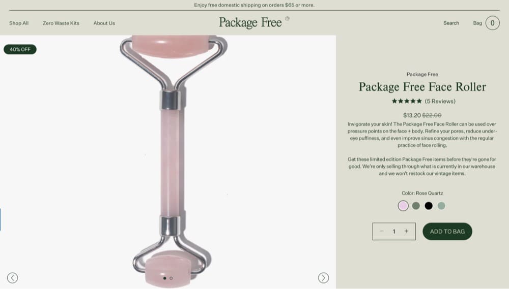
Make it easy for customers scanning your product page to see how well-liked your product is and how many people love it. Usually, the most prominent place to add the star rating is under the product name and most successful Shopify stores follow this practice.
Here’s an example from Package Free, a zero-waste lifestyle store:
We rely on social proof to help us sell our popular products. Almost all of our customers report checking out before making a purchase product reviews in our customer feedback surveys.
By split testing our product pages for our Day & Night CBD gummies, for example, we were able to increase purchases by 12% for that product by moving the “Reviews” display around. In the end, the best design put reviews front and center which convinced more customers to buy.
Although we also played with our image sliders, layout, and product description, what made the most dramatic difference to our conversions was showcasing reviews prominently.”
Shawn Thomas, Pure Relief
- Feature reviews that back up your claims.
When you’re sorting through your best reviews, feature the ones that are not only positive but a thorough review of the product. 73% of consumers place more emphasis on the review than your overall rating i.e. customers are looking for product details that will help them understand if the product is a good fit. - Use Google’s review schema.
This markup helps you display your aggregate rating and the number of reviews when people search for your product.
Here’s how it appears:
Even before someone lands on your page, they already have an inkling of how good (or bad) your product is.
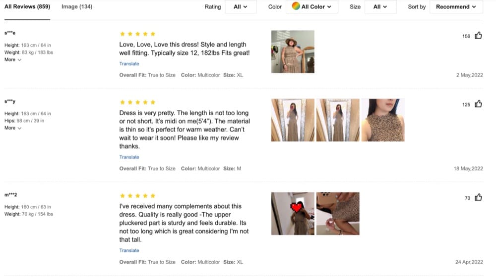
- Use customer photos in your reviews.
Yes, you just spent your time and money on getting high-quality photos for your site. So why use somewhat unflattering, low-resolution images? Because according to a 2021 study by Bazaarvoice, 2/3rds of buyers want to see customer photos before they make a purchase.
The fast fashion brand, Shein, is a good example of how to implement this:
Note: Source customer photos from social media if customers find it a hassle to upload images when writing reviews.
- Don’t remove all your negative reviews.
Having 100% positive reviews is unrealistic and can seem scammy. While having a vast number of negative reviews is bad for business, consider keeping one or two negative ones. This helps establish you’re a legitimate business and lends credibility to all your reviews. - Respond to negative reviews.
How you treat your unhappy customers doesn’t go unnoticed. Make sure you address their issues so first-time buyers know your customer service will be there for them should they have problems.
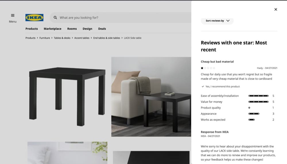
Even IKEA’s most popular table, the LACK side table, has some dissenters. But IKEA acknowledges the customer’s opinion and responds with a thoughtful note.
All your certifications
You may be carbon neutral, vegan, cruelty-free, and allergy-friendly, but savvy consumers won’t take your word for it—you have to show them.
We include certifications on the pages where we display our products. On the page where it says, “Add to cart” we emphasize that our products are GMO-free which is important to our consumers. Both our USPs and certifications have helped our pages convert.
Melanie Bedwell, OLIPOP
Here’s how OLIPOP displays its certifications:
Here’s another example from Partake Foods:
All your trust badges
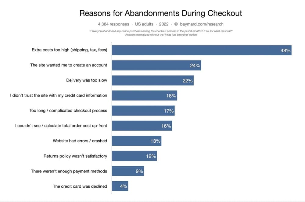
One of the main reasons shoppers abandon their cart is they’re concerned about the site’s security. According to Baymard Institute’s cart abandonment research, 18% of consumers abandon carts because they don’t trust the site with their credit card information.
Your site’s credibility is bolstered by trust badges. They want to offer you a leg up by tying your firm to other well-known and respectable companies. Because these badges aren’t as crucial as the product itself, they’re often placed underneath the call-to-action.
If you want users to sign up for an account on your site, you may want to include a badge indicating that you utilize a trusted payment processing business, your site’s security service provider, and your BBB rating. This is a simple thing you can do that will have a tremendous impact for very little effort or time.
Kim Abrams, Abrams Roofing
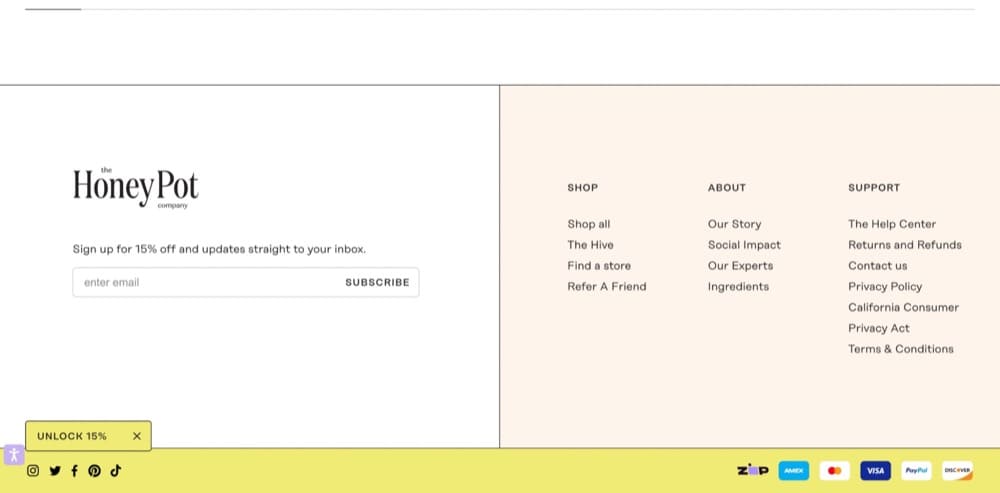
You’ll find trust badges usually on the site’s footer like this example from HoneyPot:
But you can move these trust badges further up on the page under the “Add to Cart” button.
Frequently Asked Questions (FAQs)
Sometimes folks need a little extra assistance. Offer an abundance of frequently asked questions on your eCommerce product page. This might contain frequently asked topics like how to maintain and use your product.
Travis Lindemoen, Nexus IT Group
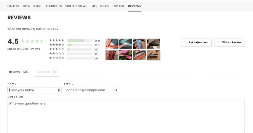
Here’s a great example from LastObject’s product page for LastSwab:

The FAQ section is divided into three categories—specs, shipping and product. Clicking on these opens up a whole bunch of frequently asked questions and answers.
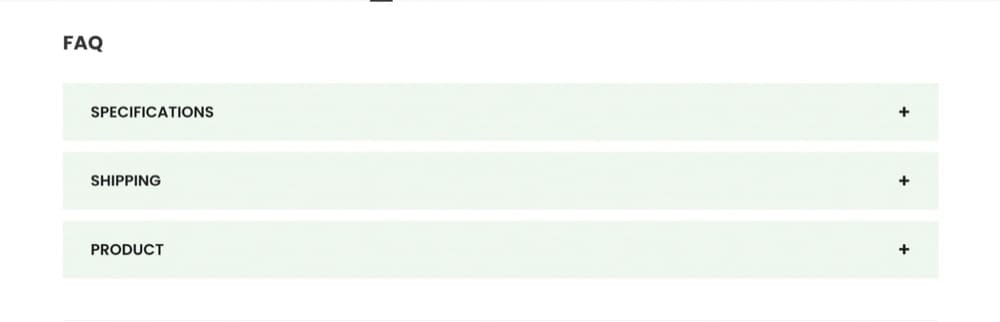
P.S. If you don’t know what to add to the FAQ section or want to keep it updated, add a section where customers can ask questions. LastSwab’s review section features the “Ask a Question” button.
Customer service options
Some people need more help to complete a purchase. In fact, if you look at the reasons why people abandon carts, most of these can be mitigated by having 24×7 support.
Think about it. In a physical storefront, if you have questions about a product or need help with self-checkout, you can always ask a salesperson.
Why not replicate that for your digital store?
Give people the option to reach out to you via live chat, email, phone or even WhatsApp.
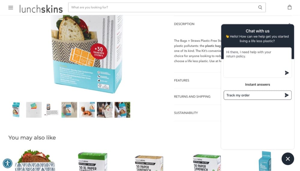
Lunchskins offers a live chat option and the ability to search for answers from their knowledge base.
How long should a Shopify product page be?
There’s no limit to how long your Shopify product page can be but you should have most of the important elements in the first fold. If you are going to add lots of information to your product page, make sure:
- The headlines tell a story
- The content is skimmable
- You break up the content with visuals
- The content is not fluff
Jason Wise recommends using negative space to avoid overwhelming users.
People have very short attention spans and are impatient with trying to grasp the meaning of something. This has changed the time a person is willing to spend on an overwhelming webpage.
Jason Wise, EarthWeb
What makes an overwhelming webpage? A lot of clutter!
When you add different components spaced with a very little gap, the brain receives a lot of different information stimuli at one time – and gets overwhelmed. Leaving larger gaps, called negative space, allows the brain to receive information in silos, keeping the customer focused on one area before jumping to another, which creates a positive experience overall.
One way you can test out the ideal length of your page is to watch visitor recordings, view heatmaps, and then run A/B tests to see how your audience reacts to different page lengths.
Shopify single product pages vs. multiple product pages
From an SEO standpoint, single product pages are generally better. If you have a ton of reviews and those reviews feature images or videos, you can choose the best reviews to feature on the page and move the rest to a separate page so it doesn’t slow down the loading time.
Another dilemma that you may face is when you have a product with a ton of variants. Should you have a single page to host all the related products or have multiple product pages linked to each other?
Think about the user experience first. If the variation is a difference in color, you can host the two products on the same page. But if the second product has more features or a completely different design, it’s better to add it under a list of product recommendations.
How to structure a Shopify product page from scratch
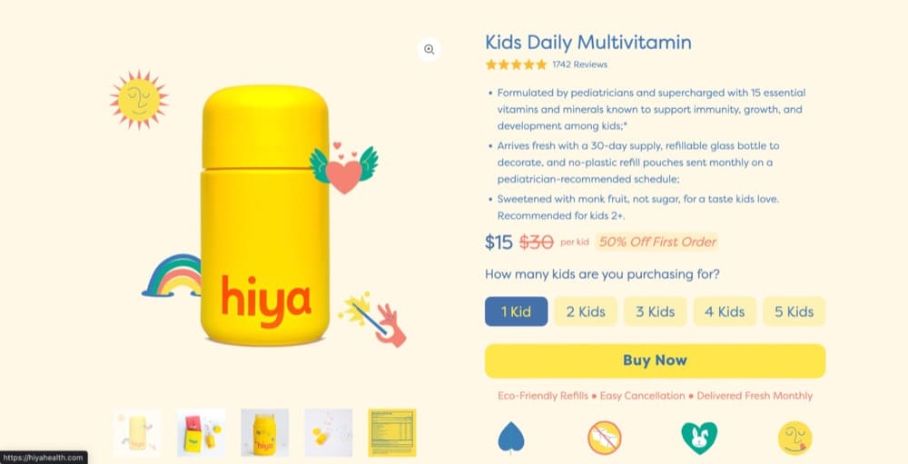
Here’s a breakdown from Darren Litt on what helps Hiya Health’s product page perform well:
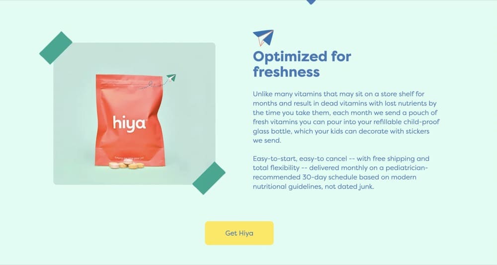
“First, it begins with clear photos of our product, alongside a list of its key benefits and description. You’ll also see the price, nutrition facts, the 5-star product rating, and the discount promo we offer for first orders. This is a good way to capture attention, get people interested in what you’re selling, and have them keep scrolling to learn more. It’s also a way for us to initially introduce our brand’s social mission.
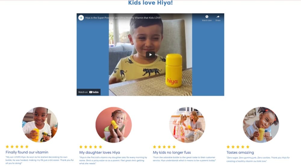
Next, we have a section for testimonials from happy customers. This is a great way to show potential buyers that others have been satisfied with what they’ve purchased, and it helps create a sense of social proof. You’ll notice that we have two sections of this, where one automatically adds the most recent testimonials from verified purchasers. It’s also worth mentioning that we’ve included photos of the reviewers to make them more relatable.
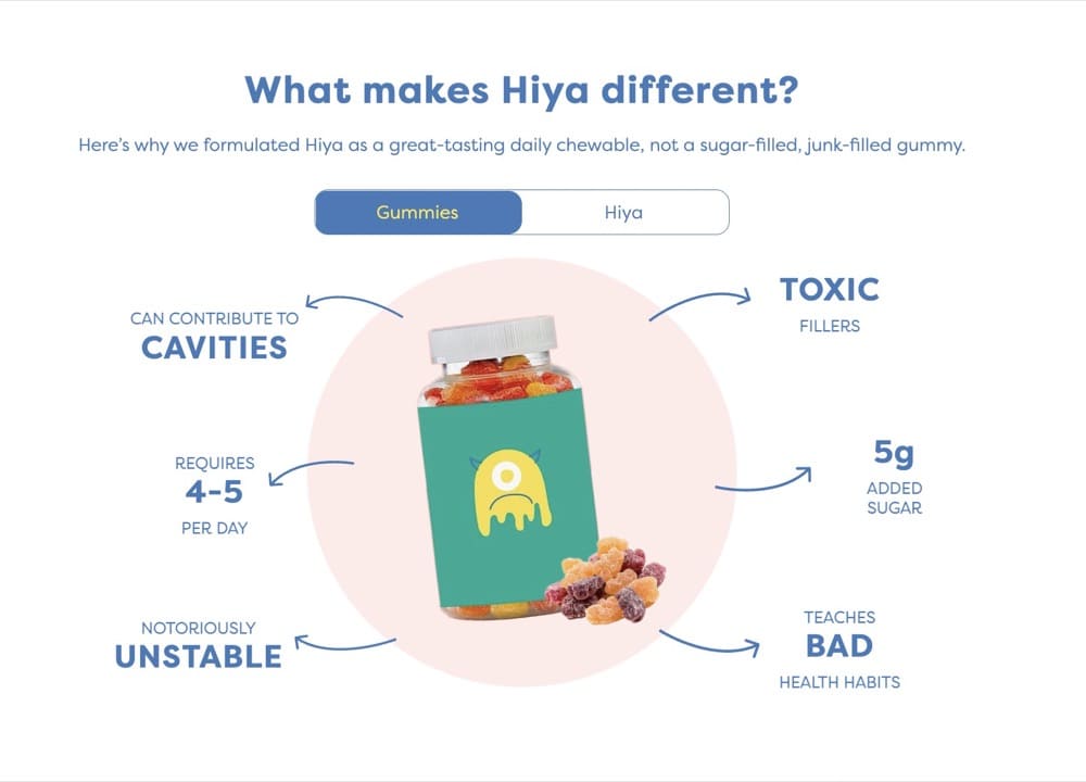
It’s followed by a section that shows what differentiates Hiya multivitamin from regular vitamin gummies in the market. This is also important because it helps people understand the unique value proposition of our product, and why it’s worth paying for.
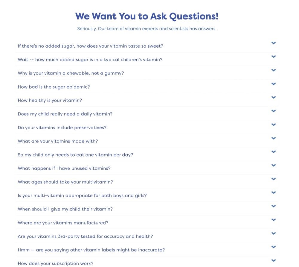
You’ll also see a section for frequently asked questions. This is important because it helps to address any concerns or reservations that someone might have about our product before purchasing. By having this information easily accessible, it allows potential customers to make an informed decision about whether or not our product is right for them. This section also shows that we’re confident in what we’re selling, and that we’re transparent about our product and its ingredients.
Lastly, we have a call-to-action button strategically placed four times in our product page layout. This is because we want to make it as easy as possible for potential customers to take the next step and purchase our product.”
Note: Hiya Health’s product page hits all the right notes. It also has a great offer for first-time buyers displayed prominently in the banner. Plus, certification and trust badges on the product page.
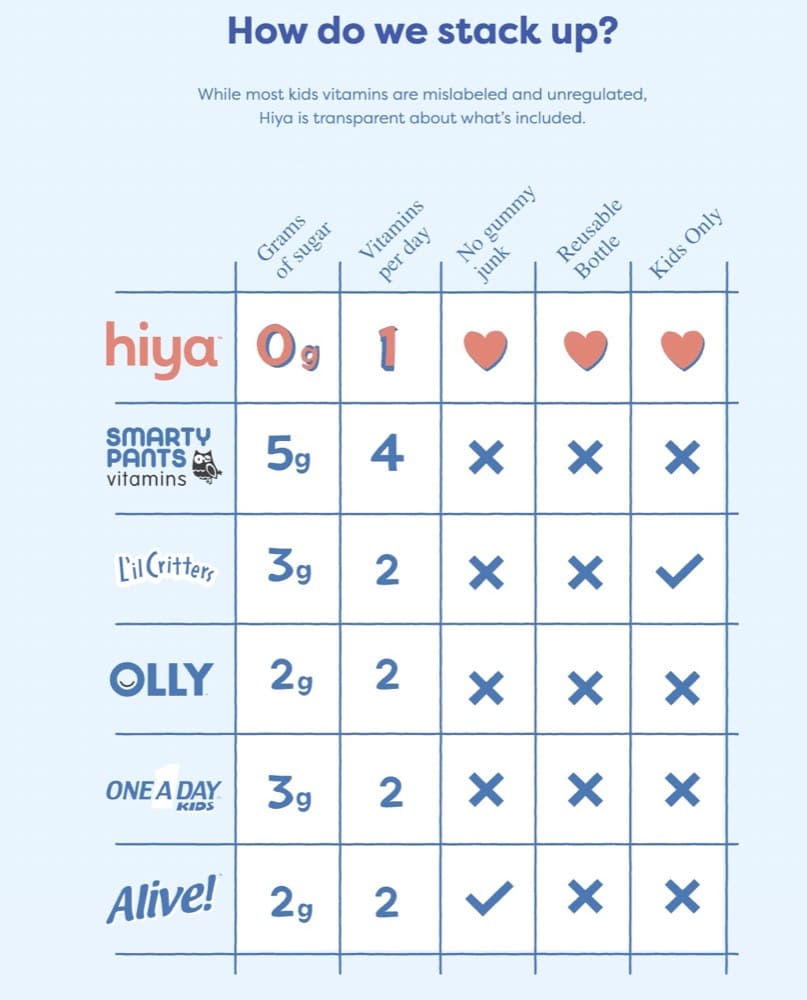
The one new thing you may want to experiment with is having a comparison chart for your product page. This is completely optional and something you may want to test before you roll it out.
Weaving emotional persuasion into Shopify product pages
Emotional marketing is both an art and a science. It’s a science because of the research required to tap into the emotions that drive the thoughts, feelings, and desired outcomes that influence your customers to buy. The art comes through using insights to create better user experiences, copy, and images that increase conversions.
Talia Wolf, GetUplift
While it may seem logical to divide your audience into different demographics, understand this: People don’t buy products, they buy emotion.
The best way to understand how this works is with an example from a brand that both children and adults obsess over—LEGO.
In GetUplift’s A-Z Emotional Marketing Guide, Talia explains how LEGO mastered the art of using emotions to sell.
If you’re a parent like me, you’ve probably gotten a few jabs on your feet because of the tiny Lego pieces your kids have thrown around the house. Ouch!
You’re willing to go through that momentary pain though and buy your kids a Lego set because you know playing with Lego bricks opens the floodgates of your kids’ imaginations, inspires them to try new things, and ultimately increases their confidence.That’s the idea the Lego Group uses to sell.”
LEGO’s masterful ads are what do the trick.
Here’s their original (award-winning) “What it is is beautiful” ad from 1980 and how they recreated it for 2021:
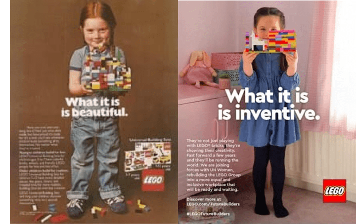
These ads are aimed directly at the heart of parents, showing them that Lego is an integral part of building, inventing and bringing their kids’ dreams to life. Lego ads don’t focus on what you can build (e.g a castle, car, tower, or monster truck). They don’t highlight the number of pieces you have in a pack or the pricing. Instead, they show you powerful images of children proudly building and holding their creations.
Apple product pages: a Lesson in selling mastery
We can’t talk about product pages and not think of Apple. Also, Google sees Apple’s product pages as an entity relevant to Shopify product pages.
Apple places a premium on providing a satisfying experience for its customers, and this philosophy extends to the company’s online store. Their product sites include an interface that is uncomplicated yet incredibly effective, and they also provide all of the essential information that is required to complete a transaction.
Tanner Arnold, Revelation Machinery
The technological behemoth has selected a single page that places a significant emphasis on the capacity as well as the finish, despite the fact that the product is available in a variety of sizes and color combinations. Apple’s emphasis on making use of the attention that users give the page in order to attract attention to a trade-in offer is another element that we really like about the company.
Apple product pages follow a similar structure:
- A quick product overview + product image
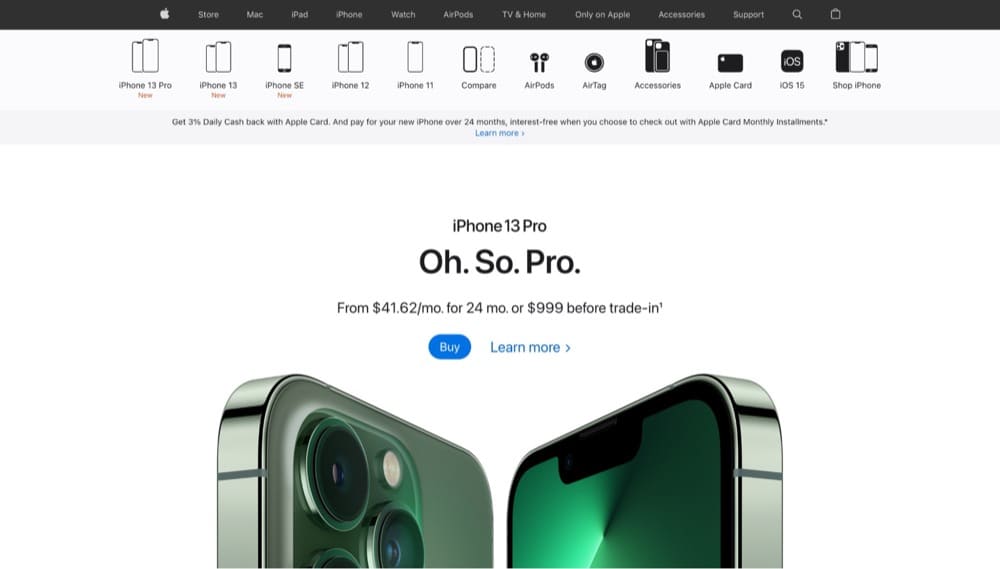
- Guided product tour video

- Comparison chart of different models
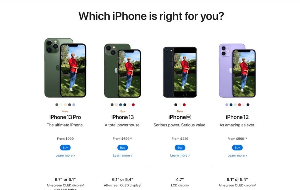
- Different purchase methods highlighted
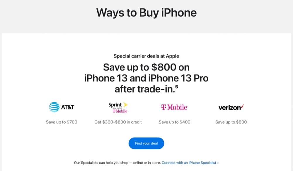
- Important links for customer service, free shipping and payment options
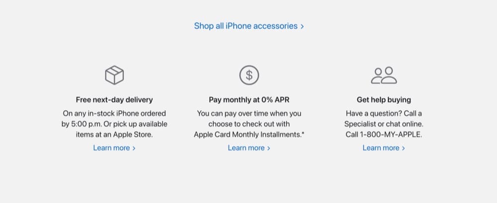
Apple product pages are littered with high-quality product photos, multiple CTAs, and give users all the information they need without overwhelming them.
Degrees of separation: other elements that impact Shopify product pages
While the product page may be the most important for a buyer, other pages and elements on your site also have an impact on your product page.
- Category page design and navigation
When designing your category page, think about the user. What would make the most sense to them?
For instance, you can lump skincare based on a user’s concern, skin type, or product category.
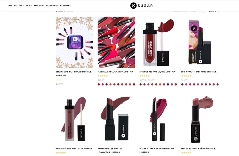
Sugar Cosmetics does a great job at showing off its different product categories and uses a drop-down menu for each main item:
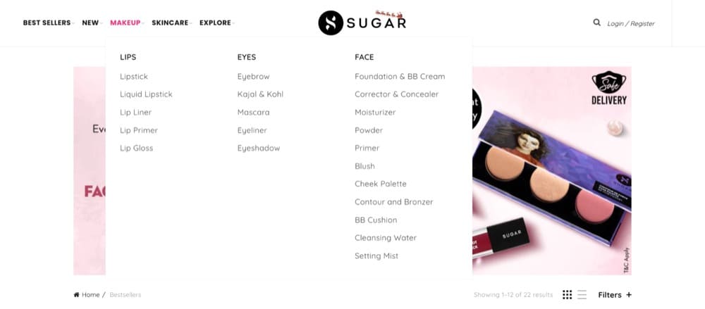
Some of these categories have sub-categories that lead to a product listing page like so:
- Contact Us page
The element that helped improve our page’s conversion rate would be ease of access to the contact page. We made sure that the contact page wasn’t too complicated when creating the website. For example, the fewer clicks it would take a consumer to reach the contact page would mean that they would likely convert.
Our company’s website is simple and concise, with just enough options for the prospective audience to reach out to us without much hassle. We have integrated our contact page with Google Maps so that consumers can easily find our physical store. The variety of options helps consumers decide which method of communication suits them the best.
Jessica Kats, Soxy
- Pop-ups
While pop-ups don’t live on product pages, they are a part of them. An annoying pop-up can ruin the customer experience. But an effective, well-timed pop-up can help you convert more customers.
How can you create a pop-up that helps you convert more? Research your audience, form a hypothesis and test it.
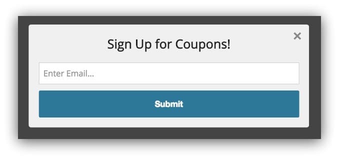
Let us ask you a question: Which of these two pop-ups from Sumo do you think is the better version?
Read our complete guide: A/B Testing Pop-Ups on Shopify: How to Make Them Effective to find out!
- Wishlists
Even though it may be hard to hear, some leads are simply not ready to make a purchase. This might be anything: they can’t afford to buy right now, or they’re waiting for the price to drop. Wish lists are also popular because they allow potential purchasers to “cross-reference” and evaluate various items and pricing.
Jason, CocoLoan
Outside the Box Ideas to Try on Shopify Product Pages
Aside from all the elements your product pages should have, here are some interesting ideas you can try:
1. Gamify receiving rewards like Kettle & Fire
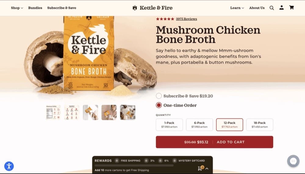
On the bottom of the product page, Kettle & Fire has a reward bar. As you add more products, the bar nears completion till you unlock a mystery gift.
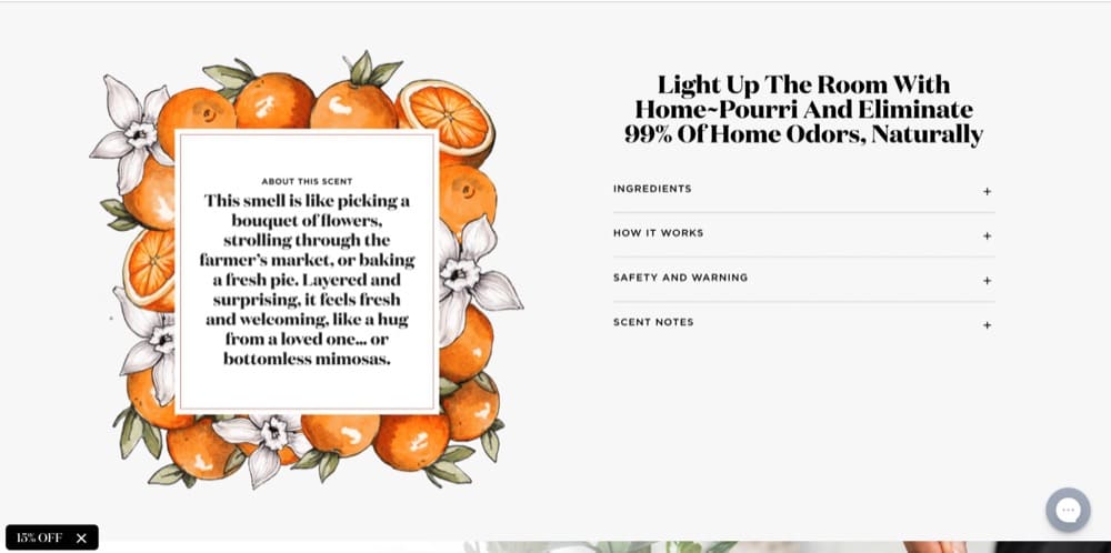
2. Be fun and witty like Pourri
Pourri, a natural odor eliminator brand, takes an extremely fun and witty approach with its brand and it’s evident in the copy:
3. Design a futuristic layout like Sixty-Nine
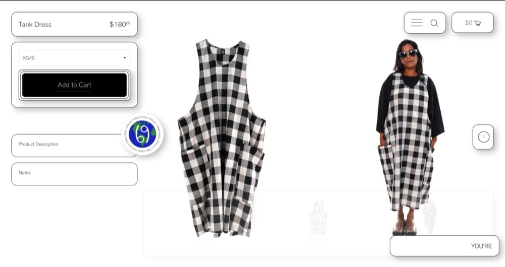
Sixty-Nine, a non-demographic clothing brand, uses a clean and minimal layout for its product pages.
The “Add to Cart” button flashes while a ticker goes by on the bottom saying “You’re Great.”
Need more ideas? Here are a few from Rishi Rawat’s newsletter, Quick Bites
- Try mixed media format for your product images
- Give your category page interface an overhaul like so
- Justify your prices for skeptics
Sign up for Rishi Rawat’s Quick Bites newsletter here.
Best Shopify Product Page Templates
Need something that works out of the box? Here are 5 of the best product page templates for you to try:
Note: Using these templates will change the look of the entire store.
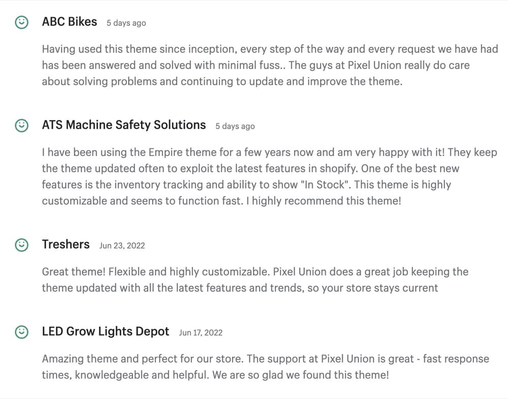
Empire
This theme from Pixel Union features a clean, minimal design and has all the necessary elements you would need to make your product pages stand out. Empire has 3 different styles to choose from—Supply, Graphic and Industrial.
Of the 277 reviews, 75% are positive.
Instant

Instant is a Shopify page builder app that can be used to create custom Product Page Templates. There is a library of over +500 templates that can be customized to fit your brand, or you can design from scratch.
Of the 171 reviews, 170 are 5-star.

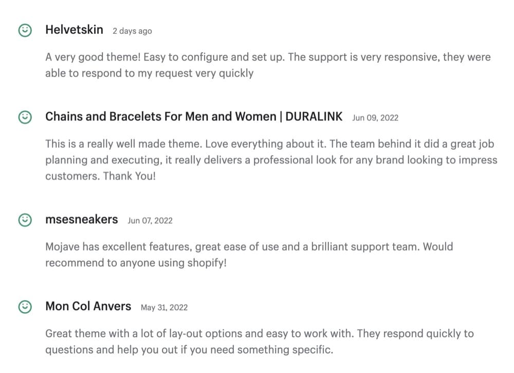
Mojave
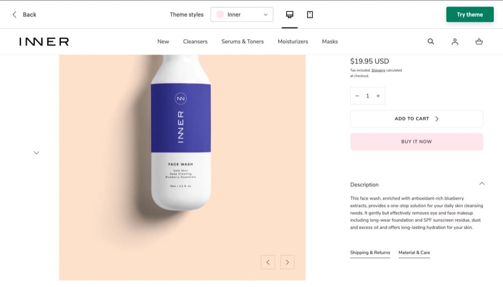
DigiFist’s Mojave theme is also a great option for product pages. Both the theme styles, Inner and Mojave, have the right elements and tabs for “shipping and returns” and “material & care.”
The reviews for the theme are 100% positive:
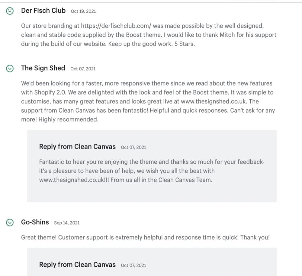
Boost
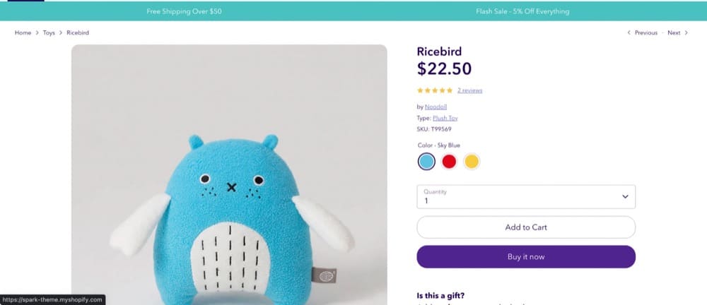
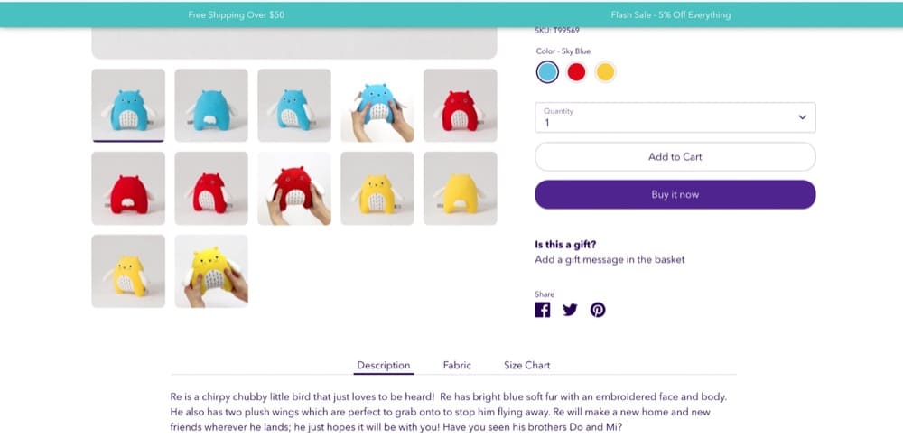
Clean Canvas’ Boost theme checks off all the right boxes. Plus, you can add a gift message in the basket when you checkout. You can play around with 4 different theme styles—Bloom, Inspire, Spark and Flourish.
The reviews are 95% positive.
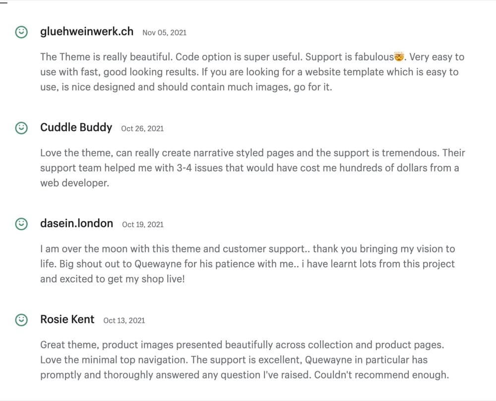
Cascade
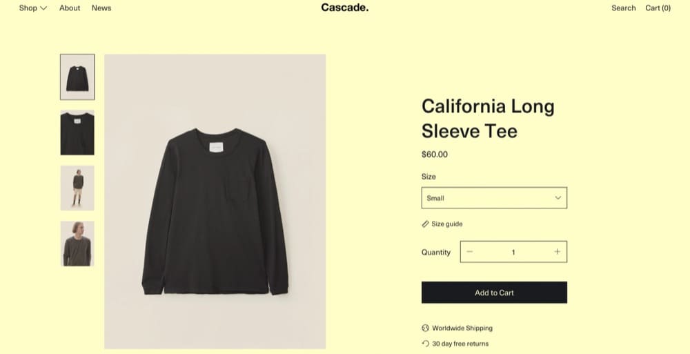
Cascade by Switch is an aesthetically pleasing theme you can try in 3 different styles—Classic, Bright and Modern.
100% of the reviews are positive.
Best Shopify Product Page Examples You Should Take a Look At
Successful Shopify product pages are built on 4 pillars:
- Clarity –
Is it clear what is being sold? As soon as you land on the page, can you tell what the store sells? Or, do you have to dig around to figure that out? Attention is fleeting so make sure your page can be understood at a glance. - Relevance –
Is it aligned with what buyers seek? If you advertise your cookies as vegan, cruelty free and allergy friendly, make sure you back those claims up in your product nutritional information and display your certifications. - Expertise –
Does the page demonstrate experience and expertise? Have you provided enough information to first-time customers to allay their fears? For instance, you should have detailed product manuals and care guides. - Ease of decision making –
Does the page offer enough information in a streamlined way so first time purchases can pull the trigger without analysis paralysis?
Ben Labay explores how important this is in this post:
Apart from the product pages we examined throughout, here are a few more Shopify product page examples that check off the right boxes:
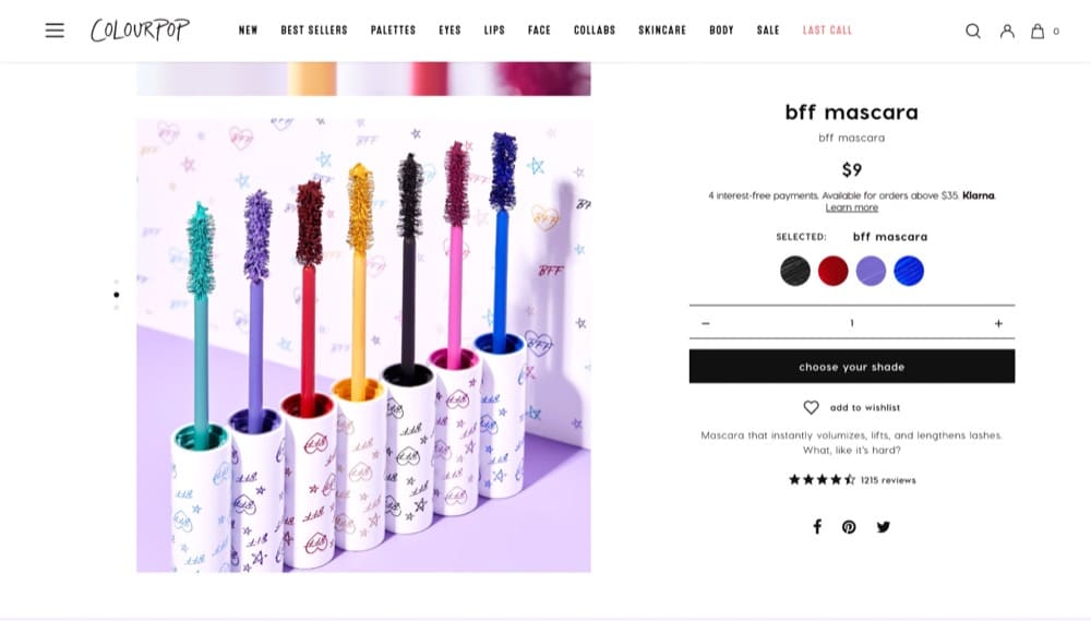
- Colorpop
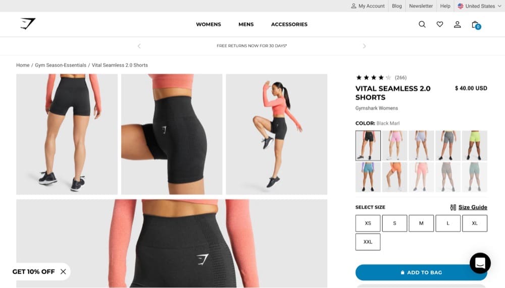
- Gymshark
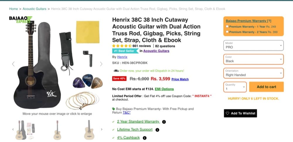
- Bajaoo
Crafting the Perfect Shopify Product Page for Your Store: Test Everything
The perfect Shopify product page doesn’t exist.
Take inspiration from successful product pages and put your spin on it. You know your customers best.
Your ability to turn your e-commerce store into a lean-mean conversion machine boils down to two things—how well you know your customers and how often you can put those learnings to the test.
Create a culture of constant experimentation with A/B testing and watch the revenue soar!

Written By
Sneh Ratna Choudhary, Trina Moitra


Edited By
Carmen Apostu
