Top 13 A/B Examples of Tests to Run on Your Shopify Store
By default, the customer journey is littered with conversion blockers.
For a Shopify store owner, these blockers are reasons visitors don’t buy. They risk wasting money in non-converting areas when investing in paid traffic.
Of course, you’d want to find and eliminate any challenges to convert more visitors into buyers. But that’s easier said than done.
There’s no magic mirror that shows you what’s stopping your visitors from buying. Instead, the closest you can get to conversions is to A/B test your Shopify store. But there’s a catch: What exactly should you test?
Shopify stores have different facets and functionalities, and it’s not that straightforward to determine what areas to test to gain more orders. And this is what many businesses are looking to simplify.
In this article, we’ll show you examples of effective Shopify A/B tests and why they’re successful and help you get inspiration for your own.
Let’s go…
What Is A/B Testing? How Is It Relevant to Shopify?
A/B testing involves identifying and testing website or page elements for potential improvements that lead to higher conversion rates.
Because Shopify has many customer touchpoints, it only makes sense to A/B test them to find opportunities for improvement and provide a better customer journey and experience. Something as simple as a broken link or button color can put visitors off and make them leave.
This is where A/B testing fits into the picture.
Let’s see why it’s so important to run tests on your Shopify store.
Why Is A/B Testing Needed for the Shopify Plus Community?
Increasing traffic to your website no longer guarantees an increase in sales. With ever-changing privacy laws and regulations, you can’t count on the commercial traffic quality you get from ads. And you also need to devote significant time and effort to search engine optimization.
The Shopify Plus community can’t rely on the “traffic = revenue” formula anymore. The better (and scientifically valid) way to boost your online store revenue is to optimize and match it with innovation.
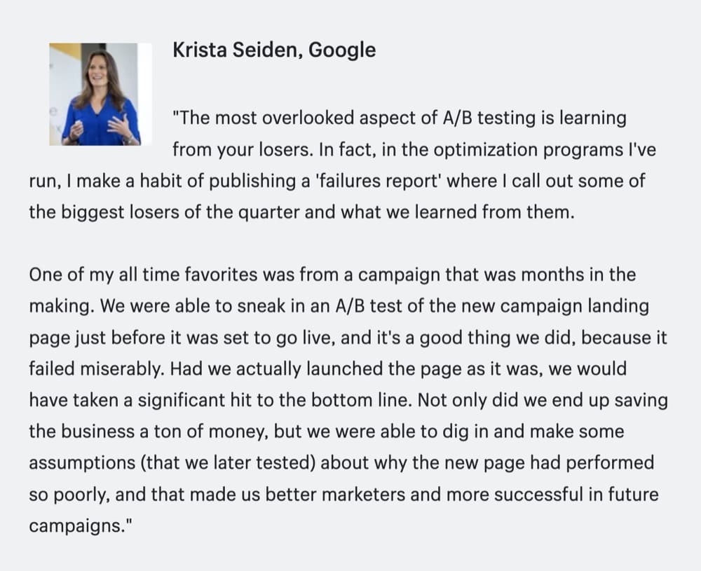
(Source)
As Krista explains, when you dig deeper into why you’re losing customers, you drive more sales from your current traffic instead of spending money on bringing new visitors to an unoptimized store. You need A/B testing to “block traffic leaks” to get more revenue from your existing traffic.
How A/B Testing Friendly Is Shopify?
Is Shopify A/B testing user-friendly? Can you just install an app and dive straight into optimization?
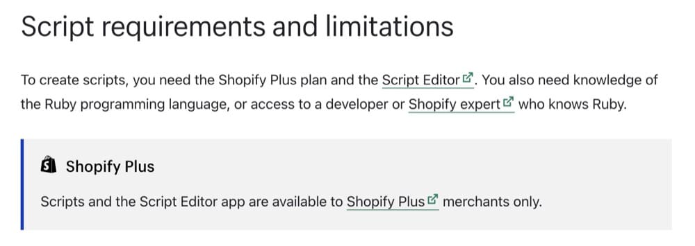
While Shopify generally allows A/B testing, it’s much easier with the Shopify Plus platform. You get better product page optimization and customization.
For example, you can run third-party scripts to test checkout pages and A/B test your Shopify theme with a Shopify Plus Platform via the Shopify app. This comes in handy when testing a custom page design you created on an e-commerce store like Shogun. But when talking about the ease of testing, tracking, and attributing revenue on Shopify compared to other sites, you can also come across some challenges, such as:
- Correctly QAing mobile tests because of Shopify’s anti-clickjacking technology
- The limitations with the default Shopify app stores not allowing third-party scripts
- You need a developer to push test winners live without the right A/B testing tool (Convert Experiences lets you do this)
(Source)
Types of A/B Tests You Can Run on the Shopify Plus Platform
You can run A/B tests on the different sections of your Shopify store, including
- Homepage (or other ad landing pages)
- Category pages
- Product pages
- Checkout pages
But where should you start?
What Is the First Place to Run A/B Tests on a Shopify Plus Store?
All Shopify pages can be optimized. But when digging for insights to improve page conversions, where should you start? What would be the most valuable insight to kickstart your optimization program?
We asked Shopify Plus expert Rishi Rawat and here’s what he suggested:
The place to start optimization is the point where the consumer has to make the purchase decision. For most e-commerce websites, this happens to be the product page.
A product page consists of:
- Product images
- Price information
- Customer reviews
- Product description
Updating the product photos is expensive. The price is the price, and customer reviews are out of our control. If you have 600 positive reviews with an average rating of 4.8 stars, but the newest three reviews are negative, that would strongly and negatively impact conversion rates.
So really, all we have to play with is the product description.
Product descriptions are often overlooked. While a lot of effort goes into getting the best product images, many store owners treat product descriptions as an afterthought (if they’re included at all) and miss out on this powerful conversion driver.
Product descriptions aren’t just for SEO. People want to read them, especially when researching products before purchasing. And since this is your selling point, how do you maximize your efforts?
Rishi further suggests you think of product description as a three-act movie script:
The Opening
When the user first enters your product page, they are somewhat interested but not fully engaged. They may even have a few competitor tabs open. This shouldn’t be surprising– think back to your own shopping behavior, are you fully engaged in every marketing pitch you encounter? Of course not. That would be impossible. Consumers have to deal with 100s of ads every day.
So the purpose of the opening is to let the user know they aren’t just looking at any product. They’re seeing something special.
Ok, now you’ve got the user’s attention. The next step is to get them to trust us as a brand.
We can’t pitch our product till the buyer is comfortable with us. We need to get the shopper over the “unfamiliarity barrier”.
Now the buyer is ready to listen to our pitch.
The Middle
At this point, the marketer has just one job – to convince the buyer about our product.
Consumers want to buy the world’s best product that does the job and is priced in their budget.
The marketer must convince the buyer this is the only product that fits that criteria.
The marketer must do the following:
- Prove this product can do what is being claimed.
- Prove you are an expert on this subject.
- Show the challenges you overcame to make the product perfect. After all, if you didn’t have challenges, then how do you know your product is the best?
- Give the buyer the confidence to stop what they have been doing and start doing what your product expects of them. Ultimately, crafting the world’s best sales pitch is pointless if you can’t motivate the buyer to take action now.
The Closing
As the reader is reading the sales pitch, questions are forming in their minds. Guess what happens if the reader reaches the bottom of the pitch and still has unanswered questions? They’ll defer judgment. They will think, “I like this product and want to buy it, but I have some questions that I didn’t see the answers for today. I’ll just come back later and pull the trigger.” But later doesn’t happen because life gets in the way.
To prevent this from happening, the marketer needs to think of every potential concern and question.
I like to think of copywriting as a court case where the copywriter is playing the role of a lawyer and trying to convince a jury of 12.
To win the case (close the sale), we need to convince each jury member.
This tried and tested method for crafting Shopify store product descriptions can revamp your product page. And it’s worth experimenting with!
Let’s show you examples of some descriptions first, and then we’ll discuss how to get started with the best tools for A/B testing on Shopify.
Examples of Shopify Product Page A/B Tests
As mentioned above, the product detail pages (PDP) determine whether your visitors open their wallets. Conversion performance needs to be the highest on your PDPs.
You can make changes and additions to these pages to ease the customer journey down the sales funnel. See how the following four brands did some impressive A/B testing.
1. Canvas Prints
Canvas Prints competes in a saturated niche. To set their photo printing site apart from the competition and boost conversion rates, Frictionless Commerce tested conversion copywriting on their product page.
The idea was to help the visitors break the “unfamiliarity barrier”. And how did Canvas Prints do this?
Since they had no particular superstar product but many products in different subcategories, they needed to find a solution that could be implemented sitewide. And this solution had to play uniformly on all product pages, so Canvas Prints decided to add a “Do This Before Uploading Photo” button on their product pages.
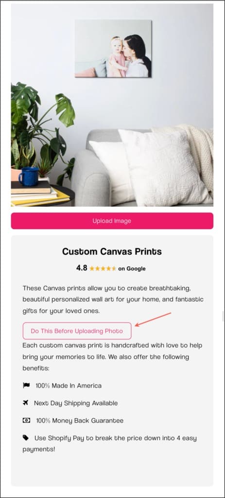
(Source)
This button introduced the reader to Canvas Prints’ “Why We Exist” pitch. It was smooth, conversational, and relatable. They further tested this product page variant against the control – the original product page without the button.
Here are some of their findings:
13.8% of site visitors engaged with this button. They had a clear winner after exposing the test to 17,921 visitors and 1,447 completed orders. The variant with the button performed 8.84% better than the control.
Canvas Prints went on to test five more pitch versions. They acknowledged that getting visitors to understand your brand better goes beyond the “About Us” page and contributes to conversion on the product pages (without obstructing the customer journey). It’s worth testing.
2. ZQuiet
ZQuiet’s anti-snoring mouthpiece product page was the star product on their site. So, when they wanted to increase product sales, Frictionless Commerce turned to Google Analytics to understand how sales happen.
They found that a bulk of the traffic to ZQuiet’s site came from mobile devices pulled in from ads. But something was also off about it. The mobile version of this product page had a lower conversion rate than the desktop version.
Considering that the mobile site was getting most of the traffic (paid traffic, for that matter), it just needed to be optimized.
Also, since these visitors came from ads, their first contact with the brand was this product page on the mobile site. For the A/B test, every pixel had to be rethought. Frictionless Commerce’s three prior attempts failed, but they stuck to the plan and found a winner on the fourth attempt.
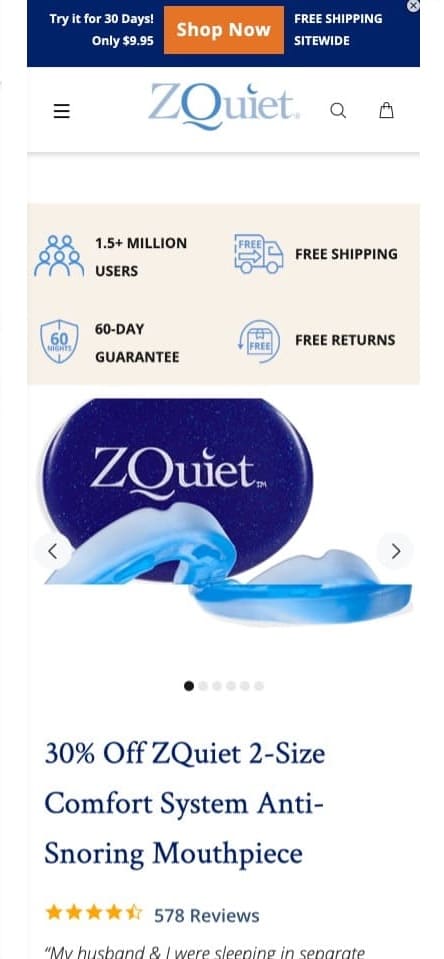
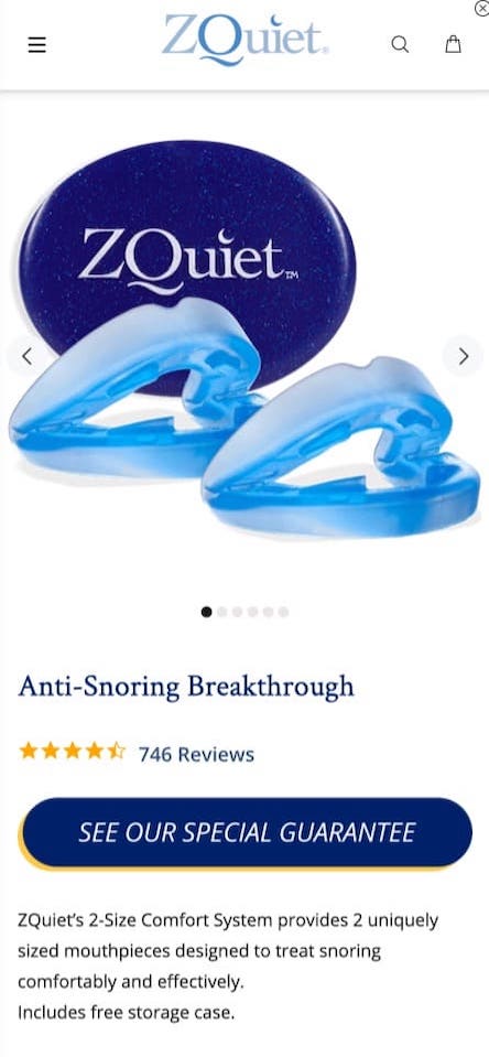
In this Shopify product page A/B test, a lot of changes went into the “B” version. Reimagining the mobile page version got them asking about the purpose of each page element.
Mobile sites have limited real estate, so Frictionless Commerce:
- Shortened every trimmable element
- Removed unnecessary details
- Moved the ones that could work better elsewhere
They made many changes for one purpose: conversion. And it worked on the fourth attempt! In seven days, they had a clear winner. But they kept going for two more weeks to ensure the test was exposed to a wide range of visitors.
What Frictionless Commerce found:
The variant performed 34.04% better. That means 34% more return on the money spent on driving traffic to the mobile version of the product page.
Mobile sites don’t always have to be scaled-down versions of the desktop site. Many site elements don’t display the same way, and the customer journey may also not be the same. Give it some thought and decide if you need to redesign your mobile site.
3. Pillow Cube
Ever seen a pillow like this?
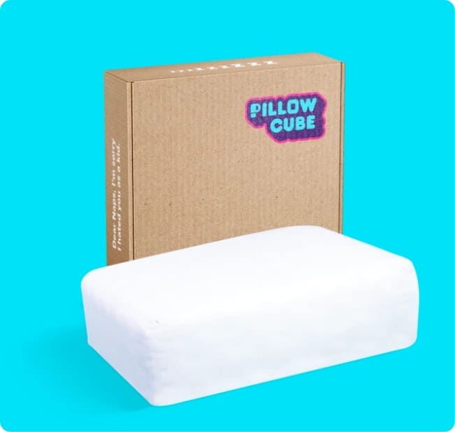
(Source)
Pillow Cube experimented with a product video that went viral. Naturally, this meant a ton of traffic to their website. So they needed to make the most of this attention.
To multiply their bestselling product page’s conversion rate, they needed to target two types of buyers:
- Who were happy to buy immediately
- Who wanted more information to be convinced
Filling the product page with copy that appealed to both audiences was one way, but it could hurt the user experience. So, they tested different objections in different locations.
- The price tag was a potential friction point. $88 is quite pricey for a pillow, so why should a customer pay? Pillow Cube added a “Quality matters” lightbox content next to the price. It addressed why the product was worth more than $88.
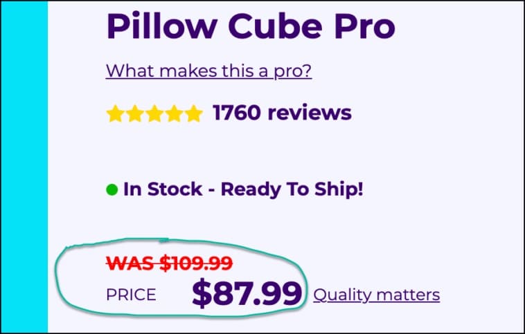
(Source)
- The product had two versions: pro and classic. Why pay for pro when there’s a classic? They added another note titled “What makes this a pro?”. This addressed the strategic difference between “classic” and “pro” skeptics.
- They also added “The Whole Story” button to their product pages. This was another way to answer more questions and prove the value of the weirdly-shaped pillows.
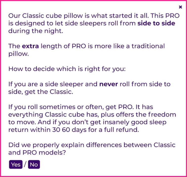
(Source)
And this worked.
After 4 weeks, 60,000 visitors, and 4,903 orders, this change produced a lift of 10.17%.
You can’t underestimate the power of leveling up with your buyers. Everyone wants their money invested the right way and has a base level of distrust for something unfamiliar on the internet. So you need to address their objections so that it doesn’t interrupt the flow of content on your page and see what happens.
4. Oransi
How much content should your Shopify product page have to get the highest conversion rate?
What if your product has a lot of technical details? What’s the best way to present it to a diverse audience (those who study every line of text and who just want to know it works)?
Oransi’s is one of the most iconic A/B/n test examples to understand how Shopify A/B testing works. For this, Frictionless Commerce created four variations. But we’ll focus on variation 4 because it has all the elements to succeed.
- The headline was rewritten for better “persuasion”.
“No other air purifier does so much, this quietly. And we’ve tested them all.”
- This is an excellent way to suggest to the reader to end their search. Instead of figuring out how to address both the diggers and the skimmers, how about letting them identify? This was done with a question:
“How much time do you have?”
Anyone who opted for “I have 2 minutes” received a short product description with the most important points. And anyone who picked “I have time” got all the details to help them make a purchase decision.
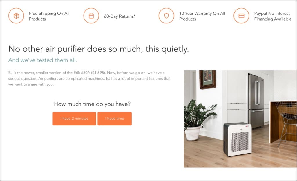
(Source)
As it turned out, this is what audiences loved.
After 4 weeks, variation 4 increased the air purifier unit sales by 30.56% at a statistical significance of 98.51%. Other variants performed well, but this was the one with the highest confidence level.
Examples of Shopify Home Page A/B Tests
Your homepage is super valuable real estate that determines whether visitors advance to your products and offers. It should be captivating and differentiating.
Here are some examples of how you can best optimize your Shopify homepage.
1. Salty Captain
Salty Captain offers salt wash, engine flushing, and boat gear in the US, Australia, and New Zealand. They had an announcements bar at the top of their Shopify stores’ homepage, but few people engaged with it.
From a UX perspective, the apparent culprit seemed to be the announcement bar color, which was too similar to the menu background color. If you think so too, you may be right. Let’s find out with this A/B testing case study by Swanky Shopify Plus Agency.
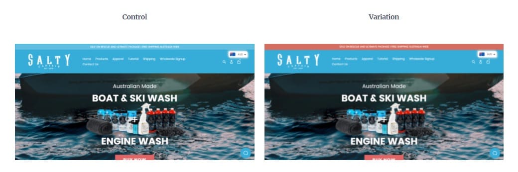
(Source)
For this test, the announcement bar color was changed to something more contrasting and aligned with the menu. This modified version showed better results than the previous one.
As more people saw the announcement bar, they became aware of deals and sales.
The variant beat the control with 234.54% more clicks on the announcement bar. And not just that, it also boosted conversion rate by 13.39% and total store revenue by 4.88%. What a big difference from a minor change!
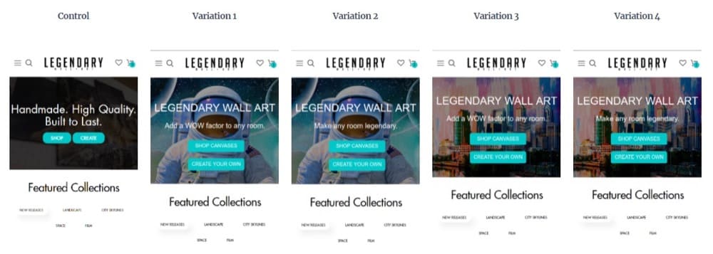
2. Legendary Wall Art
The “hero section” enables visitors to engage with the rest of your Shopify site. This drive’s effectiveness depends on how “persuasive” this area is.
For Legendary Wall Art, a company that sells custom canvases for home decoration, the hero section had one purpose:
Getting visitors to click one of two CTA buttons: “Shop” and “Create.”
Or would that be two jobs?
You have a tiny window of opportunity to grab attention. Visitors bounce off the site if it doesn’t immediately seize attention.
When Legendary Wall Art examined their heatmaps, they found not many visitors were engaging with the hero section, so they had to change it. For this, they decided to test four combinations of two different background images and two messages with multivariate testing.
One definite change they made:
The CTA buttons were now “Shop canvasses” and “Create your own”.
Source
All 4 variations performed better than the control. But variation 3 came out the winner with 325.39% more engagement with the hero section and 30.07% higher total revenue.
3. byBiehl
byBiehl uses recycled gold and silver to create feminine jewelry and sells it directly to customers through its Shopify store. Sustainable brands like byBiehl attract many of today’s conscious consumers, but this wasn’t enough appeal for this Danish jewelry company.
For one, their homepage wasn’t compelling enough for visitors to get to the category and product pages.
To figure out how to improve their homepage conversion, Ontrack Digital turned to analytics data and qualitative research.
They found that the homepage should present the products better. So they tested adding a slider section showing the most important collections.
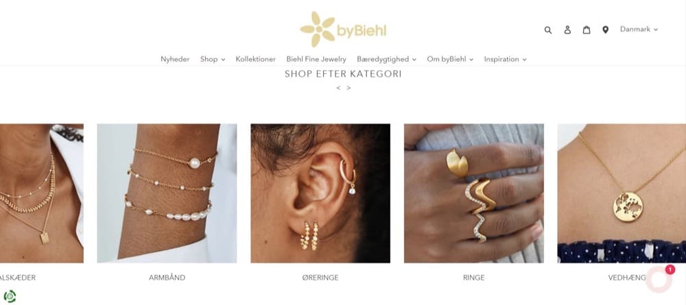
(Source)
The slider showcased the product collections and made the homepage visually appealing – especially for a brand that sells fashion accessories.
And the results showed that it converted better than the control, increasing category page visits by 5.87%, revenue per user by 3.25%, and overall conversion rate by 19.73%.
Examples of Shopify Category Page A/B Tests
Category pages are like corridors on your Shopify website that direct “searchers” to the products they want. If you have thousands of products, this page is vital to help users find their way around.
You’d want to test how effective these pages are in simplifying site navigation, among other things. Let’s look at some examples of e-commerce businesses that found success with A/B testing.
1. Copycat Fragrances
Ever considered why the story feature of social media sites performs so well? Imagine how a similar feature could affect a Shopify store?
Here’s how Copycat Fragrances’ conversion rate optimization agency, Ontrack Digital, leveraged a social media-like story feature to optimize the fragrance company’s Shopify store.
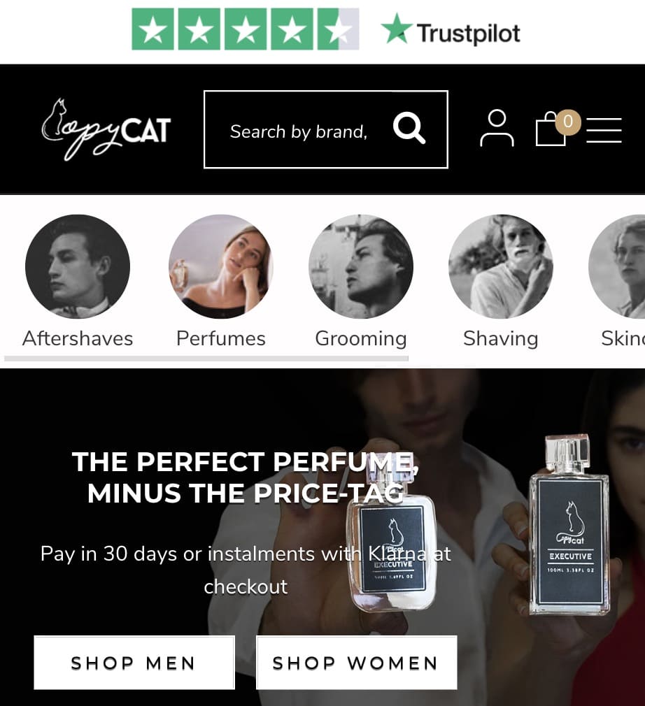
(Source)
Although the feature Ontrack Digital tested on Copycat Fragrances’ store is technically called “thumbnail navigation,” it looks a lot like Instagram Stories. Ontrack Digital directed visitors to different category pages using this feature. How did they do it?
They first started analyzing user behavior with heatmaps, session recordings, and user testing methodology. Using the insights gathered, they designed a story-like feature in a variant against the site’s original version.
The variant increased engagement with collections by 4% and increased revenue per user by 18%. It also proved that the site visitors preferred this way of exploring the collection pages.
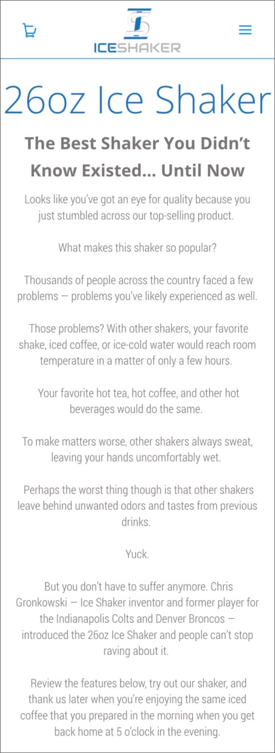
2. Iceshaker
Conversations with site visitors on your category pages can boost conversion rates. Plus, it’s an incredible way to allay concerns, show understanding, and build trust.
Ice Shaker is a popular brand that offers premium insulated drinkware as an alternative to plastic shakers. Their products are not only eco-friendly but also competitive. They even scaled up to Shark Tank and secured Mark Cuban and Alex Rodriguez investments.
Their appearance on Shark Tank dripped with confidence and competence, as promised. But when Frictionless Commerce checked out their online store, they didn’t see that confidence playing a significant role.
How could they communicate that trust online for site visitors to see reasons to buy?
For this optimization project, Frictionless Commerce focused on the mobile version of their bestselling category as it had the most web traffic. They planned to reduce incriminating content for the visitor and instead present a product story that eliminated common purchase objections.
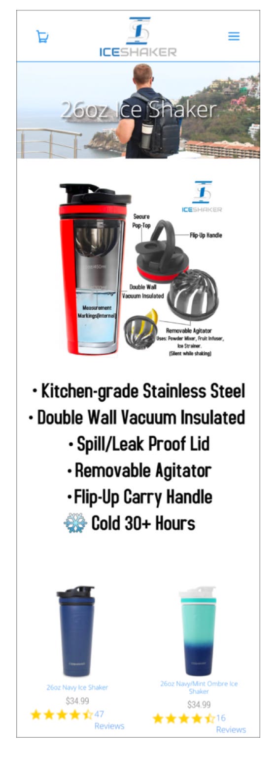
You’ll notice that the header image, infographic, and bullet points were removed in the variant. Because they didn’t add value or display well on mobile, they had to go.
Frictionless Commerce replaced all these elements with a conversion-focused product story, bullet points of product features, and slides with descriptions.
The test ran for one month, and the variant showed a 15.95% lift in conversions.
Addressing objections (or negative thoughts) helps break down barriers that would otherwise convince people not to buy. Also, remember to optimize your category pages for mobile devices to make a big difference in conversions.
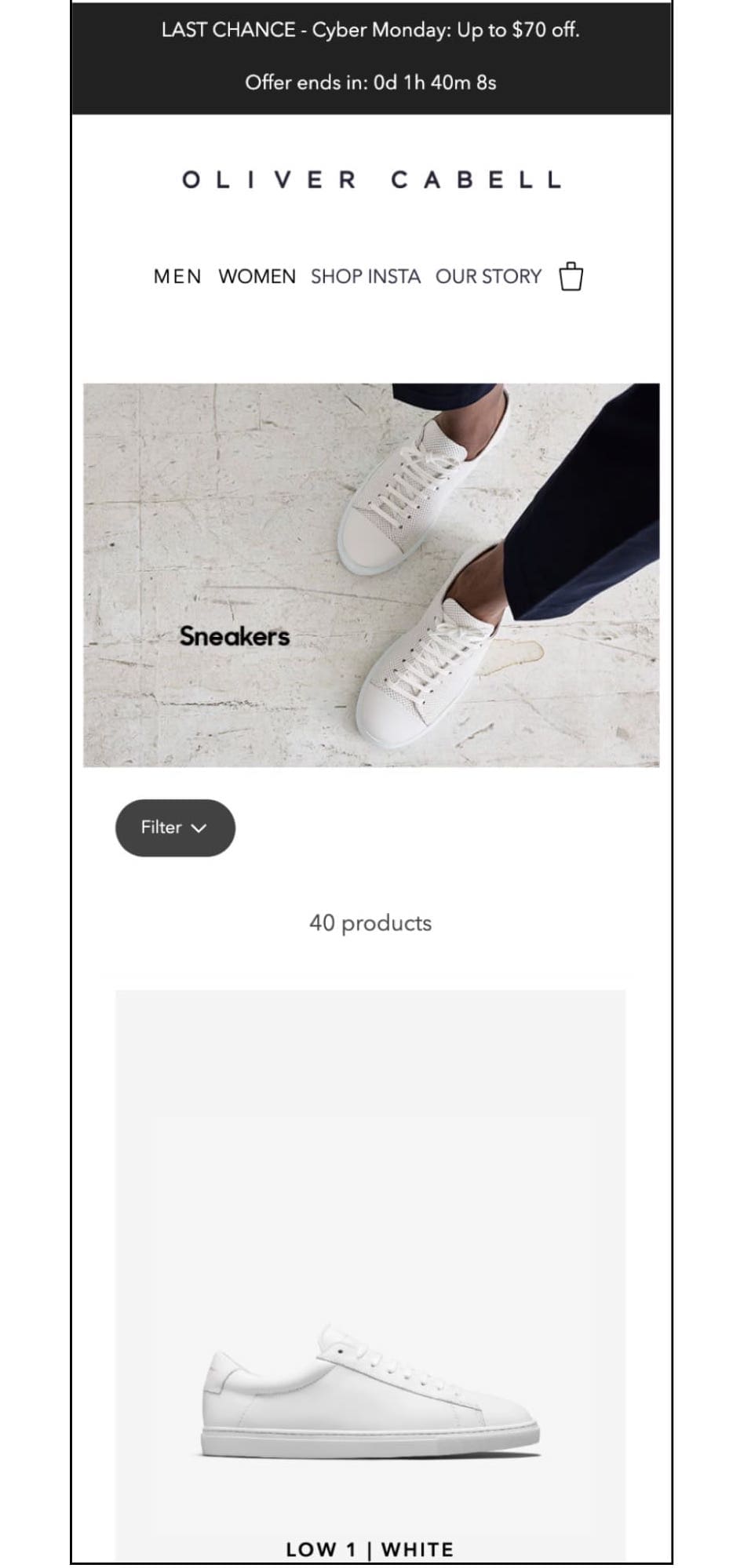
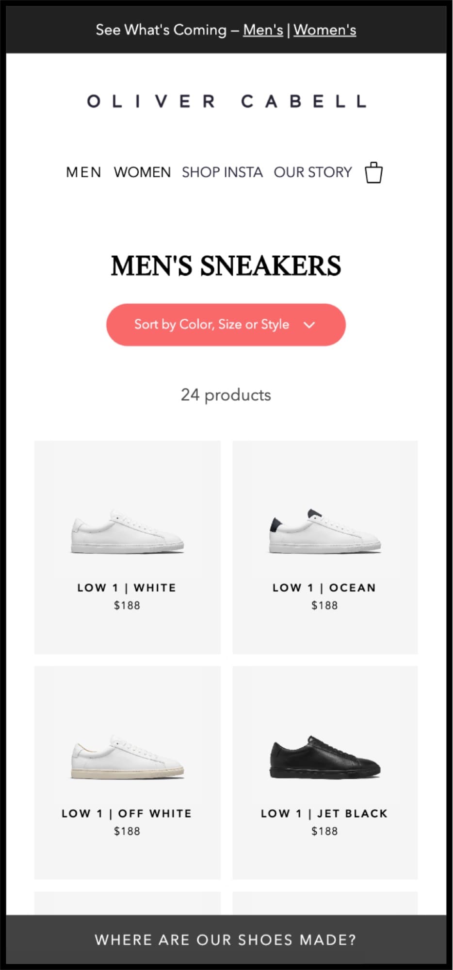
3. Oliver Cabell
A category page that does its job well directs most visitors to the desired product pages. But if the page is cluttered with non-converting elements and a hard-to-find filter, this task is difficult to accomplish.
DTC’s premium footwear brand, Oliver Cabell, wanted to improve the journey for mobile visitors through its category pages, so they tested:
- Improving filter button’s color and visibility
- Removing the header image so products were immediately visible
- Modifying the product layout to improve the page appearance
They created three variations with two key differences:
- Variations 1 and 3 had a different copy than variation 2.
- Variation 3 had a double-column layout, while 1 and 2, a single.
Variation 3 with “new copy” and “double-column layout” performed best.
In the variant, you can see a much more visible filter button, no header image, a double column, and a note at the bottom that reads “WHERE ARE OUR SHOES MADE?”.
This common objection was correctly addressed in a lightbox highlighting that pros made the shoes in Italy. A statement of quality gave extra points for transparency.
A 14.86% lift in traffic reached the product pages with 100% confidence. This also increased checkout page traffic by 5.49%.
Speaking of checkout pages…
Examples of Shopify Checkout A/B Tests
The harsh truth of the e-commerce customer journey is that many make it to the checkout page but turn back. So how do you reduce cart abandonment rates?
Here are some examples to help you understand how you can use the A/B testing process on your Shopify checkout pages to increase conversion rates and average order values (AOV).
1. Oflara
Recommendation engines that show sections like “Similar products” or “You may also like” increase average order value for e-commerce sites.
Probably worth testing these engines on your Shopify store? See if your target audience responds positively to upselling to justify implementing this feature sitewide.
But if recommendation boosts AOV, why even bother testing it? Why not implement it right away?
While such features might draw attention to lesser-known products, they can also distract visitors from higher-value products. So, even if they increase the number of orders, there could be a decrease in overall sales at the same time.
These metrics are more important than the pure conversion rate in this test. Oflara, an online fashion jewelry store, tested this with an “Add to cart” button:
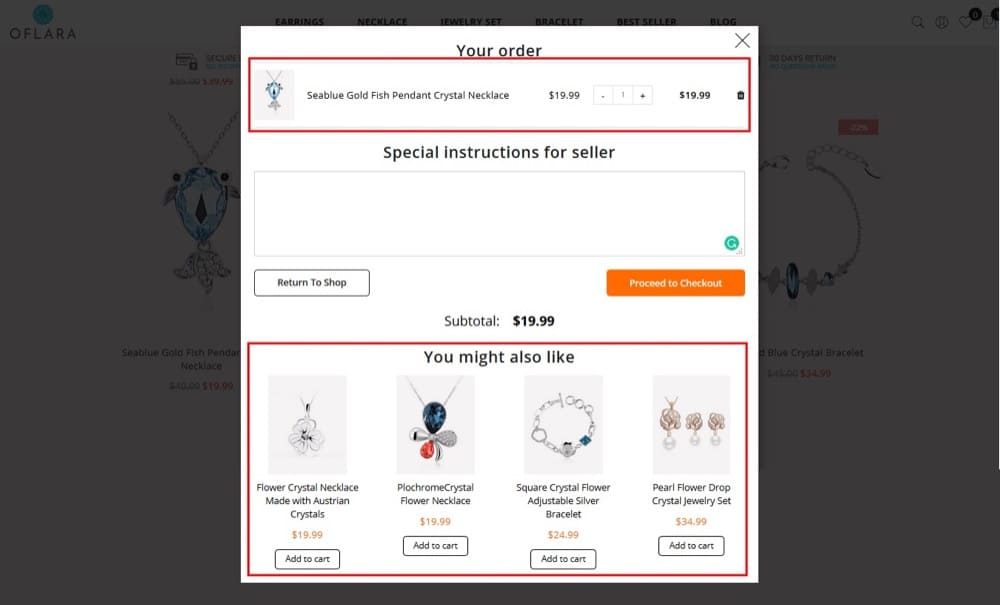
Source
The test ran for 30 days and showed a significant improvement in overall revenue.
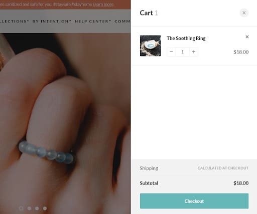
2. Conscious Items
Conscious Items sells spiritual goods for home and jewelry to enlighten the body and mind. Their visitors are primarily mobile users who like to compare products and offers.
But having to return to the cart after going elsewhere on the site created significant friction in the sales funnel. To eliminate this friction, Ontrack Digital tested a checkout process version that allowed visitors to access the shopping cart anywhere on the site.
So when visitors added an item to their cart and decided to try a different product, they didn’t abandon the cart.
This shopping cart A/B test yielded positive results and eventually came to life.
Results showed a 12% increase in revenue per user and a 10% increase in conversion rate. Also, the average number of products per visitor increased by 14.45% as the cart followed the visitors across the site.
3. Homeware Shopify Store
This example establishes why it’s important to look at your Shopify store’s qualitative and quantitative data before designing a test. Something may work for one brand but not for another because of major differences like audiences, product, and buyer behavior.
For this UK-based home goods Shopify store, data showed that most visitors only purchased one product. This insight provided an opportunity to simplify the checkout process.
They tested redirecting the users (both desktop and mobile) to the checkout page every time they clicked the “Add to cart” button.
At the end of 19 days and 98% stat sig, this redirect scaled up the conversion rate by 47.7% and revenue per visitor by 71.4% for mobile users. No increase was reported on the desktop.
When they rolled out this change for mobile users only, they saw an overall increase in conversions of 26.9%. Pretty cool, right?
A Note About Shopify Price Testing
Pricing is a tricky affair. People pay what they think your product is worth. When people agree that your product is worth the price, that’s one less friction in your sales pipeline. If they don’t agree, too many potential customers might turn away once they see the cost.
How a value is communicated and understood determines what’s considered fair pricing. If the value you communicate is significantly higher than the price you demand, you leave money on the table. And this can make any entrepreneur nervous.
But what’s even more nerve-wracking is losing customers and brand reputation when people find out you use their hard-earned money to test your ideal price. So you need to know and determine your product’s best price. The market is constantly changing, and your pricing should be too.
Now, should you A/B test your Shopify prices? Is this a sound and ethical business practice? And what’s the psychology behind price testing? Let’s dive into more details.
How Customers Honestly Feel About Paying
For most people, the least favorite part of buying is when money goes out of their wallets. This moment of exchanging money for a product is actually quite painful.
It feels great to get something nice, but usually, we have to trade the pain of paying for the pleasure of acquiring it. The product and the price determine the magnitude of these emotions. The higher the price relative to you, the more painful it is. The higher the value of the product for you, the more pleasant.
In “Neural Predictors of Purchase” by Knuston, Rick, Prelec, and Loewenstein, consumer response to this value-pleasure and payment-pain was monitored using an fMRI scanner.
Participants were shown a product and then its price. They had to press a button to determine whether or not they would buy. When the product image popped up, it activated the brain’s reward center. But when the price tag came, the area associated with physical and social pain lit up.
The more we want something, the more active the reward center is. Researchers found that participants were willing to buy when the gain of getting something outweighed the pain.
Now you can’t hook up your customers to an fMRI scanner and find your best price, but there are different ways to do it.
How to A/B Test Shopify Pricing
Ethics are crucial in testing. You don’t want to test steep prices for your product. Small changes in a positive or negative direction are okay, but for the right reasons.
Besides A/B testing the actual product price, you can try advanced pricing strategies that still indicate value customers place on your products. Some of these strategies are discussed below.
Anchoring
Your product’s value is dynamic and can be influenced. When you allow people to judge a price, the lower always seems like the better deal. As a result, two similar products with different prices can mean anchoring for the cheaper one.
The Magic of 9
It feels better to pay $49.99 than $50, even if the difference is only 1 cent. It even feels better than paying $45. According to SpringerLink, prices ending in “9” outsell lower prices for the same product. You can use the same hypotheses to set your pricing. Suppose the price is originally $25; you can test it at $29.99.
Reframing
You’re not changing the price here, just how it’s presented to visitors to see how they react. For example, you can show the shipping costs differ from the product cost in “A” and “B,” add them up and offer “free” shipping.
Getting this wrong can put customers off, so you need to be absolutely sure it’s worth the risk. Most A/B testers strongly recommend not A/B testing your prices.
And they have solid reasons too!
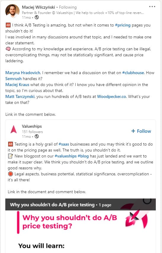
Source
Now that you know what to A/B test in your e-commerce optimization journey, let’s get the best A/B testing tool for Shopify – one that’s ideal for your current ideas.
Shopify Plus A/B Testing With Convert Experiences
Convert Experiences, one of the fastest A/B testing tools, values your time and builds on customer experience and satisfaction. It provides easy access to a Shopify store through a custom app and automates the installation process so you can avoid common testing errors.
Follow these simple steps to set up and successfully A/B test your Shopify store with Convert.
Install Convert With the Custom App
To install Convert on your Shopify store:
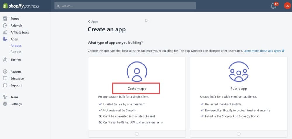
1. Go to partners.shopify.com, click “Apps” in the left panel, and click the “Create app” button.
2. On the next window, click “Custom app”.
(Explore Feature In Free Trial)
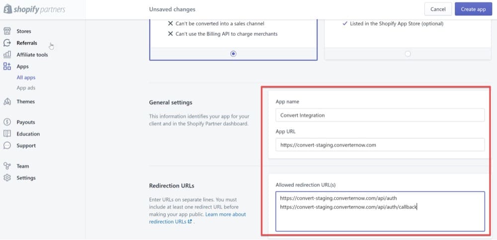
3. Once you choose the Custom app option, you need to enter some values. You can get these from the Convert Helper Tool. Enter your Shopify store name in the tool, and it’ll automatically generate the values you need to proceed, including App name, App URL, and Allowed redirection URLs.
4. Enter the values from step 3 into the Shopify Custom app window.
(Explore Feature In Free Trial)
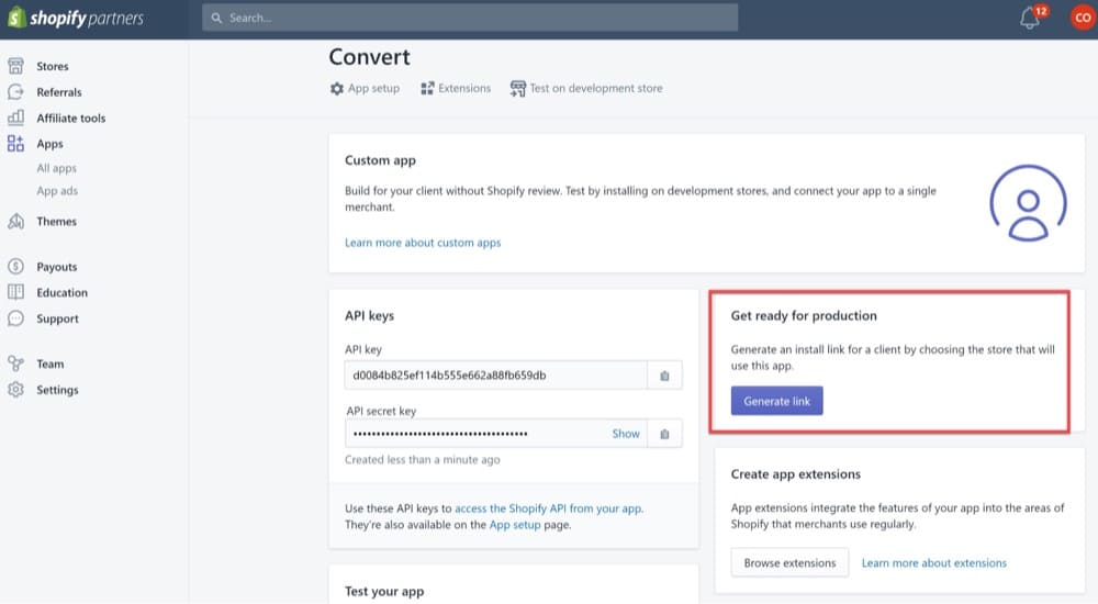
5. Once you enter the value, an app is created. It gives you API and API secret keys. Click the “Generate link” button to go to the next step.
(Explore Feature In Free Trial)
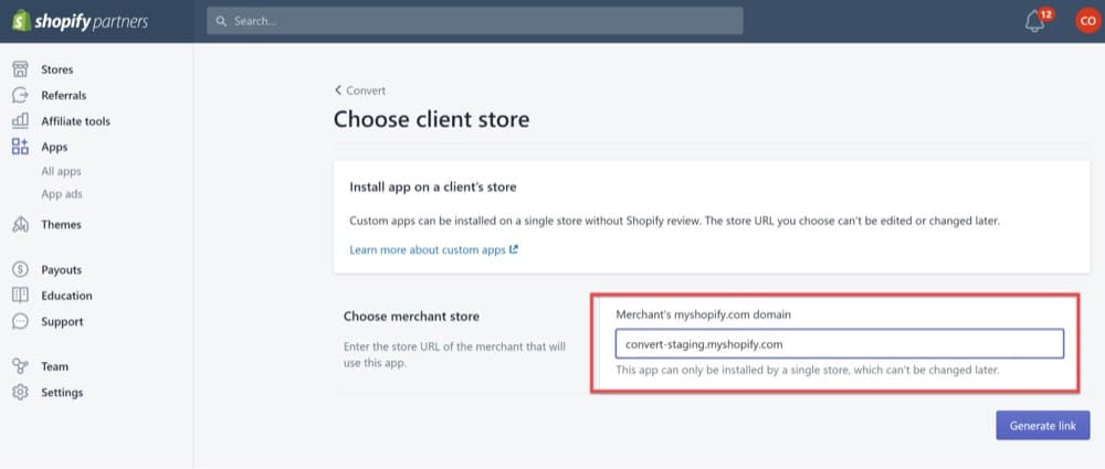
6. Enter your “myshopify store domain,” which is also available in the helper tool. Then visit the generated link to complete the installation by entering the API key and secret key.
(Explore Feature In Free Trial)
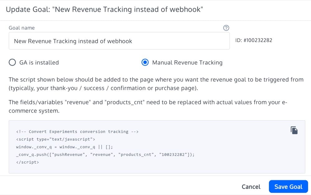
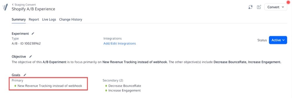
Create Your First Revenue Goal
1. Create a simple revenue goal during your initial setup. Add this to an experiment you want to run on your Shopify store.
(Explore Feature In Free Trial)
(Explore Feature In Free Trial)
2. Add the account, project, and revenue goal IDs.
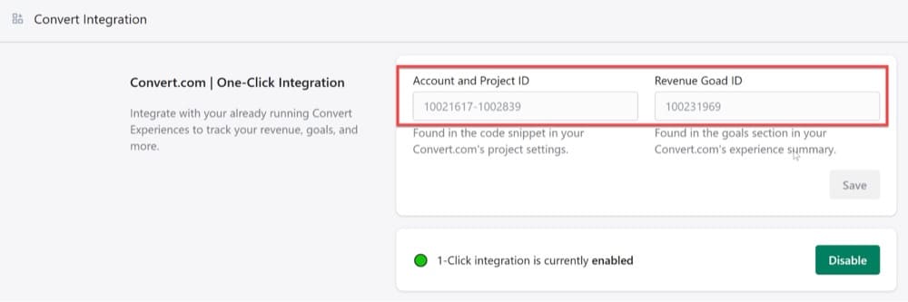
(Explore Feature In Free Trial)
All of these steps should help you design and run tests on your Shopify store with Convert Experiences. You can even start split testing your Shopify Plus theme designs to determine which theme performs better than the other.
There’s a lot more you can do with Convert Experiences.
Test Site Variations
Convert allows you to test site variations with changes inspired by one or more of the 13 examples shared above. It’s not limited to just A/B or split testing; you can easily and effectively perform multivariate testing with Convert.
Add Revenue Tracking to Shopify via Webhook
Since everything boils down to a common goal, i.e., driving more revenue, you need to make sure you’re tracking and allocating earnings correctly.
There’s always a better (and more accurate) method than tracking “thank you” pages. Shopify webhooks enable you to track sales when a visitor places an order. You can easily create a revenue goal in your Convert account and link it with your Shopify store without breaking a sweat.
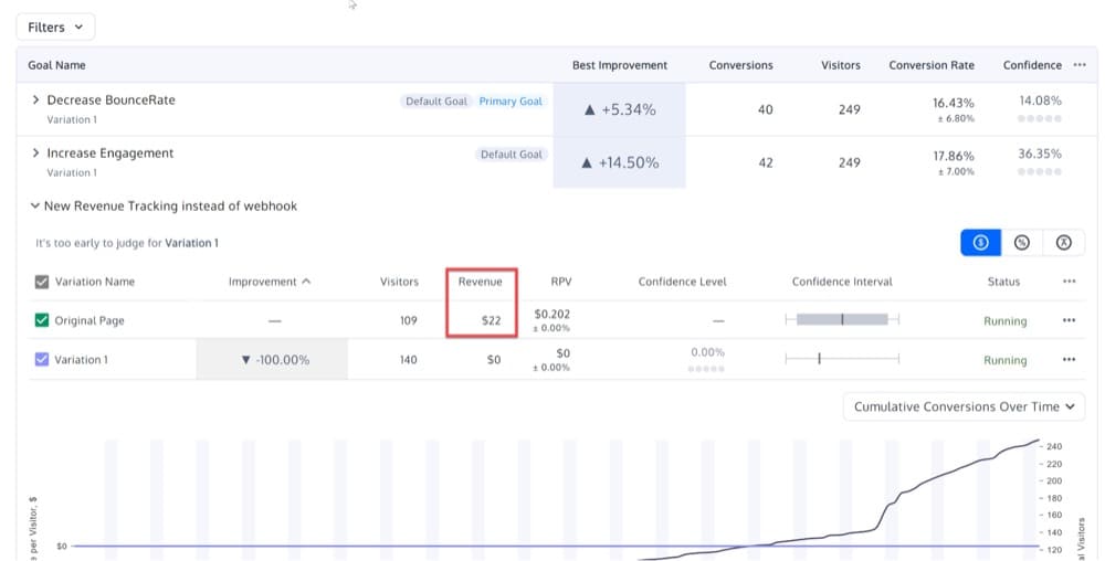
Once set up, you can start getting revenue data in your A/B testing report. This warrants your Shopify A/B testing reports accurately attribute revenue to control and variants.
(Explore Feature In Free Trial)
Test Then Use: Enjoy Convert’s Free Trial
Start optimizing your Shopify store with a 15-day no-obligation free Convert trial. Convert is easy to use, has robust code and visual editors, and even lets you debug checkout with a virtual card. It helps target specific audiences based on traffic source, average time on page, product SKU, price, product name, and 40+ other filters.
Combine this targeting flexibility with advanced goal setting, and you have the power to design complex tests for your Shopify Plus store despite its limitations.

Written By
Uwemedimo Usa

Edited By
Carmen Apostu
