Picture a grocery store’s aisles: Even if you’ve never been to this specific one before, you can almost always find your way to where the drinks are.
This isn’t only because you have the overhead aisle signs to guide you (although they play a huge role in it), but the sections and departments are organized in a way that just makes sense. Plus, it’s that same familiar grid style.
Navigation on a website, specifically the navigation on a Shopify store, follows a similar pattern. Your shoppers want to intuitively find their way to what they’re looking for with as few clicks as possible. When you get that right, your Shopify navigation is optimized for great user experience.
And since SEO is built around helping people find exactly what they intend to find, the algorithms point to stores that support wayfinding. That’s the other sweet side of a well-optimized Shopify store navigation — you rise in the search engine ranks.
But you see, it’s not always easy to optimize the navigation of a Shopify store. Grocery stores and supermarkets got their aisle layouts, product categorization, and labeling right from decades of testing. It wasn’t one person’s genius idea.
However, in this article, 18 conversion rate optimization experts share their brilliant ideas for Shopify navigation. You’ll learn what works and what doesn’t, and steps to take today to improve your Shopify stores’ organization for optimal UX and SEO.
First Things First: Bring UX and SEO Together
The most recent Google search algorithm update ranks pages “where visitors feel they’ve had a satisfying experience”. That sentence alone, from Google Search Central Blog, already ties user experience with optimizing for higher SEO ranking but let’s bring it back to Shopify navigation.
What does this look like for ecommerce sites?
According to Louis Smith, Ecommerce SEO Consultant, in a LinkedIn Post, there’s a wrong way to look at Shopify navigation that poorly matches your customer’s intent. And that’s setting it in stone — or I would say, following what most think is the norm and letting it be.
Instead…
What you need to be doing, is understanding that your customers are searching for your Shopify collections in different ways.
For example, you might sell “hoodies”, in which everything you sell gets put into a “hoodies” collection…
And wait. Then realize you’re not getting solid traction in the search engines.
Instead, break it down into sub-collections, such as:
✅ Running Hoodies
✅ Training Hoodies
✅ Crop Hoodies
✅ Men’s Hoodies
✅ Women’s Hoodies
✅ Winter Hoodies
✅ Zip Hoodies
Now we have 7x the number of traffic sources we can target 🚀
It drives me insane when brands ignore the importance of your navigation.
Build out your topical coverage, help your customers (and Google), and then reap the rewards.
For some, this is a fresh idea but it shouldn’t be if we’re all holding on to the idea that navigation has to be so organized and logical that wayfinding for web visitors is intuitive. And as long as you build your Shopify store with that in mind, you’ll want to:
Break product collections into sub-collections
Stop squeezing each and every relevant keyword or high-intent shopping query into one page
Optimize each sub-collection landing page and add traffic sources to your Shopify site
Cluster your products around various themes, which will help customers find exactly what they need, faster — probably with fewer clicks
Why go through all these when you can just add a filter widget and let customers run their search? It’s still fewer clicks, right?
While it’s easy to just add filters to an amorphously organized mega product page, you don’t want to be at the mercy of how well the filters work to return the right product(s).
Plus, how do you know web visitors always have the right words for what’s in their minds?
Alternatively, it’s possible to take this too far by creating very niche collection pages and end up with just a few products in each.
From Google’s point of view, this isn’t authoritative. And it makes for a disappointing user experience — when subcategories are used where filters would’ve been better.
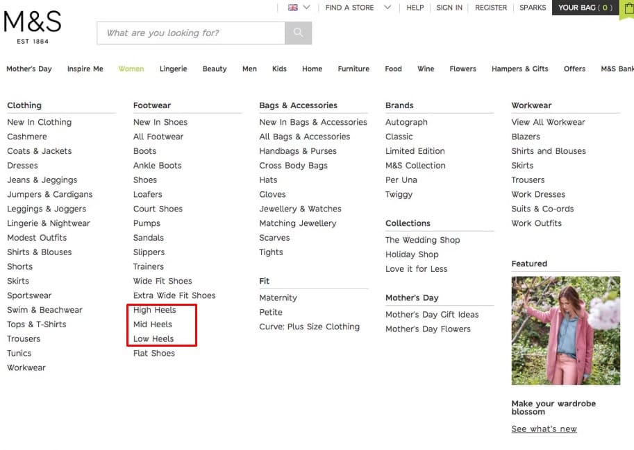
Marks & Spencer implement product types with shared attributes as separate categories (Source: Baymard Institute)
Then there is the question of how many products to load dynamically and how many to load as search results, and the impact of the choice on pages’ load times and user experience.
Another way too many products on a page ruin UX is by making visitors feel overwhelmed. But too few makes them underestimate the full range of products you have available, and they might bounce. According to Baymard Institute, 52% of desktop sites fail at walking this thin line.
What’s the ideal number to load by default? There is no set number. It varies depending on your industry, the type of products, and the browser’s device. This is an excellent opportunity for testing.
Two things are very clear from this short exercise:
There is no one size fits all solution. Your customers want to find the right product, fast. What this looks like for your industry, your products, and your Shopify theme is rooted in context and research.
You can’t get away with not thinking about and optimizing your Shopify navigation.
Your navigation takes your site structure (something backend and technical) and turns it into a marketing (SEO impact) and customer experience (CX) lever.
The following section was kindly provided by Abi Hough, an experimentation expert with 20 years of experience.
To use an analogy, navigation on any ecommerce website is not too dissimilar from planning a route when you want to get from A to B. So I think it’s helpful to think of your users as drivers, and they come in many flavors when it comes to how they navigate your website. The trick is making sure they can all accomplish what they want in the way that they want it.
The Commuter Driver
Knows exactly where they need to go. These types will probably resort to search first before a prolonged navigation traversal or are so familiar with your site they don’t need to be shown how to get to their destination. Make sure your search is good because they’ll get remarkably annoyed if they have a delay finding what they need.
The Taxi Driver
Knows how to get somewhere as they have “the knowledge” but can deal with diversions easily enough. Will probably find an alternative route if needed but efficiency is the name of the game.
The Learner Driver
Probably got very little experience or your site or what you’re offering, therefore needs concise instructions with plenty of notice and signposting so they don’t get lost or flustered.
The Tourist Driver
Happy to stop along the way and catch the sights. They are venturers and not afraid to go off the beaten path in the hope of finding a hidden gem or beauty spot. Unlikely to be a rush.
The Racing Driver
Likes it fast and precise. Quick drill downs through the category tree helps along with helpful filtering and sorting options. Not adverse to finding shortcuts or cutting corners.
The Delivery Driver
Makes many stops along the way and may not make all their drop offs by the end of the day. These peeps need to be able to pick up where they left off without having to repeat themselves.
The Test Driver
Willing to hit your navigation to the limit exploring possibilities and choices. Likely to end up with limited results on list pages due to overzealous filtering. Make sure you have alternative product options in place just in case.
The Emergency Services Driver
Concise and considered, these users know that making the right choice is critical for a good outcome. They’ll spend lots of time deliberating over categories and facets to ensure they get it right the first time.
No matter what sort of drivers you are dealing with, there are some clear common denominators that they all need to navigate how they want to, these are:
Clear signposting. Everyone needs a clue as to how to get somewhere (even if you’re familiar with the route). Signposting should also be hierarchical, much as you see on the roads for example.
Logical structure. Do you think you know your categories best? Maybe… but I’m willing to bet if you ask your users to categorize your products you’ll get a different option. Use card sorting to help define the structure of your categories so it makes sense to your users. Remember, you are not them.
Waypoints. If a user is busy navigating through your site then provide waypoints so they don’t lose their way. For example
Breadcrumbs
Pagination (yes, include this on infinite scrolls solutions too!)
Persistence. Navigation should always be available to use within the viewport of the device. Same goes for filtering options.
Consistency (particularly mobile solutions). If your user is 3 levels deep in your navigation and then opens the navigation up again, show them the navigation relevant to the level they are at as the default. Don’t just jump back to the top level options. Provide easy traversal up and down the category tree.
U-turns. If your user has navigated to a point whereby they have hit a dead end then always provide a solution for them to head back to the main road. Whether it’s possible product recommendations based on their previous behavior or some recommendations based on what other people with similar behaviors have looked at, you can always provide inspiration for them to continue their journey. Even if it’s a simple form offering an extra helping hand, it’s better than a road closed sign.
Congestion. Don’t clog up your main arterial routes with road works, diversions, cows in the road and temporary traffic lights. If there is anything a driver hates the most it’s probably all of those things. Your users are no different, they all have a destination to get to (whether it be the scenic route of a tourist or the most direct route for a commuter). What they don’t want however is a bunch of speed humps and potholes in the way. Keep your routes clear, figure out what’s causing delays and nuke the problem.
Shopify Navigation for Beginners: The Nuts & Bolts
Now that you understand the underlying user experience concepts that make for a rockstar Shopify navigation, let’s get into the mechanics of how it works.
What Is a Shopify Navigation Menu? Why Is it Important?
Navigation is how web visitors find their way around a website. There are collections of links on the navigation bar, menu, footer, and sidebar that point visitors around the website.
The central location for these links is usually the navigation bar (or “nav bar” for short). It features links to important pages on the site, kind of like the elevator of a building.
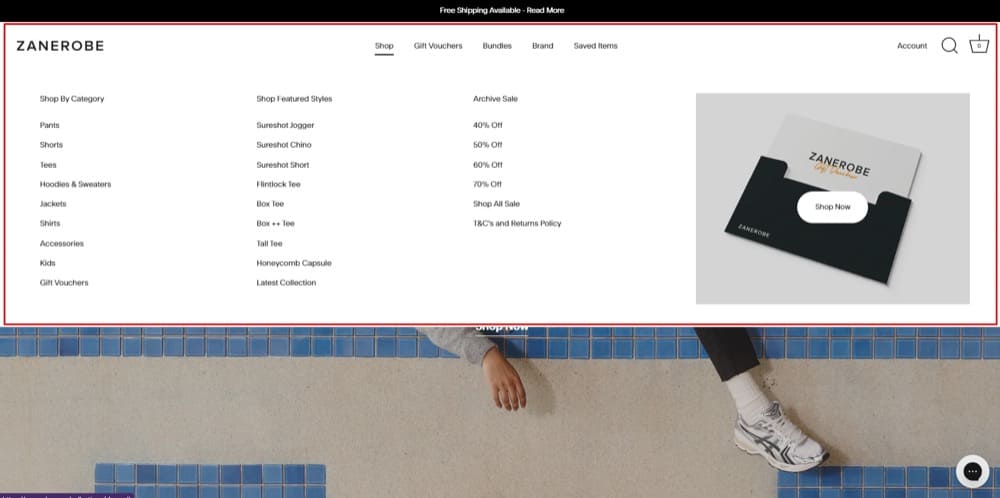
Example of a Shopify navigation menu (Source: Zanerobe)
On Shopify sites, the navigation menu is the menu that performs the function of helping visitors find their way around the site, often linking them to category pages and best sellers, featuring the search bar, providing quick access to log into accounts, etc.
The navigation menu sets the tone for the site. Smooth navigation is the first step in finding and purchasing products.
By default, Shopify gives you two menu options: The main menu at the top and the footer menu at the bottom of the page. Every single page on your online store will have these same menus at the top and bottom.
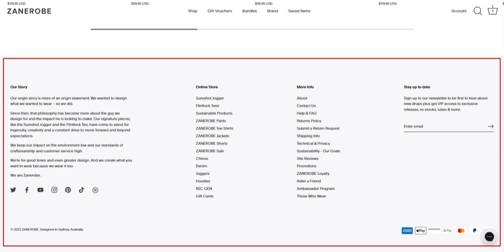
Example of a Shopify footer menu (Source: Zanerobe)
Being a Shopify Plus member gives you access to greater flexibility with how you build and customize your menus. For example, businesses with B2B/wholesale offerings can set up a unique navigation for their wholesale channel.
You also earn the ability to add custom code and scripts for unique branding and functionality. Plus, you can flex up to 100 Shopify themes at a time — that way, you can create seasonal looks for your navigation menu and store in general.
On a basic functional level, Shopify allows you to add menu items and link to additional pages besides “Home” “Our Story” “Catalog”, etc. But to do impressive conversion-friendly stuff with your navigation, like create responsive mega menus, add icons and images, and include promotional banners, you’ll have to use:
By the way, what are mega menus? While regular menus have one-dimensional layouts, mega menus are two-dimensional, which means they feature dropdowns and further expand into several more items when you hover over them.
Mega menus are a common feature in stores that have a large catalog (with categories and subcategories) and want to simplify the process of finding the right product. Without a large catalog, it doesn’t make practical sense to have a mega menu.
Also, for stores of this size, another way to smooth the process to the buyer’s desired product is using a filter so that instead of scrolling endlessly through possibly 100s of products, the buyer can narrow down their search by criteria available in filters.
Mega menus and filters are big pluses for the user experience on high catalog ecommerce sites.
Difference Between Category Page & Collection Page
Category pages and collection pages are sometimes used interchangeably but do not mean the same thing.
A category page features products similar in characteristics or classification. For example, “Shoes” are a category while “Men’s shoes” and “Women’s shoes” will be subcategories of that category. They exist mainly for logical accessibility.
Meanwhile, collection pages are curated to feature products similar in a designed attribute. For example, “Fall collection” can feature apparel commonly sold and worn during that season. “Christmas gift collection” will have products that are great gift ideas for Christmas celebrations. Collection pages are used to ease navigation.
Sometimes store owners use both at the same time and feature them on the top level navigation menu, and that’s okay. They’re appealing to different shopping intents.
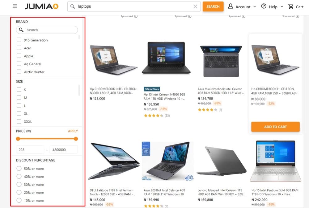
Faceted Shopify Navigation: Treat It With Respect
Faceted Shopify navigation is a helpful UX pattern that connects shoppers to the exact product they’re looking for even faster. They’re like filters.
Here’s how it works: On category pages with lots of products, products can be sorted by attributes like model, size, color, discount percentage, weight, free shipping, etc.
When the user selects one or more attributes, the page reloads with more fine-tuned results that align with that selection.
And why do you need to treat this with respect? Because it improves the user experience by a lot but at the same time, it presents some SEO risks.
For example, if the crawl bot finds various versions of your site with the same content but with multiple URLs, you’ll have duplicate content that then leads to keyword cannibalization and dilution of ranking signals.
If you use faceted navigation on your Shopify store, you have to fish for these issues and fix them. You can fix the sample issue above by using canonical tags. Learn more about faceted navigation and fixing its accompanying issues.
The State of Ecommerce Navigation
Taking a broader perspective on e-commerce navigation user experience, we see the following:
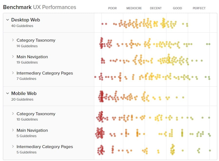
The Current State of E-Commerce Navigation UX (Source: Baymard Institute)
This scatterplot represents the results of 40 rounds of manual UX performance benchmarking of 185 top-grossing US and European ecommerce sites by Baymard Institute.
The UX performance score is assigned to each of these sites according to how good or bad of an experience a user will have based on 644 weighted ecommerce guidelines. The closer we get to green, the better the experience. The more it shifts to red, the opposite is true.
At first glance, it seems the bulk of the performance is tilted toward the bottom two-thirds of the performance graph. But on closer examination, it shows that there’s decent performance when it comes to “Category Taxonomy”. 52% of the sites performed “good” and “decent”.
The not-so-good performance in “Main Navigation” and “Intermediary Category Pages” shows that ecommerce sites have the potential to do better. In fact, in all 3 categories, Shopify store owners or other ecommerce merchants can improve their store’s performance.
Here’s how according to Baymard Institute:
Category Taxonomy: This plays out in how sites sort product types with the same attributes in different categories or when sites don’t divide categories and subcategories into manageable chunks.
It’s one thing to categorize your products according to how you see fit. But are you conducting user research to see if that’s actually how your users understand them?
Overstock and Etsy are doing a great job on this on desktop. On mobile, you’ll want to check out Build.com and H&M.
Main Navigation: A common problem is keeping the entire product catalog behind a single menu item on the nav menu. Store owners really should make product categories visible in the top level navigation. And if it’s on a mobile device, it should be the first thing you see when you open the menu.
Another UX issue found on 90% of the sites in this result is that there’s no highlight of the user’s current scope in the main navigation. The fix? Apply a different style to menu items when users are on that page so that they can always know where they are in your store.
Some great examples of main navigation implementations: Gilt, L.L. Bean, and B&H Photo on desktop, and Macy’s and GAP on mobile.
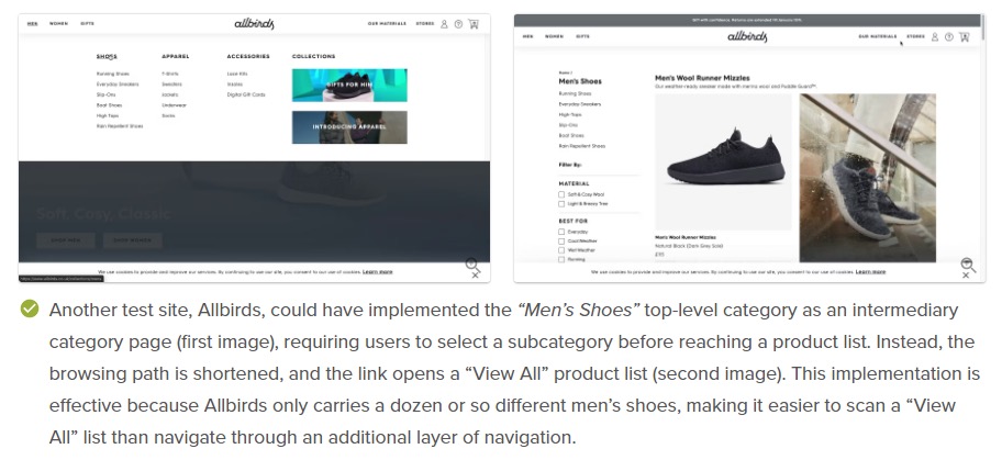
Intermediary Category Pages: There’s a bit of contention about intermediary category pages. Some are for it but some aren’t.
There’s a time and place for it, and if tests prove that it is right for your audience, you should definitely go with it. As long as you have direct access to products depicted in inspirational images.
When you use intermediary category pages, do it right with inspiration from Macy’s, HP, and Home Depot for desktop, and Argos, B&H Photo, and Sears for mobile.
Baymard Institute’s research also revealed mobile ecommerce has its usability woes plaguing it as well. There are very few ecommerce sites excelling in product finding capabilities on mobile, mobile navigation and product browsing, mobile on-site search, and mobile cross-navigation and compatibility.
But these are all solvable problems. Shopify store owners can invest in evaluating, testing, and improving these aspects of the mobile version of their stores and gain some UX advantage. Even though mobile conversion rates continue to trail behind desktop, as long as the revenue opportunities remain, they’re worth working on.
18 Experts Chime in With Shopify Navigation Optimization Advice
When it comes to optimizing your Shopify navigation, a huge emphasis is placed on how pleasurable you can make the shopping experience. In our interviews with experts, the following ten major themes emerged:
Start with User Research
Every optimization project should naturally begin with research — both qualitative and quantitative. Preferably, have a mix of both qualitative and quantitative insights to identify problem areas, just like Andra Baragan, Founder of Ontrack Digital, suggests:
If you’re feeling a bit down or not sure what to do with your time, watch at least 10-20 session recordings of one specific point in the funnel for either your website or your client’s website and I can guarantee that you’ll be busy for the next 2 hours and you’ll immediately turn that frown upside down!
While I was watching recordings for a client today, I noticed that users seemed to be a bit confused about the filtering options. They went in the same behavior pattern which delivered some poor filter results.
I went further into analytics (where we’re tracking all the filter interactions) and what do you know, you could see a clear correlation between users that were landing on a specific collection and the filters they would use. This pointed out that the shopping flow is not as intuitive as we might have thought.
Only this quick exercise gave me the needed insights for at least three new tests and suddenly things got a lot more exciting!
So, put that time to good use and identify a new problem that you can fix 🤓
PS: We have recurring tasks in Trello for session recordings analysis so that we make sure it gets done at least every 2 weeks for every client
Use segmented click maps to get a better sense of your website navigation usability. If you’re seeing certain menu items aren’t receiving enough clicks, it might be worth testing the navigation.
Use the Navigation Summary report in Google Analytics to get an idea of how the visitors are navigating through the funnel after their first interaction with your online store. This will give you ideas of what you should test to improve the user journey.
Another effective way to find optimization opportunities for Shopify navigation that (also) uncovers personalization opportunities is to track existing user behavior. Here’s how Shiva Manjunath, Senior Strategist at Speero, explains it with an example:
A key aspect of Shopify store navigation is solving the challenges your buyers face:
Think about the problem your visitor is trying to solve and make it easy for them to solve it. One simple example: by adding a “Shop by Room” section to their Shopify store navigation, V-Mat (stylish vinyl mats for your home) made the shopping process simpler and faster for their customers. This simple change is resonating with visitors as the 2nd most popular way to start their buying journey!
Because the best approach is always centered around the user.
After all, your menu should streamline the path to purchase by simplifying the customer journey, so you need to evaluate your navigation from their perspective.
I conduct many tests to complete this process, depending on specific requirements. However, one important consideration for any store is spacing. The right spacing can impact the attractiveness and usability of your navigation, especially on mobile devices that require touch input.
From the many tests I’ve carried out, I learned that the height between individual menu items should be no less than 10mm. This is because the average fingertip width is between 8-10mm, so anything lower can increase the likelihood of misclicks that hurt the user experience.
Jakub Linowski of GoodUI shared a few navigation patterns that he has seen emerge:
Visible search. Placing a search bar (with a magnifying glass icon) at the top of your Shopify store is something visitors have come to expect and can improve their experience as well as your conversion rate. You can see tests on this pattern. Source
Category images. Your product categories are like hallways in your Shopify store’s navigation. They need special attention too. There’s a question of whether you should use category images or not — a pattern that’s worth testing. Source
Single or alternative buttons. A popular conversion best practice is to have only one CTA button. It makes the process super simple for the visitor. But what if they want to do something different? Does it ruin the experience for those users if they have to dig deeper to find the button for them? That’s the idea behind this pattern. Source
Single or multiple triggers. Could you improve the user’s experience of navigating your store by providing alternate directions to go according to their search terms? Such as “people also search for” and “popular categories”? See this pattern. Source
Important point to note: This is only to inspire. Don’t blindly implement patterns on your site without testing them first.
Create a Swipe File of Filter & Navigation Examples
When inspiration is elusive, swipe files are an excellent tool for keeping it close at hand.
You’re not always going to come up with something brilliant on a blank page but when you have well-organized jpegs or pdfs of excellent Shopify store designs that caught your eye, the process is much faster.
If you don’t have any, start collecting. Keep a Google Slides file for this. One slide per screenshot of a filter or navigation example, a short description, and the source URL. You can also do this in Google Sheets, Airtable, or Notion — whatever works for you.
You can start by searching examples on Google to see what other people have collected in compilation articles or videos.
You’ll even get a peek at experts discussing their design ideas on LinkedIn and participate in the discussions.
Let Primacy & Recency Guide You
When you’re creating your navigation menu on Shopify, what do you start with and where do you end? Do you go alphabetically? Or in order of customer demand?
There are two effects to keep in mind when arranging your Shopify nav menu:
The words that you pick and the order that you put them in for the top navigation really can have a significant impact on all visitors.” – Brian Massey, The Conversion Scientist.
When it comes to the user experience or product discovery, the number of menu items in the main navigation matters, however, the order in which the menu items are placed is another extremely important factor.
Primacy effect: Menu items at the beginning of a list are more easily remembered.
Recency effect: Menu items at the end of a list (or things that just happened) are more easily remembered.
You can test placing the least important menu items in the middle of your list — think of those items that won’t hurt your bottom line if users don’t recall them easily.
Does Your Store Need Navigation Persistence?
Most Shopify stores do.
Rich Page tested a sticky filter bar on category pages to improve the user experience while browsing through products. The goal: make it easier for people to find what they are looking for.
This is how it turned out:
Most users appreciate not having to scroll back to the top to use a function like a search bar or filter — even if you have a sticky scroll back to the top button on the bottom right.
Mega Menu Is Valuable Real Estate
Mega menus are a big deal now, not just for user experience but for Shopify SEO as well. Did you know they can be valuable real estate like the above-the-fold section of your homepage?
Use mega menu navigation on your Shopify store with drop-downs for main categories, not just a ‘shop’ link. Make it even more engaging by featuring icons next to subcategory links and add relevant imagery.
Don’t cram it with lots of links. Some mega menu Shopify apps will allow you to keep it lean and simple. And you can even use the extra whitespace to feature a small banner of your best seller or a special deal.
Rich Page has compiled an E-commerce store optimization roadmap with over 75 expert recommendations and tips. Download it for free.
Don’t Neglect Breadcrumbs
As website design became more “modern”, breadcrumbs were phased out. It’s probably not true for most people, but I appreciate breadcrumbs when I find them – they make navigation easier.
While most smaller websites that go only 3 – 5 pages deep can get away with this, ecommerce sites cannot. Visitors will love to go back to a previous page without having to press the back button several times.
This can work in tandem with your other optimization strategies and make them perform even better:
We looked into the most common features customers use when navigating the site, and we’ve positioned their CTA buttons on the navigation panel for visibility and accessibility.
We’ve tested how customers interact with CTA buttons and tweaked their appearance and positioning to suit their needs better. They meshed well with a “breadcrumbs system” that indicates which section of the page they are currently on without having to click the “return to the previous page” button on their browsers.
By now, you’ve seen that a lot can happen in your Shopify store’s navigation menu. As long as things are logical and organized, you’re already doing better than the average.
But then you can take it one step further by improving focus on select items and being ultra-specific with the labels you use. The CRO experts we spoke with said these things produce great results.
See:
Our Shopify navigation optimization revolves around the menu bar, the navigational structure’s centerpiece. We limit our categories to six items and use specific names for the more familiar products. Arranging them based on importance and popularity is critical. Moreover, each option has a sub-category to narrow the list and allow shoppers to browse the list without getting overwhelmed.
Shopify’s customization options are expansive enough to cater to our needs. A dropdown menu is enough to display the most sought-after products.
I’ve run a few different A/B tests for navigation on Shopify websites. One of the most impactful tests that we have done is having a top level menu that only showcases key product categories vs a drop down menu that breaks down into product sub-categories. We find that the results vary for each website but we have seen differences of up to 30% in conversion rates.
We have also tested the use of coloured text and icons next to the most popular product categories to help them stand out from the rest of the navigation. On average, we have found this to increase conversion rates by 6%.
There are common ways to title some elements on your ecommerce website but when you can sound clearer and more specific, it could be worth it to swap out those generic terms.
Instead of generic labels like Shop, Categories, Collections in the main navigation TEST descriptive labels like Sublimation, Women’s Clothing. Descriptive labels provide more context, improve clarity and will minimize the friction in user journey.
Abdul Wahab, eCommerce CRO Specialist
Avoid Intermediary Category Pages
Whatever purpose intermediary category pages serve, research by Baymard Institute has shown that it does not justify disorienting your web visitors.
Participants of the research struggled to get an overview of the DTC site’s products whenever intermediary category pages were introduced in their journey.
In one example where the participant wondered if the disorienting page was “like an introduction page”, Baymard summarized: “For users wishing to browse available products, intermediary category pages on small catalog sites increase the number of clicks — and amount of effort — required to reach product lists.”
Avoid these and take the users to the product list in as few clicks as possible.
Are you giving products “on sale” the best spotlight they need? Are you making it easy for users, especially those actively searching for deals, the easiest navigational path to find those products?
You may be thinking: That means I should create a subcategory and add all the products “on sale” to that category. Got it! No. Baymard Institute’s research shows that that’s a mistake. You’ll silo your Shopify store visitors and it can actually be a navigational headache.
Instead, apply “On sale” or “Sales” as a filter to relevant product lists, not as a subcategory. Shoppers should be able to use your filter to search for products and apply “On sale” as an attribute. For example, “Women’s dress” of “Size 8” that are “On Sale”.
“Navigation in eCommerce these days can be quite complicated once you start selling 5 or more products.
The need for categorizing these products can start to get tricky and what I see mostly is that brands are copying each other and not paying too much attention to whether or not their navigation is easy for the end customer to use.
Here are my top 3 Dos and Don’ts for Shopify navigation…
The Dos
Keep navigation simple, especially on mobile. It’s best to use category filters on your collections page and let the customer discover what they are looking for on these pages.
Be selective about the titles of your main navigation links. Be sure that the titles are descriptive to what you are selling. For example if you’re selling knives, instead of labeling your link as “Shop” you can use “Shop Knives”. What this does is give new customers visiting your site for the first time a hint at what you sell by quickly scanning the page.
Include subtle animations whenever possible. This adds delight to you customers and, when done well, a level of polish that your competitors are almost never doing. Take a look at this Public Rec example of a great use of subtle animation on mobile.
The Don’ts
Don’t have more than 7 links shown at a time. This goes for your main navigation and any drop down navigation. I understand that the norm is to pack as many links under a menu as possible but all this does is make the customer stop in [their] tracks to find the link they’re looking for every time they use the drop down. Hick’s Law states that “the larger the number of choices a person is presented with, the longer the person will take to reach a decision”. We have to take this into consideration every time we add more and more links to our navigation menus.
Don’t use more than 1 layer of drop-down menus. If you find yourself adding a 3rd layer of menus then you should stop and find a way to better utilize filters on the collections page or integrate those links into the main or the secondary menu layer. Remember, simplicity is the key here.
Don’t add administrative links to the top navigation. Links like Contact, FAQ, Locations, etc. should not be found in your main top-level navigation. Instead, include those links in the footer.”
More Shopify Navigation Test Ideas & Case Studies
When we asked our Shopify Conversion Rate Optimization experts what specific navigation tests stood out to them, they gave us a ton of ideas.
But before we get into the rest, here’s a brief primer on what you should know about testing and optimizing your Shopify navigation menu from an experienced VP of Growth:
If you’ve had some doubts whether your website’s navigation is working for your visitors, it’s crucial to conduct user research before it impacts the overall user experience and ultimately revenue. Once you’ve collected research-driven hypotheses about your users, we recommend key types of navigation and metrics be tested and tracked.
Here are the 4 types of navigation tests:
Categorization: Consider the top-level categories your users use to think about your site. This could even include removing or re-categorizing items.
Information Architecture: Once you have collected data on how users interact with the navigation items, consider organizing them to maximize clicks. This will help them reach their goal faster.
Search Bar: Collect data from users to help add, remove or even create new categories as mentioned previously. This feature is more of an optimization tactic, but it’s an important one.
Layout and Components: Think about what’s the most intuitive way for users to understand and interact with your navigation. Don’t make them guess—add photos or descriptions.
Here are 5 metrics for measuring the navigation experience:
If you have a diverse product portfolio, your navigation will take up a slightly different role than that of a store that sells only a handful of products. It’ll have to work harder and do a better job at helping shoppers find the right product. Here’s what this means in practice:
“Research: Identify by what criteria your customers in the wild are discovering products. E.g. what categories do they evaluate, then use them in your navigation.
Add value in your navigation, if you’re offering subscription products, then try adding a category that shows all of them.
Search: Especially with large product ranges site. Search is a very important means of navigation, use it. If you’re using native Shopify search, check out all the search terms that delivered no results and improve product discovery.
Navigation is not just for product discovery, but also useful for people to learn more about your brand or access other services like support that you might offer.”
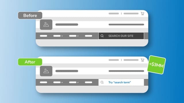
Now here’s a brilliant navigation menu case study from the amazing team at The Good:
Our team has run lots of Shopify navigation tests.
Here is an insightful one that tested how to optimize search in the navigation and resulted in over $3MM in revenue gains for the client.
Process: User testing and session recordings showed users primarily navigating via search or engaging with only select menu categories.
Hypothesis: Adding friendly microcopy and enhancing search bar visibility will encourage the use of search and increase transactions.
Results: Exposing search with a white background and adding friendly microcopy, showed a significant lift over the control. We expect the variant to produce a revenue increase of over $3MM.
Natalie Thomas, Director of CRO and UX Strategy at The Good
That was one idea. How about 7 more?
If you’re like most Shopify store owners, you’ve probably run a few A/B tests to test different versions of your store’s navigation. But what are some other A/B tests you can run on your store?
1. Change the order of your navigation menus.
2. Add more sub-navigation menus to help users find what they’re looking for faster.
3. Alter the structure of your menus to see how different configurations affect site speed and usability.
4. Test different pop-ups or alerts that might be triggered when a user clicks on a menu item.
5. Compare the effectiveness of different call-to-action buttons (CTAs) in terms of converting traffic into leads or sales.
6. Test different text and imagery for your CTA buttons, and see which ones work best for your business goals.
7. Compare the results of running variations of your store’s banner and header images, as well as changes to your site’s overall layout and design.
Finally, when we asked CRO Expert Abdul Wahab which Shopify navigation tests stood out for him, he gave us 3 which highlight more friction points in the user experience and how you can experiment solutions:
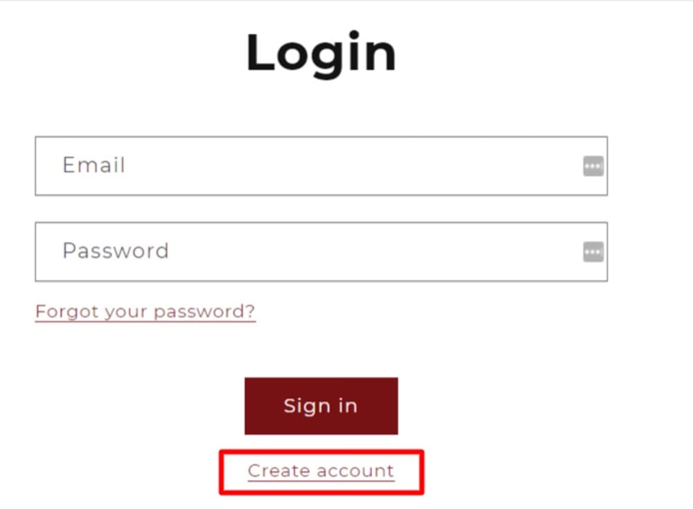
Instead of having a single option for account in the navigation, create two separate options of Register/Login which redirect the visitor to the respective page. (This is extremely important if your website is subscription or membership based).
I’ve viewed tons of user session recordings where a lot of the new website visitors would click on the Account menu item which by default redirects the visitor to the Login page instead of the Register page.
There’s no other way to reach the Register page unless you click on a tiny clickable link “Create account” available ONLY on the Login page. This is a HUGE friction.
It’s a best practice to have Best Sellers as top level navigation menu. Based on your website traffic intent, Best Sellers might not be as relevant as “New Arrivals” or “Clearance”. Split test the presence of these key menu items to see which category has a maximum impact on your bottom line.
If you’re getting tons of customer support queries about “Where is my order?” or “When I’ll get my order” split test “Track Order” as a navigation item in the main menu to see it’s impact on the customer support queries.
Remove social icons from the main navigation as they’re a distraction in the customer journey. Simply add the social icons in the footer.
Abdul Wahab
Conclusion
Navigation menus on your Shopify stores are like elevators. They set the tone for site navigation and help your visitors find the products they want and proceed to buy them.
If navigation menus aren’t functioning as intended, they can ruin the shopping experience for the visitor. On the other hand, if they’re properly optimized, the user experience quality they add will be so good that it’ll reflect in your conversion rates, average order value, and revenue.
To optimize yours, first assimilate the ideas in this article and then begin researching your store. Find problems, they’re opportunities. Turn their solutions to hypotheses and test them.