Can optimizing your Shopify images really result in millions in revenue?
Think about the last time you went shopping for shoes. You picked up an amazing pair to complete your outfit. You touched it to feel the texture, you examined the sole to see how much traction you’d get, and you sniffed it to make certain it’s got that new kicks smell.
You’re using all your senses (except taste, I hope) to assess the shoe. That shoe has to be worth the money you’re paying for it. However, the biggest inspiration to pull your wallet out is when you try it on — for looks and comfort.
Your eyes play the biggest role here. From what you see, you assess whether the product solves your problem.
What does this say about you? You’re like 93% of consumers who consider visual appearance to be the key deciding factor in a purchase decision.
Now, when you’re shopping online or in a virtual setting, you can’t touch or try the objects you buy. You have to rely on images to pull the trigger.
This is the same for the shoppers who visit your Shopify store.
But there’s a problem… Relying on images this way creates a gap. A gap that adds a level of anxiety and eats away at the motivation to take action.
This “thought tool” is a product of years of testing and research, that helps you focus changes to areas on your web pages that can directly improve the probability of conversion.
Here’s what it means:
● C = the probability of conversion
● m = the motivation of the user
● v = the clarity of the value proposition
● i = the incentive to take action
● f = the friction elements of the process
● a = the anxiety about entering information
Back to the motivation to buy: This heuristic shows that motivation carries some major weight in improving the quality of conversion.
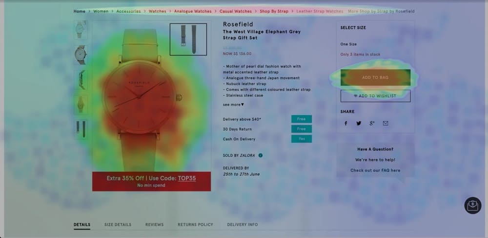
In your Shopify store, people are mostly motivated by the visual elements of your product page. Take a look at this heatmap that highlights where shoppers spent their attention:
Yes, incentives (such as discounts), great product descriptions (clarity of the value proposition), and trust signals (to ease anxiety) really make a difference, but motivation carries the biggest weight (multiplied by 4).
In fact, images are the most robust medium of storytelling that brands have at their disposal. Albeit underrated.
But when you search for “how to optimize images for Shopify”, almost every result that’s returned goes into all the ways you can compress images, choose the right image formats, and boost Shopify image SEO juice.
Shopify image optimization should not be restricted to compressing visuals, and debating about the right image format for easy rendering. PDPs call for a strategic approach to image placement. Images should amplify and supplement copy, and vice versa.
In this guide, we will cover both the strategic and tactical aspects of Shopify image optimization with the help of seasoned CRO experts, Shopify merchants, and marketers.
Reframe: Product Images Are a Funnel Too
According to Lorenzo Carreri, who brought this up on LinkedIn, product images on a product details page (PDP) are like a funnel.
It matters a whole lot, the order in which your product images appear. This is a core aspect of image optimization for Shopify stores.
Adding multiple high definition images from various angles and in different contexts might seem like 100% mission accomplished. But that shouldn’t be the end of your task, especially if you want those pictures to play their full role in motivating shoppers to buy.
100% of your visitors will see the first image in the slide, carousel, gallery, etc. But a fewer number will check out image no. 2. Even fewer will view image 3, and so on.
Doesn’t it make sense to put your most relevant image in position one? If the most relevant image is a model wearing the garment you’re selling or your product featured in your best-selling use case, why not make that the first image?
💡 Conversion idea: Test using different product images in product one of your carousel to see how well they influence clicks on the “Add to cart” button.
If your bestselling picture is tucked away at the bottom, you’re missing out on conversions. You want potential customers to visualize how your product meets their needs as soon as possible, which increases the likelihood of a sale.
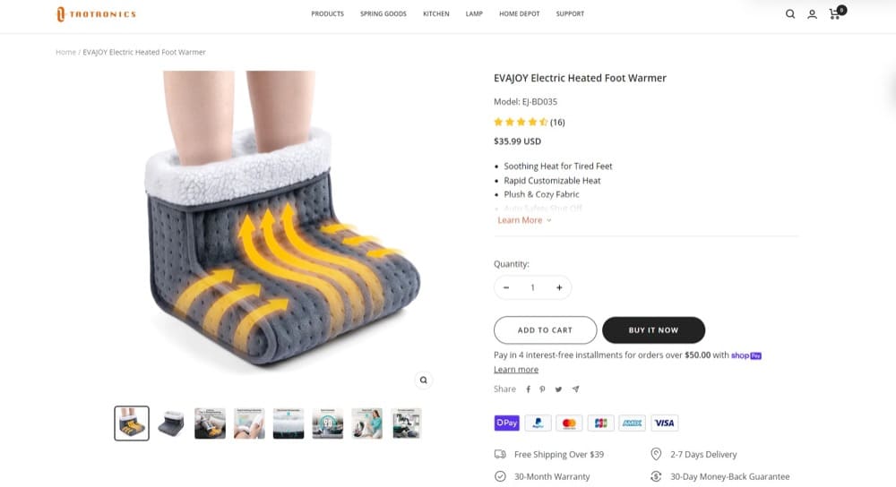
I feel my feet warming up just by looking at the first image on this PDP (Source: Taotronics)
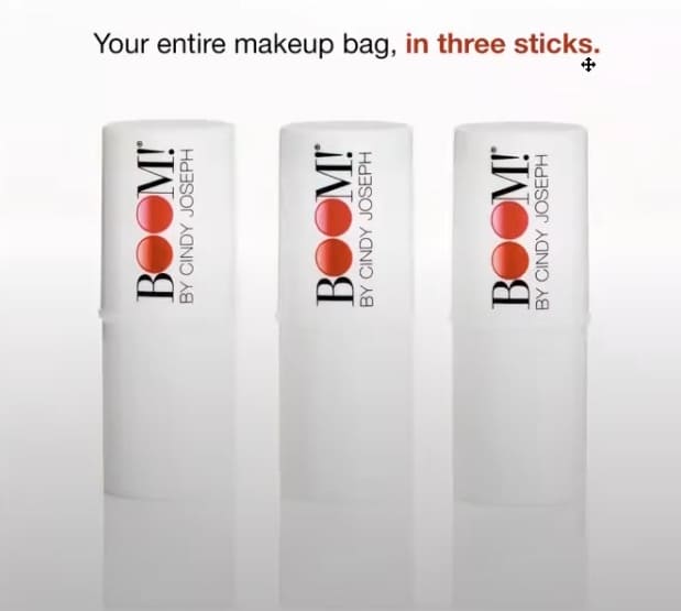
Lorenzo also talks about images acting as funnels with Rishi Rawat in Ep #4 of How Shoppers Think — while tearing down the BOOM! PDPs.
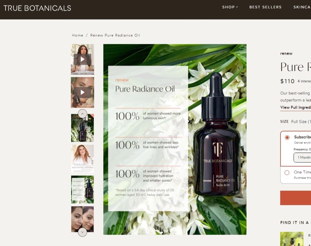
In their insights-rich conversation, they emphasized how motivating and anxiety-alleviating product images can be, when used right. For example, since most people pay attention to images vs products descriptions, you can create image stories. This is where you feature key highlights from your copy on the images (as opposed to plain products shots).
Put these in a story-like order and you’ve got a charming gallery.
Now, imagine this gallery also shows the transformational effect of your product — sort of a before and after story. You’ll have a powerful funnel right where your customers are spending the bulk of their attention.
Sliders also contain images. We’ve compiled a guide to optimize your store sliders for better results. READ HERE
Images & Emotions: Which Visuals Spark Feelings & Why?
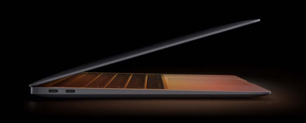
You could look at the latest MacBook on a random desk and think, “That’s just a MacBook”.
Another example: Think about your throwback pictures. If we could digitize emotions, your 15 KB high school graduation picture taken on a Nokia could contain over 17 TB of vivid stories, emotions of nostalgia, and the sadness of leaving your friends — all saved in your head.
Images and emotions are interrelated. You cannot leave out the emotional substance of your Shopify product images and call it optimized.
You can use PDP images to evoke curiosity, thereby creating a knowledge gap that the visitor needs to bridge.
This pushes attention to the conversion-ready information on your page, allowing your sales pitch to do its job.
As Will Laurenson elaborates with the help of a plethora of first-hand tests:
Imagery is one of, if not the most important asset on the Product Page.
Pretty much whatever your product is, your customer wants to see the picture first, make sure it looks like the thing they want, and then they start looking for the detail.
Check heatmaps for any product page and the hottest sections will always be around the image gallery, this is where your customers attention is so why not make the most of that?
Couple that with the fact that most PDPs see a good 25-50% drop off in scroll rate below the fold.
It’s my belief that images need to do more than just be aesthetic on the page. They need to provide information, answer customer questions and really do the hard work.
I’ve run several tests recently with product galleries and in each case we’ve found that customers specifically click on images in the gallery that are annotated, because they want that information (although it’s worth noting that as the hero image is normally plain, it’s rare that it gets clicks because it’s the first thing they see, not because its not valuable).
Installation guides for lighting improved conversion rate.
A graphic showing that an orthopedic pillow was suitable for side and back sleepers improved conversion.
An image for a reusable water bottle that explained how it opens, how long it keeps drinks cold, and that its dishwasher safe improved conversion.
If you’re not taking the opportunity to put these key sales messages on your images, in the highest engagement area of the PDP, you’re missing out.
That said, what are some excellent stories you can tell with your Shopify images?
1. Lifestyle Shots
Lifestyle shots showcase your product being used in a real-life scenario or context. This is an upgrade from the plain white background or studio setting.
When used for Shopify product images, this type of product photography helps your shoppers see how your products fit into their lives, and can be really engaging.
If you’re selling a backpack, show a picture of someone hiking in the mountains wearing that backpack. Selling a gaming laptop? Show someone having an absolute blast playing a game on that laptop.
People will imagine themselves in a similar scenario, placing your product in a “buying” context. And soon enough, it will be in their hands right after they place that order.
Product-in-use: One thing I also noticed is that visitors can often be responsive to images that depict people using the products or services. I suspect this is because that type of image provides a more personal “real-life” perspective as compared to “sterile” product images on a white background. It seems that such photos can help customers visualize how a product will fit into their lives. Keep in mind, though, that stimulating visitors to visualize using your product doesn’t always seem to have the desired effect. (Source)
However, we love playing the Devil’s advocate. Hence, here is some food for thought by Chris Marsh:
If your main image is a lifestyle shot of the product in use, then it may be unclear exactly what the product is. Instead, test showing the product on its own first, before a lifestyle shot.
We aren’t trying to confuse you. Just showing you that different experimenters and professionals come at optimizing from different angles.
The more hypotheses you will generate and test, the better you’ll get at finding winners.
2. Benefit Shots
While lifestyle shots are great at giving buyers more context, benefit shots take it one step further. They help your prospects see what life will look like when the bleeding neck problem your product tackles is well and truly eliminated.
Show your products in action and link them directly to the transformation your shoppers are looking for. For example, if you’re selling a kitchen gadget that saves time, show the product in use and highlight the time saved.
Benefit shots are particularly effective for products that have complex features or benefits that aren’t immediately obvious from just looking at the product. That’s why you can also try showing different use cases for your product.
One thing to keep in mind here: Ensure the focus remains on the product and its benefits. Don’t get too creative and try to jam too many benefits in one pic. One benefit per product image is a way to maintain emphasis without overwhelming your customers.
Wondering what benefits and USPs you should focus on? Your selling angles are literal gold. Get them right with this deep dive resource where we bring together 150 years of copy and optimization experience. READ HERE
3. Showman Shots
I loved the movie The Greatest Showman. PT Barnum was one heck of a businessman. Even though his integrity may have been questionable.
While we won’t ask you to be all smoke and mirrors with your product claims (clarity is always the queen, with trust, they go hand in hand), you can use images and visuals as the modern day equivalent of the PT Barnum’s Museum of Wonders.
Take a chapter out of Blendtec’s Will It Blend series. It was not only an oddity—no other brand was blending items you don’t see in smoothies—it was also an amazing testament to the motor’s power and the blade’s durability.
This dude in this Bettr.co ad I like ate the product he’s advertising to prove it’s safe and organic:
Not saying you have to do that but gestures that show faith in your product are quite powerful.
There are more sober and simple ways to use this ploy in your visuals. Isolate the most interesting claim you can make about your product, and visualize it. You can translate qualities like “strength”, “durability”, “freshness” through concepts and visuals.
If you have decent product-market fit, you will automatically receive user images tagged with reviews. Include the best ones in your image carousel on the PDP.
Mark these out as User Generated Content (UGC). Your buyers will love the authenticity. And if you find that elusive fan who has a ton of experience buying your product, or similar products, seek them out and incentivize them for a genuine video testimonial.
The ROI should be phenomenal.
UGC as product images doubles as social proof, which is even more powerful because it’s now located where the bulk of the buying intent attention is — your product images carousel.
Referring to Theo and his take on user generated content:
In December 2020 Bazaarvoice conducted a survey using a large international panel. It revealed that nearly two-thirds (62%) of consumers said they were more likely to buy a product if they were able to view customer photos and videos (Source). So, in addition to showing professional, high-quality photos yourself, allowing customers to add photos themselves (usually as part of a product review) can provide an additional boost in conversion rate.
Theo van der Zee
Side note: Obtain permission from customers before using their photos on your website or other marketing materials. Ensure the photos comply with any relevant laws or regulations. Let’s focus on making money, not settling lawsuits.
Theo also expands upon how brands can choose relevant images. Ideally, you should procure each type of visual discussed in this blog.
Relevance: Images are an essential part of any product detail page because they allow websites to showcase the features and benefits of a product visually. They can make a product feel more real and tangible for customers, compared to just reading textual descriptions about them. Images can also be used to communicate important information about a product (such as its size, color, and features). This can help users make informed decisions about whether the product is right for them in a way they can’t do without seeing the product visually. These aspects of images likely contribute to over 85% of online shoppers from the US selecting “Clear product images” as the most important aspect of a great shopping experience in a 2018 survey (Source).
Choosing images: Concerning choosing which images to show, it’s important to take a look at your customers’ behavior to see what types of images they seem to engage with most. For example, if they’re likely to scroll past images quickly or not click on them, you may want to reconsider using a different style or size of images on your product pages. Also, I recommend looking for inspiration from other successful businesses in your niche to see what they are doing (but make sure you A/B test those ideas first before implementing them on your website).
Theo van der Zee
In his inimitable style, Rishi Rawat weaves a lot of the elements we have touched on into what he calls Picture Stories.
You know how a disproportionate amount of attention goes to the product images? This is a problem for most Shopify marketers who put all the conversion-driving words in the product description. This could mean a lot of your page visitors miss out on your perfectly crafted sales pitch.
Picture stories combat this. They highlight your most important selling angles while giving visitors a visual representation of your product. This brings more visibility to your sales pitch that could’ve been missed in the product description.
Rishi’s picture story example on a BOOM! product page (Source: How Shoppers Think)
They’re like magazine ads that use images to tell a story and showcase a product.
It is critical that you design picture stories to enhance (or complement) the images rather than compete with them.
PDP Image Size, Number & Placement
The content and intent of an image are important. Equally important is where you place these images.
Often the general trend of the number and placement of images, especially for category pages, can be scraped from the big boys and girls — the retail giants.
Jakub Linowski creates stellar meta-analysis content around this, doing the heavy lifting of identifying and finessing patterns for you. So go give him a follow:
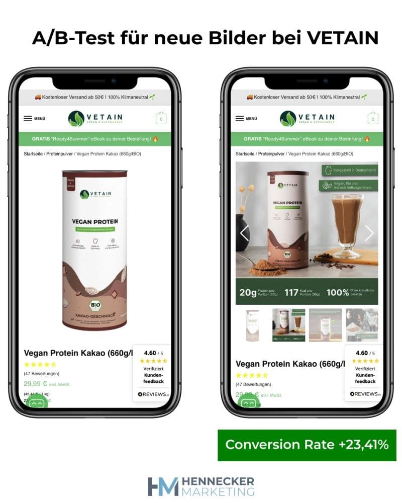
The more the merrier? We asked Marven Hennecker, and he added evidence to the pattern above:
These new images have increased the conversion rate of VETAIN by 23%…
Sounds like a lot? But that’s the way it is.
Already a few weeks ago I reported here on LinkedIn about the test at Vetain.
In collaboration with Elia, Luca and Philipp wanted to find out what potential new, informative product images have.
For this we have set up an A/B test.
Previously, there was only a single picture of the can.
Now there are 6.
With information on: the ingredients, the production, the climate-neutral shipping and the enthusiastic customer reviews.
I’m always happy to see how good the results can be with a single A/B test.
Jonny Longden also shares unique and often puzzling test results in his newsletter “Test Everything”. This is one particular instance of image curation that can inspire you to go ahead and cherry pick the visuals that make the most impact, instead of giving in to the LISH (Length Is Strength) heuristic and dumping the entire camera roll on your buyer.
Yeah, a no-brainer. But it is always nice to have some A/B testing validation to sprinkle on top.
This is echoed by Chris Marsh:
Make sure there’s an easy to use image zoom functionality and high quality images once zoomed in. This sounds obvious, but this important aspect can get overlooked by some brands.
Consider the optimal image size for your product type. Visual products may require a larger image size. On the flip side, for spec based products you could test a 1:1 image ratio – as this minimizes the vertical space used, and brings the add to cart higher up.
Chris Marsh
He also goes on to suggest layering images with relevant meta-data to up the ante.
If your product has won an award, be sure to showcase it clearly in the first product image.
If you haven’t won any awards, apply for some! Showing an award badge is a great way to signify authority and social proof, two of Dr Robert Cialdini’s six principles of persuasion.
If you have supporting text on the image (like highlighting a feature or benefit), ensure the text is large enough to be easily legible, e.g. matching 12px or ideally 14px font size.
Chris Marsh
This is something ace optimizer Joshua of Test Triggers also re-iterates:
Without a doubt, the image gallery on your product page is the most under-optimized section of your online store. I encourage you to look at a heatmap of your top product page and notice how many taps and clicks the image gallery gets. And yet, most image galleries are just a photo of your product at a few different angles. Here are a few things for you to add to your images and boost conversion rates:
Add testimonials to the bottom third of images
Have an “annotated” image that points to the top benefits of your product
Show photos of your product in action
Place badges like “10 year warranty” or “Oprah’s Favorite Things” on photos
Make some of these changes and watch the improvements.
Remember though… you should ideally test everything on your site to see what works!
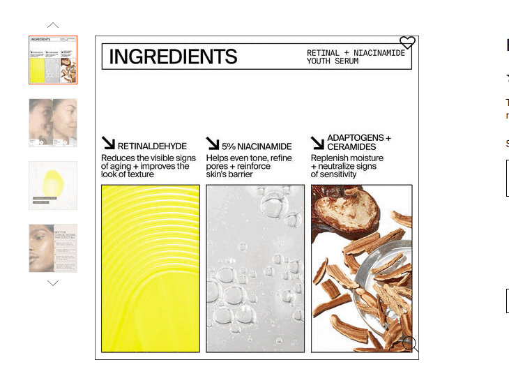
Infographics Can Be Called Into Action
We’ve already gone through the fact that most of the attention on your Shopify product pages goes to your images. Meanwhile, you have a ton of copywriting that can convert your traffic sitting in the product descriptions and other sections below the fold.
It seems people are not interested in reading those. So, what are you going to do? Force people to read? You can’t do that. Be content with your conversion rate? The fact that you’re learning how to optimize your Shopify store means that’s not an option.
What about making your key content much more visible?
That’s where infographics come in. Infographics make reading and consuming stats and ideas more fun, but we seem to have abandoned them in 2018.
With infographics, you can curate your product information and explain them in beautiful graphics. Add this to your product photo gallery to leverage people’s love for pictures to highlight the value of your product.
You can’t change user preferences. You can only adapt to them. Andra Baragan discussed this Shopify product page infographic idea on LinkedIn. And if you look around, you’ll see Shopify brands acing it:
If infographics aren’t your thing and you don’t want to go there yet, start small. Follow Chris’ recommendation:
Overlay a powerful label. Product images are a key location to highlight something impactful. For example: a best-seller, best value, vegan, made in the USA — whatever is very important to your audience… How do you know what’s important? Ask them!
Survey purchasers and ask what it was that convinced them to buy (open text response).This data can provide inspiration for test ideas around these labels — to highlight key aspect(s) that resonate with your shoppers.
Before you get those juicy insights, adding a ‘BESTSELLER’ label (when relevant) is an easy test to start with. This can help reassure shoppers and boost their confidence in product selection.
Lampenlicht.nl, a Dutch retailer, wanted to increase their Add to Cart and revenue per visitor. So, they hired Mintminds to conduct A/B tests on their product pages.
However, the four tests showed significantly lower results than the control. This made Mintminds conduct user research and that’s when they found that people wanted to view more pictures and were interested in USPs like “In Stock” and “Fast Delivery.”
Technical specifications meant little to buyers.
Mintminds then formulated a new hypothesis based on their findings and conducted a test where important product features or USPs were textually shown below each product image from the second product image onwards in the carousel.
The result? After 28 days, they got a 116% ROI and a 19% increase in the Add-to-Cart metric for return visitors and 15% for those who shopped on smartphones.
This demonstrates how important it is to place information in the right place, satisfy user curiosity, and provide information that can’t be deciphered from plain Shopify product images.
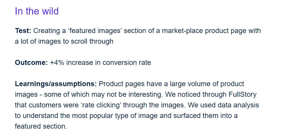
9 PDP Image Tests to Get You Thinking
We don’t want to list a bunch of vague best practices just because people in the know have shared them with us. While most of the A/B tests do not come with statistical data, it is a touch better than tips because each and every store owner has also shared their hypothesis and the insights gleaned.
We hope that once you’ve gone through all the experiments featured, you’ll begin to see images as a solution to user experience issues, rather than simple aesthetics.
User Generated vs Professional Photoshoot
Hypothesis:
If user-generated photos featuring real product users are used in place of professional photos or stock images, then the conversion rate will increase since users find UGC more appealing and relatable.
The impact:
We found out that user-generated photos have [a] much higher conversion rate, relative to stock images. It was around 17%. Featuring real customers using the product was much more appealing to the visitors than images from a professional photoshoot.
Dubravka Davidovic, Head of Content at AskGamblers
You can try testing productive ways to complement your product photos with user generated content. But as far as one canceling the other, we don’t think that’s ideal.
Dubravka throws in another test that may shed light on what kind of UGC you can aim for. At the very least, this is an interesting take on how customers feature themselves in UGC.
Hypothesis:
If UGC photos are taken from a 4:30 or 7:30 angle (using the clock hands position), then the conversion rate will be higher because it is the best balance between showing the product and keeping the user in the frame.
The impact:
We found out that the best angle of a person using a slot machine is either 4:30 or 7:30 using the clock oriented position. This optimized the amount of the product you can see, while still keeping it with the human element, however the differences were not as significant and throughout a couple of tests, the relative difference was only 4.8%.
Dubravka Davidovic
In fact, Claire Jarrett chimes in with a meatier experiment, again to do with how products are oriented in images, and the type of background chosen.
Front Facing vs. ¾ Angle
The product images you use can have a big impact on how your products are perceived by potential customers and directly influence the CR (conversion rate). Ideally, you want to run some A/B tests for some of the most popular image variations, including:
Product angle: For example such as a front-facing image versus a three-quarters view.
Image zoom: Zoom per click or zoom via hover
Image style: For example as a carousel, or as static images.
Here’s an example Claire’s team did for a hunting store:
Hypothesis:
If the product is featured at a ¾ angle in the product images, it will improve conversion rate compared to a front-facing photograph as it creates a wider view that fosters a better sense of familiarity with the product.
We wanted to see how the angle of the product image would impact conversion rate on one of the key driving product pages in a client’s hunting store. We chose to test two variations of the main product image: one showing the product from a front-facing angle with a white background, and another showing the product from a 3/4 angle with a white background.
Claire Jarrett
The impact:
We assigned ad budgets to show the front-facing variation to 50% of the traffic and the 3/4 angle variation to the other 50% of the traffic and ran the test for two weeks. During this period, we closely monitored conversion rate, as well as engagement metrics such as time on page, bounce rate and scroll depth, to see if there were any direct differences in engagement. The A/B test showed that the 3/4 angle variation significantly increased conversion rate by almost 9% compared to the front-facing version. Additionally, we noticed that users spent more time on the page and a subsequent lower bounce rate. For that specific product page the 3/4 angle variation was clearly outperforming the front angle version.
We continue to monitor the page’s performance and run new A/B tests as necessary, but this test has been a great way for us to improve the performance of our product page and increase our conversion rate. I should note that running several A/B tests in succession, with different variations, can help you find the best image placements for your product pages. So never stop testing.
Claire Jarrett
Static vs Tutorial
Kind of a no-brainer. Right?
I have run tests for my product images with video tutorials or static images of the products. My A/B tests have shown that people favor video tutorials as they want to see the real-time experience.
There is more evidence to pile on here. Check out this test:
Hypothesis:
Adding multiple images featuring products in various angles and a 360-view of the product in video format will increase add-to-cart conversion rates since this gives the shoppers varied ways to view the product.
The impact:
Adding multiple images from different angles of our products increased our add-to-cart conversion rate by 15%. The videos showed a 360 degree view of our images and increased it by another 20%. Those two changes alone increased our overall sales more than any change we ever implemented on our website.
But you have to approach this with all the information you can gather, so as to set the right expectations.
In a research (Is a Video Worth More Than a Thousand Images) that assessed consumer neurophysiological response to product image vs image of product in use vs 360-degree video, it was found that people engage best with the interactive format (360-degree video) but purchase intent didn’t correlate with the display format.
This means videos engage better but they don’t automatically lead to more sales. So…
‼️ALWAYS TEST‼️
We are a supplement company that tested adding humans to our images instead of just listing the product image. We expected to see an increase in conversions, but it was the other way around. We saw a drop on our most popular page from 3.9% to 3.1%. We believe it was due to the different demographics of searchers coming to that page and the human image not matching up with their own image.
In many cases, lifestyle images could be the spark your Shopify product page needs to ignite your customer’s interest. It’s worth testing that.
Hypothesis:
Switching from a product shot to a lifestyle image will improve clicks on the promo information button.
As a design agency, running A/B tests on high-resolution product images is one method we use to optimize site performance. One of the A/B tests we did for a watch brand was to replace the hero image on the homepage from a photo of a watch with a lifestyle photo with a smiling model. We positioned the face of the model on the right side and the model’s eyes were looking into the direction of the heading which included the promotional information.
Sharon Chung, Founder, Design and Development Director at Bamozz
The impact:
From the heat map results, we found that at least 4 out of 5 high-value recordings in a week moved their cursors to the promotion information on the left side of the hero image and 3 of them clicked into the promo for more information.
Sharon Chung
You can also iterate by testing various positions of your lifestyle shot, assuming you have a carousel and want to know the ideal location for the product image.
Single vs Multiple Images
One test I ran was on a product page for a popular outdoor gear item. I created two versions of the page: one with a single high-quality image of the product, and another with multiple images showing the product in different settings and being used by different people. I then sent equal amounts of traffic to each version of the page and measured the conversion rate (the percentage of visitors who made a purchase).
Multiple images showing the product in different settings and being used by different people will boost the conversion rate because it provides more angles and context for the shoppers to feel more familiar with the product.
The impact:
The results showed that the page with multiple images had a 13.5% higher conversion rate compared to the page with a single image. This demonstrates the power of showing potential customers multiple images that allow them to envision themselves using the product.
Justin O’Brien
This is corroborated by a research conducted by Shopify. Only 0.52% of consumers want to see a single product photo. 33.16% prefer to see multiple photos. And 60% prefer images that will enable them to have a 360 degree view of the product.
It looks like you’ll get better results if you have more pictures featuring your products in various angles and contexts. But there should be a sweet spot, so as not to overwhelm the shopper. Test and find out what yours is.
NOTE: This featured experiment adds credibility to the pattern shared by Jakub Linowski. Seems like more is better than one. And curated is better than irrelevant.
Simple vs. Detailed
I’ve run a number of A/B Tests on product images and the results were kind of surprising to me. We’re a vitamin and supplement company. Typically I’ll use a mix of product images and lifestyle images. One reason for using a variety of images is these days Google is showing image previews in search and by having a unique image you’ll show up and your listing will stand out, this is why I use lifestyle images or some type of mocked up or customized image while most others will use a stock image. I’ve also however played around with what types of images drive conversions. I did an A/B test where I tested a plain stock image of a pill bottle versus an image of a pill bottle with the pills spilled out in front of it. People sometimes ask about the size of pills or the color of pills so decided to take some pictures and test out some different images.
If the product image has the pills spilled out in front of the pill bottle, it’ll drive more sales compared to a plain stock image of the pill bottle because it answers upfront the key questions users have about the size and color of the pills.
The impact:
To my surprise the image with the pill bottles spilled out converted 34% higher than the stock image. I still use product images as my primary images because that’s what shows up on Google Shopping and it’s a cleaner more recognizable image but I do now use more lifestyle images as well as images I take of bottles showing pills or powder spilled out in front for effect.
Tread carefully here so you don’t clutter the picture. Maintain the focus on the main object, your product, while figuring out the cleanest way to show the elements of your product that your customers desire to see.
How a Seasoned CRO Expert Approaches Image Experimentation
In the case of one of our clients – a hair loss prevention product out of LA – testing lifestyle photography was impactful both on product and other informational pages throughout their site. The client had always been of the opinion that they had an entirely male client base and that their solution based product was only relevant for that one audience. Namely, men who disliked their balding and thinning hair.
When their analytic data showed that their audience distribution was nearly split 50/50 by gender, the client argued that it was the end users’ partners shopping on their behalf or while logged in to their significant others browsing credentials biasing our audience data.
Eventually, with the aid of inbound intent survey responses suggesting that c. 90% of survey respondents were browsing for themselves, our client was convinced to AB test our hypothesis – “female browsers will show more buying behavior when presented with representative imagery, resulting in increased add to carts and checkout initiations.” Through the following series of tests we validated that both genders were interested shoppers, and our client had been ignoring roughly half of their potential customer base.
In fact, their female consumer was if anything more image conscious than the male audience, as balding and thinning hair was seen as a more normal issue for men.
To take the example in our response to question 1 – we clearly identified a large (therefore potentially high value) and distinctly different, under performing audience segment through audience analysis. Our team compared audience data in Google Analytics and purchase transaction data in Shopify Plus to confirm that while audience composition was close to a 50/50 split by gender, the actual names on orders represented a large bias towards male shoppers. Validating Google Analytics reported conversion rates by gender. The female cohort were hugely underperforming.
As for qualitative, we took this as a two-stage process. First, we validated via inbound intent surveying that the female audience were interested in buying. Then, having qualified female buying intent, we leveraged exit surveying to understand why female browsers weren’t buying.
“Was your session successful? If not, what stopped you?”
The resounding theme of that feedback?
“It looks like it should work for me but none of the images show a woman using it.”
A couple of considerations I would suggest keeping in mind when testing imagery.
Don’t add bias. Simple examples of bias for image focused tests could be things like:
Loading too large of an image, GIF or video file causing page load speed to impact user behavior.
Utilizing an image that may address your hypothesis but have other high impact visual factors that could bias results.
Don’t over egg it. When testers are chasing a win they often “stack”. Applying multiple changes to a variation, often so much so that it’s unclear which (if any) of the changes caused an increase or decrease in performance against the control.
Experimentation is a powerful lever. Period. Use it to grow to 8 figures, 9 figures and beyond. READ MORE
5 Things to Keep in Mind When Using & Optimizing Shopify PDP Images
We talked to experts and store owners about the most effective Shopify image optimization techniques they’ve used. We’ve consolidated their ideas into 5 key points, expanding on everything you need to know to use them for your store’s success.
Here’s what they said you should keep in mind:
1. Ensure Shopify Images are the Right Size and Format
Most Shopify image optimizers begin here.
You see, if your images aren’t the right size (most times, too heavy), they’ll slow down your Shopify pages and ruin the experience for shoppers. Also, if they are not in the right resolution, they’ll distort the size of the products featured and mislead buyers.
The goal here is to match high picture quality with a low file size. In Shopify circles, it is suggested that you keep full screen images no more than 400 to 500 KB. The hero image can never be more than 1 MB large.
This is possible if the image files are saved as JPEGs or WebPs, instead of PNGs. PNGs work best for computer graphics with few colors, such as logos and trust badges. Your own exception here is when you absolutely need to use a photograph with no background.
If your product images are saved as PNGs, open them in Adobe Photoshop and convert them to JPEGs. With JPEGs, you’ll have a high quality image with a much lower file size.
Sometimes, JPEG and WebP images could be larger than 500 KB. In this scenario, you need to compress the image. Shopify has a built-in image optimizer but if you want to step things up a notch off-platform, use these image compression tools:
You can also install Shopify image optimization apps. These ones sometimes come with additional features that’ll be handy in lightening the size of your Shopify site’s files or optimizing your SEO.
Crush.pics: Has automatic compression and resizing of images and allows for customization of image sizes for specific products, collections, and pages. You can also bulk optimize images to save time and effort.
AVADA SEO: Image Optimizer: This is a comprehensive SEO optimization app that includes image optimization as one of its many features. You can resize images, compress them, add alt tags, and convert them to WebP format.
TinyIMG SEO Image Optimizer: This is another image optimization tool for Shopify that compresses, resizes, crops, and bulk optimizes pictures. It also has features for SEO optimization and lazy loading images.
These tools help optimize images on Shopify without losing quality. Some features, like bulk optimization, might require opting for a paid plan.
Want to further speed up your load times? Compressing images will only get you so far! We’ve created an in-depth guide walking you through how you can make your store blazing fast. READ MORE
2. Optimize Your Shopify Images Metadata
When search engine robots crawl your Shopify website, they can’t view images and decipher what they depict. Accurate and descriptive metadata helps these robots read the content of your images, and serve your products in the SERPs.
Hence, optimizing your store’s image metadata is a principal task in search engine optimization for Shopify stores.
What is image metadata? This is the text information that is associated with an image file describing details about the image and its production. The image metadata that matters in SEO are:
Title
File name
Alt text (or alt tags)
Caption
Description
Many content management systems (CMS), use the file name as the title. Make the file name descriptive and accurate. That means no “IMG20210516.JPG”. We’ll see an example in a bit.
The alt text and description should help visually impaired people know what the image is about. It’s also vital for search crawlers.
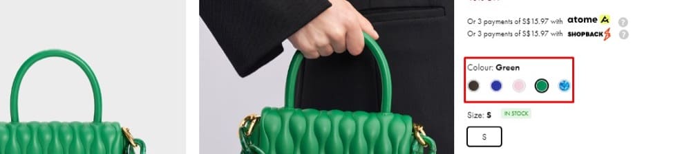
When I ran an image search for “green handbag”, it was one of the top results. Let’s look at the page source code:
Title: Iva Boxy Top Handle Bag – Green
Alt text: Iva Boxy Top Handle Bag, Green, hi-res
Ensure you’re not stuffing keywords into the alt attribute. Make your alt text readable and descriptive and do not include SKUs or models.
3. Get Tactical with the Type of Product Shots You Use
High quality original pictures are great. But you can do even better. There are several ways you can make the user experience better and add conversion-driving twists to how you present your Shopify product images.
For starters, take your product photos in natural light. And keep the background simple and ideally, monochrome. Nothing should distract from the star of the image — the product.
Use natural light: Pretty straight-forward. Natural light is, simply said, the most flattering light for photography, and it can bring out the best in your products. When taking professional photographs of your products, try to do so in natural light or at least use a lightbox to mimic natural light. Most of the big brands do it, so emulate their style.
Claire Jarrett
Another product photography tip:
Make sure that the images of your products are clear, well-lit, and show the product from multiple angles. This will help potential customers better understand what the product looks like and what it can do.
Get all the vital details in the shots. You want to provide as much clarity as possible without making it weird.
When taking photographs of your products, it’s important to pay attention to the details and the key features. Try to capture close-up shots of the product that highlight the textures, patterns, features and materials. This can help customers to get a better sense of what the product looks like.
Claire Jarrett
We’ve already discussed multiple images from various angles and different contexts. This is something the buyers want. It helps bridge the anxiety gap of shopping online.
Another point to kickstart a tactical approach to Shopify image optimization that isn’t talked about enough is having a cohesive image strategy.
Use a consistent set of images throughout your website and branding, to help establish a strong sense of brand identity and create a sense of trust with customers.
Justin O’Brien
Consistency keeps the entire buyer’s journey on a single path. Anything outside the ordinary (or what’s already been established) can constitute some amount of friction. It’s also something to keep in mind when running ad campaigns.
Check that your first product image is inline with your ad content. Aim for consistency in the colors, product, vibe/feel, models etc.
Chris Marsh
4. Maintain Great User Experience with Images
Your Shopify images should load fast (discussed this in point #1), the visually impaired should be able to know what the picture is depicting (point #2), and the experience should be consistent across your brand touchpoints (point #3).
And now on that same track, here’s another thing you can do to maintain great user experience: Add a zoom functionality.
Make sure there’s an easy to use image zoom functionality and high quality images once zoomed in. This sounds obvious, but this important aspect can get overlooked by some brands.
Chris Marsh
[The zoom-in functionality] can help them to get a better sense of the product’s quality and can be particularly helpful for products like clothing and jewelry.
Justin O’Brien
One way to make it really easy to zoom in is to add the zoom on hover effect. To enable this, use the developer-level solution illustrated by Shopify. Or you can install apps that do it for you. Two apps for this are:
Remember: Don’t make any significant UX changes without running a test on it first.
Here’s another Shopify image UX optimization tip: Provide a way for users to compare products. A simple start is comparing alternative colors.
Showing alternative images or color options to your customers can help them to visualize a product in different ways which will increase the chances of making a purchase.
Make it easy for shoppers to compare different variant types, and check photos for various options. For example, if you have multiple colors and variant color (swatch) buttons, then placing these somewhat high up near the photos makes it much easier for shoppers to browse colors without scrolling down too far.
Chris Marsh
Finally, don’t forget the mobile users! They make up 58% of website visitors nowadays. That is more than half of your traffic. Ensure your images look great on mobile devices as well.
Optimize images for mobile. Incredibly important for user experience and SEO. More and more people are now shopping solely on their phones. So it is imperative (!) that your images are properly rendered on all mobile device and that they load quickly (tip: use a proper CDN).
Claire Jarrett
5. Tell a Story with Images
Storytelling with product images conveys the unique features and benefits of the product in a more memorable and eloquent way.
Instead of only the plain surface look of the product, you can craft a narrative around the product, using images to highlight the story arc.
Rather than just using images to show off a product, use them to tell a story. This can help to create an emotional connection with potential customers and make them more likely to buy.
Justin O’Brien
A great example is showing people using the product, such as people out camping with a solar-powered charger. The emotions this picture evokes trigger potential customers to imagine themselves in a similar scenario with the same product.
I think a universal tip, which is useful no matter the product, is to present it in use. Showing customers how the product can be used in real-life settings can help them envision themselves using the product, which can lead to increased conversions. Especially when it’s a product used by humans, attaching a big smile to an overall feeling of joy and positive emotions can be beneficial and lead to better memorization of the product.
Dubravka Davidovic
Product image storytelling on your Shopify PDPs is a powerful way to capture attention and engage with your shoppers on a deeper level. You cannot optimize product images without paying attention to their storytelling element.
The best product images are those that create a sense of context and show how the product is actually used by real people. As an ecommerce store owner, you want to capture the product in a real-world setting and use images that tell the story about how the product can be used in the customer’s life and how it can help them. Let them envision themselves using the product – this is one of the key driving factors to more sales.
Claire Jarrett
Lifestyle shots such as these mentioned here are delicate to work with. The wrong model in a lifestyle shot could alienate a certain demographic in your audience. That’s why it is best suited for niche audiences.
Also, using lifestyle shots in the wrong position on your product page can cause confusion.
If your main image is a lifestyle shot of the product in use, then it may be unclear exactly what the product is. Instead, test showing the product on its own first, before a lifestyle shot.
Chris Marsh
You have to be careful with using lifestyle images and don’t forget to test.
Another great way to tell stories with product images is infographics. They’re a simple way to bring those crucial points below the fold to the section of the page that has the bulk of the users’ attention. It’s even more essential if your product has a bit of a learning curve.
If the product is complex and has a lot of features, consider using infographics or diagrams to explain how it works. This can help to simplify the product for potential customers and make it more approachable.
Justin O’Brien
A story ties everything together and makes the next logical step a conversion.
Conclusion
You can unlock significant wins quickly with a well-rounded approach to Shopify image optimization. It isn’t only about optimizing image metadata and setting things up for better SEO ranking. You’re in this business to make sales and that means also optimizing for conversions.
In this guide, we dove into the entirety of image optimization for Shopify stores. Now, you know that this journey isn’t really complete without experimentation.
Good Product Images are not made in seconds. They need at least as much effort as every other A/B-Test on the PDP.
Excellent research can result in enormous uplifts. Especially when the product needs to be explained, a lot of good pictures can help you stand out against competitors. And don’t be scared to put text on your images. If it’s not too much, the information will help the user. It’s always worth it to test Images.
Marven Hennecker
Mobile reading?Scan this QR code and take this blog with you, wherever you go.
Content strategist and growth lead. 1M+ words edited and counting.
Contributions By
Andra Baragan, Chris Marsh, Claire Jarrett, Dubravka Davidovic, Jakub Linowski, John Frigo, Jonny Longden, Joshua Frank, Lorenzo Carerri, Marven Hennecker, Rishi Rawat, Rudger de Groot, Sean Clanchy, Sharon Chung, Theo van der Zee, Will Laurenson