Whether you’re just starting out and looking to learn the ropes or you’re an old hand looking for ideas and inspiration, this mega collection of 90+ CRO tips and tricks has something for you to take away and test or apply to your work.
Browse the list below to see what topics are covered and jump to the sections which pique your interest using the hyperlinks. Or grab a coffee and start at the beginning.
You’ll also find a list of all 44 contributors at the end of this guide, including their LinkedIn profiles. Most of the contributors featured are pretty active online, sharing their wisdom regularly, so if you like their advice in this guide, give them a follow.
CRO Basics
This section presents the key principles of conversion rate optimization, covering the fundamentals of the practice, such as
The mindset needed to do your best optimization work
How to (and not to) form hypotheses
How to ensure your A/B test results are valid
The priority of what and where to test
Psychology-based persuasion techniques.
We’ve also included some hints and tips based on the latest trends in online user behavior, such as QA-ing your website in dark mode. So, dig into the following section to ensure you have the basics covered.
1. Ask the right questions and stay humble about the answers
Investing in CRO is a bit like building a retirement account. Every small investment you make in improving how easy it is for visitors to purchase is going to grow into high-value, sustainable returns.
But you can’t fully optimize for your customers without a mindset shift. It takes a culture of experimentation to really understand what your customers are looking for—and that begins with a willingness to ask the right questions and stay humble about the answers.
Examples of good questions to start with include:
What is in the hero section of your homepage right now? Does the copy clearly indicate who your product helps? Stop treating this section as an afterthought.
Are you giving shoppers an easy way to navigate your site and products? According to Forrester Research, 43% of website visitors go straight to the internal search bar when they open a website. They’ve been trained to think search is the quickest way to find what they need, which means the common UX is failing them.
Are you sharing information only when/where the shopper needs to know it? For instance, the only place that a laundry list of accepted payment methods belongs on your ecommerce site is in the checkout, where it matters to folks who are ready to pay. Otherwise, it is just a distraction and doesn’t add any value for your consumers.
I’ll start by saying that any A/B testing is better than none, but the number one mistake I see eCom merchants make is that they come up with tests randomly and without necessarily considering the data they have access to (i.e., analytics, sales reports, etc.).
Sure, a new design of a section may perform better, but there is often low-hanging fruit that you can tackle first, and that may be easier to evaluate through the data you already have.
For example, how about A/B testing free shipping thresholds? Or discount offers to capture emails? Start there before testing new designs. It’s easier and faster too.
4. Conversion research is one of the most important activities you can do
Conversion research is often overlooked but is an essential way of gaining better ideas to improve your website conversion rates and sales. It helps you discover what your visitor’s main problems, doubts, and hesitations are so you can improve your website to meet their needs better.
User tests on your target audience, visitor surveys, customer surveys, and visitor recordings are the highest impact ways of doing conversion research. Using tools like Hotjar.com and Userfeel.com are highly recommended for this.
Conducting A/B tests without any type of tool is incredibly difficult. You’ll require web developers to create both use cases, but you’ll also need two separate instances of your site with load balances configured to handle the distribution. And that doesn’t even include saving that session data for users, so you have something to analyze.
If you want to conduct A/B tests, you need to use a tool like Convert. This tool allows you to put a thin layer on top of your site that will handle splitting the traffic and then, using javascript, will modify the user experience, showing users either the A or B experience rather than saving the data so you can analyze it. This means you can perform A/B tests without modifying your side code.
6. Identify pages with the greatest opportunities for improvement
Focus on the right pages to optimize. What I mean by this is that you don’t want to optimize a page that has zero traffic or a page that is currently converting well.
Google Analytics is your best friend here when it comes to seeing what pages convert and what pages have room for improvement.
A rule of thumb that we follow is to focus on pages with less than a 3% conversion rate.
Different CTA button colours will often only have a very limited impact on conversion rate unless it matches other elements on your page and doesn’t stand out. Ideally, they need to stand out from the rest of your page, but there are many other higher impact elements to improve first.
Trying to change too many things at once makes it impossible to know what’s working and what’s not. Instead, focus on testing one thing at a time so you can really see the impact that it has on your business.
For example, you might start by testing different headline copy on your home page. Once you find a headline that performs well, then you can move on to testing something else. But by always testing one element at a time, you’ll be able to identify the changes that have the biggest impact on your business and grow your ecommerce store more effectively.
Sometimes you can optimize by removing clutter and focusing on the most simple things such as your message, your offer, and how your customer can use your product to achieve their goals (Jobs To Be Done framework.)
Start with one research piece and build other elements on top of that. The easiest thing to start with is a heuristic analysis or customer interviews.
Don’t overcomplicate testing. Focus on shipping one single test first and help your business understand the overall process.
What’s a single element preventing you from achieving your results? Start by focusing on that.
Experimentation is sometimes about doing less, to do more.
10. A/B test the location and wording of your CTAs
Testing the location and wording of your CTAs is much more important than A/B testing the color of CTA buttons. It is essential to use action-orientated, benefit-driven words like ‘Start Free Trial Now.’
Always make sure CTAs are above the fold on desktop versions of your website and then repeated at the end of long pages.
Your HiPPO (Highest Paid Person’s Opinion) may often want something changed or improved on the website based on their opinion or what they like. It is often quite different from what visitors want and is the opposite of using good insights from conversion research to improve your website.
Learn the influence principles from Robert Cialdini’s famous book.
Jesse Pujji, Founder of GatewayX, venture studio behind Growth Assistant
The famous book Jesse recommends is Robert Cialdini’s Influence: The Psychology of Persuasion, in which he discusses six principles of persuasion.
The six principles are
Reciprocity. Giving something to get something in return.
Consistency. Our desire for things to be consistent with what we believe and how we have behaved in the past.
Social proof. Following what others are doing.
Authority. We Listen to those who display signs of authority.
Liking. The more we like someone, the more we are persuaded by them.
Scarcity. The less there is of something, the more people want it.”
14. Personalize your website once it’s optimized to a high standard
Personalization is a newer trend that has many tools specializing in it. While personalization helps to show more relevant content to your visitors and can work well, you should only start personalization efforts after you have improved your website to a good CRO standard first. It doesn’t matter how much you personalize your website, if it has poor usability and isn’t very engaging, it still won’t convert very well.
15. Understand ‘dark patterns’ and avoid using them
The ‘recipe for dark patterns’ involves applied psychology, A/B testing, and user interface design, according to a recent workshop facilitated by the Federal Trade Commission (FTC). The intention, according to FTC documentation, is “to trick consumers into taking particular actions in the company’s interest.”
Some of the ‘CRO hacks’ I see making waves on Twitter could land you in trouble. Not only do you risk alienating users and damaging trust, but increasingly authorities are going after offenders. Common examples of dark patterns include not being upfront about ‘hidden fees’ early in the journey and making it difficult to opt-out of cookies.
Test if your site’s images and videos are working for your customers and putting your business in the best light. Photographs are about more than aesthetics, and the charts and graphs you include on your website should be relevant and easy to interpret for all visitors.
You might have a visually stunning online store, but if the images you include aren’t what customers need, you won’t generate conversions. Run A/B tests to determine what kinds of product images and graphics work for your audience. Do they like seeing how-to videos for assembling your product? Will size guides make them more confident in their purchases? As the saying goes, “A picture is worth a thousand A/B tests.
Scarcity and urgency techniques can work well to influence visitors to purchase or sign up for something, for example, having limited availability of what you offer. These are not as important as other persuasion techniques like social proof, though.
18. Use social proof to get convince more shoppers
Gather social proof and shout about it on your site to put shoppers at ease, generate trust and enhance your conversion rate.
Social proof like reviews and other UGC (User Generated Content) is essentially digital word of mouth, showing your potential customers that your store is reputable and other customers have had brilliant experiences with your products. This works because the main driving force behind social proof is a cognitive bias called the bandwagon effect, which describes how someone is more likely to copy an action if they see someone else doing it.
Social proof should be done in many ways depending on your type of website and should be prominently displayed on your homepage and product pages. Good examples of social proof are adding testimonials, reviews, ratings, media mentions, awards, and logos of well-known clients.
19. Consider sample size when designing tests
When A/B testing your ecommerce store, many of the testing tools and software determine the statistical significance without first waiting for a predetermined sample size or a certain point in time to be reached. You can use sample size calculators so that you know enough users have participated in your test in order to make more accurate conclusions.
You also must run the test long enough so that the sample is a good representation of your customer base. Most of the time, you will want to run your test for 2 to 4 weeks which depends on how fast you need the sample. Don’t run them too long because you can run into what’s called sample pollution, which means the longer your test runs, the more likely external factors will impact your test.
When we launch an A/B test, we are often impatient to know the results. It is recommended to let it run according to the life cycle of the product and according to its own market.
If you operate in the fashion sector, you will have seasonality criteria to take into account, unlike the sale of internet boxes [routers], where life cycles can be quite extensive. Your A/B test should run long enough to account for 1-2 sales cycles. By default, we will leave it at least 3 weeks or even a month to smooth out the differences in behavior between the week and the weekend. You must also have a sufficient sample to obtain statistically reliable results that will have something to tell. If the solution tested is a winner and it saves you conversions, you can directly implement it.
Ilija Sekulov, Digital Marketing Consultant, Mailbutler
Yes, statistical significance is important, as is power. Both need users or sample sizes. However, you should go with a Minimum Detectable Effect that does not call for a test to be live beyond the 2-3 week mark.
Long-running tests have issues like bots, Sample Ratio Mismatch (due to cookies mis-bucketing returning users), and the natural spread or variability that certain metrics tend to display. There is an opportunity cost here as well, so consider your trade-offs carefully.
21. QA your store in dark mode
Here’s a fairly big issue I found recently:
At my clients’ store,
When a shopper wants to select an item in Black ◼️
The button actually appears as White ⬜
😤This is fairly high friction for anyone using Dark Mode on their device.
It’s simple to check, I use: Android > Samsung Browser > in Dark mode It’s well worth checking your store in Dark Mode! 👀
Chris Marsh, Conversion Optimization Consultant at Dash of CX,original post here.
Coming Up with Test Ideas
Coming up with test ideas involves a broad range of skills and a lot of groundwork before you put a single test live on your website. Ideally, you and your team are able to:
Select the most suitable research techniques to identify user motivations and FUDs (Fears, Uncertainties, Doubts.)
Analyze quantitative data to identify where the trouble areas are on your website.
Prioritize your hypotheses so you focus on the highest potential impact ideas.
Design a test treatment that provides better UX, clarity, or persuasion to test against what’s currently on the website.
In this section, we guide you through the challenging task of coming up with test ideas, from which research methods can help uncover different user problems to how to run group ideation sessions.
22. Collect data from these ten sources
Ten data sources to collect and analyze that will help you improve your ecommerce conversion rate:
Customer surveys (on-site and post-purchase)
Heatmaps and click maps
Customer support tickets and live chat conversations
Customer reviews mining
Social media comments mining (Youtube, Reddit, Facebook Groups)
User testing
Session recordings
Web analytics data
Keyword research
Customer interviews
Pick 1-2 of them and focus on answering these 2 questions:
Heatmap tools allow you to see how your visitors are browsing your online store. In particular, you will learn which elements are attracting their attention and which elements are being ignored.
You can then run A/B tests to see if you can improve your visitors’ interaction with specific elements of your website. For example, if you were to take a heatmap of your checkout page, you might see that visitors were clicking on the payment options menu button but not making a purchase. You could use this insight to run A/B tests with different payment options to see which performed the best.
Leanna Serras, Chief Customer Officer at FragranceX
24. Use chat logs to discover what information customers are looking for
Analyze your live web chats to find issues with your website and missing information that visitors are looking for. These insights can be a real goldmine for high-impact website improvement ideas and quick fixes, particularly for adding missing information that seems to be stopping visitors from purchasing.
Search for words like these in your web chats to help you find insights quicker:
“Issue”
“Can’t find”
“Problem”
“Not working”
“What is the”
You should also filter out any live chats containing “order status” related words, as you will get a lot of those which aren’t that useful.
Examples of issues to fix you might find from live chat:
They can’t find the dimensions or specific info for a product
The coupon field is broken on mobile checkout
They can’t find if you have to pay to return products
They are unsure of when products will be delivered
They are confused about which plan to choose
And don’t rely on your customer support team to let you know about these potential issues, as often they may forget. So as soon as you get a chance, spend a few hours reviewing and analyzing your live web chats for issues. You will be glad you did!
25. Review VoC data to understand customer motivations
Mine the reviews of your brand and your competitors. Conduct a customer survey, dive deep into the customer support chats/emails, and understand;
Who actually is your customer?
What problems and pains are they facing?
Why did they decide to engage with your brand?
What are their deal-breaker needs?
What motivates them?
VoC (Voice of Customer) analysis will help you create an experience and content on the website that will resonate with your potential customers. Your website will not only be optimized for functionality but also your customers’ motivation.
26. Use active reading to truly understand what users mean
The top salespeople that make the most money are masters at the art of active listening.
In reviews mining (or I should say qualitative customer research), the best people master the art of “Active reading.” What I mean by that is to truly understand what the person means in the reviews mining, go beyond the surface and think and analyze what the person really means.
Here’s an example: I was doing some reviews mining for an email marketing software, and here’s what one of their customers said:
“This is probably the easiest mailing list platform out there. It takes minutes to set up your account and get started sending emails to a list. For developers, API is a dream. It’s incredibly well documented, and there are dozens of integrations already built in almost every platform and language to make integration into your software even easier.”
If you go beyond the surface of this comment and start to analyze it, here’s what this person is saying:
“Easiest mailing list platform” → benefit for “persona 1”: the user
“It takes minutes to set up your account and get started sending emails to a list” → outcome for “persona 1”: the user
“For developers, the API is a dream. It’s incredibly well documented, and there are dozens of integrations already built in almost every platform and language “ → benefit for “persona 2”: the developer.
The conversion must be divided into a series of processes that together form a funnel. You need to know;
Which pages do visitors finally end up on when coming from various URLs?
Where do they land when they click that link, the main page, a category page, or a product page?
A rate of 45 percent for items added to shopping carts is fantastic, but does that represent that almost half of your site’s visitors are making purchases? That’s not likely.
Imagine a funnel with visitors leaving the store as they get closer to the checkout. You need to figure out how to improve that one step where the process is slowing down. For instance, 45 percent of site visitors who view a product page end up adding the item to the cart. Unfortunately, only 10% of site visitors really look at the products on offer.
Clearly, more effort has to be put into increasing the number of people who take the next logical step in the sales process, clicking through to the product page. To help customers find what they’re looking for, perhaps you could use more descriptive product photos or a filtering system.
Every time you read a customer review, try to bucket it into themes and sub-themes.
I recently analyzed Hush.ca, a Canadian DTC brand that sells weighted blankets.
One customer said this:
“I am OBSESSED. I was skeptical that I wouldn’t get very hot at night. I have had this blanket for weeks now and I never got hot at night. It’s also great to help calm my anxiety. I recommend this to everyone.”
This review can be broken down into 2 themes:
Theme 1: Results the customer got from the product:
Sub-theme 1: I never got hot at night.
Sub-theme 2: It helps calm my anxiety
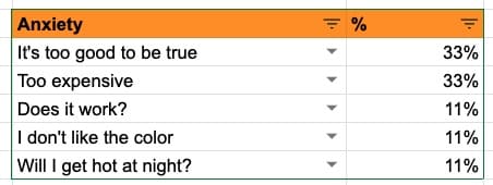
Theme 2: Customer anxiety and skepticism before buying
Sub-theme 1: Will I get hot at night?
Once you are done bucketing each response in different themes and subthemes, you simply quantify how popular each sub-theme is at the theme level.
Here’s an example for the Theme “Customers anxiety and skepticism before buying” that we discovered when analyzing Hush.ca”
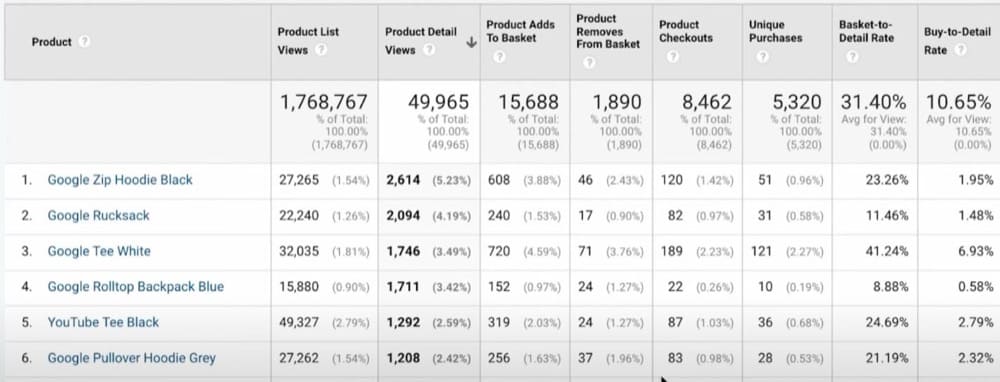
There’s a specific report that you can analyze to look at all your products and identify problems. It’s called the Product Performance report under ecommerce in Google Analytics.
The two most important metrics are these:
Basket-to-detail rate: How many people add a product to the cart divided by how many people viewed the product.
Buy-to-detail rate: How many people buy the product divided by how many people viewed the product.
With this information, you can:
Understand if you have a checkout problem by analyzing the difference between basket-to-detail and buy-to-detail.
Understand which products are added to the cart the most. In this case, you are doing a good job of conveying the value of the product.
Use the data to identify high-performing products and fix low-performing ones.
Riccardo Vandra, Conversion Optimization Consultant, original post here.
30. Don’t be afraid of exploring your prospect’s pain
The pain is the problem that led your prospect to you, such as anxiety over not having the right outfit for an upcoming wedding.
Many store owners worry that exploring a prospect’s pain will make them sound too negative. But how can your prospect get excited about your solution if they don’t really feel how much they need it?
Addressing and agitating their pain by tapping into the difficult thoughts and emotions they’re experiencing helps them feel understood, empathized with and helps motivate them to say yes to your product.
Kirsten Lamb, Conversion Copywriter at Electric Ink Creative
31. Ask recent customers open-ended questions
Send an open-ended survey to your recent customers with the following 2 questions:
What’s one thing that you were skeptical about before buying product X from us?
What’s one thing that made you pull the trigger and convinced you to buy from us anyways?
Then focus on experimenting with:
👉 Tackling the most skeptical “themes.”
👉 Highlighting the most popular elements that made the customers pull the trigger anyways.
32. Allow prep time before group ideation sessions
Ideas are the lifeblood of optimization and innovation, but how do you move from insights to good ideas? Because of various cognitive biases, it turns out we’re naturally bad at ideation without knowing it.
In my experience, ideation is often the weakest link in an optimization process. From research, we know that group ideation produces better quality than working in a vacuum on your own, but the secret is to let people ideate alone before sharing their ideas in the group. Different people are likely to approach a problem from different angles, so use that to your advantage.
Research also shows that quantity breeds quality, so start with a range of diverse ideas before narrowing down. Quality of ideas = quantity x diversity. Ask people to make rough annotated sketches of their ideas before verbally discussing each idea as a group. Hot tip: encourage your team to come up with “silly” ideas. These are often the catalyst to massive leaps in ideation.
Optimization and testing use a scientific method to identify how changes impact outcomes, and these methods can be used well beyond measuring the impact of copy and design changes through A/B testing on websites.
In this section, we explore some of the broader applications of testing, such as experiments that challenge “best practices,” your business model, or other fundamental aspects of how you do business. We also explore different objectives for experimentation that go beyond website conversion rates which focus instead on overall business performance.
34. Consider ecommerce subscriptions
Subscriptions are one of the most powerful ways to generate recurring revenue and ensure growth.
The most amazing aspects of running an ecommerce subscription model?
You get recurring revenue without additional spend. You acquire the client once, and then they keep on ordering every month.
You get more than just one-off customers, you get loyal customers. Subscriptions build bonds between businesses and their customers, and you get many more chances to offer a WOW experience.
Shopify is saying that by 2023, 75% of businesses that sell direct to consumers (DTC) are expected to offer subscriptions.
We are now working with most of our clients to find the right formula that applies to their products and makes sense for their customers. This is a whole lot of fun because it involves so much research and testing—we get to understand the needs and habits of the users and cater to those.
I’ve found the following to be most effective:
You need to make it as easy to cancel as it is to subscribe. Nobody wants to be tied to something they don’t need anymore. Offer a great post-purchase experience and make it super obvious everywhere that they are free to cancel anytime. The more transparent you are, the less anxiety you will create, and the more likely users will be to purchase.
Value for money is the most important aspect from what I’ve seen, it’s a lot about getting additional value. Whether it’s getting the products with a discount or getting a gift product with your order, make users feel important and like they are getting a great deal.
Membership equals status. When customers subscribe to your products or services, they want to feel special, and they expect to be treated as such. Send out birthday cards, and offer them exclusive access to sales, events, and so on. This gives them a reason to brag to everyone around them about the VIP treatment they’re getting.
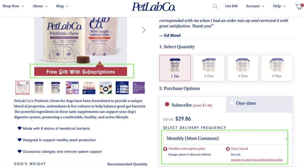
If you want a great example of this, have a look at PetLabCo’s product page.
When it comes to conversion rate optimization, people tend to focus on the Cost of Acquisition (CAC) rather than the Lifetime Value (LTV) of a customer.
Yes, ad costs are going up, the cost of goods are increasing, everything except your price for the products is going up, which makes for an extremely tight pinch on your margins. Where the companies I have worked with have found a lot of success is, in some ways, to stop focusing as much on CAC and to look at overall LTV.
That is not to say that the CAC is unimportant, but the two need to be viewed in harmony as opposed to as two varying metrics.
It’s not always about the first sale, it’s about happy customers and creating an experience that keeps them coming back time and time again. So that you can convert that single customer multiple times as opposed to paying a high CAC and only selling once, it also justifies the higher CAC if you have a higher LTV.
There are a few key takeaways to increase the LTV. First, you need to capture SMS data so that you can send them ongoing promotions or reasons to return to the site. SMS is far more effective than email. However, worst case scenario, get an email.
Secondly, you need to ensure that you have a reason for them to return. Make certain that you have the most engaged customer service team on the planet ready to answer questions and direct customers both to what they need while in your store but also what they may not know they need.
In this post, Rishi Rawat, Product Page Optimization Specialist at Frictionless Commerce, discusses the importance of using segmentation to identify a more valuable addressable market, rather than going after everyone.
A simple heuristic for identifying this might be to look at users who spent more than five minutes actively engaging with your website—because that’s a pretty strong signal of intent. You can define this addressable market however you like, but the point is to narrow down who you will target.
Rather than trying to convince everyone, he focuses on very specific groups of people. He likes to target “healthy skeptics.” If you think about your audience in tiers, you have;
Believers – these people are already buying.
Healthy skeptics – who believe there is a better solution, and they kind of believe in what you are saying but need a bit more convincing.
Skeptics – this group is not very energy efficient to target.
Cynics – who will find fault no matter what you say.
38. Be strategic with discounts
Offering a new customer discounts (if you can) has become such an expected part of shopping while engaging with a new brand.
We did a lot of conversion research this year for a Shopify store that offered different discount campaigns periodically because they didn’t think a consistent new customer discount mattered.
The first thing we saw in qualitative feedback was that people were outraged by this and specifically dropping off the website because they were either going elsewhere to look for a promo code or couldn’t comprehend why there wasn’t one offered. If you’re not offering one already, design a test around this and see if it would make an overall difference in revenue for your store.
The product page is where a sale is often made or lost in the mind of a user. But optimizing product pages can feel pretty overwhelming as there are endless techniques you can use to present product information, quash objections and convince customers to buy.
This section provides you with some great tips and tricks on how to whip your product pages into shape and create clear, highly effective pages.
39. Be inspired by UGC when crafting product copy
One product page optimization test we encourage Shopify stores to try is taking a line from the best customer review you have for a specific product and adding it above the fold before the product name.
Just something quick like this can work great “LOVED this protein powder. Vanilla tastes great and mixes better than anything else I’ve tried.”
This will be the first thing someone sees along with the product images and can immediately catch a shopper’s attention. Of course, have a full selection of customer reviews further down the page, but test these social proof headlines on product pages too. Be sure to use a review that’s specific to the product someone is viewing.
40. Humanize your brand by showing model information
Mentioning the name of the model really humanizes the brand.
Rishi Rawat, Product Page Optimization Specialist at Frictionless Commerce, original post here.
41. Split-test product descriptions regularly
Copy is crucial to your SEO and, more importantly, to your customers’ satisfaction.
Regularly test out different keyword strategies to boost your Google rank and keep up with changing algorithms, then A/B test to determine which descriptions help match customers with the right product for them.
Your descriptions should link to higher levels of customer satisfaction, so try personal touches, recommendations, and any other copy variations that help communicate your product’s true value and features to users.
Selling stock in brick-and-mortar stores is almost always easier than selling online because customers can physically interact with your products. So, making efforts to replicate that in-store experience and getting your customers to imagine owning and using your products will help boost online sales.
To do this, utilize clear product imagery, video content, and in-depth product descriptions, so your customers know exactly what they’re buying.
Since it’s tough to predict which content users will like best, split testing different layouts can make a big impact. A/B test all images on your site, but pay closer attention to those that help with the flow of conversion.
No wish list feature on your ecommerce website? Your cart abandonment rate will usually be much higher. But why?
Because many users will be using your cart as a way of ‘saving for later’ and may not be interested in buying then or any time soon.
So not only does offering a wish list feature improve user experience and lets users share it with friends and family (great for gifting), but it also lowers your checkout abandonment rate!
And don’t expire your cart session too early either, as if users come back a week later and their cart is empty, you may easily lose the sale. Shopify does this better, at least, and expires the cart 2 weeks later. But it’s still no substitute for offering a wish list!
Video is fast becoming one of the best ways to communicate with an audience, and it’s one of the most engaging types of content out there. According to recent data, nearly 5 billion videos are watched on YouTube every single day. That’s 2 videos per user per day. With these kinds of numbers, there’s no denying that video is powerful and should be included in any marketer’s toolbelt.
In any study or article I find on this subject, it seems an overwhelming majority of users say they’re influenced by video content when buying a product and that they prefer video content instead of reading how to use a product.
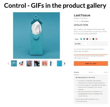
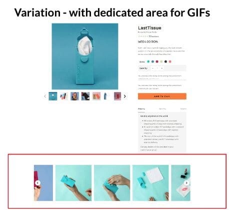
This correlates nicely with a test we ran a while back on using animated gif videos on the product pages. These videos would show the product in action and the steps in using it. One more thing to note is that we had the GIFs already in the product image gallery, but we saw there wasn’t enough interaction with them, so the test was about giving them a dedicated section on the product page.
The results were amazing, with a 12% uplift on the sales conversion rate, it was obvious that videos were there to stay.
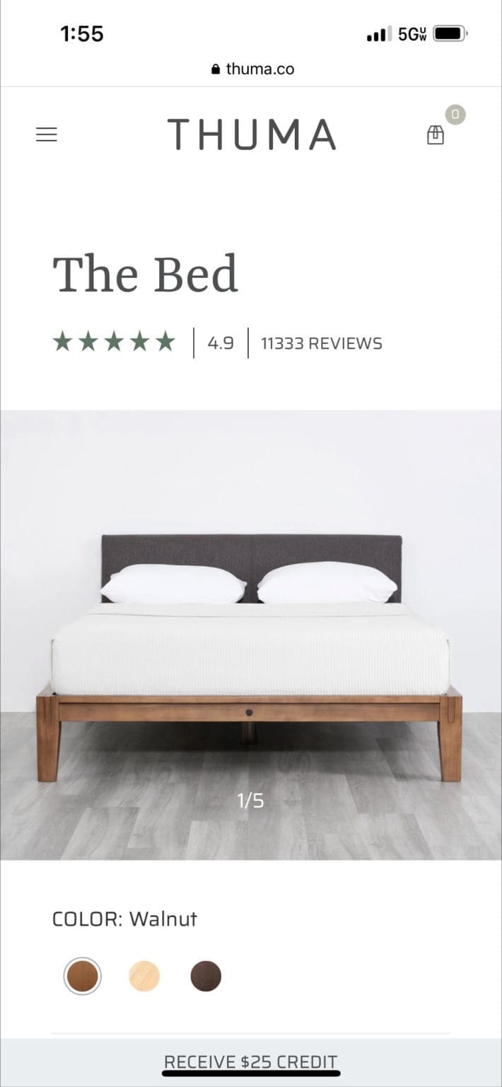
The more images shoppers view on your PDP > the more they’ll get pulled into your pitch > higher the probability they’ll buy.
But how do we nudge them to browse more images?
Simple: show a count of how many images you have for them. Notice the “1/5” label in the image below.
Rishi Rawat, Product Page Optimization Specialist at Frictionless Commerce, original post here.
49. Test ‘before and after’ stories and images
People care about the transformational outcome and the results that your product helps them achieve.
Meaning that your product will help them go from an A situation:
“I am not happy because I got this problem”
To a B state:
“I am now happy because I’ve achieved what I wanted thanks to your product”
In the Fitness and Beauty industry, the Before and After images are quite powerful. You show the photo of an overweight guy next to the photo of the same guy with a 6 pack like Ronaldo.
But what about other industries? It’s totally applicable, doesn’t matter how visual your product is.
If you are selling home furniture, can you show your customers’ living room before and after they bought the new dinner table?
If you are selling mattresses, can you show screenshots of an Apple Watch showing the avg. number of hours that your customers sleep before and after buying from you?
If you are selling mosquito spray, can you show the before and after photos of your customers’ arms and legs after hanging out on the patio during a summer evening in Florida?
Just because Before and After images are not used in your industry doesn’t mean that you can’t use them. Customers are looking for a transformational outcome, it doesn’t matter what industry you are in. Showing them the transformational outcome helps lower one of the most common conversion issues that DTC brands have: TRUST.
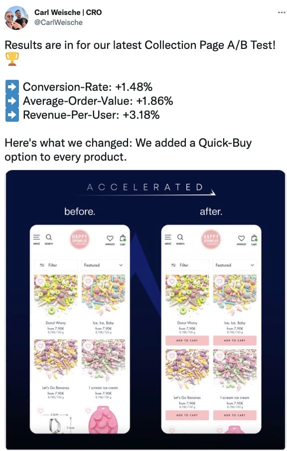
In this Twitter post, Carl Weische suggested adding a quick selector option to the product page had a strong impact on sales:
While no actual data was provided to back up this claim, GuessTheTest has observed a similar positive pattern with verified A/B test case studies and real-life results.
You might just find adding a quick selector option is a quick fix for more revenue but always test first because what works for audiences on one site won’t always work for yours.
A user who is browsing your category/listing pages is likely to want to see clear product information – they’re comparing options.
A user from Google Shopping will have only seen one of your products – they haven’t seen your whole range, so you could convert them by focusing on alternative options.
Users from a product-focused email campaign (back-in-stock notifications, for example) may be just ready to buy, so don’t distract them.
These users have different needs, so might need different pages. Consider where the user has come from and customize the experience for them.”
Personalization has been proven effective for some ecommerce brands, but there’s only one way to know what jives with your unique audience – A/B tests.
One of the most popular personalization strategies is offering product recommendations based on a customer’s previous purchases and searches. In order to conduct an A/B test of this nature, a merchant would need to measure how their overall revenue is impacted when personalization is offered vs. when it’s not.
Excite them. Motivate them to buy your product. You can list off all the features and check off all the boxes, but if someone isn’t excited about your product and what it’ll do for them, they won’t be pushed over the edge to make the purchase.
You need to show off the end result of your product. Whether it’s before/after photos, copy that explains how your products work or how they benefit people. If you can get them to see the positive impact your product will have on their life or that it’ll definitely do the job they need it to, you’ll get the sale.
Motivation isn’t entirely product related, though. Sometimes people just need that extra little nudge to get them over the line. Things like low-stock warnings and shipping timers are also great ways to get people to make the decision and commit to the purchase.
Just be honest about it though, people will notice when your low-stock products never go out of stock.
Will Laurenson, Conversion Rate Optimization Consultant at Customers Who Click
54. Don’t wait until the last step to provide shipping costs
Shopify and many ecommerce platforms often wait for the user to enter a shipping address before giving a price. That might be one of the last steps in the checkout. For most stores, shipping prices and times are really simple. Give the user that information up front (on the product page).
Don’t force them to hunt for it, or worse, just leave!
As we journey further down the conversion funnel towards a sale, even the slightest of details can play a significant role in whether a user converts. Everything from a small row of trust seals to the number of form fields can impact your conversion rate.
This section explores what you can do to improve the chances of a purchase and ensure all of your time, money, and effort spent getting users to this stage in the buying journey doesn’t go to waste.
55. Uncover the root cause of cart abandonment
The root of cart abandonment is often higher up in the funnel, not the cart itself. In this case, making changes to PDPs and PLPs is more likely to decrease cart abandonment rate.
Adding stuff to the cart requires no commitment to purchase. Shoppers use the cart as a wishlist to “think about it,” discuss with their partner, etc. Perhaps it’s not yet clear how this product would make their life better, they may have unanswered questions or some concerns about the product.
No amount of cart optimization is going to resolve that. Use qualitative insights to fine-tune the sales conversation higher up the funnel.
56. Understand what users do after clicking the submit button
One of your biggest opportunities lies with people who have spent time completing your checkout, have clicked the final ‘submit’ button but still can’t complete their order. They want to give you their money but haven’t been able to because of a UX issue within the checkout.
To improve this group’s conversion, look at your checkout analytics and analyse what these users do after a failed submission. Which fields are they jumping back to try and ‘fix’? This data will give you insight into your most pressing UX issues and what changes will deliver the biggest return.
A great example of this is to not force customers to create an account in order to purchase. Forgotten email accounts, email authentication emails getting lost in spam folders, trouble authenticating; it all takes time, mental energy and, ultimately, is the fastest way to kill conversions.
Shopify has the option to select “Accounts are optional” in the checkout settings. Customers are then given the option to create an account after the checkout process is complete.
Your forms play an important part in how well your website converts. Doing essential things like removing unnecessary form fields and improving error validation will often increase your conversion rates, particularly on your signup or checkout pages.
At checkout, is it better to make shoppers register for an account so you can capture important contact details, personalize the experience, and remarket to users? Or, is it more valuable to skip the account creation requirement allowing users to checkout more easily as a guest, making the sale more likely?
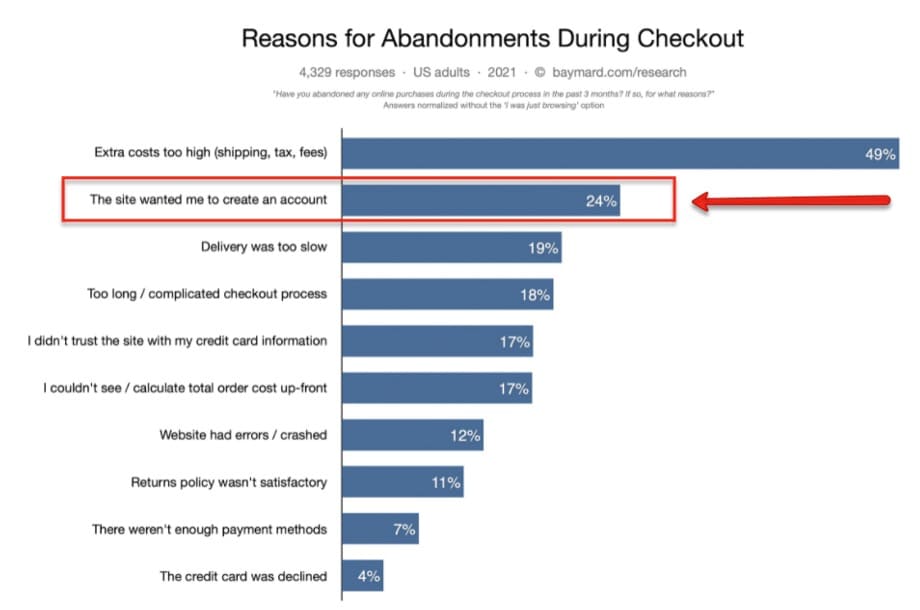
As our GuessTheTest case study shows, the answer is clear: reduce user friction by offering a guest checkout option!
Why?
Well, as this chart shows, one of the top reasons for abandonment at checkout is because the site requires users to create an account:
Nobody wants to register yet another account or remember yet another user ID and password. They’re there to buy something. A guest checkout button is the ultimate remedy!
In his study affectionately known as The $300 Million Dollar Button, revered UX researcher Jared Spool reveals adding this one button—a guest checkout button—can boost conversion rates by as much as +45%.
The even better news? If you’re on a Shopify site, adding a guest checkout option is super simple. As this article explains, all you need to do is select the guest checkout option when setting up your online store.
By default, Shopify gives three options.
Offer guest-only checkout
Provide a guest checkout OR require an account
Make account registration mandatory
Additionally, you can provide guest checkout AND add an account registration option post-purchase. Or use OAuth login, enabling login through social sites like Facebook and Google.
However, always A/B test first because not all case study examples will hold true for your site. To seamlessly set up your A/B tests, consider using Convert, which specializes in A/B testing for Shopify sites.
Improve your shopping cart and checkout by reducing friction. For example, remove the header navigation, increase the perception of security and reduce risk by prominently showing risk reducers like guarantees and free shipping.
But don’t just focus on this—you need to optimize the whole visitor journey up to this point.
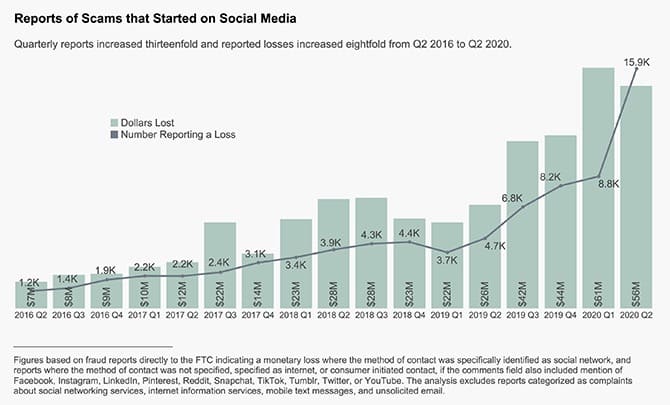
When shopping online, consumers have a lot to be skeptical about. According to some statistics, online security breaches happen every 39 seconds! And cyber crimes are only on the rise. In fact, as the below chart shows, over four years, the number of reported online scams increased 13-fold, resulting in over $56 million in lost consumer dollars.
Add in unsecure checkouts, credit card fraud, and online identity theft, and you’ve got a dynamite combination leaving online shoppers incredibly vulnerable. With so many scam sites out there, how can you possibly trust any of them?
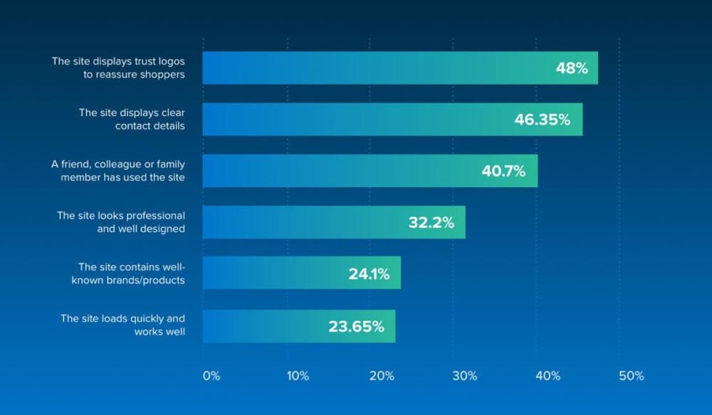
The answer is trust badges.
Those small symbols and seals placed on your website can truly help instill buyer confidence. They let shoppers know your site is legit and secure. In fact, according to this study, trust logos can increase the perceived trustworthiness of a brand by 75%. And, a survey by Econsultancy found trust logos are the top way to build consumer trust:
For many stores, an upsell is a huge source of extra margin and profit on an order, but it’s easy to get this wrong.
Don’t just add a simple carousel to the basket.
Consider (and test) when the best time is to offer an upsell, what products (and how many) to show, if you can give any compelling reasons for the user to buy, and most of all, make sure you don’t get in the user’s way.
In tests, we’ve often seen that ‘overselling’ a user with additional products can significantly harm the conversion rate.
While it’s common for people to skim read text, do not underestimate the power words can have. Copy is just as important as the visual and design elements of your website.
Carefully considered copy can provide clarity and convince, persuade and motivate your users to take action. It can guide users through a journey and set expectations, as well as subtlety signposting who your brand is for.
63. Test headlines and copy above the fold
Copywriting is one of the biggest influencers on conversion rates, particularly for elements like headlines seen above the page fold.
Using benefit-driven wording works well, as does using wording that solves visitors’ pain points. A/B test different variations on your key pages.
Pay attention to visual hierarchy in text, giving users a visual cue to what information is most important with a visual emphasis.
Kaitlyn Fostey, Director of Ecommerce at Levitate Foundry
65. Turn your CTAs into a CTVs
Your call-to-action (CTA) is arguably (or not-so-arguably) the most important copy on your page.
One of my favourite strategies for driving conversions is to turn CTA into a CTV. CTV stands for call-to-value.
When you use a CTV, you directly highlight the benefit of the conversion for your prospect, ”Learn more” becomes “Save me time.
Kirsten Lamb, Conversion Copywriter at Electric Ink Creative
66. Test CTAs
CTAs are bread and butter material for split testing because they are the mechanism that guides users down the sales funnel.
CTA size, color, typeface, and placement all influence conversion rates. Putting a call-to-action in the wrong spot, color, or size on a webpage may inevitably cause users to drop off the sales funnel before they even see product pages.
Optimize CTA designs to be brand-cohesive, attention-catching, and persuasive before split testing for the best conversions.
67. Don’t just solve the buyer’s immediate problem, think two steps ahead
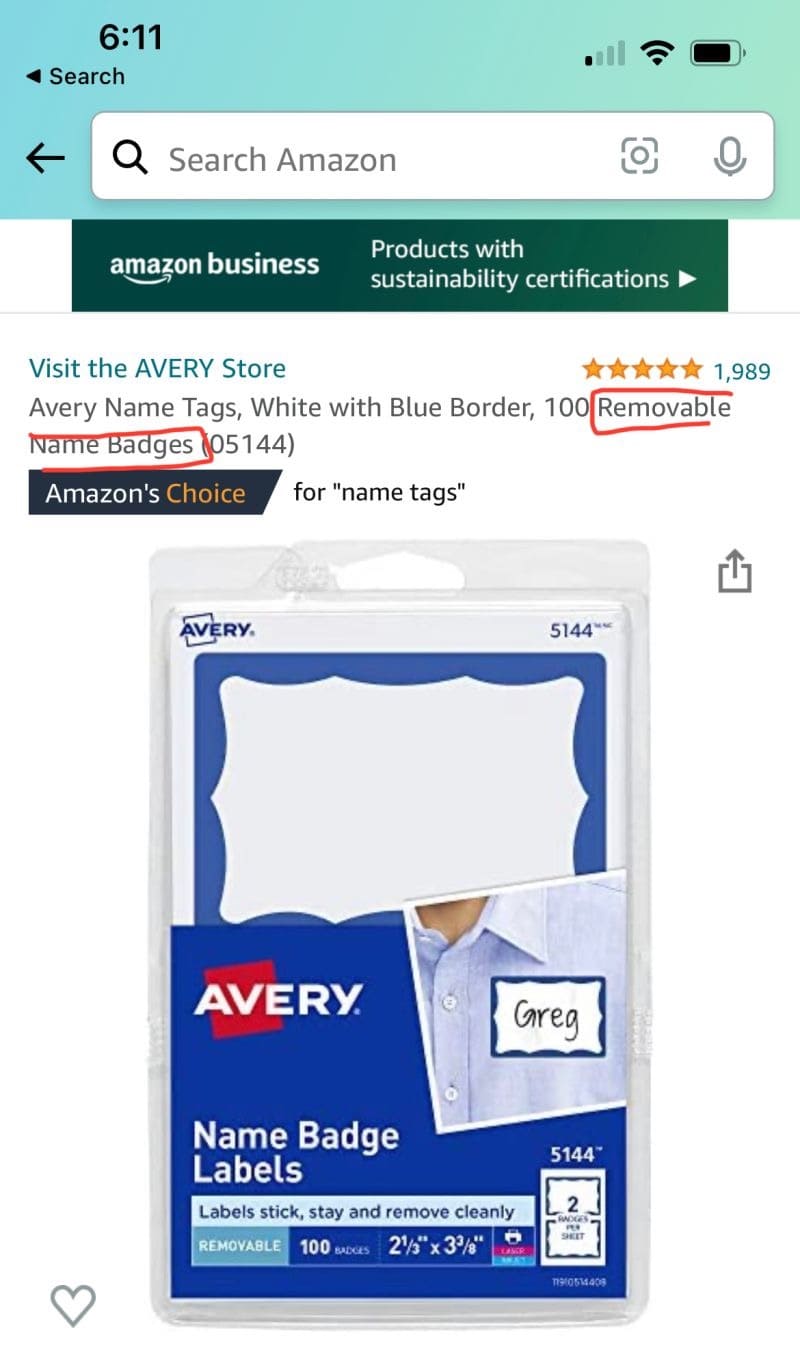
Most shoppers are only thinking about solving their immediate problem. They aren’t thinking 2 steps beyond that. If I’m looking for a stickable name badge for an event, I’m not thinking about the convenience of removing the name tag AFTER the event.
While looking at nearly identical options, I came across the one below. And their headline injected a detail I hadn’t considered (highlighted in red).
Once injected, it became part of my criteria. That immediately made them top of my list.
I then went to other brands to see if this removability feature was mentioned. It wasn’t. Now I’m thinking, ‘if I buy the other options could it leave a mark as guests try and peel it off AFTER the party? Wouldn’t that make me look bad and ruin the event? Isn’t it better to just pay a little more for this one?’
It’s very possible that ALL name badges are easily removable. But the fact that this brand prominently talked about it made me associate that quality with them.
Rishi Rawat, Product Page Optimization Specialist at Frictionless Commerce, original post here.
68. Make users the center of every line of copy
Replace every, “I, us, and we,” with “you.”
Kirsten Lamb, Conversion Copywriter at Electric Ink Creative
User Journey Optimization
Up until now we’ve focused on specific pages or flows which form the overall website journey, but optimizers need to consider the entire journey to ensure they have proper context.
To do this, research, data analysis, and journey mapping can be used to gain an understanding of where users have been before landing on your website and what other elements they might have interacted with or been influenced by, such as their experience in physical stores, social shopping or reading off-site reviews.
This section also covers how off-site elements such as emails and notifications can benefit your CRO efforts and be improved by A/B testing.
69. Use data to build a customer journey map
I would highly recommend for any Shopify owners to implement a customer journey mapping process (which just means visualizing all the digital contact points customers have with your brand on their way to purchasing from you). It allows you to identify choke points, problem areas, and difficult-to-navigate areas of your website.
Quick example: We used session recordings to identify a problem we were having with cart abandonment. Customers were adding products to our shopping cart, but then, at a much higher than normal rate, were leaving. We quickly figured out that, due to my oversight, we forgot to enable Apple Pay, Google Pay, and PayPal. This shows the importance of having data available to you as you seek to improve your conversion rate.
Richard Clews, Founder & Chief Pants Officer at Pants&Socks.com
70. Prominently show your value proposition on key entry pages
It doesn’t matter how engaging your website looks if you don’t clearly show your unique value proposition—these are the reasons that someone should purchase from your website instead of your competitors (low price guarantee, biggest selection, highest rated, etc.)
And don’t presume that your visitors know it already, on the contrary, they will often be doing comparison shopping. Therefore you need to add key elements of your unique value proposition prominently on your key entry pages, like in a benefits bar under your navigation and on your homepage.
71. Create opportunities for micro-commitments throughout the user journey
Get users to make micro-commitments as they scroll or move further down the funnel, increasing the commitment level to lead to conversion.
Kaitlyn Fostey, Director of Ecommerce at Levitate Foundry
72. Make use of behavioral triggers
Let’s assume you offer price-match or price guarantee. Now many visitors will mark up the name of the product and copy-paste it into google to see if they can find a cheaper store.
With behavioral triggers, you can show a pop-up indicating your price guarantee based on somebody marking up and copying your product names.
Here is an example:
We have seen a nice lift in conversion rate and lower bounce rate on retainers that implement this.
You could also do this for checkout, in case somebody adds a coupon that doesn’t exist. Why not give them a 5-10% discount but collect their email in exchange? You will dramatically reduce cart abandonment if you implement this concept on your site.
73. Build trust through consistency on all channels
The biggest leverage are the foundations:
Product market fit
Offer
Messaging
This is essentially the 20% of effort that will get 80% of the results. So brands need to execute these foundations at a high level across their store, social media content, email, and advertising strategy.
On top of that, I think they need to have congruence in their positioning and messaging throughout all channels and, more importantly, build trust.
Trust is one of the most important currencies in online consumer behavior. People need to trust a brand that they will deliver on the Value Proposition and claims they make.
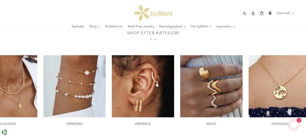
74. Test sliders to help users discover more products
byBiehl is a Danish jewelry company, and after completing analytics and qualitative research, we noticed that not enough users who landed on the homepage were browsing through collection pages. By adding a slider section with the main collections, we hypothesized that we can showcase more product ranges and engage users further in the conversion funnel.
Our goal was to increase the visits to collection pages as well as improve the overall conversion rate and revenue per user.
The new visual design had a positive impact on the user experience, making website visitors browse through more collections and complete more purchases. The new design was successfully implemented on the website.
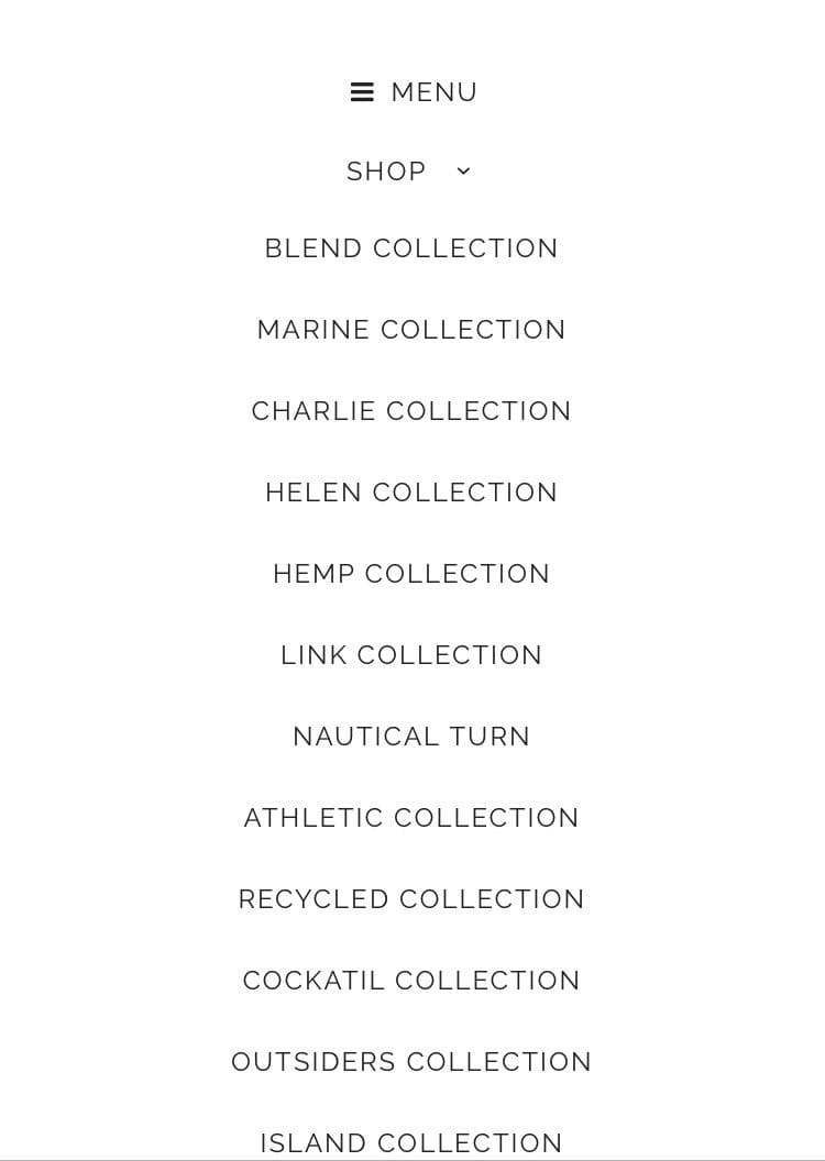
75. Don’t sacrifice clarity for the sake of differentiation
With the ecom game being more saturated than ever, I can totally understand the desire to differentiate and stand out in whatever way you can. Unfortunately, this can backfire in unexpected ways when the clarity of how to use and navigate the website gets compromised.
A good example of this would be “fun” category names that no one understands at first glance. Let’s say you open the category page of an apparel site, and all you see are words like this:
When you click on any of those, are you going to see socks, shoes, or sweaters? Categories by actual product type is a more reasonable way to go to make sure your customers are finding what they need to find.
It might sound a bit strong, but people are cautious, wary, and anxious about making purchases online due to the massive amount of unknowns and the risk involved in putting their credit card details in and trusting a business. So you need to answer their questions.
Whether it’s about the product or your business, you need to make sure information is easily accessible on your website where the customer wants to find it, not hidden away on an FAQ page.
Not everyone needs to contact your business, but a lot of people will want to know they can. You may have a 30-day free returns policy, but if people can’t see a way to contact the business, that returns policy is meaningless.
As marketers, we need to answer these two important questions every customer has.
Is this the right product for me?
Is this the right business to buy it from?”
Will Laurenson, Conversion Rate Optimization Consultant at Customers Who Click
77. Forget homepage diplomacy, let testing decide
We see an issue with huge brand campaigns that don’t appeal to and/or are confusing new customers on the home page. A lot of ecom teams battle with brand teams in terms of what and how much space something should take on the home page, which is, of course, prime real estate.
It makes sense that every marketing department wants their stuff to be present, but the reality is that new customers want to quickly understand what you are selling and how it benefits them before engaging with hyper-focused brand campaigns. This is where experimentation comes in. If you have the traffic, test that new huge feature first before committing to it.
Answer the ‘frequently asked objections’ on the website across different funnel steps. The gold mine that is voice of customer data helps in identifying those objections and what matters to your prospects. Because that’s exactly what matters to the users during the decision-making process.
Jyoti Malik, Director Of Ecommerce at California Design Den
79. Capture visitor emails on their first visit
Don’t presume your visitors will convert first time—over 95% of them will leave. Capturing email addresses by offering a good incentive (like discounts or related guides) is essential. When using a good series of automated emails, email will often become your highest converting source of traffic.
80. Include shipping info in the first funnel step
I have not done research for a single ecom company where this issue didn’t come up. How much is shipping? Is it free with specific orders? Which countries do you ship to? Are all taxes included?
These are all questions that should be answered before your customer adds something to their cart because if they make it to checkout and see an unpleasant surprise of added costs in there, you’re going to have a problem.
My personal experience shows that most people would prefer not to think about any of this and just have everything included while they enjoy “free shipping,” but this is, of course, also an excellent area to test and see what really works for your specific audience.
Whichever shipping/discount options you choose, they should be very clearly communicated from the first funnel steps.
Whatever the customer wants to do when they land on your website, it needs to be easy.
Whether that’s finding a product, managing their account, reviewing an order, or getting in touch with the business.
For those looking to buy, your website needs to help them get to the right place. If they land on your homepage, how quickly can they get to the product listing page relevant to them?
If they land on a product, but it’s not the right product for them, how easy is it for them to find the right product?
When someone hits Add to Cart—your website should make it obvious what’s happened and what the next step is for that person.
You can even add steps to this process as long as they are relevant.
Upsells are a controversial one here. A lot of people say leave them out, they just annoy customers and cause drop-off, but if they are relevant to the experience, people will either accept them or reject them and move on. If your ecommerce site takes the airline route though and sticks 12 upsell steps in front of them, of course, you’ll see drop off.
Will Laurenson, Conversion Rate Optimization Consultant at Customers Who Click
82. Optimize your site for mobile users
One of the best ways to improve conversion rates on your website is to optimize your site for mobile access.
These days, there’s an incredibly high chance that a customer is shopping for whatever you may be selling on their phone or other similar mobile device, so it’s absolutely essential they can view everything normally on that device.
A/B testing for mobile optimization can help you find bottlenecks and improve the customer journey. Make sure you’re also comparing your conversion rates between desktop and mobile, as this will give you insight into where the majority of your customer base is, as well as what kind of ads and site optimization they’re responding the best to.
Here are 7 proven CRO tactics for e-commerce brands to enhance their homepage experience on mobile:
#1 Vibrant Social Proof:
Showcasing authentic testimonials and images of satisfied customers will make your homepage burst with life. This will build trust and engage visitors immediately.
#2 Trust Amplification:
Spotlight your positive reviews prominently to underscore your brand’s reliability and customer satisfaction. Trust is critical to converting visitors into loyal customers.
#3 Emotive Headlining:
Use an emotionally compelling headline that connects instantly with your visitors. A strong emotional pull can significantly increase engagement.
#4 Crystal-Clear Benefits:
Streamline your messaging with a sharp subheadline and highlight USPs (Unique Selling Points). This ensures quick and easy comprehension of your product’s benefits.
#5 Intuitive Navigation:
Implement a full-width CTA (Call to Action) button tailored for all devices. This will make user engagement seamless and increase conversion rates.
#6 USP Highlight:
Prominently feature your top three Unique Selling Points. This ensures visitors grasp your product’s value within seconds of landing on your homepage.
#7 Payment Seals:
Display accepted payment methods on your homepage. This reassures customers and reduces friction during the checkout process.
Use live chat software to interact with website visitors in real-time and provide assistance as necessary. Add these elements to your high-converting web pages, including your price and product pages, to ensure prospects receive the information they need immediately.
Your communications and chatbots can also be action-based. For instance, you might wish to automatically give assistance and respond to any queries if someone spends more than a minute on the page (a live chat tool, like HubSpot, makes this easy).
84. Improve your navigation menu, filtering and search
Your navigation menu, filtering, and search elements are often some of the first things used on your website, so they need to be highly usable. The better they are, the more likely that visitors will find what they are looking for faster and easier and convert.
It’s particularly important on mobile category pages to make your filters more prominent and easy to use, ideally using sticky elements, so they are always visible.
Sure, you have done email marketing for ecommerce but did you ever stop to think about using push notifications?
You can send them directly to your customers’ phones or if they are on a desktop using their browser. You can use them in the same fashion as your email marketing, but it gives you another channel to re-activate your shoppers.
The advantage of push notifications is that they are faster to deploy and require fewer steps to take people back to your store.
The process is super simple: send a push notification, get your visitor to interact with it, and then redirect them to the website. It is less clunky than opening an email, but it should be used in cohesion.
When customers are scrolling through your website, they are looking for the solution to their problem(s). But, more often than not, they do not know precisely what the solution is.
A quiz should be made so that, upon completion, the customer knows exactly which product is the right solution for the problem. And it is not that hard to create.
The visitors should go through a few (3-5) loops where they answer a meaningful question that gives you more information about what they are looking for.
For example, if you sell soccer shoes, you can ask them what their favorite brand is, what is their style of play, and what surface they play on, and after they answer these questions, you should be able to provide them with the right product. Now, it is crucial to offer ONLY ONE product in the end.
88. Improving your site load times is only a top priority for certain websites
Site speed is often mentioned as important however it’s usually less likely to have a big impact on conversions than other tactics.
The truth is that unless your pages are noticeably slow at loading (over 5 seconds) and you are in a very competitive market where visitors can easily go elsewhere to buy what you offer, then improving load times likely won’t have much impact on your conversion rates.
Upselling from the thank you page is one of my favorite “tricks.” But you should not underestimate the importance of this little page for other purposes too.
Here are 3 tips for getting the most out of your thank you page:
🚀 Share a video or photos of other customers receiving your package or product unboxing.
💬 Add a few comments from yourself as a founder. Consider this a “personal thank you,” if you want to go over the top, you can send a personalized postcard!
🗺️ Add an integrated tracking map to help your customers track their order directly from the moment they placed their order.
90. Optimize paid search ads to increase relevance
Paid search is often a key source of traffic, so it is essential to improve the relevancy of your ads, in particular by improving the message continuation from your ad to when they land on your website.
Driving paid search to specific keyword-focused landing pages rather than your homepage will ensure higher conversion rates.
Campaign emails are not enough. You need to have flows (sequences) in place to maximize conversions. Unlike campaigns where you’re broadcasting at your time, flows are behavior-based that meet the customer where they are in their journey.
Email and SMS have their individual strengths, but together they make a killer combo for customer experience, support, and conversions.
92. Track scroll depth on landing pages from PPC ads
Track scroll depth on the specific landing pages you use for PPC/Google Ad campaigns. We’ve found that, for some of the more long-tail keywords, visitors are actually looking for depth of information on a page and not necessarily just looking to transact or get in touch without having everything they need in terms of information from a page.
If you track scroll depth on a landing page split test, you can see both whether users do actually scroll before purchasing or bouncing and also to what level they bounce if they do scroll. You can then make informed landing page decisions in terms of updates and amends based on the data from your testing.
Having journeyed through the optimization process and the core elements of a Shopify store you should now be armed and ready to optimize any part of your Shopify experience.
With over 90 ideas to try out, get stuck into analyzing your own website data and user research to understand which tips and tricks might apply. Once you’ve identified and prioritized problems and opportunities in your store, get inspired by the ideas in this guide to springboard your own solutions to hypotheses. Happy A/B testing.
Contributors
A big thanks to everyone who contributed their ideas and advice to this guide. You can find links to everyone who contributed below.