SaaS UX Research: Everything You Need to Know in 2022
SaaS apps have some of the highest user churn rates.
A typical mid-sized business changed 39 percent of its SaaS software within a year to make it more user-friendly. In other words, people found the tools hard to use and left shortly.
That translates into tens of thousands of additional investments, tons of time spent on remakes, and a lot of frustration.
Designing a powerful SaaS app which is also easy-to-navigate could be challenging. If the dashboard is too confusing and not intuitive, the user will be discouraged from using it.
That’s why SaaS companies need to plan software design based on thorough UX research.
In this article, let me walk you through the best tips and practices of SaaS UX research and give you some real-world examples.
Why is UX Research so Important for SaaS Companies?
Doing SaaS UX research is a must to ensure user-friendliness and minimize software revisions after launch.
Here are the most important things to keep in mind.
Software Trial Signups: Make Them Easier to Get More Users
Have you ever felt annoyed by how much unnecessary information you need to provide to sign up for something?
If you have, then you know how your potential customers might be feeling when they encounter a complex signup process.
Your task is to:
- make the signup flow simple by minimizing the number of steps one has to take to start using the software.
- ask for essential information only (if you’re asking for a lot right away, make sure to justify each requirement). This means no credit cards! SaaS businesses that enable signups without the credit card requirement get twice as many paying customers from free trials than those who don’t.
Take a look at the signup process of MailTrap. First, it requires only the essential info like the username and password.
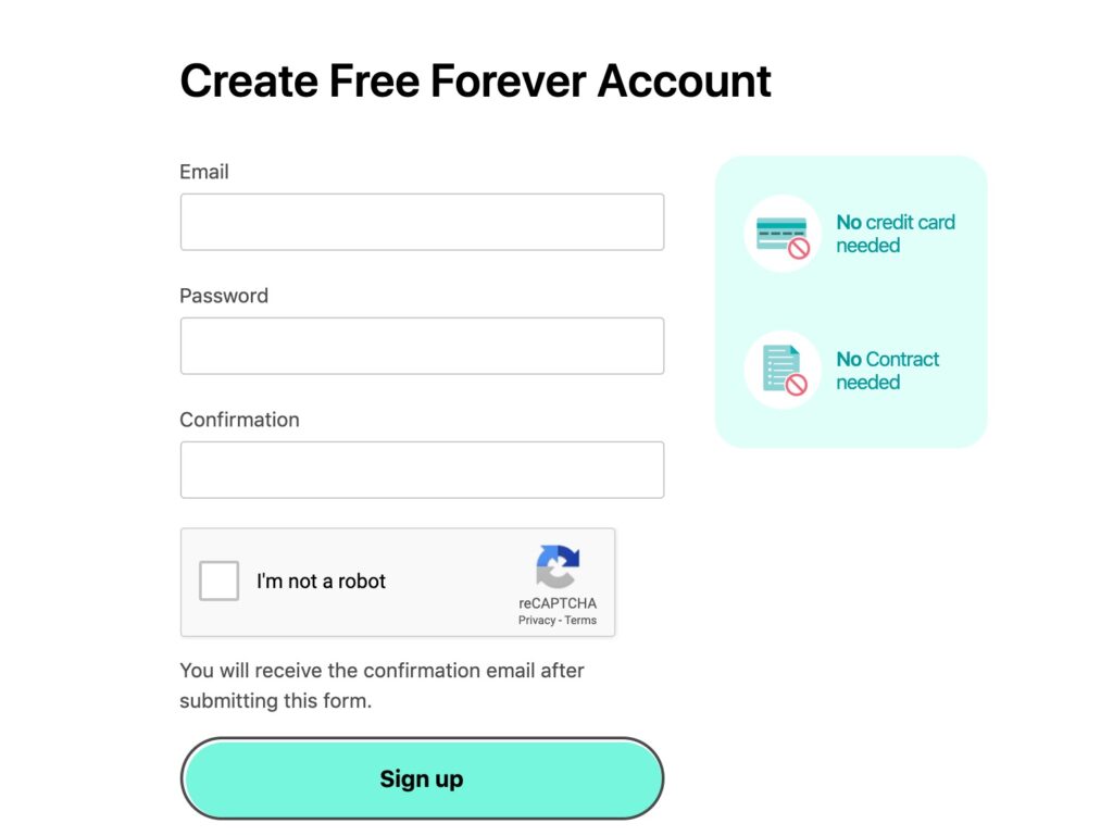
Note that they also encourage the user to sign up by reassuring that no credit card or contracts are required.
Second, the user has to verify their email address without getting access to the app.
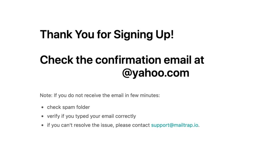
The email arrives in about 10 seconds, so the confirmation is pretty fast. The user clicks on the link and gets redirected back to the login page.
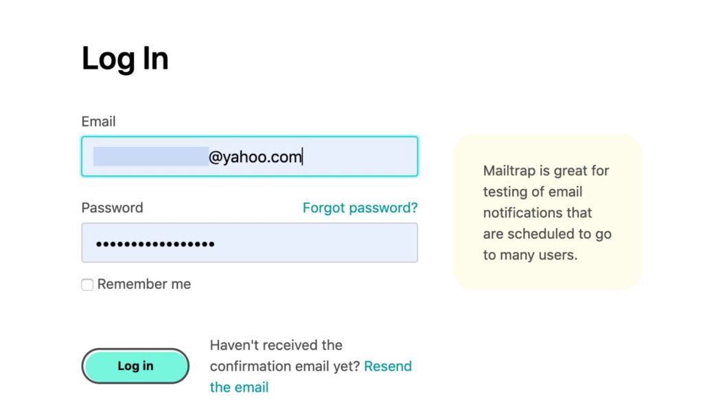
Note the use of a tooltip that encourages to login by giving the user a real use case for MailTrap.
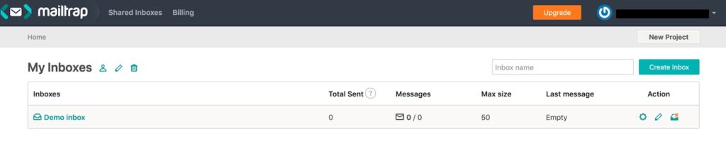
Just one click and we’re in, ready to use the tool. It’s even got a demo message to help the user learn the tool faster.
A low-effort, simple signup process like this is your best bet.
Simple Onboarding: Help Users Get Value Quickly
There’s so much your users need to know about your app to get its full value. Pushing out all that information to make them proficient as soon as possible might be very tempting.
Resist the temptation.
The best onboarding experience, just like the signup experience, is simple.
At Tidio, the onboarding experience starts with an easy four-step that has the user providing the essential details to start using the solution.
The process takes less than a minute to complete.
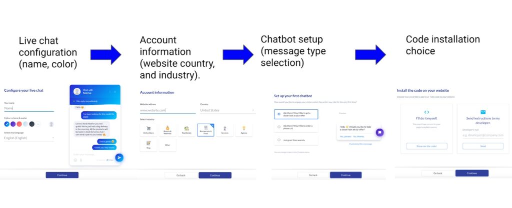
When the user completes the last step, they enter the Tidio dashboard.
To help new users navigate Tidio, we provided a brief, easy-to-follow onboarding checklist there.
It walks the new user through the onboarding process before they start using the live chat.
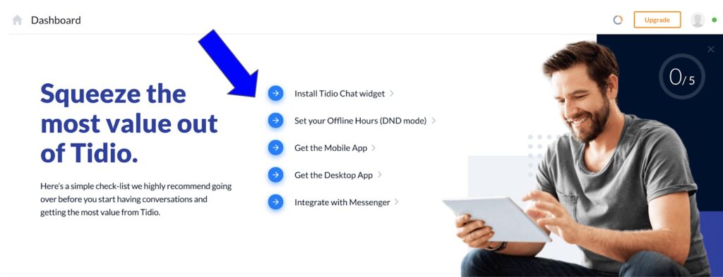
Each section in the checklist is clickable, so navigating the onboarding is quite quick and easy.
So, remember to:
- make the initial onboarding that starts from the home page (the four-step process in Tidio) simple and quick to complete.
- provide an onboarding checklist to guide new users through the journey of activation of your software.
Retain More Users with an Easy-to-Use UI
A complex interface is one of the most common UX-related reasons why users switch apps. Here, it might also be tempting to pack the interface with features, but be careful not to overwhelm the users.
That’s why learning how to make the UI as intuitive as possible should be crucial during your UX research.
Analyze the interfaces of the most popular apps in your niche and learn why customers love them.
Let me help you to start.
HelpJuice’s editor is an excellent example of a familiar, easy-to-use UI in a customer service software app.
It’s very easy to start using the tool because it’s designed in a way that resembles other popular text editors.
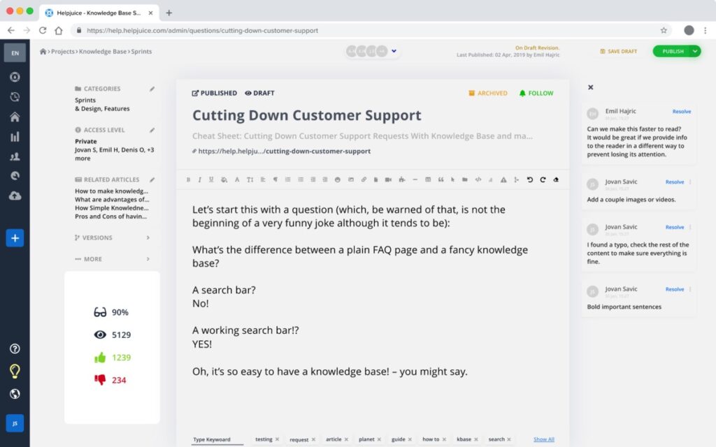
Also, the features are readily available.
The bar between the title and the main body of text, for example, has all formatting features. Such placement makes it easy to find and apply them when needed.
Another function that makes HelpJuice UI great is the drag-and-drop. If the users need to add files to the text, they can just move them to the app’s environment.
This way, HelpJuice stands out as an easy-to-use tool, which is something you need to keep in mind at all stages of UX research and planning.
Write Engaging App Copy
The recent rise of UX writing as a separate field from copywriting happened for a good reason. The ability of in-app copy to engage and even entertain the user plays a major role in both your and your customers’ success.
Here are some important pointers to keep in mind:
- make the copy as simple as possible. Imagine having a conversation with your user and turn the copy into something that resembles it.
- use a friendly tone and active voice. They make it easier to understand the content.
- use the language of the user. If you’re sure that your user understands and appreciates some industry jargon, feel free to include it in the copy.
- consider the user’s perspective. Write the copy in a way that resembles their goals (see an example from Crello below).
Every message, tip, tutorial, or another textual content is an opportunity to make the user’s work simpler, so you need to take it.
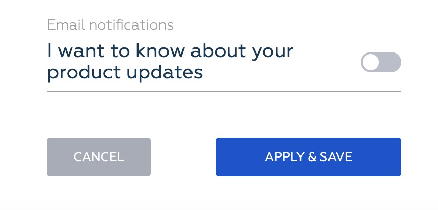
Here’s a great example of using a simple language to consider the user’s perspective in Crello’s settings.
Instead of writing something generic like “receive emails with product updates,” the UX writer chose a much better version.
If you follow these tips, the copy of your SaaS software will create a feeling of interacting with a human.
A human who communicates clearly, provides helpful advice, and doesn’t complicate anything when they have the chance.
SaaS UX Research: 4 Best Practices
Now that we know the most important goals during the research, let’s see how you can achieve them.
1. Find the Terminology Your Users Understand
Many SaaS apps, both for B2B and B2C businesses, often use professional terminology or industry-specific jargon in the interface copy.
It’s a major part of a good, user-friendly UI that makes the software more usable and understandable.
Now, you probably heard that jargon in-app copywriting is recommended to be avoided, SaaS is often an exception.
The reason for this is that selling a highly technical SaaS app to a technical audience requires “speaking their language.” By doing so, you get more credibility.
This is one of the reasons why 42 percent of headlines on SaaS landing pages contain professional jargon. That’s why terminology research is an essential part of UX research.
At Tidio, we collect terminology and copy data via surveys, Google Ads, and Google Search Console. In general, Google Analytics tools should be your go-to if you want to stay within a reasonable budget.
For example, by analyzing the keywords in the Search Console, we can define how people are looking for live chat software for businesses.
In turn, these keywords help to understand how to write the copy for app help guides for Tidio.
2. Learn Design Thinking to Create User-Centered Software
If you have some experience in SaaS product development, you might have heard about “design thinking.”
Design thinking is a human-centered approach and framework that focuses on a better understanding of the needs of users through collaboration and design.
The most important steps in design thinking are to emphasize, define, ideate, prototype, and test.
- emphasize: connect with real users to develop a strong understanding of their goals,
- define: identify their issues and think of possible solutions,
- ideate: here, you actually brainstorm with your team to come up with specific ideas,
- prototype: build different versions of the software,
- test: present the version to users and refine ideas on how they think and behave with the software.
The ultimate result of the design thinking process is a software prototype based on the research of users’ needs.
To get there, you’ll need A/B testing software, because there’s quite a bit of prototyping and testing involved.
I recommend you learn and apply design thinking in your SaaS UX research to establish more trust between your company and users and gain more credibility.
Besides, it helps you to be empathetic towards your customers, which is something one could easily forget with so many other things going on.
3. Use Heatmaps to Understand User Behavior
A heatmap is a way to discover how SaaS users interact with it.
It includes both dynamic and static elements and provides a good understanding of how the software engages users.
This makes heatmaps important for increasing conversions, revealing user behavior, and the overall experience.
Here are the benefits of using heatmaps for SaaS UX research:
- identify distractions. This could be especially useful for improving signups and other conversion-related pages.
- define the most useful features. By tracking mouse movement in your SaaS, you can see what features are the most important for users.
- validate UI design changes. Check how users navigate different designs to choose the best options.
For example, here’s a heatmap of Tidio’s chatbots landing page.
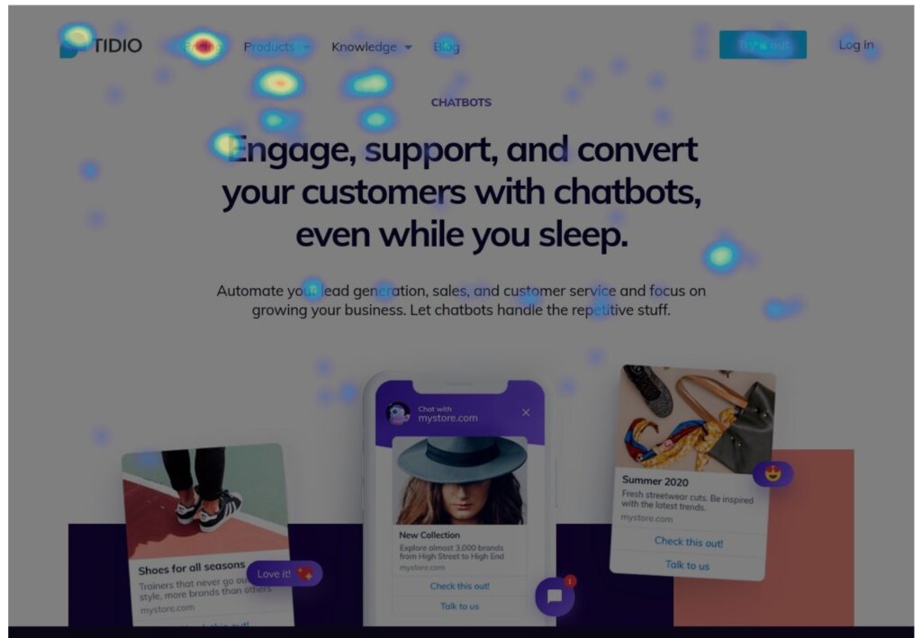
As you can see, most people click in the left side corner that includes a button to pricing and other Tidio products.
Heatmaps could also help SaaS businesses improve their lead generation. For example, by tracking how website visitors browse the website and where they convert the most, SaaS businesses can adjust CTA placement.
4. Make Support Systems Readily Available
Don’t expect users to spend tons of time looking for answers on how to use your software. If you’d like them to continue using your SaaS, you need to ensure that assistance is just a few seconds away.
To make that happen:
- compile a knowledge base. Create a knowledge base where users can get in-depth answers to questions related to your SaaS.
- provide free live chat or chatbot. Having a live chat or an FAQ chatbot inside the tool’s dashboard is a good way to be ready to accept inquiries from users.
- write clear and concise usage guidelines. Use a question-answer format to answer common user questions.
At Tidio, we also use different chatbots on different dashboard pages to offer relevant self-help content.
For example, this chatbot is installed on the chatbot builder’s page and offers a how-to video for first-time users.
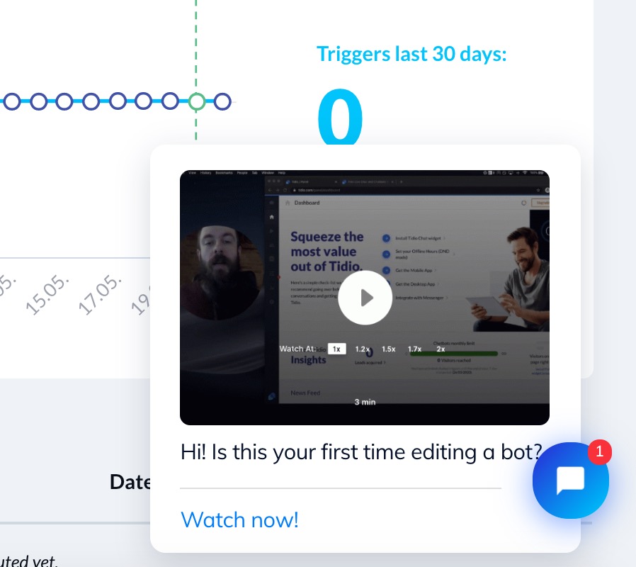
A chatbot like this could handle a lot of common, repetitive user inquiries and allow users to control their experience.
Remember, delivering great support to your SaaS users should always mean a combination of self-help and customer service options.
Not only this helps to save money but also ensure greater availability of help for users.
5. A/B Test Everything
I’ve mentioned testing many times in this article, but it’s really hard to stress its importance well enough.
By A/B testing your SaaS, you can define if it’s usable, helpful, accessible, and valuable. To make that happen, keep three goals in mind for every test:
- a specific, focused task that users need to accomplish, i.e. create a chatbot,
- a broad task that small tasks are contributing to, i.e. provide more efficient customer support,
- the position of the user in the funnel, i.e. free trial user, paying customer, etc.
Here’s a great example of a well-performed A/B test with Convert. After testing and implementing changes, the following results were observed:
- 61% increase in leads on a landing page,
- 57% increase in leads on the pricing page.
Quite impressive, huh?
Take a look at a transformation that took place:
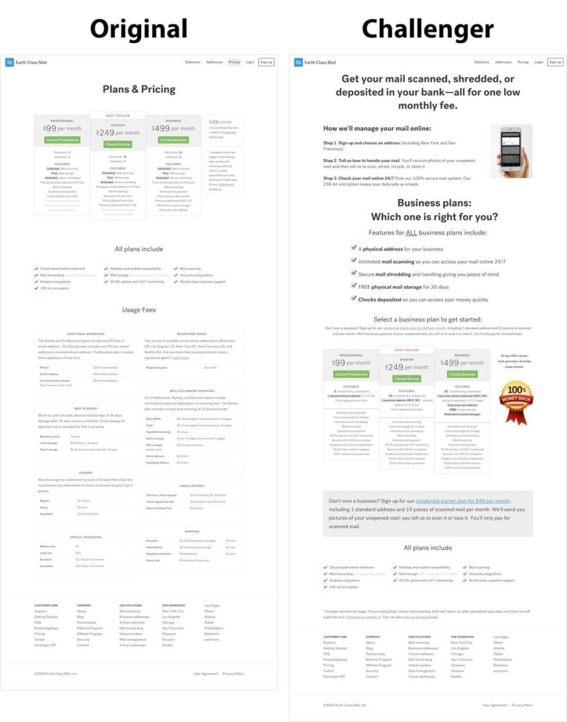
If you ask me, I’d say that every test should be about two things: usability and business goal. And using Convert as an A/B test software has helped Earth Class Mail to uncover the issues and achieve awesome results after fixing them.
SaaS UX Research: Final Thoughts
To avoid remaking your SaaS after launch, you need to invest in thorough UX research. It doesn’t cost a fortune but can really help avoid investments in revisions and keep churn rate low.
Meeting your users’ goals is the ultimate goal behind every tip here, so approach your research accordingly. Apply the best practices mentioned in this article and you’ll increase the chance of developing SaaS that helps users get their job done and keeps their experience positive.


Written By
Pawel Lawrowski
Edited By
Carmen Apostu
