How to Accurately Read and Interpret a Convert Experiences Report
If you’re a Convert user, then you know that your reports are packed with valuable data. But what do all of those numbers and graphs represent? And how do you know what conclusions you can draw from them and you use that information to improve your testing?
Is it as simple as using a statistical significance calculator to validate an experience?
Is calling an A/B test a success if it shows green on an experiment report enough – or should we be looking at other factors too?
While statistical significance calculators are essential for accurate testing, they don’t tell the whole story. In order to get the most out of your Convert reports, you need to have a solid understanding of A/B testing statistics.
And why is that?
Because A/B testing is fundamentally a method of statistical analysis. You can’t have one without the other.
An A/B test or experience is an example of statistical hypothesis testing, in which a hypothesis about the relationship between two data sets is developed and compared to see if statistical significance is found.
So, whether you’re a newbie or an experienced user, read on to gain an understanding of the full range of testing statistics available in your reports and get better results from your A/B tests!
So what can you do with an A/B testing report? Let’s take a look at two practical examples.
Example 1
An e-commerce business is planning to optimize the product pages to improve conversion rates.
In this particular situation,
the product page conversion rate = the number of orders / the number of visitors to the product page
The marketing team is evaluating three new product page designs. They want to choose the most effective one from four possibilities: an existing design and three new ones. How can they use the Convert Experiences report and its statistical methods to spot the best performer, given that conversion rate is a factor?
Example 2
By changing its pricing page, a SaaS website hopes to grow its member base.
For them,
the pricing page conversion rate = the number of subscriptions / the number of visitors to the pricing page
Marketing is evaluating three different designs to see if any of them can attract more subscribers than the current one.
Using the Convert Experiences report and its statistical methods, how can they make such a comparison using the conversion rate as a criterion for selection?
This article will explain what the Convert Experiences report contains, how you can use it to improve your website, and how to interpret the detailed analysis of your visitors’ experiences so that you can take action.
Read on for an easy-to-follow guide to help you understand the statistics behind Convert A/B testing reports.
A Detailed Map of Every Section of a Convert Experience Report
As a Convert user, you have access to detailed information about your website’s performance through reports. Let’s take a comprehensive look at all the elements of a Convert report so that you can understand exactly what information is being presented, and how best to use it to improve your website’s performance.
You can access reports by selecting the experience you wish to view and clicking the Report tab.
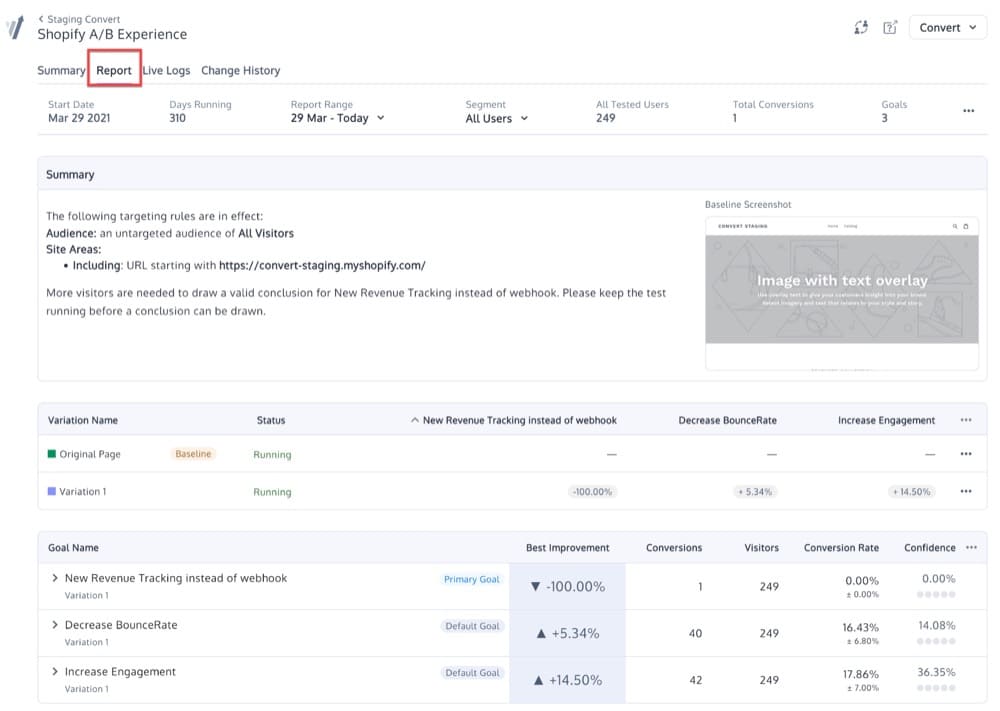
In this section, you will see four different sections:
- Top Menu
- Summary
- Variations
- Goals
➢ Top Menu
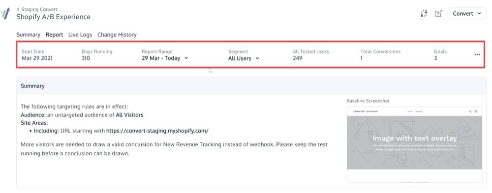
The top menu provides quick access to the following information:
- Start Date: the date the experience started
- Days Running: length of time the experience runs for
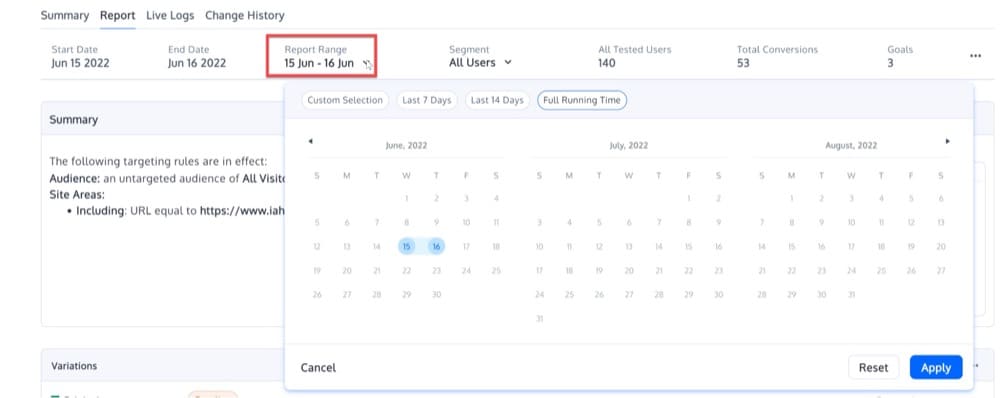
- Report Range: a date filter allows you to filter data for a specific period of time
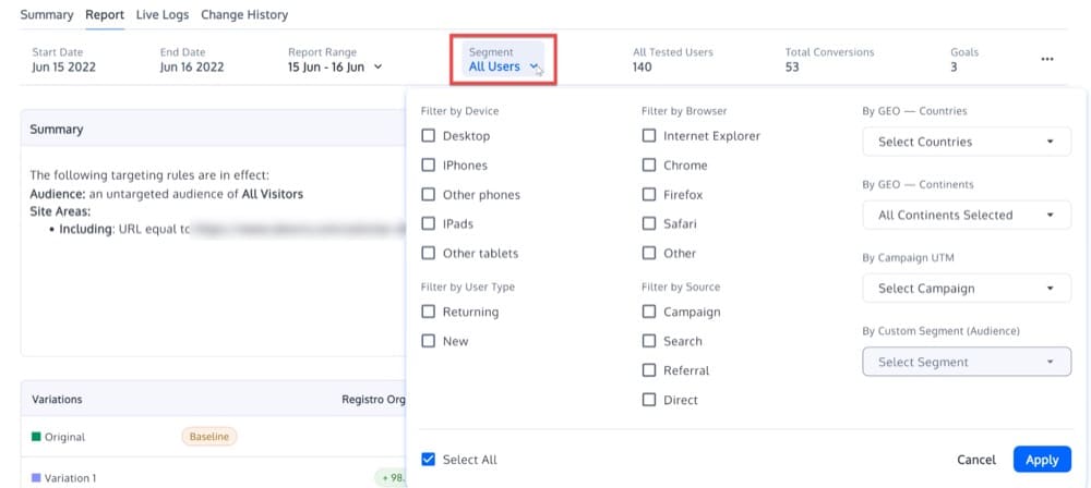
- Segment: filter the report by visitor segments
- All Tested Users: the number of users who participated in the test
- Total Conversions: total number of goal conversions. Convert tracks only single goal conversions per unique visitor. Check out this page for multiple goal conversions.
- Goals: the number of goals a given experience has
Filter for a Specific Date Range
Data can be filtered for a specific date range using the Report Range. Custom date ranges can be specified using either the existing choices or the calendar control.
Filter for a Specific Segment
You can filter the report by visitor segments by selecting them from the “All Users” drop-down box. You can use this to answer questions such as
- How did traffic from different sources behave in the experience?
- What was the winning variation on mobile versus desktop?
- Which variation attracted the most new users?
You should target audiences/segments that matter to your organization and that are likely to exhibit a variety of user behaviors and intent signals.
Examine the improvement and confidence scores for each audience to see how each variation performed. Depending on the results of your analysis, you can decide whether to launch the winning variation to all of your traffic or adjust your allocation.
A Convert experience report includes the following segments:
- browser used,
- device used,
- new vs old visitors,
- user country,
- traffic source,
- continent, and
- 10 custom segments.
Here’s how you can create a custom segment (audience).
You can also use the three-dot menu and apply some further actions:
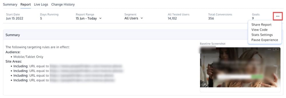
Share Report
Clicking Share Report will open a popup with the following options for downloading the experience data:

View Code
View Code is the second option, which gives you access to your Convert tracking code:
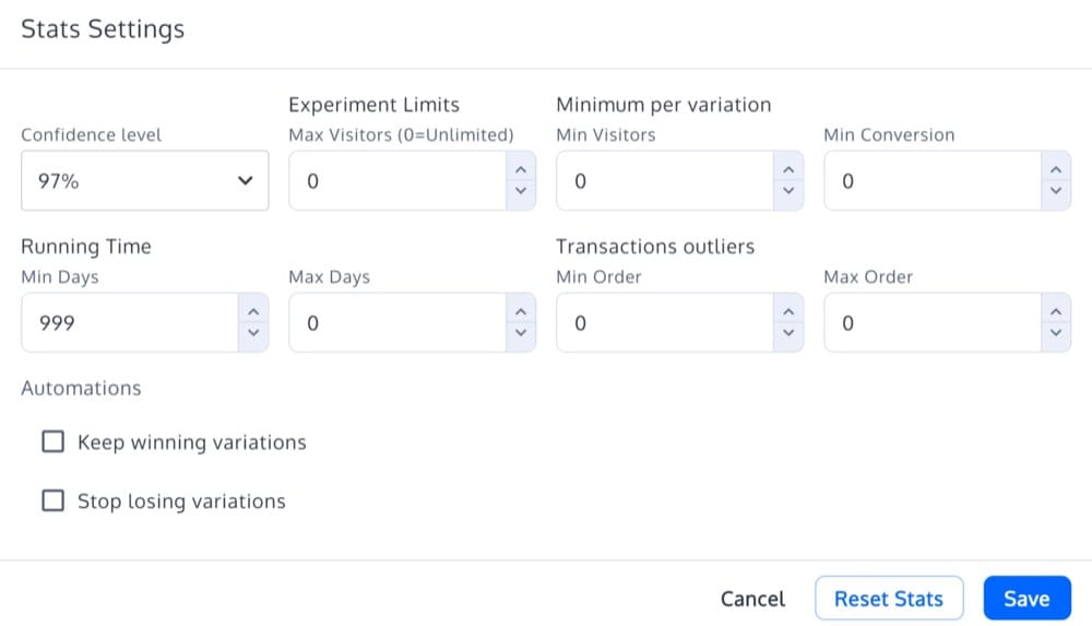
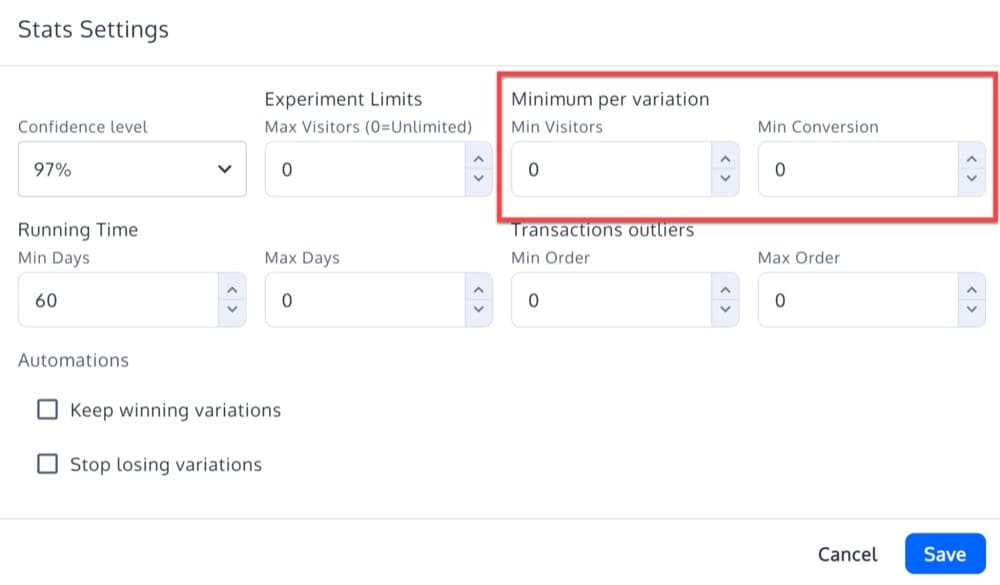
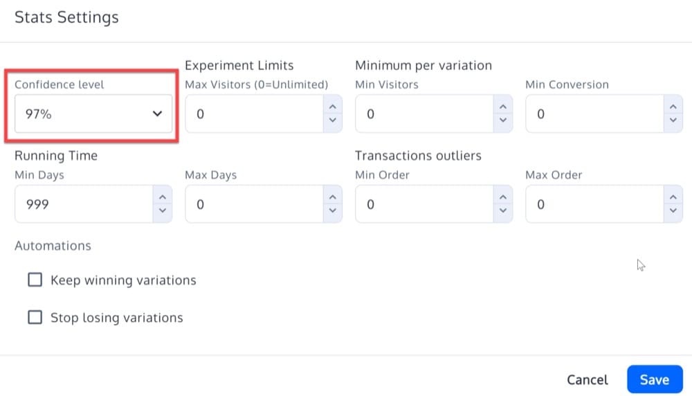
Stats Settings
The third option, Stats Settings, allows you to configure the following:
- Confidence level (statistical significance) — described here
- Transaction Outliers — described here
- Automations — described here
- The Reset Stats button to reset the experience data
Pause Experience
A fourth option allows you to pause the experience.
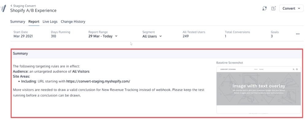
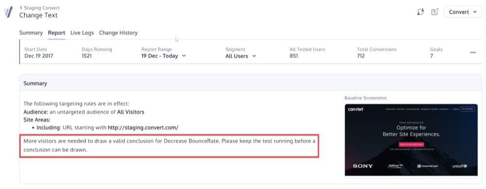
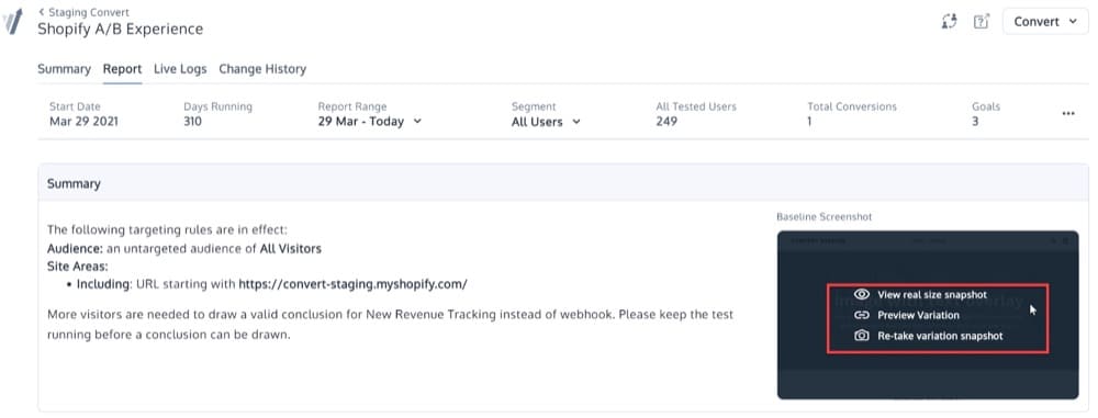
➢ Summary
In the Summary section of your Convert experience report, you will find a summary of the Site Area and Audience conditions that apply to your experience. It also offers some smart recommendations:
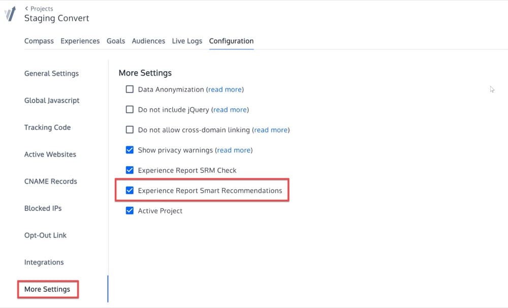
Enable Smart Recommendations
Go to your Project Configuration, More Settings, to enable Smart Recommendations:
View Smart Recommendations
You can view these smart recommendations in two places.
- In the report summary:
The following messages may appear based on your results:
- Significant & lift negative: We are observing that variant ${variant_name} is the best performing one with a negative lift of ${lift}%. The experiment for the goal ${primary_goal_name} is significant. We suggest extracting learnings and design a new hypothesis.
- Significant & positive lift: Congratulations! For ${primary_goal_name}, ${variant_name} is currently winning with an improvement of ${lift}%. The experiment is significant.”
- Insignificant, positive lift: More visitors are needed to draw a valid conclusion for ${primary_goal_name}. We only see that ${variant_name} is the best performing one with a lift of ${lift}%, but needs more visitors before a definitive conclusion can be given.
- Insignificant, negative lift: More visitors are needed to draw a valid conclusion for ${primary_goal_name}. Please keep the test running before a conclusion can be drawn.
- In the Goals expanded box:
The following are some possible messages you may see based on your results:
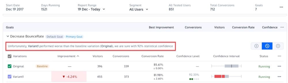
- Congratulations {variation.name} is a winner, we are sure with 00% statistical confidence.
- Unfortunately, {variation.name} performed worse than the {baselineText}, we are sure with 00% statistical confidence.
- {variation.name} seems to be performing better than the {baselineText}, but we can’t be sure yet
- It’s too early to judge for {variation.name}
Baseline Screenshot
If you hover over the baseline screenshot, you will see some additional options:
- View real size snapshot
- Preview Variation
- Re-take variation snapshot
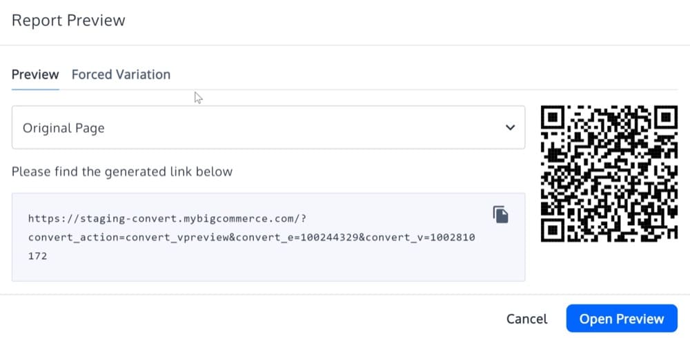
Live Preview and Force Variation Links
The Preview Variation will open a popup where you can get the Live Preview and Force Variation URLs.
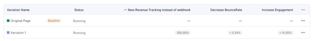
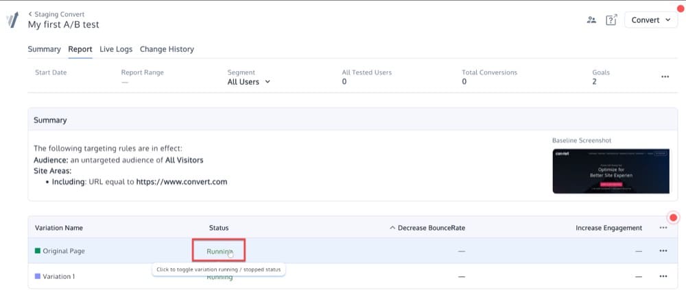
➢ Variations
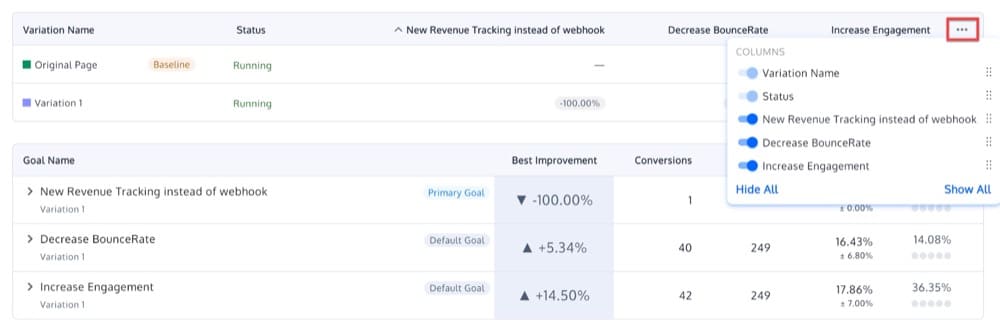
A section called Variations provides details about your experience variations. Each column after the Status column represents your experience goals:
You can enable/disable columns or rearrange them by clicking the three-dot menu:
With the status button enabled, you will be able to pause variations:
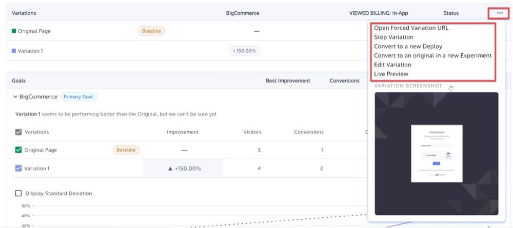
There are some extra options available when you click the three-dot menu on one of the variations rows:
- Open forced variation URL
- Stop Variation
- Convert to a new Deploy
- Convert to an Original in a new Experiment
- Edit Variation
- Live Preview
➢ Goals
A brief description of each of the experience goals can be found in this section as well as a few interesting stats and graphs that we will analyze in the next section. Before we proceed, let’s explain a few terms you may not be familiar with.
- Default Goal: If you see the term Default Goal next to one of your goals that means it is one of the 2 default goals we add to every experience.
- Primary Goal: There can be only one primary goal, which must be decided by you. It is the most important goal for your experience. This will be shown first on the goals list and experience status will be changed based on this.
- SRM: Potential Sample Ratio Mismatch detected on your test. Check the experience setup or contact [email protected] if you spot this.
- Baseline: This is your default experience baseline.
Now, let’s go through each of the elements in this report.
Variation Name
This is the name of your variation. There is a checkbox next to it that you can enable/disable in order to show and hide the variation stats.
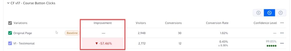
Improvement
You can see here how the original and variation of your web page perform in terms of conversion rates. The percentage difference can be positive or negative. When computed confidence is greater than the confidence set in the stats settings the color changes like this:
- Red for –
- Green for +
- Gray for other
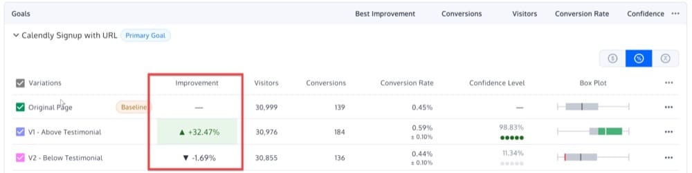
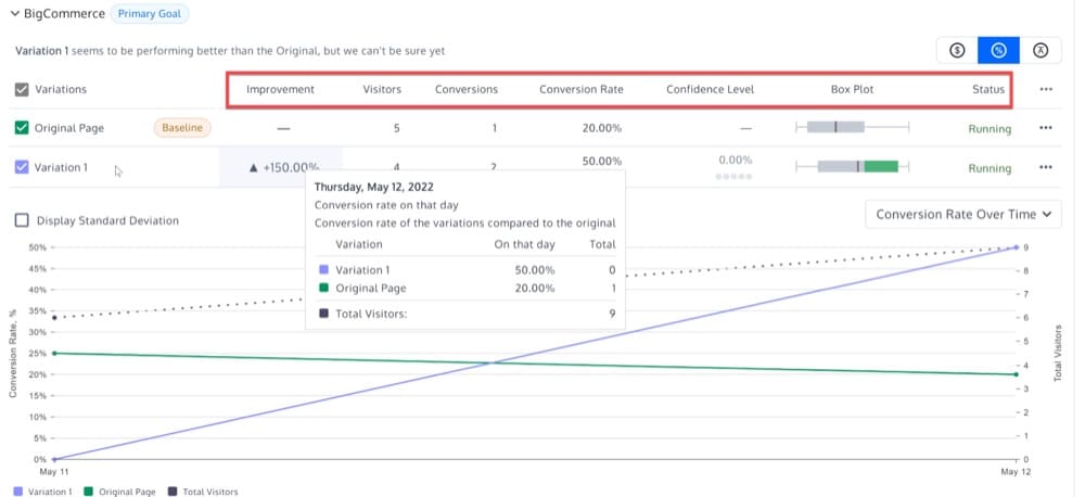
Visitors
This is the total number of bucketed visitors to the experience. Unique visitors are listed here.
Conversions
This represents the total number of conversions for each goal/variation. Any desired action that you want the user to take is referred to as a conversion. Depending on your website, this might include everything from clicking a button to making a purchase.
Conversion Rate
This column shows the percentage of visitors that turned into conversions.
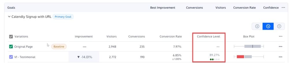
Confidence Level (Statistical Significance)
When interpreting your A/B results, statistical significance is the most important concept.
This column indicates how different the confidence interval for the conversion rate for the experiment variation is from the original. If the confidence is not showing any number, this is because (by default) there is a minimum of 5 goal conversions needed for each variation in order to calculate it. It also must meet the minimum visitors set for each variation. If you changed the minimum conversions, the minimum you selected would have to be met.
This column contains gray/green dots that indicate:
- 1 green dot for 75%-85% confidence
- 2 green dots for 85%-95% confidence
- 3 green dots for 95%-96% confidence
- 4 green dots for 96%-97% confidence
- 5 green dots for 97% and above
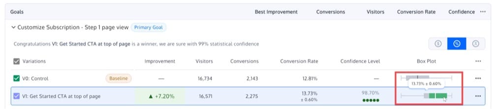
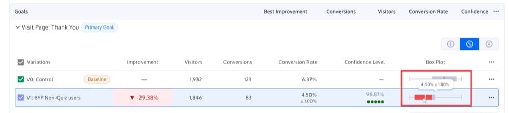
Box Plot (Confidence Interval)
The box plot or confidence interval indicates a range of values where the true conversion rate falls.
It’s a good idea to show the observed difference in the conversion rate value for the original and variation pages when discussing the results, and the range within which the conversion rates can actually fall. The difference interval is a possible range of values that are plotted on a number line scale.
The highest possible range of conversion rate is marked by the upper limit on the number scale, and the least possible range of conversion rate is marked by the lower limit on the number scale.
On the scale, you can see the following colors:
- Gray area: Indicates that the experiment is still inconclusive or that additional people are needed to declare a valid result.
- A winning variation is indicated by the green color.
- A losing variance is indicated by the red color.
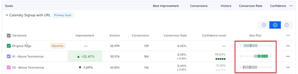
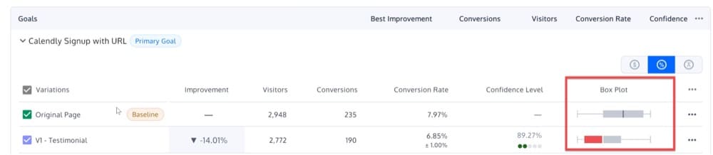
In the box plot, keep an eye out for overlap between the Original and Variation conversion rates.
Assume that the conversion rates for Original have a confidence interval of 10-20% and that the conversion rates for Variation 1 have a confidence interval of 15-25%. It’s worth noting that the overlap between the two confidence intervals is 5%, and it’s somewhere between 15-20%. In this context, it is impossible to tell whether the variation in B is actually a major improvement. This is why, if there is an overlap of the box plots, Convert will not declare a winner.
Status
This shows you a status report on the variation.
Graphs
From here, you can access three different types of graphs.
Below is an explanation of each:
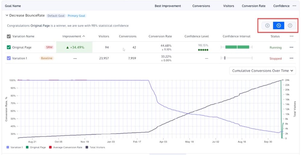
Conversions
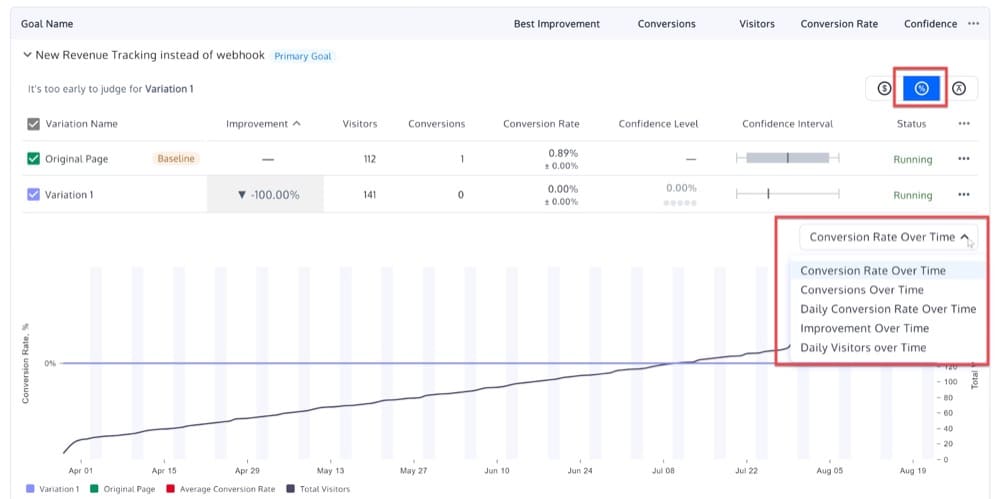
- Conversion Rate Over Time: Y axis shows conversion rate, X axis shows time. Each line represents a variation (cumulative conversion rate) + one for the conversion rate of the whole experiment (average of all variations) + a second axis Y at the right which represents the cumulative number of visitors inside the whole experiment
- Conversions Over Time: Y axis shows conversions, X axis shows time. Each line represents a variation (conversions) + one for conversions of the whole experiment (average conversions of all variations) + a second axis Y at the right which represent the cumulative number of conversions inside the whole experiment.
- Daily Conversion Rate Over Time: non cumulative conversion rate – similar to graph Conversion Rate Over Time, except the Y axis does not show cumulative visitors and the non cumulative is used for the API.
- Improvement Over Time: improvement in conversion rate by day on the X axis and lines each variation (but not original).
- Daily Visitors over Time
Products
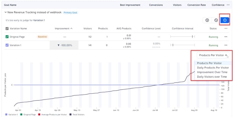
- Products Per Visitor: cumulative average ordered products per visitor – Y axis shows the average ordered products per visitor, X axis shows time. Each line represents a variation (cumulative average ordered products per visitor) + one for average ordered products per visitor of the whole experiment (average of all variations) + a second axis Y at the right which represents the cumulative number of visitors inside the whole experiment.
- Daily Products Per Visitor: non cumulative average ordered products per visitor
- Improvement over Time: improvement in products by day on the X axis and lines each variation (but not original)
- Daily Visitors over Time
Revenue
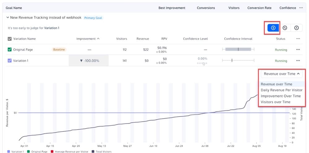
- Revenue over Time: cumulative average revenue per visitor – Y axis shows the average revenue per visitor, X axis shows time. Each line represents one variation (average revenue per visitor) + one for average revenue per visitor of the whole experiment (average of all variations) + a second axis Y at the right which represents the cumulative number of visitors inside the whole experiment
- Daily Revenue Per Visitor: non cumulative average revenue per visitor
- Improvement over Time: improvement in revenue by day on the X axis and lines each variation (but not original)
- Visitors over Time
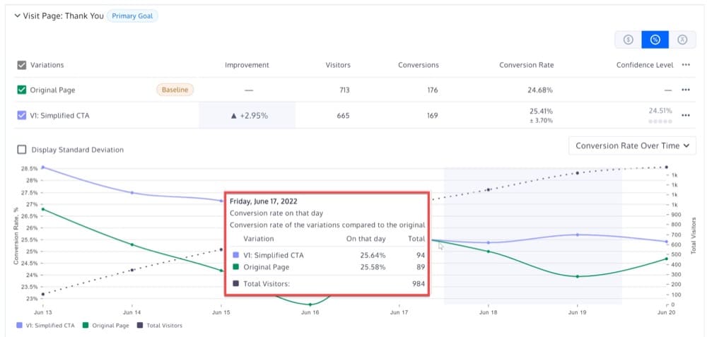
Hover Mouse Over Graph
Hovering over the graph will reveal every variation’s conversion rate on that day and the variation’s conversion rate compared to the original:
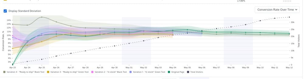
Display Standard Deviation
You can also check the box to display the standard deviation (also called the standard error):
Statistical Formulas Convert Uses
Note: Statistic terms are covered in a different blog, so we won’t repeat them here. Our purpose here is to mention the math formulas Convert uses.
Convert uses a frequentist two-tailed Z-test at a .05 confidence level (95%). That is .025 for each tail being a normal symmetric distribution with the option to change this between 80%-99%.
We will soon be adding bayesian statistics to Convert reports. Stay tuned for more information.
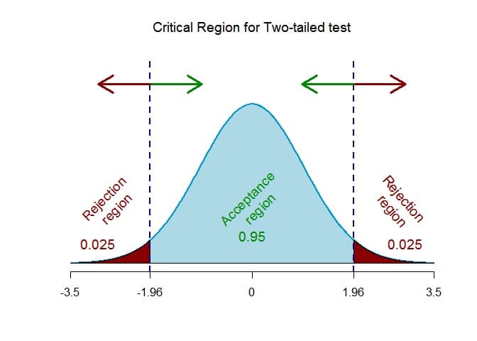
A two-tailed test should be used when we want to find a statistically significant difference in any direction (uplift or drop). The goal here is to determine if the variation led to a statistically significant increase or decrease in conversions.
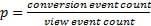
Conversion Rate
This formula is used to calculate the Conversion Rate for each variation:
(Total Number of Goal Conversions / Number of Unique Visitors) * 100
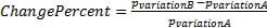
Conversion Rate Change for Variations
The percentage change of the conversion rate between the experience variation and the original is calculated like this:
Confidence Intervals
A statistical method for calculating a confidence interval around the conversion rate is used for each variation.
The standard error (for 1 standard deviation) is calculated using the Wald method for a binomial distribution. Thus, for a given conversion rate (p) and sample size (number of Unique Visitors), the standard error is calculated as
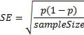
Standard error is calculated using this formula, which assumes that the binomial distribution can be approximated with a normal distribution (because of the central limit theorem). The sample distribution can be approximated with a normal distribution when there are more than 10 conversions on the specific goal.
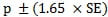
To determine the confidence interval for the conversion rate, multiply the standard error with the 95th percentile of a standard normal distribution (a constant value equal to 1.65).
In other words, you can be sure with 90% confidence that your true conversion rate p lies within this range:
Z-Score
Using a Z-Score, we can determine whether the results are significant (that conversion rates are not differing due to random variation):
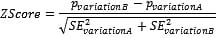
The Z-Score is the number of standard deviations between the original and variation mean values. Using a standard normal distribution, the 95% significance is determined when the view event count is greater than 1000 and one of the following criteria is met:
- Probability(ZScore) > 95%
- Probability(ZScore) < 5%
Improvement
The chance to be different (displayed on the report) is derived from the Probability (Z-Score) value where:
- If
Probability(ZScore) <= 0.5
then
Improvement = 1- Probability(ZScore)
- If
Probability(ZScore) > 0.5
then
Improvement = Probability(ZScore)
What to Look For when Interpreting Experience Reports
Now that you are familiar with all of the Convert experience report sections and its statistical formulas, let’s try to interpret a few different experience reports and see what you can get out of these.
Is the Experience Data Significant?
Before you evaluate the results and make judgments about what to do next, make sure the experience data is significant. Using the “Confidence Level” in the Convert experience report, you can determine if the findings are due to chance or a true reflection of your users’ behavior.
A 95% significance level means that you are 95% certain that the observed conclusions are not a result of chance. It also implies that there is a 5% chance you are wrong.
Alternatively, you can think of the confidence level as the likelihood of getting different results if you repeat the experiment.
If you earn a 90% confidence rating, there’s a 1 in 10 possibility that you’ll get different answers if you repeat the test. With 95% confidence, there is a chance of 1 in 20, while with 99% confidence, there is a chance of 1 in 100.
Winning Variation: Positive Impact
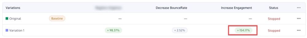
Here is an example of a significant variation that outperformed the original and resulted in a positive improvement.
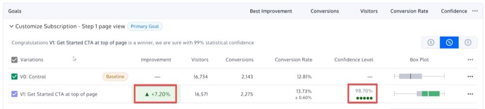
For the goal “Customize Subscription – Step 1 page view”, Variation 1 has a 98.7% chance of beating Variation 0 (Original) in this experience. The box plot shows that selecting Variation 1 can result in an improvement over the Original of 13.73% +- 0.6%
In this experience, it’s safe to say that the improvement is +7.20%, but there’s an equal chance that the conversion rate is anywhere between 13.73% +- 0.6%. Regardless of the situation, Variation 1 would improve over Original, so this is a strong indication to implement it!
Why?
If the same experience was repeated 10,000 times under identical conditions, Variation 1 would still win 9,870 times out of 10,000.
Losing Variation: Negative Impact
Let’s take a closer look at the results of a significant experience in which Variation 1 does not result in a positive improvement but instead has a negative influence on Variation 0 (Original) Conversion Rate.
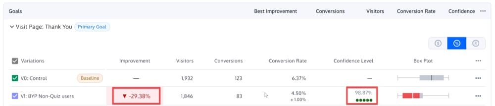
In this experience, there is a 98.87% chance that Variation 1 will lose on Conversion Rate over Variation 0. A negative impact on the Conversion Rate of the Original between 4.5% +- 1% can be expected with Variation 1.
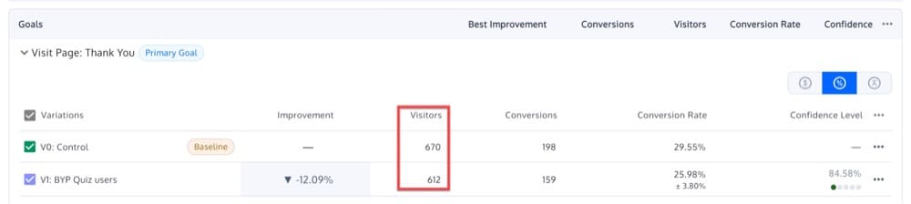
Inconclusive Results: Neutral Impact
Now let’s look at an experience that is not significant. In the experience below, none of the variations has a high enough chance of winning or a probability greater than 95%.
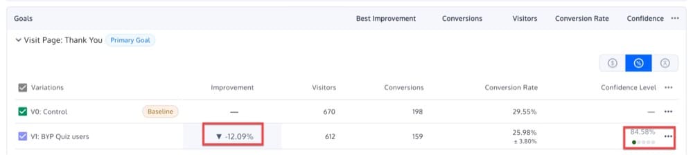
The probability of Variation 1 winning over Variation 0 is only 84.58% in this experience.
What is the next step you can take?
There are several options to choose from, all of which depend on the hypothesis and the ultimate goal of the experience. Whatever the case may be, there are always a few options on the table:
- Extend your audience. If your visitor segment is too limited, try focusing on a segment with a larger audience.
- Remove some variations. If you’ve developed four variations, for example, try running the same experience with two or three variations.
- Leave it running for a longer period of time.
- Follow your gut and choose what is most consistent with your brand. If the results are similar across two variations, and your colleagues agree that one is better aligned with your brand requirements than the other, you may opt to choose one as the winner.
- Relaunch the experience. Running the same test twice to validate or invalidate the initial results is a smart practice. Because the circumstances are unlikely to be the same (different time period, traffic fluctuations, etc. ), the results may differ!
- Allow it to be. It’s possible that your original is already optimized.
Is There an Even Traffic Distribution?
When you set up an A/B experience, you assign a percentage of traffic to each variation (by default, 50/50).
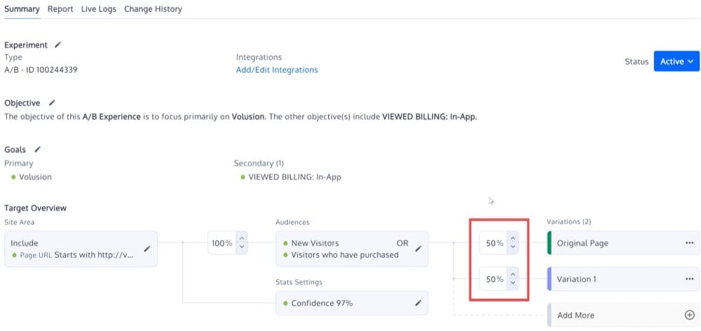
The Visitors count should represent the predicted traffic split.
In the case of a significant difference, there is almost certainly a sample ratio mismatch (SRM)
In a 50/50 split, if you get 400 visitors on one side and 600 on the other, the results aren’t reliable. When this happens, it’s time to look into your A/B experience setup. The results could be skewed by outliers like internal IP addresses or external bots.
Remember, data is only as good as the analysis you do with it. Take advantage of all the tools you have at your disposal, including Convert Experiences’ in-depth reporting, for accurate and actionable insights.
If you don’t already have an account, sign up for a free trial and try it out for 15 days. You will have access to all of the cool features we discussed in this post, plus many more. And if you have any questions or need help getting started, our team is here to help.


Written By
Dionysia Kontotasiou

Edited By
Carmen Apostu
