Complex A/B Testing Hypothesis Generation: The Step-by-Step Guide For when You’re Done with the Obvious
With the amount of guesswork involved, one would think the discipline of conversion rate optimization is wild goose chasing!
As professionals who live and breathe testing, we do get a ton of requests to “increase click throughs, increase revenue and increase engagement” on a variety of sites. In most cases these requests don’t come with a lot of context. ‘
Cause clients often tend to think that we optimizers have some sort of magic formula that can unerringly take them to big conversion lifts.
DISCLAIMER: There is no magic formula.
But there is a tried and tested empirical process that turns “suppositions” into more actions, more dollars, more profits and just more for marketers and businesses in general.
And this process starts with a hypothesis.
Gain Seeker Meet Hypothesis
The Cambridge English Dictionary defines a hypothesis as “an idea or explanation for something that is based on known facts but has not yet been proved.”
In science, a hypothesis is an idea or explanation that you then test through study and experimentation. Outside of science, a hypothesis can also be a guess or theory.
A detective might have a hypothesis about a crime, and a mother might have a hypothesis about who spilled juice on the rug. Anyone who uses the word hypothesis is making a guess.
However, the power of an educated guess is what sets CRO professionals who regularly exceed client expectations from those who succeed with a random test, only to fail with subsequent iterations.
As with everything in CRO, hypotheses also have their layers.
Businesses starting out with optimization may already have a very clear idea of what has their visitors stymied. The hypothesis is cut and dried. And the gains from the tests are tangible and immediate.
But what happens when you run out of all the obvious options? Do you let go of optimization and rely on increasing your marketing spend by thousands to see proportional improvement in revenue?
Nope. There’s no limit to better, and no limits to testing. So you dig deeper and you read between the lines. Let’s show you how.
How to Generate an A/B Testing Hypothesis, When You’re Done with the Obvious:
1. Obtain and assimilate a list of business objectives that the client has – both short and long-term
It is crucial to keep in mind that not all clients have the same issues and the same objectives. The end goal is making more money for most of them but you can’t simply assume that. Stop, collaborate and listen.
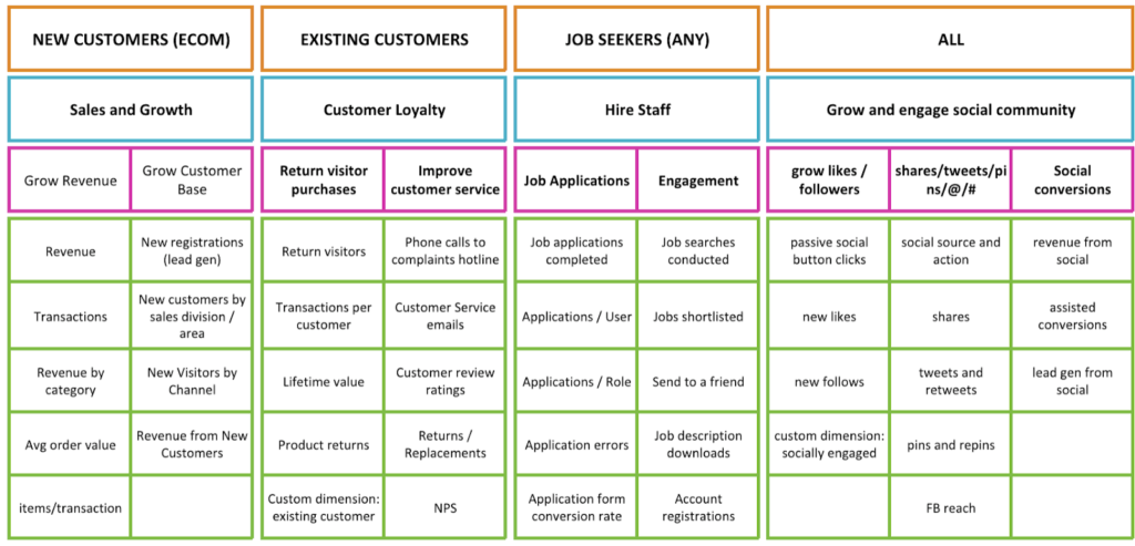
The great thing behind your client’s or your own business objectives is that after you’ve defined them you are halfway done with the measurement plan. As long as you know what you want to track you will also know how to track it.
We have come across a really well done, comprehensive measurement template that takes a bit of time to populate but the results are worth the effort.
You can make a copy of this document from Fresh Egg and make it your own by adding in your numbers and objectives.
2. Check your data and then analyze it
Start analyzing the numbers by checking that the data is accurate and correct. You can’t really improve something if you’re measuring the wrong things. Use Google Analytics crawlers and checkers to make sure the tracking code is installed on all pages, get rid of any duplicate data, add the right filters and use dedicated views based on the objectives and particularities of each business. We will explain this in much more detail in a future article as it is a subject in its own.
Some of the tools we are using?
http://www.gachecker.com/ – Great for spotting any URLs that don’t have tracking code on – works for Universal Analytics and GTM.
Tag Assistant by Chrome – Take this one with a grain of salt as there will be some non-standard configurations out there and you don’t want to be the one crying to your client or boss that Analytics is not installed when it actually is.
WASP Inspector – this has absolutely saved us in terms of event tracking and cross domain tracking validation.
What do we look for in an analytics audit? Basically patterns and outliers in the users’ behavior. We highly recommend doing thorough education in terms of Google Analytics so that you get the most out of this invaluable resource.
Two great places to improve those analytics skills:
Google’s own course, excellent for beginners.
ConversionXL’s Google Analytics Courses – Beginner, Intermediate and Advanced.
In the initial audit, you will want to see the impact of each element on the site, what users are doing, where they are dropping off, any incompatibilities between the website and certain browsers, devices, resolutions, any bug that is worth fixing. After you have all this information put together, you will know where things go wrong but you will also need to find out the reason why things go wrong so go ahead and start working on the qualitative research part of the audit.
3. Set up qualitative research
Launch site polls and customer surveys. By the time you are done with the complete analytics research and insight generation, you will also have a sufficient volume of qualitative information to analyze for your audit.
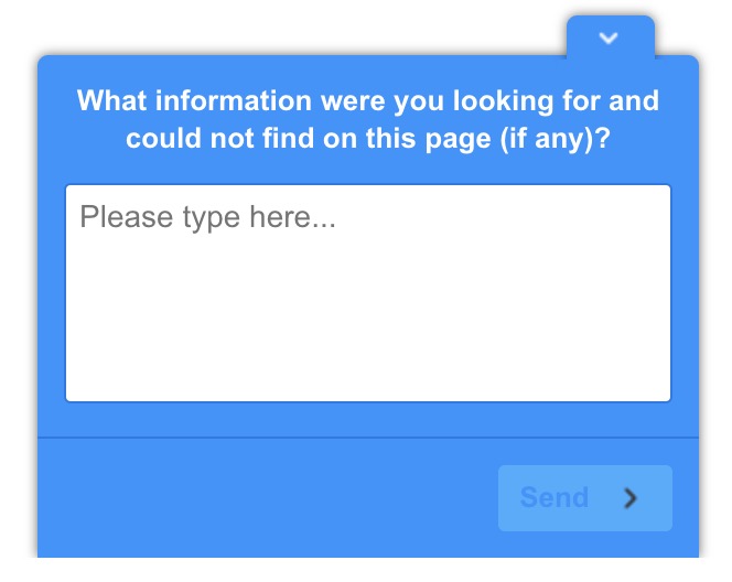
Where do you launch these site polls? Do a quick funnel analysis and identify the drop-off points. If 70% of your users are leaving on the product pages, there might be something there that is not convincing them. What better way to find out than to ask them? Our typical site poll looks something like this:
The customer survey is sent out to recent customers, after they have received their product, ideally. Try sending this to customers that are not older than 30-45 days as you want them to remember the experience they had with the website, with the shopping process and also with the actual product. If you send out the survey too soon, you will not get relevant information on the quality of the products or delivery. The questions we ask almost always are:
- What can you tell us about yourself -> good to find out their age, gender, location, etc. This will help put more context and validate the insights you have in the demographics reports in Analytics.
- What made your buy our products/become our subscriber/sign-up? -> this is good to identify the main points that convince users to buy so you can emphasize them in further communication with your prospects.
- What doubts and hesitations did you have before buying/subscribing/signing up?
- What would you miss if you could not use our products/services anymore?
- What is the one big thing we are missing?

These questions are great as you get to know a lot more about your customers – through these surveys, we found out that the majority of our client’s users were over 65 years of age and the entire communication and feel was built around cool, young and successful professionals.
Also, the questions around what they like about the product will give you an understanding of how your customers perceive and use the product as well as offer great sales copy direction as you will now have their own words and expressions, making your product sales copy much more relatable for your target audience.
The questions around what they don’t like about your products or shopping experience will help you address those issues and improve the experience users have on your website.
Asking users how likely they are to recommend your products/brand to a friend provides value in two directions: you get to quantify the actual happiness of your clients and you also get to brag if you have an NPS score that is close to 10 (NPS score – Net Promoter Score and it means basically that, how likely your users are to recommend your products).
4. Conduct Heuristic Analysis
Bees are great at heuristics. In fact when mathematicians were stumped by the traveling salesman problem, bees proposed a solution with the heuristic approach.
When we refer to heuristic research in the CRO realm, we mean a site walkthrough, really. A heuristic research is an experience-based assessment, meaning you simply apply your experience and understanding to the website and define some of the reasons why users are or are not converting. Analytics shows you the numbers while a heuristic analysis will show you why those numbers are like that.
Anything uncovered through heuristic analysis should not be taken as an absolute truth in any way but it is very useful to outline some areas to focus on and sets the direction for the testing hypotheses.
Now, as you’ve probably read before, there are certain elements to keep in mind when conducting a heuristic analysis. We won’t insist on them much but feel compelled to at least list them here.
- Relevancy
The first thing to keep in mind when doing a heuristic analysis is that you should start from the SERP or from the banners or email or any of the other traffic mediums you are using to bring users to your website. Why is this important? Because relevancy has a lot to do with users’ expectation to the content they will find on your website. When they are clicking a link or a banner they are expecting something and it is your website’s role to deliver it.
For example, let’s say you are selling organic cotton t-shirts and users find you organically (pun intended) through a google search.
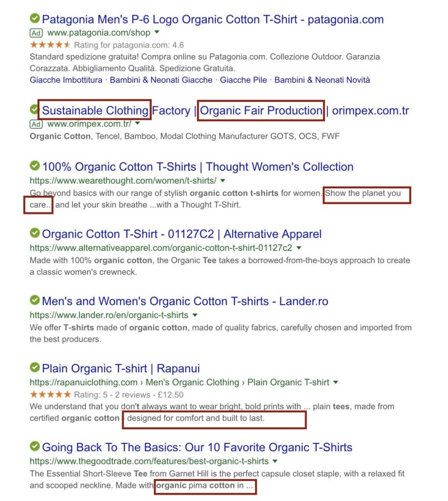
You can see there are some keywords that really stand out, such as organic, sustainable, comfort, care. These can highlight some of the elements users are looking for when searching for organic cotton t-shirts so let’s see what we find on the first result:
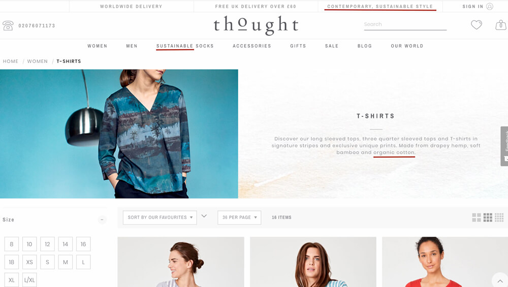
On the Thought landing page, we find further references to organic cotton and sustainable clothing.
You could score this landing page on a scale from 1 to 5, based on how relevant you think it is for the users’ expectation and search terms. We would definitely give it an above average grade.
- Clarity
Clarity simply refers to whether the offer is clear enough and users can easily understand it and how to buy it. The richest industry of examples we’ve seen on this subject has to be the world of SaaS. Many of the businesses out there present their tool in vague, “hype-y” terms that don’t really get the message across to users that are not very patient.
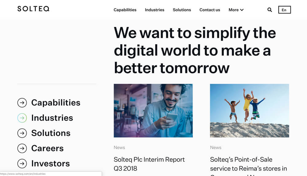
One example would be from Solteq who are sending Google Ads traffic to a landing page that has this headline “We want to simplify the digital world to make a better tomorrow” and that does not really say anything and is lacking a clear call to action. They showed up in our searches for “procurement management software” so you would see why the two don’t really meet.
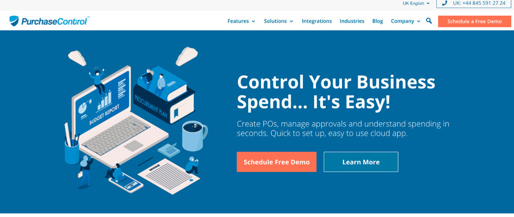
On the other side of the spectrum, we have Purchase Control who are keeping it simple and to the point. Their software helps you keep business spending under control, that’s what they say in the headline and in the ads.
There is a clear CTA that gets you a free demo so you can really understand the offer and what you’re supposed to do on that page.
- Value
Generally speaking, the perceived value of a product will make users stay or move forward. If your product does not clearly communicate the value that is relevant to your users then they will just move to the next brand offering what you are.
This is not that complicated, it’s really about communicating what you have to offer and how that offer benefits your users. The less known your brand is, the stronger your value proposition should be. Why do we say that? Think of Netflix, for example, they don’t really need to put in too much work right now to explain how they work and what you’ll get out of your subscription.

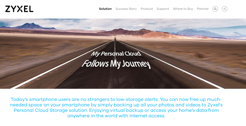
This is literally all there is on their homepage and it’s enough. On the other hand, you have zyxel.com who are offering a personal cloud solution but they make you go through some effort to find that out.
The headline is confusing, it could also be that you’ve landed on a personal blog or a travel app, it’s not clear. Also, the body of text can be quite intimidating, especially for first-time visitors. We think they would have communicated that information much more effective if they would have put it in clear bullets.
- Friction
In terms of user motivation, think of friction as a speed bump in the road for your customer journey. Any element that is causing anxiety, doubts, fear in the user’s mind will slow them down from buying or even entirely prevent them from doing it.
In terms of user experience and design, friction is represented by any element that is preventing users to take the action you want them to take. The most common example we’ve encountered is the overlapping of live chat widgets with add to cart buttons or site polls overlapping checkout forms, etc.
Make sure you’re eliminating any elements of friction in terms of design before even launching your website, it’s crucial that your website is easy to use and intuitive.
To eliminate friction on the motivation side of users, just make good use of customer surveys and site polls and identify what needs to change.
- Distraction
Distraction is caused by elements that are taking the user’s focus away from the main action and redirecting them to something less important.
One very simple example is that you remove navigation and blog posts and any other widgets from the cart and checkout page as you would not want users to leave those steps to read about your latest press appearance.
Try to keep your users focused on one call to action and reduce distractions to a minimum. Make sure you offer sufficient information but don’t pull people away from the landing page you paid money for them to see.
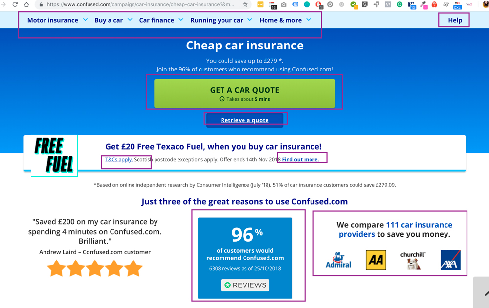
You can see this example from Confused.com where we have highlighted just a part of the links and calls to action available on the landing page.
5. Mouse tracking and session replays analysis
Among the resources used to develop a set of winning testing hypotheses, we have to list mouse tracking and session replays. You can use the software you prefer for this, we almost always use Hotjar and have been using it since they were in beta so we might be biased, make sure you go out and try your own and see which suits your needs best.
The features we use for all our clients? Clickmaps, scroll maps and session replays.
Clickmaps are great to identify areas of interest, elements that appear clickable but aren’t, should be clickable but aren’t as well as the flipped side of this coin, with calls to action that are being ignored.
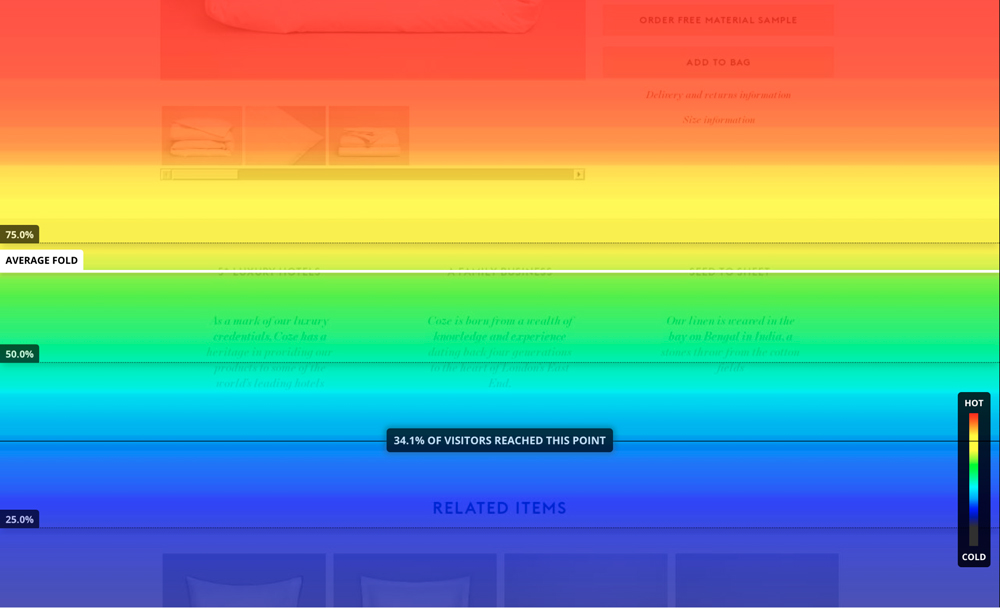
Scrollmaps show you how further down the page users scroll – this will help you identify and visuals stopping signs on your page (visual elements that give out the impression that the page is ending there).
You can also identify elements that are being overlooked by users as too few of them reach that point. We’ve seen many examples of testimonials or FAQs that were completely overlooked as they were close to the footer but users actually converted a lot more after seeing them. Sure enough, we moved some of those elements higher up and saw an increase in conversion rates.
See which elements are contributing to your conversion rate and are being overlooked and test new layouts with that in mind.
Now that you have all this information at hand and have put it all in a wonderful slide deck for your client or boss or yourself, make sure you have a winning hypothesis formula.
We love this one from Craig Sullivan @optimiseordie and definitely recommend you use something like it:
- Because we saw (qualitative & quantitative data)
- We expect that (change) for (population) will cause (impact(s))
- We expect to see (data metric(s) change) over a period of (x business cycles)
Now we have to see this Advanced Kit in action.
Let’s say we are writing a hypothesis based on information from Google Analytics and the scroll maps for the website selling organic cotton t-shirts. The statement will be something along the lines of this:
Because we observed a 70% drop off for mobile users and session replays with scroll maps indicate users are not reaching the “organic origins” section, we believe that by showing the section earlier to all visitors on the product pages, we will see an increase in “add to cart” rates. We will measure this through the add to cart goal conversion rate over a period of 2 business cycles.
And there you have it – A/B testing hypothesis generation that goes beyond the obvious and uncovers improvement opportunities that you would otherwise fail to capitalize on.
If you’re diligent, you can go through the process we’ve laid out.
If you want to save time, you’ll be interested in Convert Compass – a next gen hypothesis generation and iterative learning tool for smart testers.
Written By
Andra Baragan

