Do Sticky Menus Help or Harm Conversions? (Best Practices for 2021)
Your navigation bar is one of the most critical components of user experience on your website. Which makes total sense, since it is a roadmap your visitors follow. Without it, they can feel lost and have no way to traverse your site without exerting effort.
Customers don’t like friction, they want easy. Even minor components like the navigation menus can have big effects on user experience and overall website conversion rates.
So there is no surprise there continues to be debate about the best type of menu to use on your website, and the do’s and don’t.
In this article, we will review if sticky menus are better than traditional ones for better conversion on your website. We will look at:
- What is sticky menu navigation?
- Why navigation menus are important components for conversion.
- How to get supporting data around which works best.
Let’s begin by defining some key terms…
Your Navigation Menu – A Map For Your Visitors
Even the most non-technical person understands what a Navigation Menu is. Even if they can’t blurt out the technical definition, at a minimum, they have practical experience interacting with them while browsing the web.
Techterms.com defines navigation bars as,
“A navigation bar is a user interface element within a webpage that contains links to other sections of the website. In most cases, the navigation bar is part of the main website template, which means it is displayed on most, if not all, pages within the website.”
The definition points to the important role of menus on a website, they say:
“The navigation bar is an important element of a website’s design since it allows users to quickly visit any section within the site. If you’ve ever visited a website without a navigation bar, you may have found it is difficult to locate the page you need.”
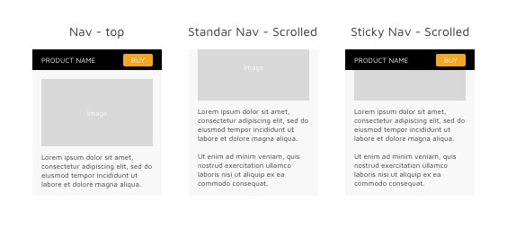
So what is sticky menu navigation? A sticky menu is a special navigation menu that provides the similar functionality as a fixed navigation menu, but more. Clicktales describes sticky menus as,
“Sticky navigation is a term used to describe a fixed navigation menu on a webpage that remains visible and in the same position as the user scrolls down and moves about a site.”
At Convert, we use a Sticky Menu. Here is an example of what it looks like:
(notice how the navigation bar is ALWAYS visible even as the user scrolls)
What Do Optimizers Say About Sticky Menus?
Several studies tie bad navigation menus to poor website experiences.
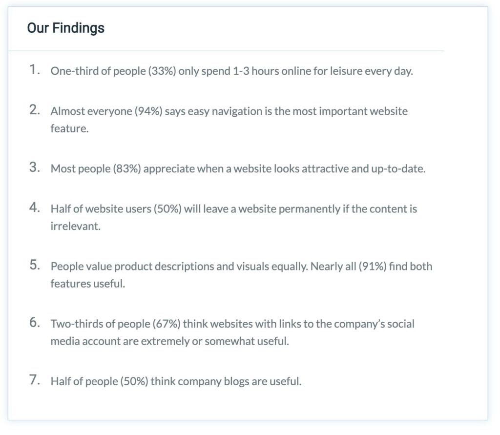
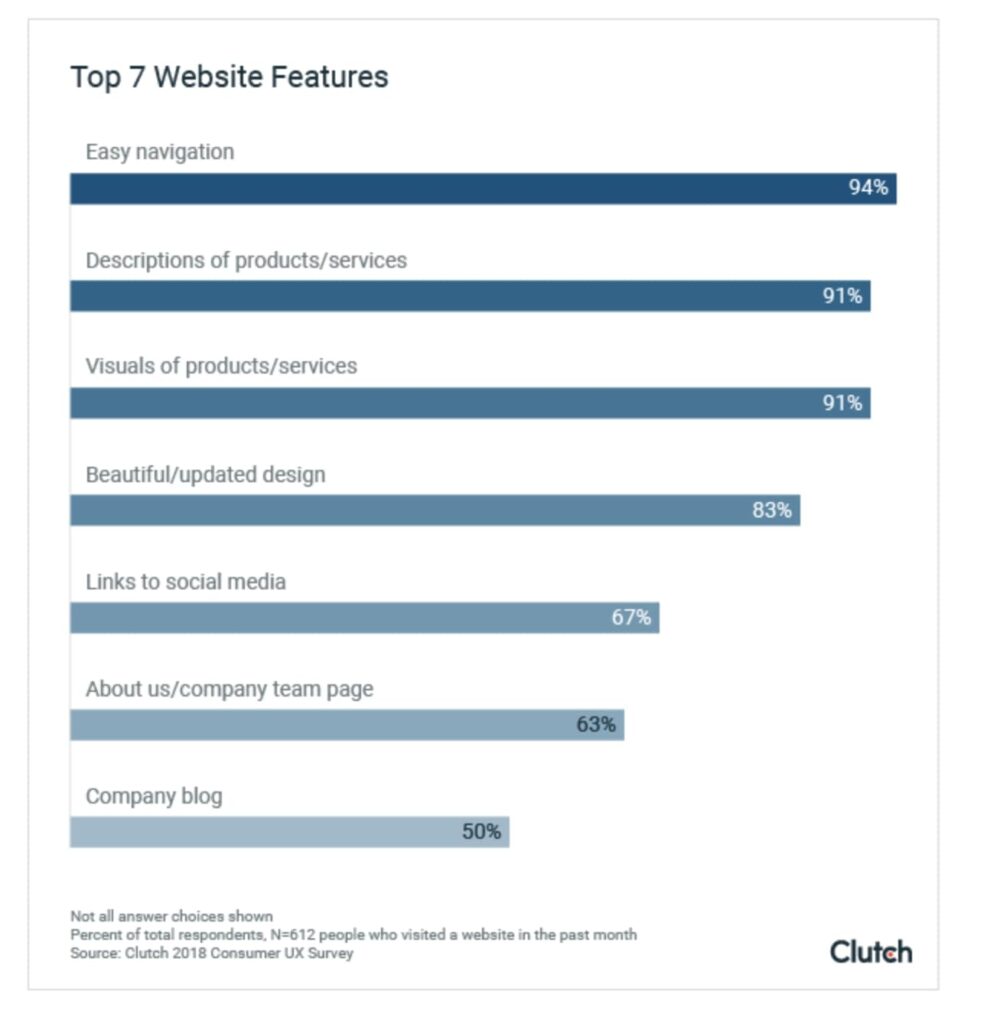
In 2018, Clutch surveyed 612 people to identify what website features were must-haves for a visitor to have an enjoyable user experience. The following graphic highlights their findings:
More important, 94% of people named ‘Easy Navigation’ as the top ‘must-have’ feature on a website.
Unfortunately, this data doesn’t tell us what kind of menu visitors prefer.
If you ask optimizers or digital marketers, each of them will have a different take on which style of navigation bar works best, sticky menus, traditional, or something outside the box.
Some objectors find sticky menus annoying and believe they encourage people to click away from the page they’re on to go to other areas on the website – avoiding the website’s carefully crafted funnel.
Sean Nguyen, Director at Internet Advisor has a vehement dislike for sticky menus. He questions, “Why would you add so much unnecessary bulk?” For that reason, they do not use sticky menus on their site. He says:
“Our site doesn’t use sticky menus because I find it a very disruptive experience. I don’t want anything following me while I scroll, it adds unnecessary bulk to the page.
A page is structured the way it is for a reason, and there is an order to the content featured. The logic behind this structure is enough to drive traffic and stimulate conversions, there’s no need to literally follow the user around the site showing them options.
Personally, I get annoyed and click away when that happens. I largely prefer traditional menus. I think that as long as you think about what you feature and where, you don’t need a sticky menu.
A sticky menu is heavy, clunky, and unnecessary. A traditional menu is more streamlined and looks more professional.”
Supporters of sticky menus are just as adamant about their position, saying sticky menus keep your CTA at the forefront regardless of where your visitor moves around a page.
As with all CRO tactics and strategies, the navigation bar debate is subjective. Milosz Krasinski, Managing Director at Chilli Fruit Web Consulting shared his opinion on sticky menus:
“The short answer is that sticky menus help conversions. Why? Online users are impatient. I mean really impatient. In many cases, this means that a simple action like scrolling back to the top of a page (a matter of seconds) becomes an irritant which may see the user navigating away from your site.
Krasinski backs up this opinion with some data:
Sticky menus are 22% quicker to navigate and encourage conversion through convenience. For example, you have a lot of content on your site which users may want to read through before following any CTA.
A sticky menu means that the user knows that he or she can whizz back to the home page or contact page with just a click of a button rather than having to spend those excruciating few seconds navigating their way back.
Sticky menus are particularly helpful for ecommerce sites which can use a ‘floating’ CTA to encourage conversion wherever the user may be on the site.”
With all these opinions, how do you determine when a sticky menu is the design of choice?
When A Sticky Menu Is A Good Idea
Let’s say you’ve designed a super-long scrolling landing page.
And your CTA asks visitors to make a phone call.
Now, would it be a wonderful idea to let your users see a fixed header with a large CTA – “Click to Call” button as they scroll down to read all the content you’ve posted?
Your big and shiny call to action button — displayed prominently inside your sticky menu right at the top of your site — becomes impossible to miss as it floats down the page following your users as they scroll through your long-form page.
The moment your lead decides they want to contact you, they have your catchy “Call” button right in their sight. With such a focused sticky menu bar, your leads are only a click or tap away from starting a sales conversation with you.

A sticky menu in action (notice how the navigation bar is ALWAYS visible even as the user scrolls)
Sticky menus can work great for homepages. They can encourage your users to scroll through your entire page. In fact, there are instances of websites that saw a lot more engagement on their long-form homepages after they replaced their regular top navigation menu with a sticky one.
Ecommerce websites also love sticky menus because they can place a CTA such as “Add to cart” in a prominent spot.
Christopher Prasad, Marketing Manager at JookSMS echoes this, he says:
“With the assistance of a sticky menu, you are free to navigate the website without losing your page. Most eCommerce sites are now using these elements to help provide the customer with a smoother and easier way to navigate through relevant data and information.
Using sticky menus also allows people to engage more in the content of the pages. This then can help to increase overall conversion rate because, with the menu following them on the page, they are then able to finalize their transactions much easier which is what most individuals desire: a quick and easy process.”
In short: sticky menus can be useful depending on how you use them.
How Do You Know the Best Kind of NavMenu to Use?
Convert’s mantra is, “don’t guess, test.” Data always supersedes conjecture or pure opinion.
While user experience is both qualitative and quantitative, the numerical analysis can provide quick insight into conversion rates and give clues to the direction you should take your optimization strategies.
The data can quickly answer the question, “What’s our next best step towards our desired outcome?” And testing and experimentation is the only way to know which one converts better. A simple A/B test that tests different navigation bars will give you data that allows you to make informed decisions.
Jeff Moriaty, Marketing Manager at Moriarty’s Gem Art, shares the power of testing:
“We have done quite a bit of testing on our website, one being the menu. With the sticky menu, the main area we saw a performance boost was with our bounce rates and pages viewed per session. Our bounce rates actually decreased and we went from an average of 1.5 pages per session to over 3 pages. This was especially true with mobile visitors, which is where 70% of our traffic originates.
We ran an A/B test over two months to come to these results. Since these findings, we have “stuck” with the sticky menu for all visitors of the website and don’t plan on changing it back. One tip. Make sure you don’t have any special offerings or header bars that might be affected by a sticky menu. This was the bug we found at first, and had to have our developer implement a workaround.”
At Convert, we never suggest businesses implement something on their website or try a tactic because it’s trendy. You’ll waste precious resources and get less return on your testing program. It will become subject to the whims of a trend, rather than proactive data-driven planning.
You can change your website only by analyzing the improvement or optimization opportunities that your data highlights.
Sandra Hurley, Operations Manager of Hayden Girls confirms the power of data-based insights. Data from their website let her know that “users don’t want to scroll to the top of the page every two minutes.” The data showed the following:
“According to our data, sticky menus absolutely help increase conversion rates through the sheer fact that they are much easier and more convenient to navigate.
Before our website launched, we went through several iterations and had them tested. 85% of users agreed that having to scroll back to the top in order to be able to access the menu and switch product categories was a big hassle and turned them off continuing the shopping experience.
The total time spent on our site was shorter than the version of the site with sticky menus. When the users tried the website with the sticky menu, not only was the time they spent on the site longer, but they also browsed through more categories, and purchased more products. Because the menu is always visible, it’s easier to access and more convenient.”
So if you decide to change the style of your navigation bar, use tools like Google Analytics to collect data (for example, conversion rates, scroll depths, etc.) and testing platforms like Convert Experiences to test and evaluate before and after data to discover what your users prefer.
Not sure where to begin, get inspired with a list of testing ideas from Relevant Insights.
Tips For Menu Creation on Fixes?
It is easy to live in an “either-or” world. But when thinking about creating the ideal navigation menu, you want to find the classic UX balance between aesthetics and functionality.
Maciej Fita, Marketing Manager at Brandignity suggests, “thinking beyond the typical navigation structure.” He says,
“If your primary action is a lead form your sticky menu should always have a CTA for a conversion. If it’s a free demo, that free demo CTA should never leave the visitors site.”
Fita also suggests staying clear of streamlining contemporary hamburger style menus,
“They might look swanky, but they can really decrease leads and conversions.”
Optimization tool, CrazyEgg, gives 9 tips on creating conversion supporting navigation bars, they include: streamlining, making hypertext obvious, keeping your navbar in a standard place, and making sure the menu reflects your business priorities.
Orbit Media has designed over 1000 websites, they know a thing or two about good navigation menu design. The following video shares what they learned and offers tips on ways to use Google Analytics or a similar tool to improve your website navigation.
Regardless of the specific menu you select, you want to implement the best design practices to ensure high conversion and great UX. The following are a few tips for static menus and sticky menus.
Sticky Menu Best Practices
Logan Adams, Founder of DC Marketing Digital Hour provided the following tips on using sticky menus:
“The most important thing when setting up your sticky menus is to consider the responsiveness, and appropriate call to action for the menu, depending on the device.
Ensure that you choose a background color that differentiates itself from any hero images, or page backgrounds, across the entire site.
Test your sticky menu across many devices… If you don’t have a wide variety of devices handy, you can use the Developer Tools in your web browser as a quick testing solution.”
When asked if there were a better alternative to sticky menus that provide better UX and conversion rates, Logan responded with the following:
“In a perfect world, you’d have “Sticky” calls to action that allows a user to always have the next possible step in a funnel ready to go. These are costly to develop, and require constant upkeep to adapt as funnels change and leadership desires new strategies, so a sticky menu is a good solution for a complex problem.”
Jane Kovalkova, Chief Marketing Officer at Chanty, suggests:
“…only use a sticky menu if you have a longer landing page and if the tabs in the sticky menu don’t deter the visitor from converting. In other words, the sticky menu needs to have buttons leading to your main product/service pages.”
Fixed menu best practices
Logan of DC Marketing Digital Hour also offered suggestions on creating the best fixed menus:
Never use more than two sublists. If a business demanded on including that many linked-lists in a fixed menu, you need to sit them down and discuss which pages should be included in a fixed menu, and which can be navigated to from the page itself.
Consider including key links from the fixed menu in the footer as well, so users don’t have to scroll back up to the top to find them.
So Which Type of Menu Will You Choose?
So no matter what kind of navigation menu you choose, be sure to install user behavior research CRO tools on your website to understand how your users behave. If you see screen recordings where users have to scroll all the way back to the top to access your navigation bar, then you might want to consider using a sticky menu to improve your user experience.
Original content created by Arian Azcua.
Written By
Nyaima Smith-Taylor

Edited By
Carmen Apostu


