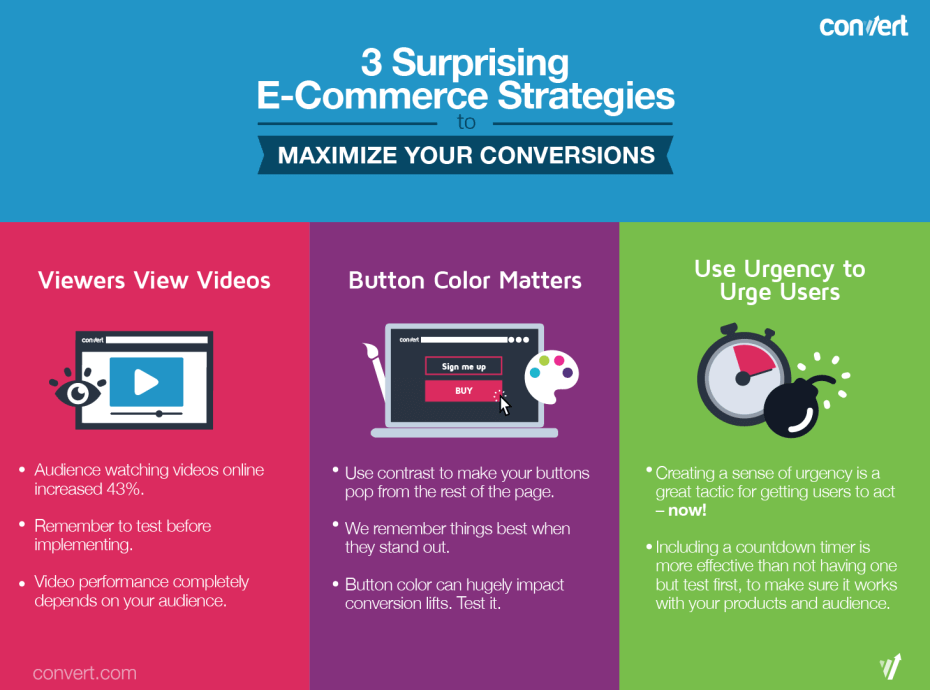
3 Surprising E-Commerce Strategies To Maximize Your Conversions
Are you looking to increase your e-Commerce conversions? Are you searching for strategies to maximize your conversion? There are a lot of factors and elements to consider when you are looking to improve. But here are three surprising strategies to consider when you run your E-commence tests.
1. Viewers View Videos
Videos on landing pages have a bad rap. Many believe they don’t convert well. But, WhichTestWon’s extensive case study library shows the opposite. Since 2009, we’ve published multiple video landing page studies. In all except one, video content far out performed static content. The one time video didn’t win was with a highly specialized, technical audience.
Now, don’t get us wrong. We’re not advocating always using video. But, we are saying, consider testing video use as part of your marketing strategy.
Research shows video marketing is – and will likely continue – gaining traction. Between 2013 to 2014, the number of Americans watching videos online increased 43%; this amount is projected to continue rising. If you do hop on the video train, remember to test before implementing. Video performance completely depends on your audience.
Timers, colorful buttons, and video content are worth testing” -@WhichTestWon #abtest #cro Share on X2. Button Color Matters
Color may account for as much as 85% of the reason behind product purchase decisions. Use the right colors; increase your conversions.
Steve Krug, renowned author of the usability guide “Don’t Make Me Think,” believes people obsess too much over website colors without worrying enough about site flow. He’s got a point. Your website’s colors may not matter much if your interface isn’t highly usable.
That said, it’s clear BUTTON color — or perhaps, more appropriately, button contrast color — matters. In the Conversion Rate Optimization (CRO) community, button color tests are often viewed as the lowest common denominator. They’re scoffed for being overly simple.
But, our case study library shows button color can hugely impact conversion lifts. That’s because color sways our attitudes and emotions. In fact, a small peer-reviewed research study found color may account for as much as 85% of the reason behind product purchase decisions. Use the right colors; increase your conversions.
WhichTestWon’s archive of case studies shows green and orange buttons tend to perform best. However, perhaps more important than the button color itself is the contrast created by the button color. According to The von Restorff effect, better known as the “isolation effect,” we remember things best when they stand out. A green or orange button on a primarily blue site will pop – and we’ll remember it.
At WhichTestWon.com, we like to call this effect the “10 paces back test.” If you can’t see a web element from 10 paces back, you need to think about what you can do to make it standout. So, when you think button color, think about using contrast to make your buttons pop from the rest of the page.
Color sways our attitudes & emotions >> button color impact #conversion – @WhichTestWon Share on X3. Use Urgency to Urge Users
Timers, colorful buttons, and video content are worth testing. But, always test when and where use is optimal for your audience on your site.
You can’t always count on countdown timers, but they can work wonders, especially on ecommerce product pages. That’s because creating a sense of urgency is a great tactic for getting users to act – now! Our case study library shows — in 100% of studies — including a countdown timer was always more effective than not having one.
Having a countdown timer can lift conversions up to 226%! according to @WhichTestWon Share on XHowever, don’t just blindly apply a countdown timer to your site. Test first, to make sure it works with your products and audience. Also, look at your end conversion goal. Although countdown timers can increase conversions, they may also increase consumer haste. Customers under the gun of a ticking timer may not feel the leisure to browse products or add new items to their shopping carts. The net effect could be lower overall revenue per visitor or decreased average order values. So, if your end goal is increased revenue, the timer may work against you.
Of course, if you decide to test using a timer, also test its placement. If you use it too soon or too far into the sales funnel, you risk turning off prospective customers. The ultimate takeaway? Timers, colorful buttons, and video content are worth testing. But, always test when and where use is optimal for your audience on your site.
Written By
Deborah O'Malley

