How to Layer Quant, Qual & Heatmap Data From Different Sources for Smart, Testable Hypotheses [Hint: Use Triangulation]
As an optimizer, you know that numbers don’t lie. But you also know that without the right context, even the most impressive metrics can lead you astray.
Quantitative data, for all its precision and objectivity, only reveals the “what” of user behavior — the pages where visitors bounce, the steps in the funnel where revenue leaks, and the segments with the highest churn rates.
But to truly move the needle, you must understand the “why” behind those behaviors. And that’s where qualitative insights come in — voice-of-customer feedback, user testing sessions, heatmaps, and session replays that put you inside your user’s head.
Grab this: Marketer’s Guide: Key Differences Between Qualitative Data And Quantitative Data
If you’re reading this, you likely already appreciate the power of combining quant and qual data to generate stronger test hypotheses. You’ve seen firsthand how qual can breathe life into flat numeric data and how quant can lend statistical weight to anecdotal user feedback.
But as you’ve also likely experienced, executing this mixed methods approach is often easier said than done.
Synthesizing insights across disparate data sources, reconciling contradictory findings, and knowing when you have sufficient evidence to move forward with a test are the challenges that separate average optimizers from the truly elite.
The answer lies in triangulation — examining your site experience from multiple angles and through multiple lenses to zero in on the points of greatest opportunity. By layering quantitative, qualitative, and visual data, you can paint a richer, more actionable picture of user behavior that reveals what users are doing, why they’re doing it, and how you can improve their experience.
As Craig Sullivan, CEO of Optimize or Die and a pioneering voice in experimentation, explains:
Each research method is NOT complete. If you take a photo of a plant or animal, you see only one side of it. Using more than one research method gives you perspective, so you get a 3D rendering of the problem from multiple sides.
This way, a problem that looked flat and featureless when you used one method now begins to solidify and take shape as you inspect it from different angles, using different methods. It’s like shining a light on a problem from different directions to get perspective.
In this post, we’ve gathered wisdom from some of the sharpest minds in optimization — Andra Baragan, Ellie Hughes, Simon Girardin, and Deborah O’Malley – on how they use triangulation to generate winning test ideas consistently.
You’ll learn:
- Battle-tested frameworks for triangulating insights across quant, qual, and visual data
- Advanced techniques for squeezing maximum insight from every research method
- Strategies for prioritizing and sequencing your research efforts for the greatest impact
- Tips for leveraging AI and other emerging tools to supercharge your analysis
If you’re ready to move beyond surface-level metrics and one-sided user feedback, this guide is for you.
Meet the panel:
Andra Baragan is an experienced conversion optimization specialist with a solid background spanning nearly a decade in digital marketing.
She’s the entrepreneurial brain behind ONTRACK Digital, a leading conversion rate optimization agency specializing in e-commerce. Andra, armed with CXL certification, is adept at crafting strategies that enhance online businesses.
Ellie Hughes, Head of Consulting at the Eclipse Group, is an expert in the experimentation industry with more than a decade of experience, specializing in scaling and maximizing value from experimentation programs.
She has earned recognition through prestigious awards such as the Experimentation Elite Award and was a finalist for the Experimentation Culture Award.
As a top-recognized experimenter with a deep understanding of tools, platforms, and analytics, Ellie is skilled in educating others on the nuances of experimentation.
Simon Girardin, CRO Manager at Conversion Advocates, brings 7 years of business growth expertise to the table, with a results-driven approach that has produced 15 ROI-positive programs in just 90 days, 228 launched experiments, and a 33.8% win rate that surpasses the industry standard.
His passion for iconic innovators like Spotify, Netflix, Paypal, and Uber has honed his recognition of how disruptive power thrives on iterative processes, frequent research, and rapid feedback loops.
Simon has applied this knowledge to generate exceptional experimentation wins for his clients.
Deborah O’Malley is a top A/B testing influencer and a leading woman CRO specialist.
She founded GuessTheTest, an experimentation resource committed to disseminating A/B test case studies and optimization insights. Deborah also heads ConvertExperts, an optimization agency where she assists clients in testing and optimizing their websites.
As an author, Deborah has contributed six peer-reviewed journal articles and shares her expertise in analytics as an adjunct professor at Queen’s University’s prestigious business school.
Defining Conversion Roadblocks and Strengthening Signals
TL;DR: It’s crucial to identify and understand the primary issues that prevent user conversion.
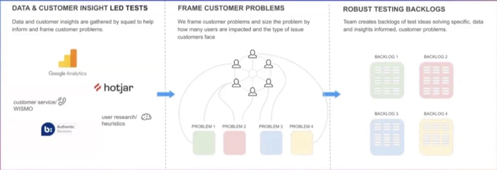
Simon advises focusing on the top three to five barriers, aligning them with the company’s goals to get stakeholders’ buy in.
Getting to these roadblocks involves extensive research across all customer journey stages using broad and deep data collection methods.
This iterative, multi-layered approach to gathering insights enables a detailed understanding of user behavior, powering targeted experiments.
You can’t optimize everything at once. With finite resources and time, you really need to focus.
So to build strong hypotheses, you have to identify the key issues preventing users from converting on your site.
As Simon explains,
If we’re able to find the top three to five issues that prevent our users from converting on-site, then that helps us gain this strategic vision on where we need to experiment for us to drive the most traction and revenue.
However, these conversion roadblocks shouldn’t be determined in a vacuum. They must align with the company’s overarching objectives.
Simon notes,
Our stakeholders are going to feel really disinterested and not bought in if we’re testing against stuff that seems irrelevant to them.
So, how do you pinpoint these critical roadblocks?
It starts with gathering a wealth of data from diverse sources. Simon recommends casting a wide net of research methods to gain a comprehensive, four-dimensional view of your customers. This means collecting insights from all stages of the customer journey – landing, browsing, conversion, and post-conversion.
Bookmark: How to Turn Mounds of Data into Usable, Meaningful Insights (2024 Guide)
But it’s not just about the breadth of data — it’s also about the depth.
Simon suggests gathering insights in short, iterative bursts, aiming for 10-20 insights per research method. This approach allows you to consistently refine and expand your understanding of user behavior without getting overwhelmed by the sheer volume of information.
Ultimately, the goal is to test and learn in a way that generates tangible business value.
The more you stack these insights, the better. The UX explains the analytics, and then the qual answers. So you understand what’s in the mind of the people as they browse the page and engage with it.
By layering multiple research methods and continuously iterating, you can gradually strengthen the signals from user problems, zeroing in on the most impactful conversion roadblocks to target with your experiments.
Here’s an example from Simon that will help put things in perspective:
For a B2B marketplace, site search was identified as a critical area impacting conversions (based on quant data).
The data showed that search was driving purchases, but users rarely made it from the homepage to product pages where conversion rates were high.
To better understand this conversion roadblock, they layered in qual data.
Heat map data provided the qualitative insight that a significant portion (30%) of homepage visitors clicked on the search bar, signaling an intent to use the search.
With both quantitative performance data and qualitative user behavior insights in hand, the team could formulate hypotheses and run experiments focused on improving the search experience.
Their goals were twofold:
1. Improving usability and results for those using the search functionality
2. Driving more users to initially use the search bar
By merging data from the experiments (quantitative results) with the earlier qualitative insights from heat maps, they arrived at a clear conclusion — improving search usability and relevance had a bigger impact than simply increasing search usage.
Following the Numbers: Quant Data
TL;DR: Quant data helps you understand user behavior by showing what areas need improvement, like pages losing revenue or where users drop off.
Andra and Ellie emphasize the importance of focusing on relevant metrics and data that align with business goals.
While this data is crucial for identifying problems and opportunities, interpreting it requires asking the right questions and ensuring data accuracy.
But relying solely on quantitative data gives an incomplete picture—it should be augmented with qualitative insights to fully understand user behavior.
Quantitative data serves as the foundation for understanding user behavior on your site.
It reveals the “what” – which pages are leaking revenue, where visitors are bouncing, and how many users are completing key actions.
As Andra explains,
With quantitative research, you identify the funnels, the key pages, drop-off points, anything you can measure, basically anything you can count.
This numerical data is invaluable for pinpointing areas of opportunity and concern. By analyzing trends, patterns, and anomalies in your analytics, you can spot the underperforming pages or steps in the user journey and prioritize optimizing them.
But collecting and interpreting quantitative data comes with its own set of challenges.
Ellie notes that it’s easy to get lost in the sea of quantitative data. “For a lot of teams, it’s just [honing in on] what’s relevant,” she explains. “Like, what can you possibly use out of this massive sea of data?”
To navigate this challenge, Ellie recommends focusing on metrics that align with your company’s goals and KPIs.
Start by focusing on metrics that really matter to the business. If a metric isn’t important to the business, they’re not really going to care if you improve it.
Another key consideration is the reliability and accuracy of your data. Ellie suggests thoroughly evaluating your tracking setup to ensure you capture the right information.
Try to get that metric [in advance] that you would measure the experiment with. And [evaluate if] you can use it for your pre-test analysis. Can you work out the number of users who are taking this action today?
But while quantitative insights are essential, they only tell part of the story. Andra cautions against relying solely on numbers:
I don’t think anyone should rely on just one or the other. It’s like you’re looking at half of the picture when you’re either only looking at numbers or only looking at qualitative data.
To understand user behavior, you need to supplement your quantitative findings with qualitative insights.
P.S. You don’t have to start with quant. Qual analysis can come first. In true CRO fashion, it depends on your problem statement. (Here’s a resource to help you think through this: qual vs quant: which comes first?)
Understanding the “Why”: Qual Data
TL;DR: Qualitative data offers insights into users’ motivations, frustrations, and decisions, adding context to quantitative analysis.
Customer surveys reveal the language customers use, which can enhance website copy. Effective surveys target specific customer motivations and objections. And review mining uncovers unfiltered opinions on products.
Qualitative research provides depth, and interpreting it accurately—such as by quantifying mentions of key themes—helps prioritize optimization efforts.
But challenges like small sample sizes and bias require careful consideration.
Qualitative insights shed light on users’ motivations, frustrations, and decision-making processes. They provide the context and depth necessary to interpret quantitative findings and develop a holistic understanding of the user experience.
Read Next: How to Treat Qualitative Data & Quantitative Data for Winning A/B Tests
One of the most powerful tools for gathering qualitative insights is customer surveys.
As Andra explains,
The purpose of surveys is to give you the voice of the customer. The way I love using surveys is to get the way your customers speak because then you can use that language in the copy you’re using on the website.
But crafting effective surveys requires careful planning and execution.
Andra emphasizes the importance of asking the right questions:
When conducting surveys, always formulate the questions with the desired answers in mind. Don’t ask questions that don’t give you information that you can actually use.
To get the most value from your surveys, Andra recommends focusing on two key areas:
- customer motivations and
- objections
What’s critical with surveys and review mining is getting customers’ motivations—how their lives need to change with the product—and their objections, what’s keeping them from buying or converting.
Another rich source of qualitative insights is user reviews.
As Andra points out, “What I love using review mining for is the voice of customer, because that’s where they have unfiltered opinions about the product.”
You can identify common themes, pain points, and selling points by systematically analyzing user reviews to inform your optimization efforts.
Andra suggests a simple but effective approach:
Get the main keywords, put down just lines. You can do it on a piece of paper really, and just say, okay, price, how many mentioned it, and then do a percentage of what you’ve calculated there.
By quantifying qualitative data in this way, you can identify the most prevalent issues and prioritize your optimization efforts accordingly. But it’s important to recognize the potential pitfalls of qualitative research, such as small sample sizes and biased interpretation.
To mitigate these risks, Andra recommends aiming for a minimum of 50-100 responses for on-site surveys per key page and 200 responses for customer surveys.
She also stresses the importance of considering the context and representativeness of your qualitative data. “Again, if you have 2,000 sessions per month, get some sufficient size there.”
You might like: A Primer on Statistical Significance in A/B Testing (And The Biggest Misconceptions Around It)
Visualizing User Behavior: Heatmaps
TL;DR: Heatmaps visualize user behavior, combining quantitative and qualitative data to highlight insights like click patterns and scrolling behavior.
They help identify usability issues and inform optimization attempts by showing where users focus their attention.
Insights such as banner blindness and the F-shaped reading pattern guide content placement to improve engagement and conversions.
But interpreting heatmap data requires careful consideration of factors like sample size and integrating these insights with other research methods to get a 360-degree view of the user.
By providing a visual representation of user behavior, heatmaps bridge the gap between quantitative and qualitative data, revealing insights that might otherwise go unnoticed.
As Deborah explains,
When we combine analytics and heat mapping data together, that’s really where things start to shine. It provides a visual picture of what’s happening and shows us where we need to focus.
Heatmaps come in several varieties, each offering a different perspective on user behavior.
Click maps, for example, show where users are clicking on a page, while scroll maps indicate how far down the page users are scrolling. Move maps track mouse movement, and attention maps highlight where users spend the most time.
As Deborah points out, “The bigger and darker the hotspot, the more time and more attention people spend looking or clicking on that element of the screen.”
This information can be invaluable for identifying areas of interest, uncovering user frustrations, and prioritizing optimization efforts. For example, if a heatmap reveals that users are consistently clicking on a non-clickable element, it may indicate a usability issue that needs to be addressed.
But heatmaps aren’t just about individual page elements—they can also provide insights into broader user behavior. One such pattern is banner blindness, which refers to users’ tendency to ignore content that resembles ads or promotions.
As Deborah explains,
Banner blindness reveals that website visitors tend to ignore content on the right side of the page. Moving key elements like sign-up forms from right to left can boost conversions.
This insight is rooted in the F-shaped reading pattern, which suggests that users tend to scan web pages in an F-shaped pattern, focusing primarily on the left side of the screen.
Tip: You can increase engagement and conversions by placing key content and CTAs in the areas where users are more likely to look.
Another powerful insight from heatmaps is the importance of visual cues in guiding user attention.
As Deborah notes, “Eye tracking shows that people are attracted to faces. Using images of people looking toward your CTA button provides a visual cue that draws attention to the desired action.”
While heatmaps offer valuable insights, using them correctly is important to avoid drawing faulty conclusions. As with any research method, the quality and reliability of heatmap data depend on factors like sample size, data collection period, and the specific tools and settings used.
Deborah advises,
Ideally, you want to see, you know, probably about 50% interaction rate. But it will give you an indication of how your users are behaving. And from there, what you should be doing is forming hypotheses, like Andra, Simon, and Ellie mentioned, to really put those insights into practice.
To get the most value from heatmaps, it’s essential to triangulate findings from multiple sources so that you can validate your assumptions, uncover blind spots, and develop a more comprehensive understanding of the user experience.
As Deborah puts it,
Whatever heat mapping data you have available is a start and then you kind of just have to take it with a grain of salt and go, okay, well, this is what I have, this is what it shows this swath of users are doing. And now how can I take this and merge it with the other data to really form something interesting?
P.S. We dug deep into heatmaps in another guide. We talked about how to use them and looked closely at the top 40 tools. Everything you need to know about heat maps is in there. And here’s a quick precap:
● Heatmaps are a powerful tool for visualizing user behavior data, but they should be used in conjunction with other research methods like analytics and user testing for a complete picture.
● When choosing a heatmap tool, look for features like automatic data collection, support for different devices and screen resolutions, and easy data sharing and collaboration.
● Heatmap tools should provide privacy by default and integrate with your existing analytics and marketing stack.
● Session recordings can provide valuable qualitative insights to complement heatmap data, but it’s important to respect user privacy and only collect necessary data.
● Eye tracking heatmaps offer the most accurate representation of user attention, but can be expensive and less organic than other methods.
A Framework for Triangulation
Each type of user behavior data–quantitative, qualitative, and heatmaps–provides a unique perspective on how users interact with your site.
But the real magic happens when you combine these data sources to arrive at a holistic understanding of the user experience.
This is where triangulation comes in aka looking at user behavior from multiple angles to identify patterns, validate findings, and uncover blind spots.
P.S. Marc Uitterhoeve, CEO of Dexter Agency, a Convert-certified agency, perfectly summarized the essence of why triangulation is crucial in another interview we conducted:
I like how qualitative and quantitative data complement each other.
A great example is user testing (qualitative) and heatmaps or analytics (quantitative). We have seen user testers complain about a discount pop-up (who doesn’t hate pop-ups?), but data showed that the subscribe rate was actually high and it didn’t hurt their conversion rate.
We also had users complain that they couldn’t find the shipping cost on the product page, but upon testing, we noticed that showing the shipping cost on the product page would result in a revenue decrease. Or they missed an ‘About Us’ section on the homepage, but no significant increase was established upon adding it.
People are biased, and sometimes, you have users who know what a good website should and shouldn’t have, so they give politically correct answers. Don’t get me wrong; user testing is super insightful, and we always use it in our research, but you cannot blindly trust what they say. Always support those insights with other research methods and test the change before implementing it.
Triangulation sounds great on paper, but how do we make it happen?
Ellie shares her approach to triangulation:
I almost think about it as taking a quantitative approach to qual data and a qualitative approach to quant data. Visualize quant data in an easy-to-consume way, and pair qual insights with quant insights that support them.
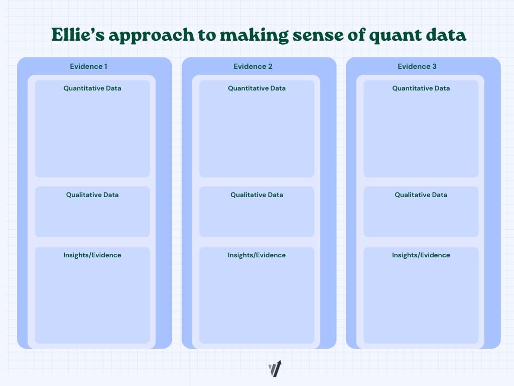
In practice, this might look like:
- Identifying a potential issue through quantitative data (e.g., high bounce rate on a key page)
- Validating the issue through qualitative feedback (e.g., user surveys revealing confusion about the page’s purpose)
- Visualizing the issue through heatmaps (e.g., click maps showing users clicking on non-clickable elements)
P.S. Ellie recommends you can go about using this in any way – if you already have a hypothesis, find qual and quant data to support your insights.
Here’s another diagrammatic way of looking at how you’d pair quant and qual data:
Simon also breaks down his process for deepening test results analysis:
Interpreting numerical data into learnings. Note down new questions and assumptions to identify blind spots. Then wrap it up with iteration ideas – every insight should have at least one more variation tied to it.
This iterative approach to triangulation ensures that each round of testing and analysis builds on the last, creating a virtuous cycle of continuous improvement.
Don’t fall victim to the habit of using triangulation to simply validate your assumptions. Triangulation is your ally — it can and should uncover new findings that feed fresh hypotheses (and innovation).
An example of this could play out as follows:
- There is a big drop-off between the cart and checkout (quant)
- Surveys show that there isn’t anything fundamentally off about the checkout process (potential buyers clearly mention that shipping rates aren’t a nasty surprise) (qual)
- However session recordings reveal that the cart is used as a wishlist because the actual wishlist widget is poorly built and more of an afterthought
By zeroing in on the right problem – the wishlist as oppposed to the cart, you can now remove noise from your checkout metrics, and can even test pre-emptive messaging like a “Using the cart as a wishlist? It expires in 3 days” to introduce the element of scarcity.
The key to effective triangulation is approaching data with an open and curious mindset.
As Simon puts it,
Every time we test something, we should create more variations and hypotheses than we had. This backlog becomes more refined, and you have more options and variety to pick from.
By continually seeking out new data sources and perspectives, and by using each insight to generate new ideas and hypotheses, you can create a truly customer-centric optimization process that drives meaningful results.
Get this guide: How to Create An Optimization Process | Building a Culture of Experimentation That Supports Consistent Growth
Preparing for Insights: Pre- and Post-Test Analysis
While triangulation is a powerful approach to generating insights, it does not happen by accident. To get the most out of your data, you need to be intentional and strategic in your analysis, both before and after running tests.
Simon emphasizes the importance of preparation in extracting meaningful insights:
Before we extract insights, we need to prepare for insights. Make sure you document all supporting evidence with your hypothesis, list out assumptions and business questions, and make a comprehensive list of your goals and evidence to track.
This pre-test analysis sets you up for success by ensuring that you’re collecting the right data to answer your key questions and validate your hypotheses. It also helps you stay focused on your goals and avoid getting sidetracked by irrelevant or low-impact insights.
Once your test is running, monitor the data closely and adjust your approach as needed. This might involve segmenting your data to uncover hidden patterns or running additional tests to validate surprising findings.
But the real work of analysis begins after the test is complete. Here, you dive deep into the data, looking for insights that can inform your next steps.
One key aspect of post-test analysis is documenting your learnings in a way that’s easy to share and reference later. This might involve creating a centralized repository of test results, insights, and hypotheses, or using a tool to track your optimization efforts over time.
It’s also important to share your findings with stakeholders and teammates, both to keep everyone aligned and to gather fresh perspectives on the data.
As Simon notes, involving multiple people in the analysis process can help generate new ideas and hypotheses:
“If you’re taking 10 minutes to do this with a team of two or three, you’re probably going to get more around 10 [new hypotheses].”
But the most important aspect of post-test analysis is using your findings to inform future tests and optimizations. Each insight should generate new questions and ideas to explore, creating a continuous cycle of learning and improvement.
As Deborah puts it:
Synthesize qualitative and quantitative data and merge it together and put it into your toolbox for really, really strong and valuable insights.
By approaching analysis as an ongoing process rather than a one-time event, you can ensure that your optimization efforts are always grounded in real user insights and driving meaningful results for your business.
So go forth and triangulate – your users (and your bottom line) will thank you.

BONUS: Using AI in your experimentation workflow
From processing vast amounts of user behavior data to generating new test ideas and hypotheses, AI is becoming an invaluable tool in the experimenter’s toolkit.
Since we thought you might like to know how to use AI to speed up your analysis and prevent analysis paralysis, here are some key insights from the FOMO Over AI masterclass:
Craig Sullivan recommends using AI as a “co-pilot” rather than a replacement for human analysts.
“Concentrate on automation for now,” he advises.
It’s not AI that’s the key to replacing analysis. Automation is the key to reducing analysis time, so we’ve got more time to spend on better problems.
AI can be particularly useful in processing qualitative data, such as customer reviews and feedback.
As Craig explains,
The main thing that all of this revolves around is being able to process a huge corpus of information, which is what customers are saying, what words and phrases they’re using, what problems they’re describing, what solutions they’re telling you to use to solve those problems, and how it made them feel before and afterward.
By using AI to analyze this wealth of qualitative data, you can gain deeper insights into customer motivations, pain points, and desires—insights that can inform more targeted and effective optimizations.
Mia Umanos, CEO of Clickvoyant, highlights the importance of AI in pre-test data analysis.
“When we think about marketers,” she notes, “I know a lot of our customers are very resistant to becoming. I mean, let’s face it, there are just so many data analytics tools out there, it’s hard to choose. When you have three or four and they conflict with each other, the situation becomes even worse. But having a vocabulary for data architecture is the base requirement for understanding artificial intelligence.”
Leveraging AI to analyze pre-test data and identify meaningful segments and behavioral patterns can help you design more targeted experiences that resonate with specific user groups.
As Taylor Gilbert, Head of Product at Sumatra explains,
If you create really effective segments, you can then create experiences tailored to those segments. And you get 95% of what you would get through perfect one-to-one personalization, but in a way that you can check everything.
But it’s important to approach AI with a critical eye and not rely on it as a panacea.
As Craig cautions, “Some tools promise a lot but underdeliver. I’ve been taking datasets and testing them, and they don’t do very well at all compared to humans.”
The key is using AI as a supplement to human expertise, not a replacement.
The power of AI in experimentation lies in its ability to process vast amounts of data, surface hidden insights, and generate new ideas—all while freeing up human analysts to focus on higher-level strategic thinking.
As Mia puts it, “I believe analytics will be very much like under the hood, right? That we are in a place where analytics becomes a decision science, a decision-based AI, where you’re just interfacing with the statistical research outcome and you’re not looking at a bunch of charts and graphs.”
Quick Debrief: Lessons Learned
Here are some of the key findings and takeaways from our expert panel:
- Quantitative data is the foundation, but qualitative insights provide the “why” behind user behavior. As Andra Baragan puts it, “You shouldn’t really separate the two, you know, like qualitative and quantitative. With quantitative research, you identify the funnels, the key pages, drop-off points, anything you can measure. And after that, you come in with qualitative research and find out why those things are happening.”
- Heatmaps and session recordings offer a powerful visual layer to your analysis. According to Deborah O’Malley, “When we combine analytics and heat mapping data, that’s really where things start to shine. It provides a visual picture of what’s happening and shows us where we need to focus.”
- Triangulation is about more than just validation – it’s about generating new ideas and hypotheses. As Simon Girardin explains, “Every time we test something, we should create more variations and hypotheses than we had. This backlog becomes more refined, and you have more options and variety to pick from.”
- Effective triangulation requires a structured, iterative approach. Ellie Hughes recommends “taking a quantitative approach to qual data and a qualitative approach to quant data. Visualize quant data in an easy to consume way, and pair qual insights with quant insights that support them.”
- Pre- and post-test analysis is crucial for maximizing insights and informing future tests. Simon Girardin advises, “Before we extract insights, we need to prepare for insights. Make sure you document all supporting evidence with your hypothesis, list out assumptions and business questions, and make a comprehensive list of your goals and evidence to track.”
- AI and machine learning can supercharge your analysis, but they’re not a silver bullet. As Craig Sullivan notes, “AI is helping you. It’s not doing, it’s helping you do the job. It’s not actually doing the job for you.”
For more practical tips on experimentation, check out these resources next:
- Tool: Convert Hypothesis Generator: Free Tool for A/B Testers
- Video: How to Come Up with Hypotheses That Solve (Real) Conversion Roadblocks
- Constructing Split Test Hypotheses: Practical Hypothesis Building: The Way the Experts Do It
- Want to Test Everything? Rethink Your Prioritization Framework
- Fundamentals of Product Experimentation for Beginners


Written By
Sneh Ratna Choudhary

Edited By
Carmen Apostu
