CRO Tactics That Just Plain Work: Let Science Guide the Way to Higher Conversions
Conversion rate optimization is when you succeed in creating an experience on a landing page so that a higher percentage of visitors carry out the intended action.
Most CRO techniques are based on vague ideas that may or may not work. These so called tactics often have nothing to do with how people behave and what drives them.
An alternative exists— CRO principles drawn from psychology.
Conversion rate optimization, when rooted in core psychological guidelines, can yield never seen before results.
Here’s how to go get them.
Psychology of similarity—Degree of similarity
A research paper delving into how we as human beings make decisions says that we don’t make decisions following the laws of probability or chance.
The thesis shares the following findings:
According to the researchers Kahneman and Tversky, we humans judge the probability of an event based on representativeness or similarity.
In many situations, an event A is judged more probable than event B whenever A appears more representative of the event than B. If event A and event B both are supposed to be CTA buttons, and if event A appears more like a button it will draw more clicks say compared to something that doesn’t look like a button— like a hyperlink.
Thus the probability of an uncertain event, or a sample, is determined by the degree to which it’s similar in essential properties to its parent population.
You can apply this takeaway to your CTA button.
The first order of designing a CTA button is that it should have common characteristics to other buttons. Sans those characteristics the button doesn’t look like a button. When that happens visitors are going to fly past it.
Don’t put some text in there, or use a hyperlink or an image or a GIF and expect people to understand that it’s a button and what’s expected of them is to click through.
Also, when it comes to button design, try not to be too clever. Most people don’t have a strong grasp on clever and hence tend not to notice the call to action. So bridle creativity and design prowess in favor of tried and tested design principles.
Where you can unleash your creativity is in the choice of color, font and wording. But the general shape and appearance should match what’s commonly found. This is known as prototypical design in the world of optimization.
Usually, buttons are rectangular shaped and increasingly coming with rounded edges.
You can shadow the corners, and add more depth so that the buttons are easily noticed.
Psychology of Gaze
A research presented in the year 2000 says that evolution has baked into us a trait that makes us follow people’s gazes.
Our brain has 30 dedicated areas that process visual input. And it’s not only eyes that matter. The entire head and body language should be signalling in the direction where we want visitors to pay attention to.
Solution? Use visual cues like arrows and gazing people to draw attention.
If you use visual cues like arrows or images of people gazing at the product, you can direct people to look at the product or the call to action.
In the picture below notice how Sunsilk directs attention to the product with the power of the female gaze.
The first image when analyzed under the heatmap shows no heat on the product implying little to no user engagement. In the second image where the woman is gazing at the product the heatmap signature lights up like Christmas.
ConversionVodoo took things up a notch by testing a CTA with 9 different gazes.
Here’s the control.

And these are the other 9 images:

One of the greatest lifts of 6.83% was produced with the woman excitedly pointing towards the call to action. You can see that the green ones all converted highly.
Forward looking subjects that didn’t gaze at the Call to Action produced the worst results.
Psychology of the Mere Exposure Effect
Mere exposure effect says that the likelihood of an action being taken increases if the number of prompts for that action increase.
Applying it to Conversion Rate Optimization:
If you increase the number of CTA placements you’re more likely to get their attention. It’s always possible visitors miss seeing your CTA the first time.
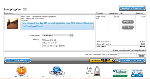
In this case study, we will look at an example where repeating the call to action helped improve conversions by over 20%. They did this by adding another call to action at the top of the checkout page.
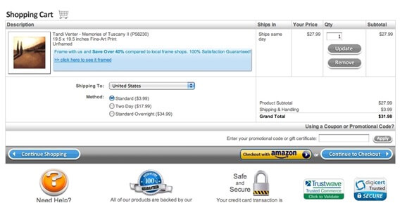
When the Conversion team found the site it had several issues and also had a high cart abandonment rate.
The cart page also had high exit and bounce rates.
Digging into probable reasons the team saw the culprit could be the lackluster checkout button placed along a gray bar. As such it hardly got any attention.
Here’s the control:

The button sizes for continue shopping and continue to checkout were the same.
A test was run after duplicating the “continue to checkout” CTA, higher up on the page.
In the variant, the continue to checkout button is what catches the eye for most first time visitors. When looking at the top CTA due to its unfamiliar placement the eye immediately begins searching for the CTA at the usual spot and both CTAs get attention.
Being highlighted it stands out and appears important.

It also becomes easy for customers with multiple items to checkout easily. The convenient placement chucks out the need to scroll all the way to the bottom of the page.
Action Speaks Louder
This post should have introduced you to the world of very practical design considerations based on solid research and psychological triggers. Now it’s time to cement the learning by taking action.
Have you ever used these tactics before? Do you have more than you can share to inspire our community?
Written By
George Mathew

