404 Page Optimization Tips: 7 Site Conversion Rate Optimization Ideas for Your Errors Page
Note: This post is a part of our CRO Month 2019. Share it with the #Optimizein28Days to promote optimization awareness and how CRO can help businesses thrive.
Optimizing your 404 page’s conversion rate is all about turning a negative experience around.
Use this opportunity to reinforce your value proposition and keep users engaged despite the error, and your site conversion rate is bound to improve.
A good 404 page is approached with similar design goals as your landing page, and should be focused on reducing your bounce rate and increasing conversions.
Following these 7 tips for optimising the conversion rate of your 404 page will help you create a 404 page that engages customers and keeps them moving down the sales funnel despite the technical hiccup:
1 Make it Human
You should be thinking about this one at every stage of your 404-page design. Putting a human touch on the 404 page can make users a little more forgiving of the error.
It may sound corny, but there is no better way to put a human face on your 404 page than by, well, putting a human face on it: yours, ideally.
Along with your name and what you do in the business, this can engage the user with a little more information on you and your business while distracting from the immediate problem.
Don’t use a stock photo!
Use a photo that really is of someone in your company – most users can spot a stock photo a mile off, and especially in B2B industries there is a good chance they have already seen your photo in connection with a wholly unrelated business. Trying to pass such an image off as you or your employee will not engender trust, and will damage your conversion rate.
Take a look at this great example of a 404 page by Email Centre UK:
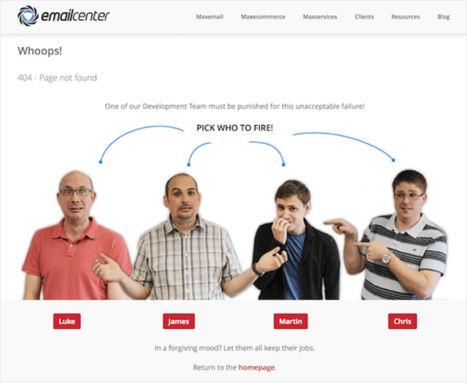
This 404 page attaches some friendly faces to the problem and also has some interactivity to hold the user’s attention, as well as taking the chance to express some of their business’ personality.
2 Apologize!
Your visitor is annoyed they’re not where they wanted to be, and inevitably some of that frustration will be directed at your site.
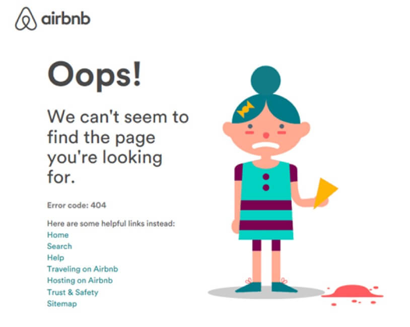
Airbnb handle this well in the above example, and anyone involved with customer service can tell you the importance of taking the blame in turning a negative experience around, even if it isn’t actually your fault.
Give a simple explanation of what happened, just in case they aren’t sure what a 404 error is. Show the user they are important to you rather than leaving a cold error message that doesn’t seem to care if they bounce away from your site.
3 Avoid Technical Jargon
Users just want to get to their destination; they are not looking for a crash course in HTTP.
Avoid using technical language to explain the problem and communicate these points in as simple terms as possible:
- The page may have moved
- The page may no longer exist
- The URL may be mistyped
Hootsuite has a good example of how to get this across and keep it entertaining at the same time:
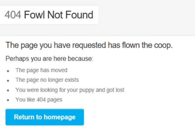
A little bit of humour goes a very long way.
Providing the means to contact you or your site admin on the 404 page is a great way to demonstrate willingness to resolve the problem, and can also potentially highlight genuine errors and broken links on your end.
4 Navigation Tools are a Must
Providing strong navigational aids on your 404 page is a vital method of optimizing its conversion rate.
Your site probably already has a navigation banner or a hamburger menu, and they are both great, but you want to show the user you are proactively trying to get them to their destination.
A link straight back to the landing page is a must, along with links to the main or most popular sections of the site.
Out of 22 million sites reviewed by WooRank, 18% of backlinks lead to a 404 or redirected straight to homepage.
Remember that users clicking a backlink may have never been on your site before, so letting them easily reach the homepage gives them a chance to explore and figure out who and what your business is.
A quick side note: link to your homepage, don’t redirect there. It is potentially confusing to the reader, and more importantly it could make Google interpret your homepage as a 404 page, damaging your SEO.
You can also provide links that may be relevant to the page the user is looking for, which is especially useful for cases where that page does not exist anymore. This could mean running an automatic search on keywords in the URL as the user arrives on the 404 page, linking to trending content on your site, or relevant/core products in your shop, depending on the nature of your site.
Be selective with which links you display here and how many though, as you don’t want to overwhelm visitors with too many options. They are potentially already confused, so focus on offering the most relevant links.
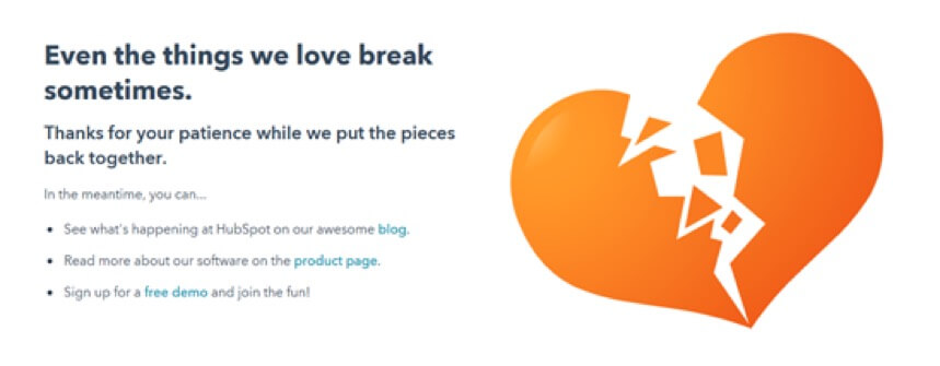
In the 404-page optimization example above from HubSpot, you can see the user is only a click away from each of the sites main areas, and to get somewhere more specific there is still the navigation bar.
It can be a good idea to place a search bar in a prominent position, even if there is already a search bar in your navigation banner, as it encourages the user to keep looking for what they were after. A search bar can increase conversion rates by as much as 50%. On more complex sites it may also be useful to have your chatbot pop up on the 404 page, as the user may need some guidance to find the part of your site they were trying to reach.
5 Incorporate Interactive Elements
Almost 74% of users will leave a site within seconds of hitting a 404 page. Interactive or animated elements can hold a visitor’s attention for a few precious seconds as well as offer a little entertainment, and if they stick around for that it is more likely the user continue navigating your site afterwards.
You don’t need to go overboard here, something simple like an animation that responds to touch and mouse movement should be enough to prevent the instant exit, improving the page’s conversion rate.
This example from GitHub shows how simple you can go here while still being effective, using just a few parallax layers that scroll as the mouse moves around:
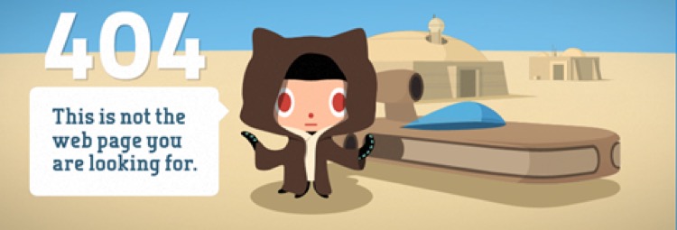
If it gets the user to fiddle with it for just a second or two, it has done its job.
6 Include a Lead Magnet
One very direct way to go about 404-page optimization is to simply incorporate plugs for some of your lead magnets. Embed the introductory video of your online course, link to your latest blog post or include the sign-up form for your e-book.
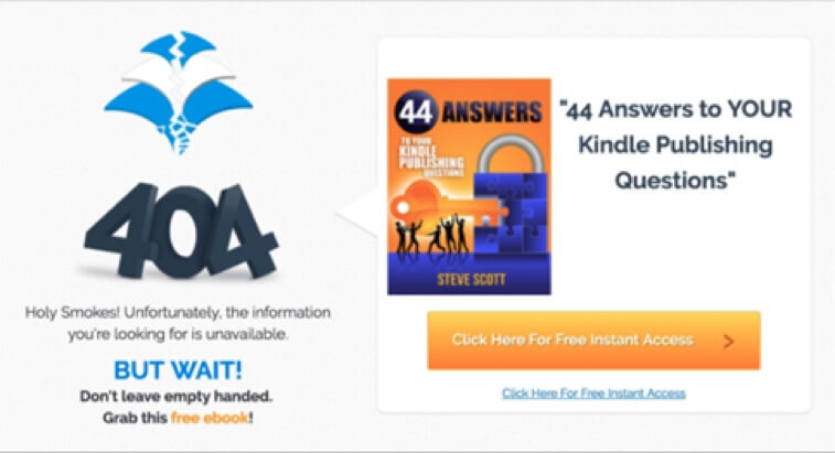
This example from Steve Scott’s site recognises why a visitor is on the site, and offers a free e-book to help answer their questions.
If you need more information than just an email address or phone number, consider putting the rest of the form fields on another page or pop-up, as too many on one page will create more resistance.
You want to take this opportunity to engage the user and reinforce your value proposition without pushing a possibly frustrated visitor too hard for contact details, so be sure to include at least one option that does not require an opt-in for access such as a blog or YouTube video. Including a video on a page can increase conversion by up to 86%.
7 Offer a Discount
Another very effective way to directly improve your conversion rate on your 404 page is to offer a voucher or discount code to incentivise the user to stay on the site and give it another chance.
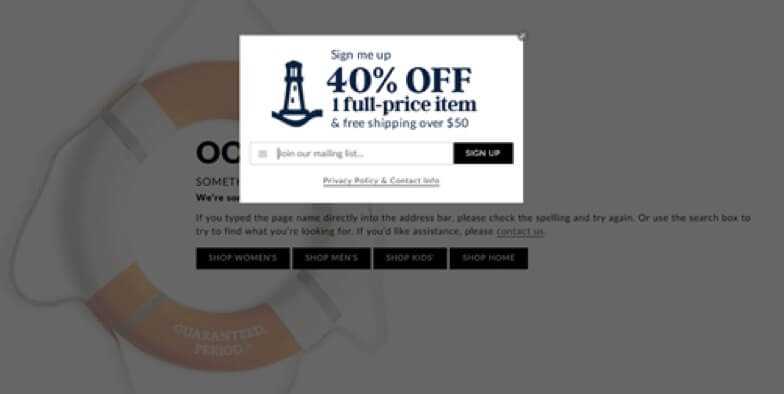
This 40% off deal that pops up on Lands’ End’s 404 page is a great way to grab the user’s attention and convince them to keep looking.
Focusing on one prominently displayed offer for your core product or service usually results in a better conversion rate than filling the 404 page with numerous offers that make it look like an ad pop-up.
This example from Land’s End shows how it’s done, with an exit-intent pop-up that appears as the visitor hits the 404 page to increase conversion and lower bounce rates.
In summary, optimizing the conversion rate of your 404 page is really no different to optimizing the conversion rate of any other page on your site.
Follow the same principles you use to generate leads and sales and you can’t go too far wrong, just remember that simply keeping your visitor on the site counts as a win here. As long as your 404 page also solves the problem of getting your user to their destination, these tips are a dependable way to increase your conversion rate and decrease your bounce rate in one swoop.

Written By
Alexa Lemzy
