7 Proven-to-Work Landing Page Design Strategies to Boost Conversions in 2025
No matter what digital campaigns you’re planning this year, you’re definitely going to need a killer landing page design strategy.
As the key element to driving conversions on your website, landing pages need to be highly optimized to influence consumer behavior and purchase decisions. And with the widespread availability of research data, companies can do a great job of creating elements that will inspire sales.
There’s a catch, though. As a result of following design guides and best practices, a great majority of websites and landing pages look almost identical to one another. With this in mind, brands that want to stand out need to invest in unique design and UX solutions for their landing pages. And that takes research, innovation, and a little bit of experimentation.
The following are the best landing page design strategies that are sure to help you get those results you’re after.
1. Stop Following Trends
Just like any business strategy, web design requires in-depth audience profiling, scientific analysis, testing, and continuous maintenance. And this means that the first step towards a killer landing page has to be the research phase. Unfortunately, very few projects can afford enough time for these steps.
Nowadays, trends dictate almost every aspect of web design. Company logos are placed in the top left corner, CTA buttons are put in the left portion of the hero section, and item descriptions occupy the right-hand part of product pages, conveniently separated into bullet points.
But the thing is, a landing page that looks trendy isn’t necessarily the absolute best choice for your brand. In fact, following trends might even hurt your branding. So, instead of blindly following practices that happened to work for others, you might want to start off by basing your decisions on research. Currently, there’s a lot of data showing how user gender, location, and age can influence web design preferences.
For example, in ecommerce, users will prioritize organizational structure and layout to aesthetic appeal. On landing pages, women will tend to gravitate towards sections without images, while both genders favor lighter color backgrounds to dark shades. User location has also been found to impact the appeal of elements like symbols, graphics, color, and even site feature preferences.
With all this in mind, it becomes quite clear that for a landing page to really work, it needs to be maximally adapted to meet the needs and aesthetic expectations of its target audience.
So how can you do better research without having to conduct scientific studies?
Well, A/B testing is an excellent method of collecting data and making better design decisions. Whether you’re wondering about single elements or entire funnels, a well-made testing tool that integrates with all your platforms will help you gather the information you need.
2. Pick Up the Pace: Adopt Agile Marketing Strategies
If 2020 taught us anything, it was that brands need to keep up with rapidly changing consumer needs if they wish to remain relevant. That’s why Deloitte’s top two marketing trends for 2022 include purpose and agility.
Purpose refers to the why behind a company’s actions and existence. Not only are values and missions growing in importance, but fulfilling those missions is going to become one of the sole measures for success.
Agility, on the other hand, means going one step further than listening to customer needs – it’s about taking action to predict and meet them before they’re even manifested.
The current state of landing pages is that there is, unfortunately, a strong discrepancy between promise and delivery.
Yes, marketers are getting more skilled at driving traffic by crafting compelling headlines and finding new ways to reach audiences. However, they’re still quite unskilled at weaving expectation management into the entire marketing funnel. That’s a shame, as expectation management is the one crucial step in ensuring high-quality UX and replacing bounces with conversions.
One way to steer the wheel in the right direction and inject purpose in landing page design is to create assets that directly address user queries. There are many examples of brands doing just that – creating valuable resources that answer questions, build authority, generate trust, and, consequently, encourage web visitors to become loyal customers.
For example, knowing that a lot of people struggle with the amount of sleep they need on a nightly basis, Eachnight created a sleep calculator tool that offers web visitors a straightforward answer to the dilemma.
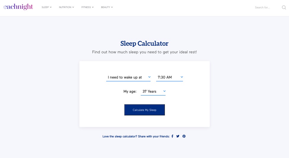
But although the landing page is one of the best-designed ones of this kind, it does not make the absolute most use of the information. That is, it’s got purpose, but it isn’t agile. There’s still value seeping through the cracks.
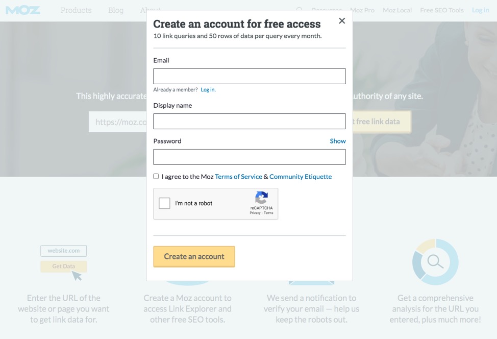
For slightly better execution, developers can look at a comparable example from MOZ. Their link explorer tool offers similar functionality – it provides users with actionable information. However, it also includes a lead-capture element that turns purpose into action. In other words, it ensures that each person using the resource potentially turns into a paying customer.
As you can imagine, purpose and agility (or, in other words, expectation management and delivery) have a high level of influence on UX.
These days, consumers are only more likely to expect better-optimized, personalized website experiences. But for a landing page to be truly beneficial to your business, it must look further than the present. It must bring you business for the moment, but also ensure that you have a base to build on in the future. Otherwise, investing in landing page design is nothing but a waste of funds.
3. Get Involved: Generate Trust & Loyalty Through Activism and Interactions
Instead of continuing to indulge in consumerist behavior, spending has seen a 20-40% decrease as a result of the COVID-19 pandemic, according to the latest McKinsey report.
Moreover, 78% of people have changed stores, brands, or the way they shop, and almost one-quarter are engaging in purpose-driven shopping in order to get behind companies they believe are doing good.
With this in mind, it’s becoming clear that trust signals and social activism will play a crucial role for brands. Fortunately, landing pages can be quite helpful for sharing core values.
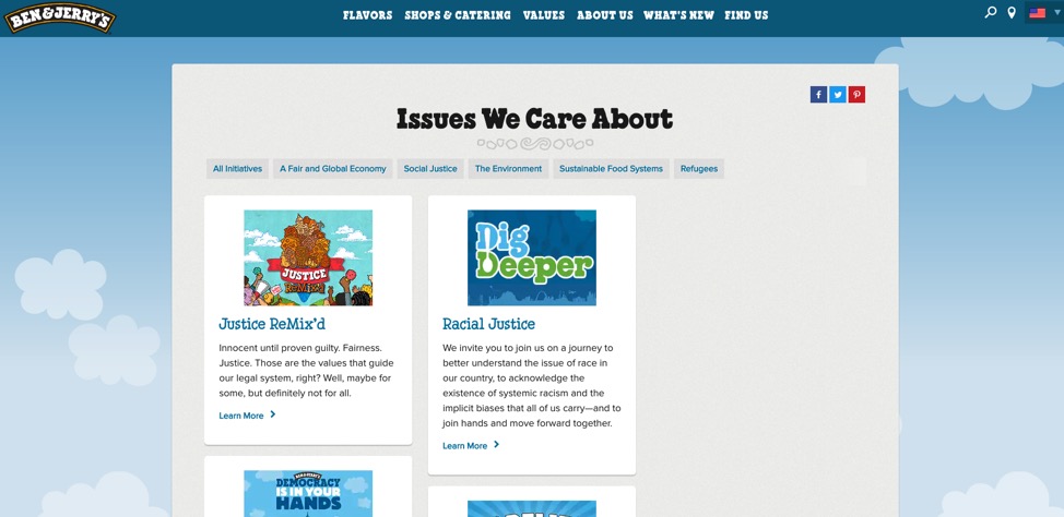
One instance of how brands can connect with their customers is to create landing pages that will explain their activism. A solid example comes from Ben & Jerry’s, whose Issues We Care About page addresses a variety of societal problems like racial justice, global warming, fair trade, and LGBT equality.
But activism in itself isn’t enough to get you through. Stating what you believe in on your landing pages is great. What’s even better is proving to your customers that you’re a brand worth staying loyal to – which brings us to the next part.
At Convert, we put our money where our mouth is. We’re 100% Climate Neutral Certified and only work with brands whose values align with ours.
4. Utilize Social Proof
If we look at the McKinsey Survey quoted above, we’ll quickly see that people’s shopping is increasingly turning towards two categories: essentials and valuable items. And what better way to prove your value than to put emphasis on social proof and trust signals on your website?
Social proof in the form of testimonials, reviews, and user-generated content sells. If people are 12 times more likely to trust a user review than a product description, then, by all means, you want to include a social proof section on your landing pages.
Unfortunately, however, very few brands do a solid job of making these trust signals stand out on their landing pages. Yes, they’re present, but they’re either shoved to the bottom of the page or displayed as text-only sections that are easy to overlook.
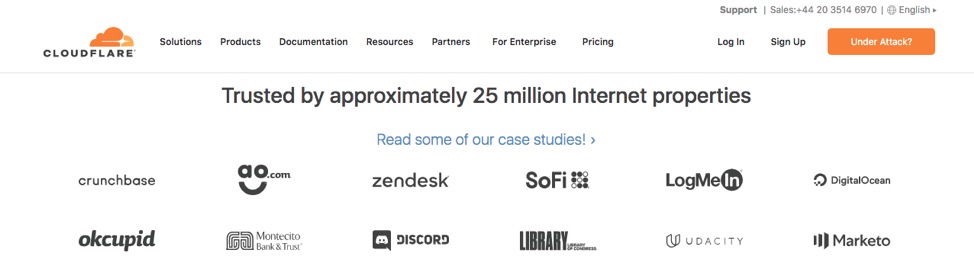
Take a look at the Cloudflare SSL/TLS landing page. It commits the exact web design landing page faux-pas we mentioned. Social proof is located at the very bottom of the page, it is unexciting, and it seems to be no more than a passing thought. Of course, with 25 million clients, the company doesn’t have to try hard to generate word-of-mouth marketing. But can you afford to do the same?
Instead of going with standard practice, one landing page design strategy would be to inject some excitement into the conversion-boosting elements you already have on your pages.
You can do this by moving the social proof section higher up on your pages, perhaps to the space right below the fold. Alternatively, you can take steps to make it stand out.
Runners Athletics is an up-and-coming company that’s taking social proof and user-generated content to the next level. In addition to aggressive influencer marketing campaigns on social media, they’re also urging customers to submit images and reviews, using these on their website to encourage purchases. Considering that each featured review includes a photo as well as insightful feedback about the products, they’re an example of exceptionally well-chosen instances of social proof, sure to make a contribution to the company’s growth.
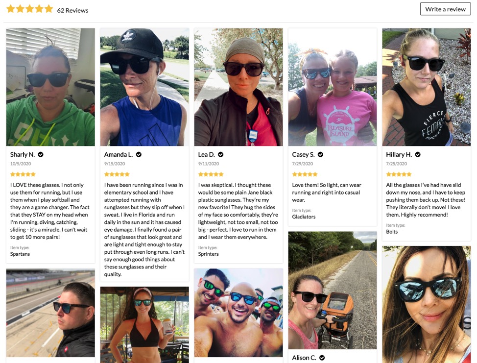
What’s interesting about this example, however, is that it isn’t simply an instance of user reviews or micro-influencer marketing. On the contrary, it’s an engaged, UGC-driven strategy that’s managing to testify to the brand’s commitment to value – all the while inspiring web design and combining a variety of communication platforms to deliver a unified, cohesive message.
5. Mix Things Up
One of the best pieces of design advice out there is to try and make your landing pages as minimalistic as possible. Simple, pared-down pages not only look great, but they’re also highly effective at navigation, SEO, loading times, and directing users’ attention.
But, one common mistake that brands tend to make is that, in an attempt to achieve a sought-after look, they sacrifice information availability and sometimes even functionality.
So, instead of applying a single design direction, like minimalism, to every aspect of your website, make sure that you’re putting your customers’ and ultimately your brand’s needs first.
There are plenty of instances of brands that are infusing personality into their landing page designs.
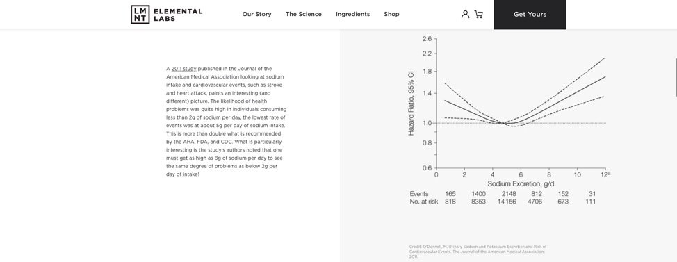
For example, take a look at what Drink LMNT is doing on its science page. By combining a minimalistic appearance with in-depth information, the brand is making the most of web users’ aesthetic preferences without skipping over the information that will help them make sales. Not only do they provide links to relevant studies that testify to their claims, but they also include in-depth explanations as to why sodium electrolytes are more efficient than sugar during fitness recovery.
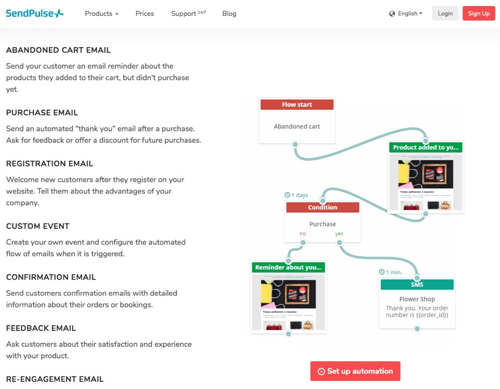
Another instance of a brand doing something unique, all the while adhering to the generally accepted rules of web design, comes from SendPuls. On the Automation 360 page, the company’s design team chose to forego the standard features list, substituting it, instead, with a GIF that shows the exact process of setting up campaigns triggered by user actions.
Both of these landing pages are excellent sources of inspiration for brands who are eager to go the extra mile to stand out. More than just a design strategy, this approach is a philosophy you can apply to all aspects of your business.
6. Personalization Lvl 99: Create Interactive Landing Page Designs
One of the best ways to drive conversions is to turn to personalization. For example, by creating dynamic landing pages, you can ensure that your message is highly relevant to your web visitors.
But how about going a step further? With minimal effort, you can design landing pages that are 100% tailored to your potential customers’ needs. That’s how you will ensure that they get quick access to relevant information and offers that are based on their specific requirements.
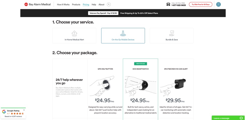
Interactive landing pages, such as this one from Bay Alarm Medical, give users the power of being in full control of their web experience. In this case, specifically, users can choose the type of medical alert system that’s relevant to their needs, then see a comparison of several devices and opt for the one that works best for them.
For a similar but slightly more detailed interactive landing page, you can take a look at the power supply calculator created by Cooler Master. This resource gives users detailed information about the power supply units that are capable of powering their specific PC build.
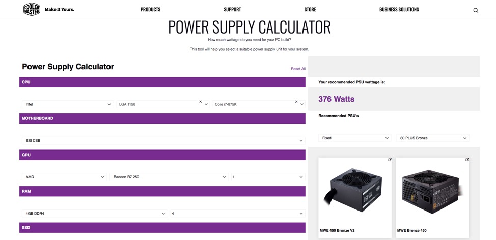
What makes it a good choice for a lot of brands is that it’s still easy to optimize these pages by following a clean aesthetic, writing excellent copy, and placing highly visible CTAs in the right places. But what makes interactive pages different is that they combine the concepts of personalization and upselling, thus maximizing the chances of conversion.
7. Innovate With Exciting Technologies
This last landing page design strategy is probably not going to work for everyone. But, if you’ve got the budget and really want to stand out from the competition, it might not be a bad idea to consider.
As smartphones, tablets, and laptops get more advanced, the limits of what can be done on web pages and in mobile apps expand. And, in some cases, you can use the new tech to drive conversions.
For example, the iOS 14 version of Apple’s mobile software allows users to add widgets to their home screens. When these are combined with the Shortcuts app, they create powerful mini-tools brands can use to trigger actions on their landing pages, like entering giveaways, reading new blog posts, signing up for new services, or even making purchases.
Another trend worth experimenting with on your landing pages would be augmented reality.
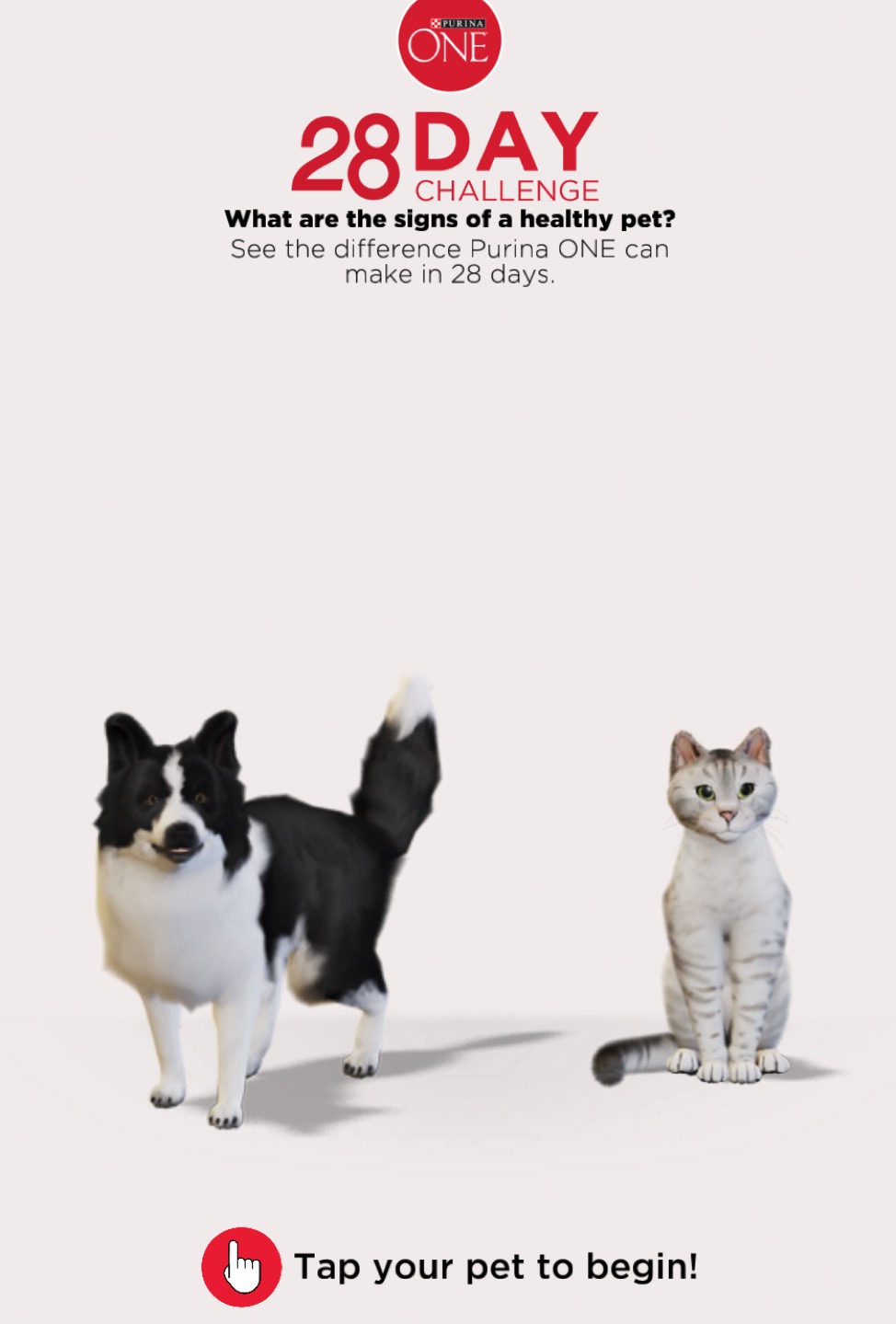
For example, Gucci, HBO, and YouTube all chose to make use of AR to promote products. But, you can also look to Purina’s 28-day challenge to see augmented reality in action on web pages.
Final Thoughts
If it’s conversions you’re after, then the absolute best way to go about designing your landing pages is to combine standardized best practices with innovative methods that will allow you to stand out.
As you’re aware, there’s no magic formula that will work for every brand.
For great results, you need to ensure you’re choosing wisely and that you’re continuously testing and improving your web pages. In the end, what works best for one brand might not be the right direction for you.
So, always make sure you’re making solid, data-based choices and that you’re not afraid of coloring outside the lines. Because, ultimately, what makes true industry leaders stand out isn’t just doing things great. It’s being brave enough to drive innovation even when everyone else is following the same beaten path.
Written By
Natasha Lane

Edited By
Carmen Apostu
