Sales Page Optimization: 8 Online Course Sales Page Elements to Boost Conversions
Note: This post is a part of our CRO Month 2019. Share it with the #Optimizein28Days to promote optimization awareness and how CRO can help businesses thrive.
The global e-learning market generated revenue of $165.3 billion during 2016. And it’s expected to surpass $243 billion by 2022. With this kind of revenue generation, it’s safe to assume that the popularity of online courses is increasing. And people are ready to invest their money into learning new things.
After working hard for months, you have designed, created, and launched your own online course. But how are you going to sell it? How are you going to motivate a visitor to click that subscribe now or enroll now button?
The answer is creating a landing page or sales page for your online course. The online course sales page will talk about your course and persuade your target audience to enroll in it. If this seems too complicated, you can use platforms like Kajabi, which lets you build your own website by customizing pre-built templates. But the best part is that you can use the course builder to develop the perfect online course and then add a built-in shopping cart to easily complete transactions.
Your sales landing page needs to be attractive and compelling if you want to drive real conversions. And for that, you need to consider the following eight important online course sales page elements.
1. Strong and Gripping Headline
The very first thing a visitor will notice on your online course sales page is the headline. The headline of the page can influence the visitor’s decision to stay and continue browsing the online course page or leave it. This means you have to come up with a very engaging and powerful headline.
A great headline will successfully get the attention of your audience and will hook them into exploring the rest of your page. To create a strong and catchy headline, you should consider the following points.
- You cannot target everyone for your online course. Whomever your target audience may be, address them directly. Your target audience can be marketers, aspiring writers, or technology geeks. Always address them directly, as if you’re speaking right to them.
- Always highlight one big life-changing benefit of the course to your audiences. Tell your audience that investing their money into your online course can give a huge boost to their professional life.
- Take your time to list ideas and come up with the most gripping, exciting, and powerful headline.
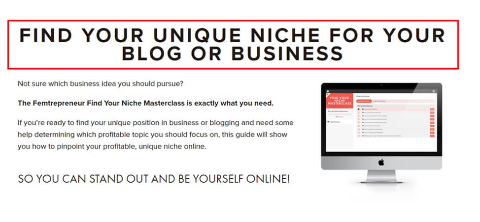
Mariah Coz has a very strong headline for her online course on finding your niche for business or blog. The headline is straightforward, very clear, gripping, and is simple enough to be understood by visitors.
2. Descriptive Subtitle
The subtitle is the next element you need to focus on to build a perfect online course sales page. Generally, subtitles consist of 2-3 statements and are a little longer than the headline. You have to make sure that the subtitle gives more useful and detailed information regarding your course.
The subtitle should be clear, to the point, and yet explanatory all at the same time. To achieve this, make sure that your subtitle highlights the ideal target audience and major benefits of your online course.
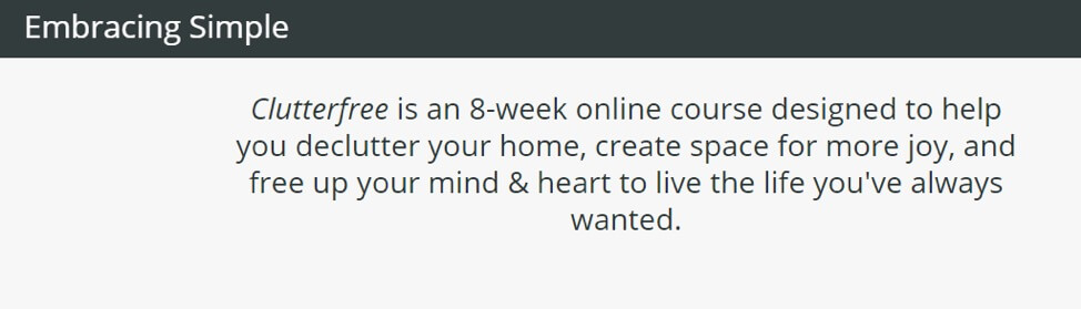
The online course by Christina Tiplea on decluttering your home and creating more space for joy has a very simple yet informative subtitle. The subtitle highlights the benefits from the online course as well.
3. Opening Story
Never put the problem or issue faced by your audience upfront on your course sales page. Instead, it’s always effective to introduce the problem in the form of a story. When done correctly, stories are more relatable and will help you gain the trust of your target audience.
Your stories should convey the experience of transformation and change. This will eventually motivate your target audience to invest in your online courses. Talk about the problem and the impact it might have on them. Then, through your story, you can show them your potential to fix the problem and create a change in their life.
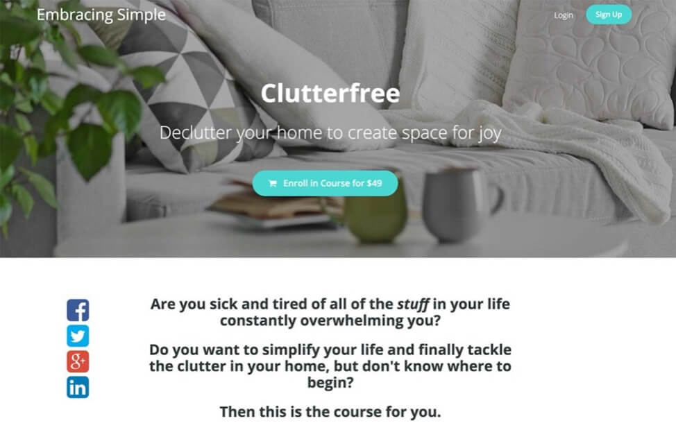
The online course on decluttering your home from Embracing Simple is a perfect example. The story on the sales pages highlights the problem. And they also talk about how this course can help their audience to change.
4. Course Description on Your Sales Page
The course description section of your sales page should highlight the expected output of your online course. Give them a short description of the course and list the advantages of signing up for your course.
Make a detailed list of your coursework, including the list of modules, course materials, and lesson plans. If you are offering any bonus course material, then don’t forget to mention that as well. This will give your target audience a full idea of what they should expect from your online course.
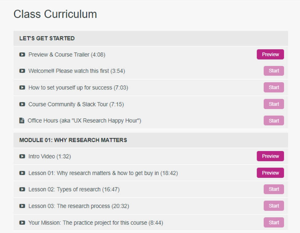
For example, Sarah Doody launched an online course on user research and usability tests. The sales page of her online course outlines a list of expected outcomes from the course.
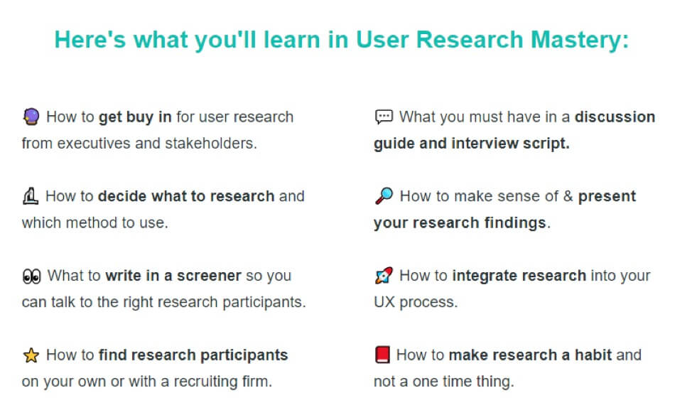
The page also gives details of the coursework, divided into five modules.
5. Clear Call-to-Action
A call-to-action is one of the most important elements of your online course sales page. A strong, suitable, attractive, and engaging CTA button can boost your conversion rates. So you need to create a super effective and impactful CTA.
Use contrasting colors on your online course sales page to highlight the CTA and get the attention of your target audience. Ensure that the CTA button stands out from the rest of the sales page. You can use tools like Adobe Color CC to find the most suitable color palette for your CTA button.
Also, make sure that your CTA button is big enough and visible enough to instantly attract your audience. If your CTA button is too small, people may have a hard time finding it. Always try to write your CTA button copy in second person so it’s directed towards your audience.
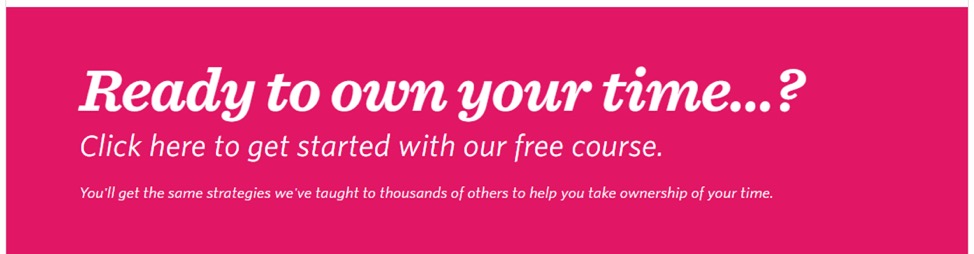
For example, Shawn Blanc is the founder of The Focus Course and the writer of The Time Ownership course. The course aims to teach sers different strategies to take control of their time.
The landing page of this online course is white and grey, but the CTA button is dark pink. And when you place your mouse over the button it turns dark blue. This is a perfect example of having a clear, bold, and big CTA button.
6. High-Quality Visuals
Include as many high-quality images and graphs as possible to make your sales page look attractive. This will encourage your target audience to stay on your page longer. Visuals will also help you to convey the required information more quickly and easily.
So take advantage of the high-quality images to create the perfect sales page for your online course. You can use a suitable and high-quality image in your headline. If possible, try using original photos, otherwise, you can use relevant stock images.
You can use graphs to show the before and after success rate of your online course. This will motivate your target audience to sign up for it. People love watching videos and it holds the audience’s attention for a longer duration. You can also add testimonial videos, briefing videos, or videos of your journey creating the course.
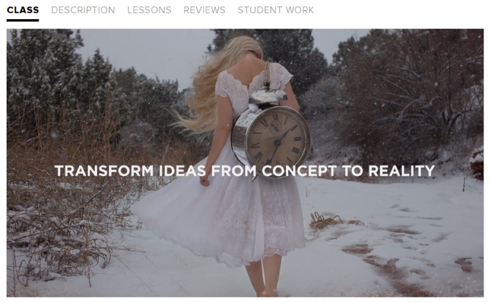
For example, the online photography course by Brooke Shaden on CreativeLive uses beautiful images to make an attractive video. The video is a short description of the course. The video is very powerful helps keep visitors engaged.
7. Showcase Testimonials for the Course
Social proof is one of the best and most effective ways of getting new people to sign up for your online course. Showcasing testimonials from your previous subscribers on your online course sales page increases the credibility of your course. This will eventually lead to an increase in conversions.
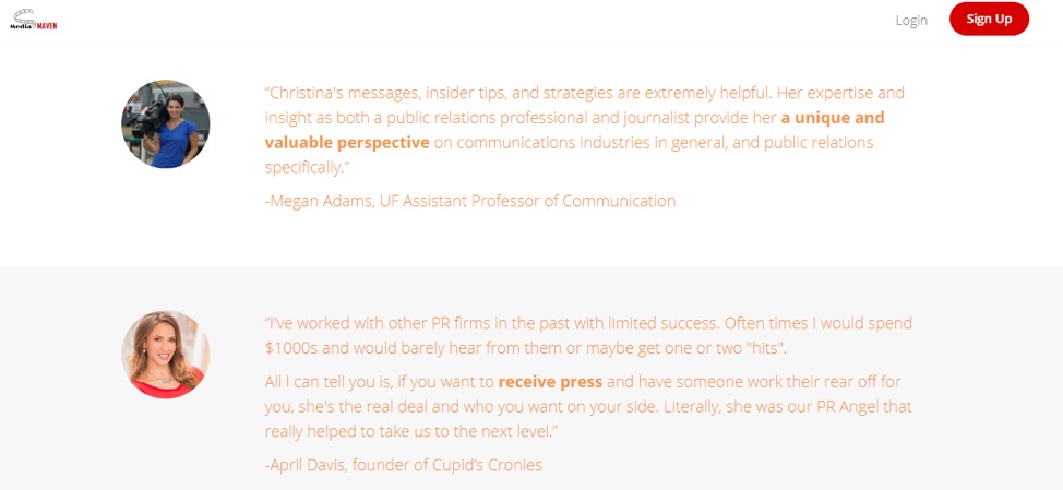
For example, Christina Nicholson has an online course on mastering PR and the need and importance of PR for small business. The course has helped a lot of her users to grow and expand their brands. And as you can see in the screenshot below, there are a lot of testimonials for the course.
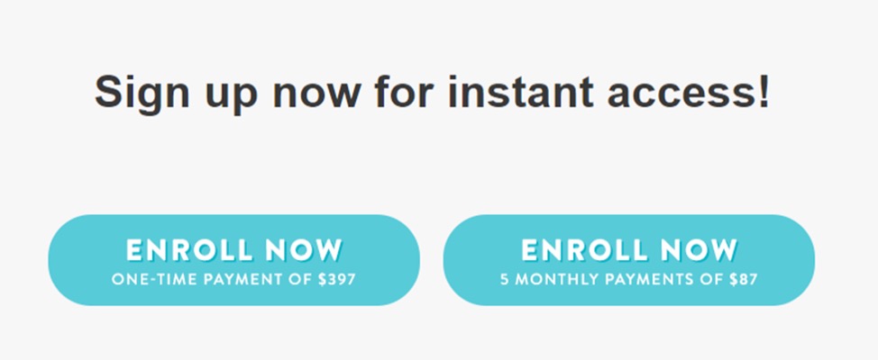
8. Clear Pricing Details
If you want to making a living from your online course, then you need to charge for it. And your online course sales page needs to cover your course pricing.
This section of the online course sales page should be very straightforward and clear. You need to list the pricing structure of your course. Also, if you are offering different types of payment such as one-time payment or monthly payments, then don’t forget to mention them.
The pricing details on the course page of Melyssa Griffin on Pinfinite Growth are very simple and clear. She offers her audience two payment options. The first is a one-time payment and the second is monthly payments for five months.
Are You All Ready to Create a Sales Page for Your Online Course?
Now that you know all of the key elements of the perfect online course sales page, you are all set to create your own. The whole objective of creating a perfect sales page is that it should help sell your online course. So you need to invest your time into creating a perfect sales page for your online course.
Written By
Gaurav Sharma
