How to Write Microcopy that Gets You Conversions
Microcopy is what one would call a “person on a mission”. Essentially, it’s a technique with a very specific purpose that can earn brands conversions, by influencing how prospects behave at the moment of taking an action.
More often than not, microcopy is what reduces friction by making prospects feel safe and bringing context to the action we would like them to take.
Microcopy is an essential aspect of a great UX. And mind you, UX is not just design, fast-loading websites, and innovative visuals. But, as vital as it is, microcopy — and UX writing in general — sometimes gets neglected.
What Is Microcopy?
You know those itty-bitty bits of text that you can find on payment forms, hovering over CTA buttons, the red error messages, and so on, that look a little like this? ⤵
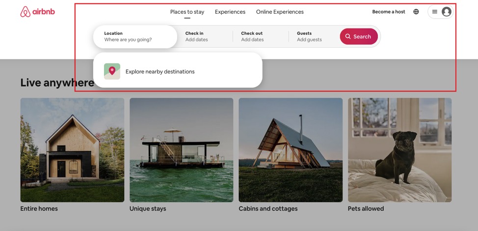
That’s microcopy.
Airbnb’s website in the example above uses microcopy on its headline to nudge users in the right direction. Messages like “Where are you going”, “Add dates”, and so on, are there to keep users from opting out.
This minimizes friction and makes microcopy a lot more than just a way to let prospects know what steps they need to take. It essentially allows users to move further along in the sales funnel and interact with the brand in a way that design can’t do.
Of course, writing for UX — and, therefore, microcopy — is a little different from website copy or articles. Writers need to remember that microcopy should be actionable. It aims to guide the reader towards a specific action, whether it’s to ease worry or provide more context in as few words as possible.
But how are you going to create microcopy that reduces friction and nudges users to convert?
Simply follow the essential steps below.
Let’s Start With the Don’ts
Since the ultimate goal is to create microcopy that converts by leading users to the next step, avoid anything that makes users hit the “back” button.
There are many reasons why a user may not want to be on your page — or convert altogether. Your tone of voice may not match their interests, for example, or your design may not be up to their standards.
Maybe your offers seem more like an online PR scheme with CTAs that ask users to “Like!” or “Share!” things than actual solutions. But let’s get more specific.
1. Don’t Make Your USP a Guessing Game
Every brand has a Unique Selling Point (USP). Usually, the USP matches the tone of voice and (micro)copy. But, in some cases, brands decide that their USP is for them to know and for their audience to figure out.
This can create a lot of friction and ultimately a lack of trust. Why would a prospect share their information with a potentially shady brand?
Building trust with your audience is quintessential, seeing as no amount of microcopy can remedy it. So, find out what your audience wants to see before creating anything. You can figure this out by sharing quizzes to your social media pages and engaging them before they even visit your website. Make it clear what your brand stands for to build rapport with potential customers.
2. Don’t Be Information Scarce
Say you have to create a PayPal account as a freelancer. How would you feel if you came across this page…
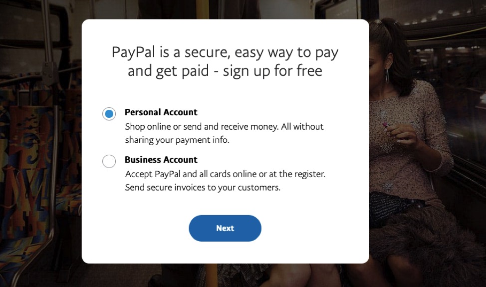
…without the additional explanations:
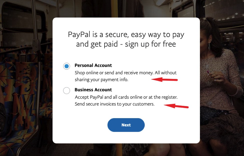
If I had to guess, I’d say that the explanations underneath each option help the users pick the right account for their needs.
A lack of this type of microcopy makes people feel confused and unsure of a brand’s intentions. So, make sure to always explain “Why a valid email address is needed”, or “What counts as a secure password” like so:
The whole point is to show users that there’s no reason for concern and that you won’t engage in suspicious activity with them.
Here’s another example:
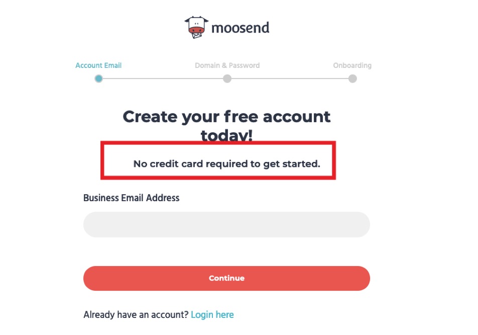
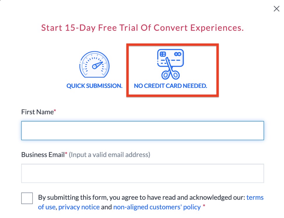
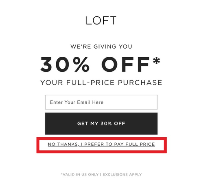
Not forcing users into sharing their credit card details when signing up for a free trial should be the norm. Convert does this (⤵️) and so does Moosend (⤴️). It just makes sense.
Prospects are wary of buying anything when they don’t know how the brand or website is going to use their information. And anxiety creates friction.
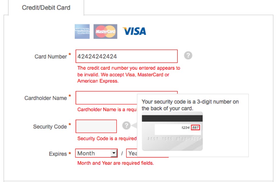
3. Don’t Mislead
Remember, people nowadays scan information rather than read the whole thing. Writing a ton of filler words but not enough essential information is a sure way to have visitors bounce.
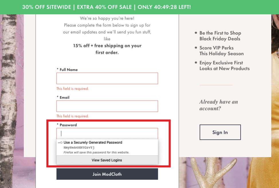
I came across this form the other day:
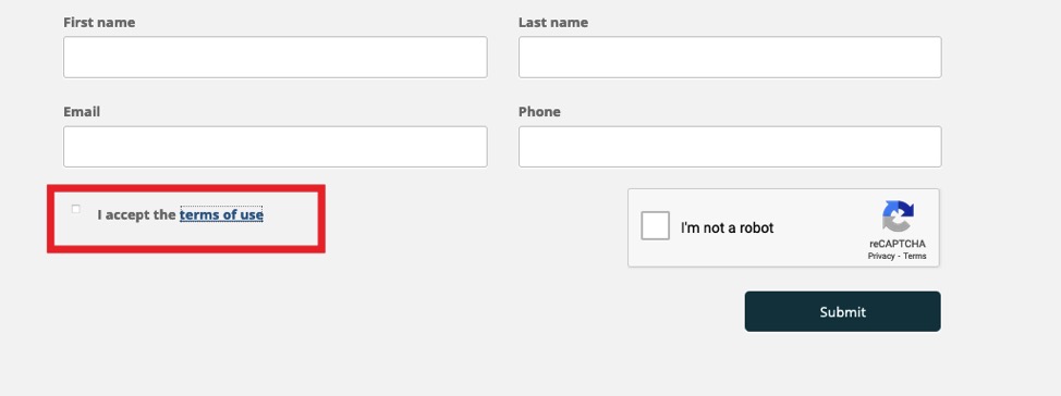
I clicked on the terms and conditions link, as I needed to know what I was about to agree to. Surprise, the terms of use didn’t load:
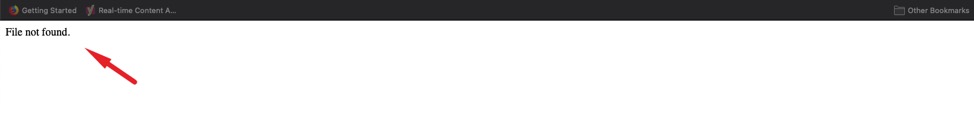
Now, I wasn’t about to sign up to receive email marketing campaigns, newsletters, and so on, without knowing what my email was going to be used for.
Another example of being completely tone-deaf is this one:
This choice of words in the example above shows how a brand can shame its audience into making a purchase. It’s a bad practice, a non-empathetic way of connecting with the customer, and a surefire way to create a bad experience.
What Makes Great Microcopy Great?
For all the reasons we discussed so far, creating good microcopy is a must for your brand. But let’s see what are some specific elements to keep in mind when crafting it:
- Less is more. Good microcopy consists of a few words and a simple, to-the-point message.
- Can lead users from point A to point B. Microcopy is, after all, a critical factor that shapes UX and helps users understand what the product is and what it can do for them.
- It’s interesting. Since less is more when it comes to microcopy, make sure the message engages the user with clever wordplay.
After all, microcopy is a UX design component.
UX design is the process of developing and improving the quality of interaction between a user and all aspects of a company.
Moosend’s Head Designer, Jason Kalathas
It’s easier said than done, though. Generic microcopy can have a soporific effect, while microcopy that is too technical can be off-putting.
When we set up our onboarding program at Moosend, we faced a dilemma: Simple and boring or technical and intimidating? Either way, the decision could have cost us conversions.
Here’s what we did:
First, we created an email sequence that aimed to engage. We perfected the CTAs, used actionable verbs, used our existing resources, like our FAQ page, and included a link to our brand new Moosend Academy that features a series of video courses on how to use our platform:
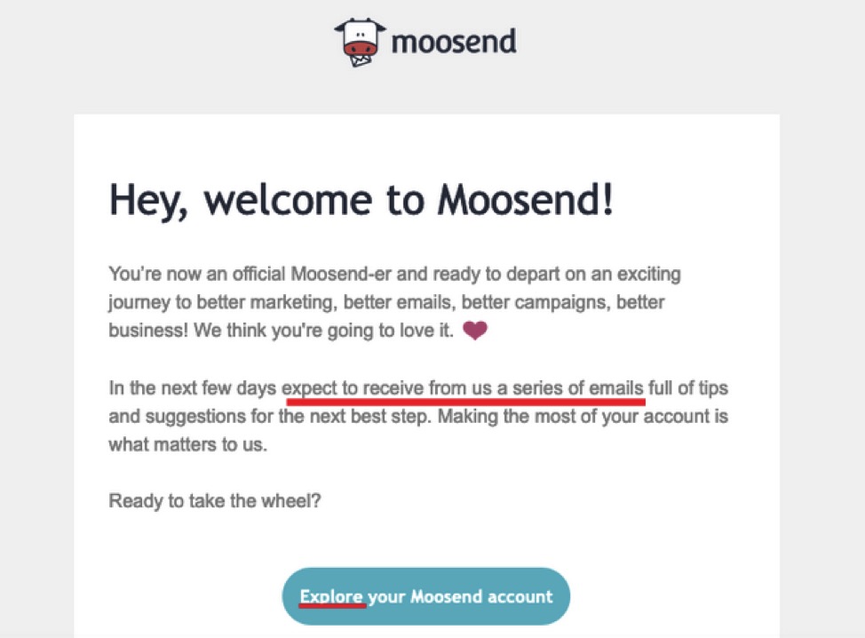
The introductory email then ensured that users explore our platform and know where to find what they’re looking for. It also served as an introduction to what the users should expect from this sequence, as seen above.
As the email sequence progresses, the microcopy becomes more specific. Take a look at this:
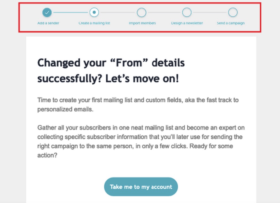
The bar at the top of the email isn’t just a cool design trick. See how it points to each step the user needs to complete in the onboarding sequence, using actionable verbs and simple verbiage?
The bar is there to motivate the users to reach the finish line by showing them exactly how close they are to their goal.
The email sequence example above motivates users to complete a task using microcopy:
- It uses human language that urges people to give a reply or take action.
- The copy is short and relatable.
- Actionable verbs and encouraging words build the user’s confidence.
So, how are you going to incorporate these elements into your microcopy?
Be Human
Creating a beautiful website that wows your prospects is easy, but how do you keep them engaged?
Picture this scenario:
You’ve created a fantastic website with a killer design that has led your prospect towards your newsletter subscription form. Now, all you have to do is to entice them enough to subscribe to your email list. This is a fine opportunity to talk to them — in our case, through the microcopy on your form. Right? Design’s done its job; now you need something like this:
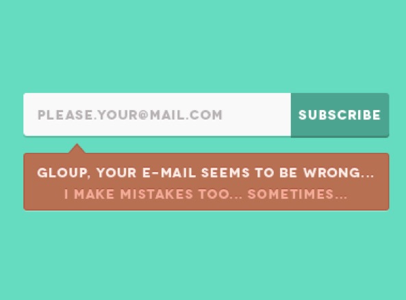
The above example is written with the user in mind, and the user is a human being that may very well make a typo when entering their email. It’s a good example of using microcopy to interact with prospects in a way they understand and appreciate. It could make all the difference between signing up for your newsletter and never thinking of your brand again.
Keep It Short and Sweet
The whole point of microcopy is to help users down a specific route by using as few words as possible. So, whatever you do, don’t babble.
Nowadays, prospects don’t pay as much attention to your message as they used to. This is why photography, typography, and great design and visuals are so important.
Of course, those elements, without any explanation, are useless. So, take a look at this example:
Tweak your microcopy enough so that you can show AND tell the user where to look and exactly what to do. Just by adding a tiny detail like an error message or a reminder, you can get a ton of conversions:
Just don’t babble. Don’t waste your users’ time and get straight to the point.
Show Your Personality
Remember, you’re writing for humans – aka your ideal audience. Your microcopy can’t be bland or void of personality.
Create messages that are quick, timely, and relatable. Write in a tone that will do your tone of voice and your style justice, while helping your audience complete the action you’d like them to complete. Like in this example:
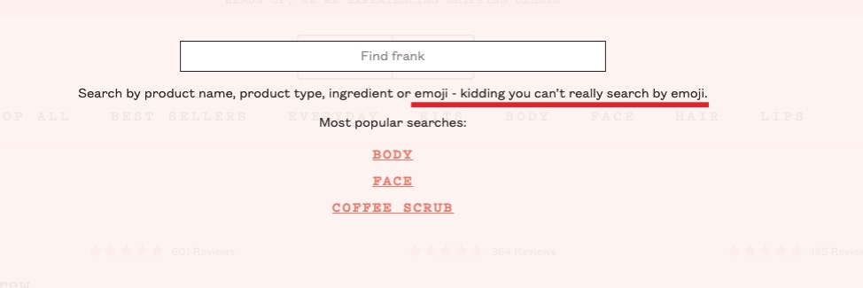
This brand’s cheekiness always makes me feel better. Frank Body’s persona, Frank, is a little sarcastic, very cheeky, and just purely entertaining. This is why their microcopy is crafted in a way that made me chuckle and just stood out to me.
Oh, and please do take a look at their 404 page:
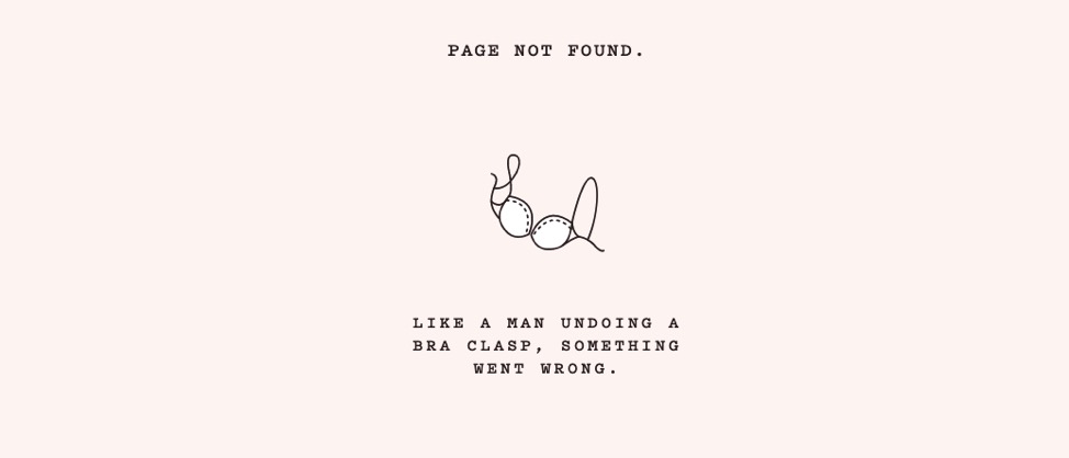
Hilarious, right?
Here’s another example coming from Convert:
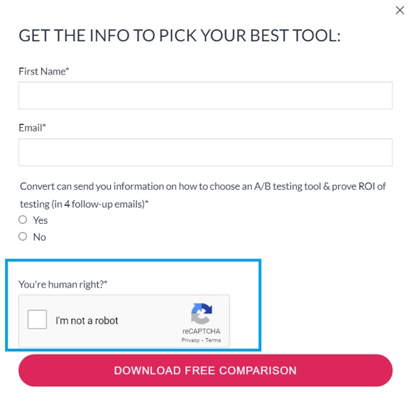
Microcopy like this doesn’t seem computer-generated. Rather, it’s obvious that there’s a human behind the screen, talking to another human. It’s establishing a very real, pleasurable connection that goes beyond UX writing guidelines and creates an actual, authentic user experience.
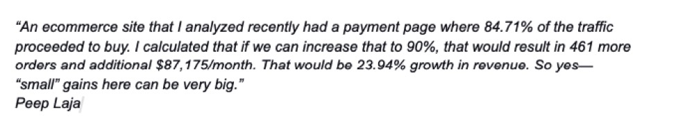
And it helps you get conversions, too. The form example above from Convert saw a 60% lift in leads to trial, from subscribers who consented to more information. Not bad, right?
Build Rapport
Whatever you do, don’t confuse the user. Visitors need to be able to grasp the main idea from very few words.
This will help create a path to a stellar user experience. If you build a rapport with users, each interaction with your brand, be it on social media platforms or on the website itself, will be a positive one since your microcopy has already made your prospects feel confident in your brand.
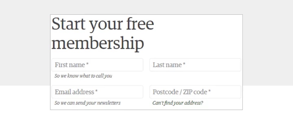
As you can see in the example above, The Guardian’s form microcopy explains exactly what the popular website needs the prospect’s information for.
The key is to create well-written microcopy that eliminates any possible concerns. This will make interactions with prospects so much easier when it comes to simple processes like onboarding or more complex procedures like completing online payments.
How to Find the Right Tone for Your Microcopy
Microcopy should help users understand your product and create a smoother customer experience. It needs to be consistent with the brand’s tone and deliver a unanimous message that aligns with your core values.

Your brand’s tone of voice reflects your personality. It’s what can make your brand feel human and natural. Think of Starbucks, for example. There is a reason behind their characteristic green color. There is also a unanimous look and feel of their website, app, and stores, beyond just the color. Starbucks aims to offer a calm and relaxed experience overall.
Needless to say, if you haven’t found your brand’s tone, you cannot find your microcopy tone, as the latter stems from the first.
So, think of your ideal customer. What are they like? Are they tall, short? Do they love flashy colors or minimal designs? Are they patient? Do they appreciate a good joke?
If you have accurate buyer personas, you can then craft a message that feels natural when communicating with them.
Let me circle back to the example of Frank Body I used before. You saw how good the 404 page was. It was that efficient because the brand’s tone is centered around Frank, a flirty, cheeky, and veryrelatable persona. Frank could be the ideal customer’s best friend, boyfriend, or confidante, making the tone just as serious and fun as needed.
A great source of information on how your prospects engage with your brand could be your chatbot if your brand uses one. Chatbots are full of data that show the exact tone your users have when interacting with your brand. The same goes for your social media pages.
Remember, your tone is only as valuable as your prospects think it is. Creating microcopy is all about enhancing your UX. If the experience isn’t positive, then you just haven’t polished your tone enough.
Final Thoughts
Microcopy is only “micro” by name. Words can completely change the way people view your brand and your product. And microcopy plays a huge role in boosting authority and building customer loyalty when done correctly.
It’s an intuitive art that can boost UX and conversions, by leading the prospects towards a desired action or outcome.

Written By
Téa Liarokapi

Edited By
Carmen Apostu
