High Conversion Sites Are Created for the Mind
We humans like to think we’re rational creatures. That we make logical decisions based on concrete information, and that are conscious minds are in control. There’s plenty of evidence to suggest just the opposite, of course, but we like to ignore it and tell ourselves we know what we’re doing, and why.
The truth is, our actions are driven more by our “lizard brain” than we’d like to admit. We make snap judgments before our conscious brains have even had a chance to wake up and say “huh?”, let alone actually process any information. In fact, that lizard brain of ours dictates what information makes it into our conscious awareness and decision-making. You’re not nearly as logical as you’d like to think, in other words.
And neither are your customers.
Just like you, everyone who visits your site makes snap judgments without even knowing why. They form an instant impression of how your site looks and feels, and that informs every subsequent action they take…or don’t take.
Whether you’re looking for opt-ins, purchases, or any other kind of conversion, design matters. The way information is presented on the page is just as important as the information itself, and arguably more so. From the way an eye moves across a web page to the colors, symbols, and overall aesthetic design of a site, our irrational subconscious is constantly telling us how to feel about the content we’re viewing. Trust, enthusiasm, eagerness, attraction, and everything else you want your customers to feel are created through design, not through a cut-and-dry copy.
Our minds are largely made up long before the logic circuits kick in. You need a good copy, of course, but a good copy can never make up for a bad site design. Sites with high conversion rates are designed explicitly to speak to our lizard brains, with great sales copy layered on top to seal the deal. If you want to see similar conversion rates, you’ll need to design with the same principles in mind.
Here are a few to get you started.
Color Your Way to Increased Conversion
More than 90% of consumers rate visual factors as the most important when making a purchase decision, and color is a major part of any visual. With a bit of study and some simple adjustments, you can create a color scheme for your website that helps inspire the precise reactions you’re looking for in your customers.
The psychology of color is used everywhere. Colors in hospitals are typically chosen to be comforting and clean, colors in fast-food restaurants are chosen to encourage fast eating (and higher turnover per table), while casinos and other businesses use different color schemes to create a more relaxed feel that encourages people to stay longer and spend more.
The right colors for your website depends on what you’re selling and how you’re trying to push for conversions. If you want people to spend plenty of time on your site, clicking around and reading their way to a purchase, blues and greens tend to be better. If you want to create a sense of urgency to get people to convert from a single landing page, reds and oranges tend to work better.
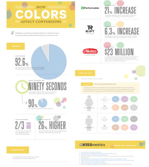
Scholarly research on the psychology of color in sales suggests that between 62-90% of a decision is made based on the color of a product alone. Apply that knowledge to your site, and your conversions should surge.
Let the Visual Flow Lead to Action
Color isn’t the only visual aspect of your site that is scientifically proven to affect behavior—and conversions. We also have the benefit of empirical data when it comes to the best ways to arrange information on the page.
Any page where you’re trying to get a conversion, whether it’s a landing page for an ad or a click-through following a blog post, should be designed to get your visitors to take a single specific action: convert. Enter their email, click that “Buy Now” button, go out and buy an iguana, whatever. The best layouts for these pages are simple, straightforward, and laid out in a way that leads the reader right to the conversion point.
When you view a website, your eyes naturally travel across the screen in patterns that make sense to your brain. For most of the Western world, where we grew up with languages that are read from left to right as we move from the top to the bottom of the page, our eyes naturally scan the page in a similar pattern. It looks somewhat like a large “F”: we scan horizontally across the top of the page (or the top of the primary content area—this is an example of why overall design is so important), then we return to the left side of the page a read down until the next opportunity to scan to the right, then back to the left and down from there.
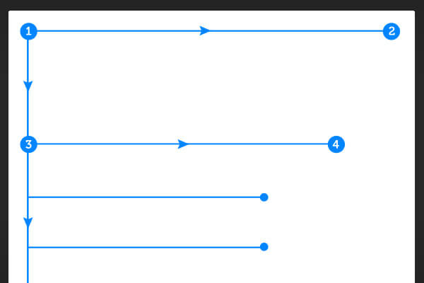
An eye-catching content block across the top, a left-hand column that keeps the reader going and often contains an early call to action (see below), and another horizontal content block or colorful standout headline that pulls the reader into the main content—your pitch, your offer, your sales letter, etc.
If you can keep them going to the bottom, you’ve won half the battle.
Vertical elements on the far right of the page are visually—and thus psychologically—set off from primary content. Avoid putting your primary offer or call to action in this area, and make sure your messaging flows in the pattern your visitors’ eyes will naturally follow. Right sidebars have largely disappeared from many sales-oriented sites altogether, in fact, precisely because they’re a drain on conversions. You don’t need a left sidebar, either, just some visuals or other elements that break up the text and keep interest flowing down the page.
Have something eye-catching in the upper-left that leads directly across the page, and have your call to action on the right side of your primary content block. For long-form landing pages, make sure you hold visual interest with some more vertically-oriented content on the left side of the page to keep users scrolling down.
Don’t Let Images Overwhelm Your Message
Having great pictures, infographics, and video thumbnails on your landing page is fantastic. Content-rich pages give information to visitors in multiple ways, allowing each individual to learn in the way that’s best for them while keeping the eye and mind engaged. And images speak more directly and quickly to the lizard brain than text—the right images can instantly create a sense of security, excitement, desire, or whatever else your site’s visitors need to feel before they convert.
It’s easy to let your images take over your landing page, though, and that’s not what you want. Your visuals should enhance your message and help lead your visitors to your call to action. They will ultimately make a conscious decision, even if they don’t realize how heavily that decision has been influenced by their subconscious minds, and your images should enhance that conscious call to action. Too many images, or images that are too bright, crowded, or otherwise distracting, will turn people away.
We’re also wired to have an immediate emotional response when we see other people, and this works for photographs, too. Using pictures of people using your product, or looking pleased/relaxed/satisfied in the context of your products or services, is a great way to see more conversions at the action point.
When it Comes to Forms, Less is More
There are a bunch of reasons to keep your sign-up, opt-in, and purchase forms as short as possible. The longer it takes to finalize the decision, the more people will back out; the more invasive your form seems, the fewer people will trust it; the simple nuisance factor of filling out extra fields is enough to push many people away from your landing page.
All of these are secondary to the fact that the longer a form looks, the less appealing it becomes. On viewing a long form, visitors have a natural reflexive desire to close the tab and move on. The rationalizations come later, justifying the reflex. Give them something visually satisfying—i.e. as short as possible—and they’ll rationalize reasons why it’s OK to go ahead and opt in.
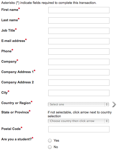
Compare your initial visual response to this long opt-in form:
to this one:
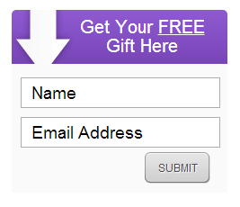
Without even knowing what the offer is for either form, you’re probably far more likely to go for the second option. One company saw conversions increase 120% when they cut their opt-in form from eleven separate fields down to just four. You can bet that the extra sales opportunities of the additional opt-ins more than made up for any lost demographic info the shorter form didn’t collect.
Take a page out of their book, and limit your opt-in or sales form to only the information that is absolutely necessary. If collecting more would truly help you create more targeted marketing, use your “Thank You” page and a special offer to get them to share a little extra—you’ll already have the conversion, and you’ll be more likely to get the info, too.
Make Your Pain Points Pop
If all of the text on your landing page looks the same, your message is going to be flat and far from conversion-optimized. You have to take the information your visitors will find most compelling and give it a visual lift to help it leap off the page.
And what visitors find most compelling is pain!
OK, we don’t want to make it too dramatic, but seriously: people buy products when those products help take the pain go away. They have a problem, and you can solve it, so you need to let them know it in a visceral—and that means visual—way.
This is an area where images and content blocks can be incredibly useful. Stick to the “F”-pattern of eye-scanning, and keep image size in mind, but use offset content blocks and simple, striking images to call attention to user pain points, with a VERY short description of how you’ll take the pain away immediately below or beside the visual attention-grabber.
Stress and soothe, then watch the conversions roll in.
Branding is About More than Recognition
When most small business owners think of branding, they limit themselves to logos and perhaps a color scheme. That’s because they’re thinking of branding simply as a way that consumers distinguish between companies.
But that’s just bare-bones branding, and it isn’t very effective.
Branding is a visual way to create authority. When all of your messaging and materials have a distinctive and cohesive look, your business automatically appears more competent and more distinguished. You go from having a few tasks you perform or products you provide to having a real identity people can form a relationship with, and all it takes is a little extra effort when it comes to design.
Take a look at this generic landing page template, for example:
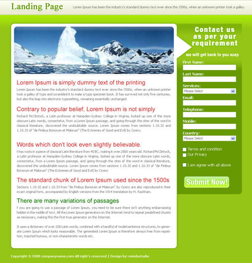
There’s nothing that sets this landing page apart from any other, aside from the, erm… interesting…shade of green (which isn’t exactly trust-inspiring)—no branding, and no visual sense of authority or authenticity. Every element of your site, especially every aspect of the visual design, should reinforce your brand. That’s how you build the trust and authority you need for the conversion rates you want.
Take this landing/opt-in page Blueprint Solutions designed for our upcoming Mindful app:
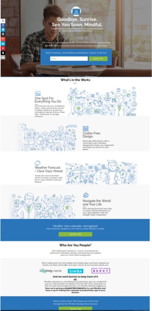
It has a simple yet consistent color scheme and a specific sense of style that carries through the layout, the copy, and the cartoon sketches. Multiple calls to action are built to stand out, and give people the option to convert right at the top of the page and at points following key information. The photo and the top and the sketches illustrate the feel of the app, and simple icons help readers navigate the information.
It’s branded, it flows, and it’s performing even better than we expected.
Your landing pages should do the same, reenforcing what you do and how you want users to experience your product, service, newsletter, etc.
Design Your Landing Pages With YOUR Audience’s Mind in Mind
You don’t have to follow all the rules all the time. Your landing page should reflect the unique value you offer, and the unique audience you’re targeting. And the best way to do that is by understanding how your audience’s mind works, so you can create your unique messaging in a way that’s truly compelling from the ground up.
Get your design right, and the results will follow. Build a converting site one step after another.
