Your PDP image carousel is doing more work than you think
How to test, optimize it, and use AI for better performance
One of my favourite parts of a Product Detail Page (PDP) is the product image carousel.
Not because it’s fancy, but because it’s a small space where you can pack in a huge amount of decision-making support. And unlike most carousels on websites (which, let’s be honest, often get ignored), PDP image carousels actually get used.
I’ve looked at countless heatmaps and session recordings over the years, and the pattern is almost always the same: people click through the images. Not always all of them, but almost always the first two.
Images three to five are usually when people slow down to sanity-check details, seek reassurance, and decide whether they trust you enough to buy.
Which is why it pains me how many brands still underuse this space with just:
- Five near-identical product shots
- Benefit images with text so small you can’t read it on mobile
- Lifestyle shots that look pretty but don’t actually answer any questions
So let’s fix that. Here’s how to build a better product carousel (I’m using “product carousel” as shorthand for the PDP image carousel), how to test it properly in Shopify, and how AI can help when you’re short on time or resources. Let’s get started.
What makes a strong product carousel?
1. Start with a hero image that doesn’t make people guess
Your first image is doing two jobs at once: making a first impression and answering “what am I even buying?”
A strong hero image:
- Shows the product in real use (when possible)
- Makes the product large enough to understand on mobile
- Removes ambiguity about what’s included
Bundles are where this most often goes wrong. If it’s a bundle, show the entire bundle clearly. If there’s a free gift with purchase, test showing it upfront. Don’t make people scroll, read, and mentally stitch the offer together themselves.
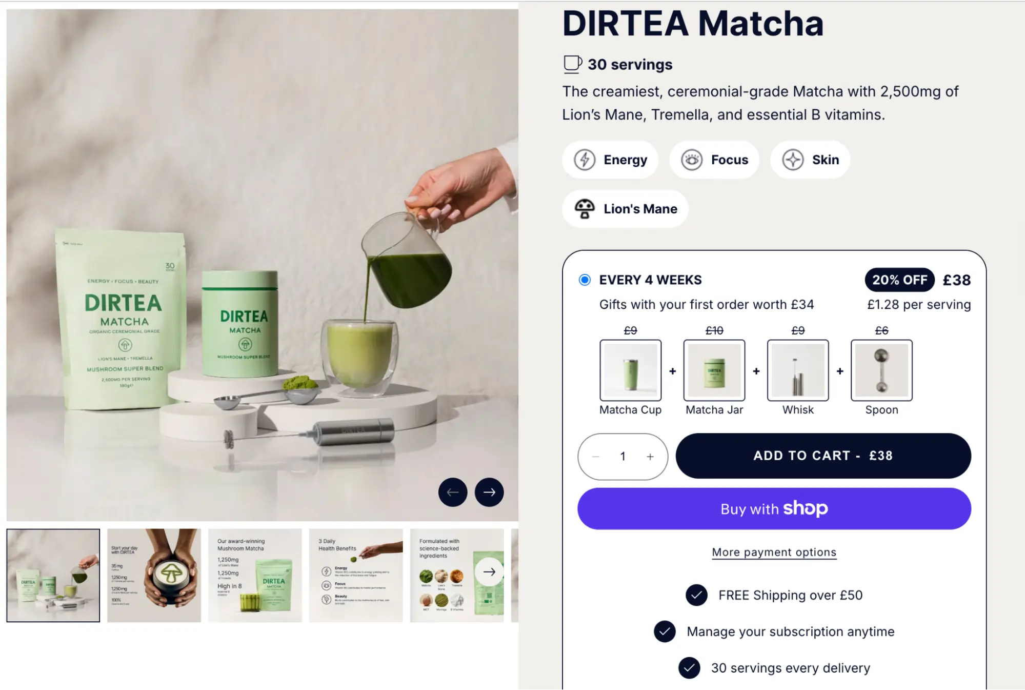
For example, Dirtea shows their Matcha clearly in the product imagery and calls out the included gifts right alongside it, so there’s no confusion about what you’ll receive.
2. Design it mobile-first
This is the reminder most teams don’t want to hear — because it usually means reworking assets — but your product carousel is primarily consumed on a small screen. If we look at DIRTEA’s Matcha page again on mobile:
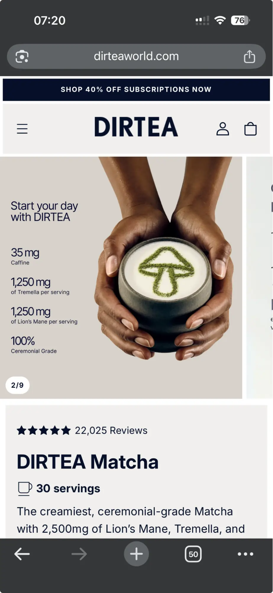
Approximately 50% of the real estate above the fold is the carousel; it needs to do a lot of heavy lifting, so it must be readable.
So if you’re putting text on images:
- One message per image
- Large enough to read without zooming
Basically: please no slide decks disguised as product photos.
3. Use images 2-5 to answer "decision question“
After the hero image, the rest of your carousel should earn its spot by addressing objections and helping people decide.
This is where you can show:
- Context of use – how it fits into someone’s day
- Outcomes – what changes when they use it
- Proof – why they should believe you
- Detail – what it’s made of, what’s inside, or a close-up look
Examples I love:
- A review snapshot (short, punchy, readable)
- Packaging + label for consumables (so underrated!)
- Ingredients close-up (when relevant)
- Material/texture shots for wearables
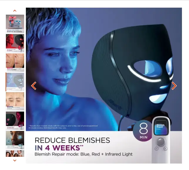
For example, Shark’s CryoGlow Mask shows a clear visual for each of the different modes and outcomes they can help with, clearly managing expectations on duration of usage and how long it takes to see results:
4. Don’t copy-paste the same shot five times
I once had a client who started with five nearly identical product images. The product was fine, but the carousel just didn’t give shoppers any new information.
We rebuilt it to include:
- Clearer packaging images
- Benefits (readable on mobile)
- Social proof
- And a couple of “trust builder” angles
The result was a 17% lift in PDP conversion rate, just by making the carousel actually help people decide.
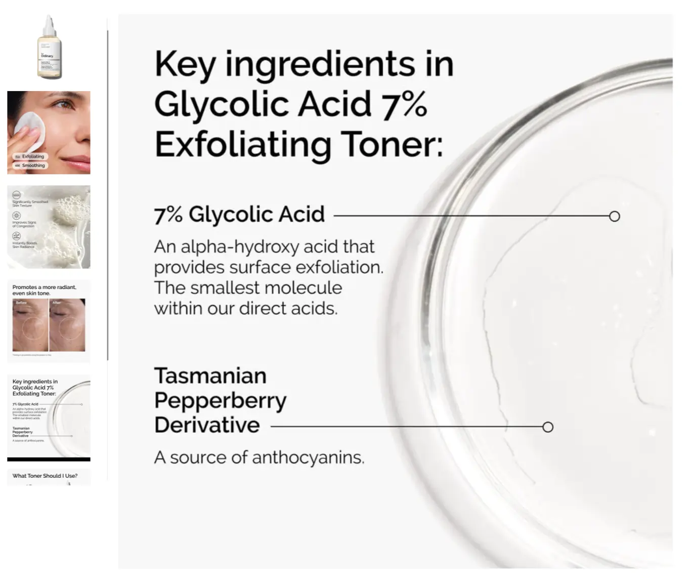
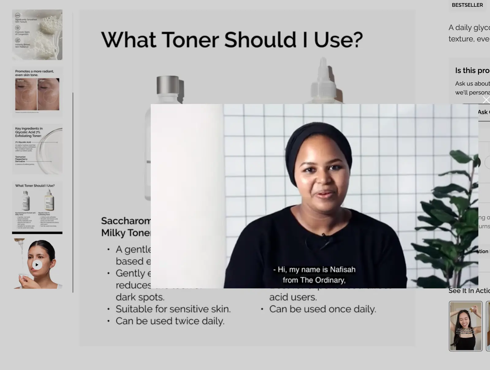
The Ordinary, a skincare brand, follows a similar structure for most of its products to keep it simple:
- Product image
- Key usages
- Results of using it
- Before/after photo
- Key ingredients and impact of the ingredients
- If relevant: Comparison to similar products they offer to help you choose
- For some products: Video explaining the product
Here you can see it for their Glycolic Acid 7% Exfoliating Toner:
5. Adjust the “depth” depending on what you sell
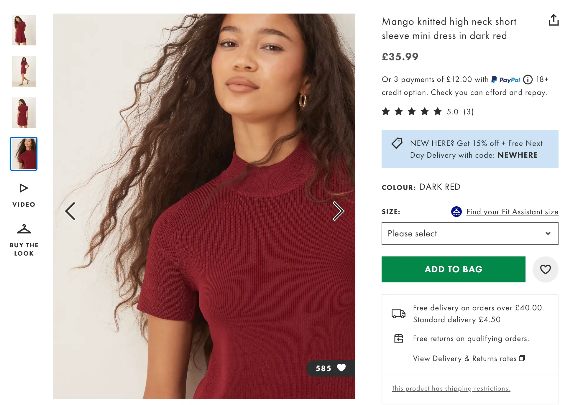
Some products need more detail than others. Wearables, for example, require greater depth because shoppers must judge quality and fit on a screen.
- More angles
- Close-ups
- Fit/context shots (showing model height/size for reference)
For example, ASOS shows most of their clothing with a mix of overall looks, zoomed-in shots, and even short videos of someone wearing the product, so shoppers get the full picture:
Consumables are different. Shoppers don’t usually need a dozen angles of the same jar. Instead, focus on:
- Showing the product clearly
- Highlighting packaging and labels
- Demonstrating how it’s used
- Providing proof or credibility
I promise: five slightly different shots of the same jar rarely change anyone’s mind.
6. Use trust builders, but keep them painfully simple
If your product has scientific backing, celebrity or expert endorsements, or certifications, use them in your carousel:
- A study or diagram that proves efficacy
- A celebrity or authority using the product
- A certification, badge, or expert quote
For example, Wild Nutrition highlights the science behind their Magnesium with clear, credible imagery that builds trust.
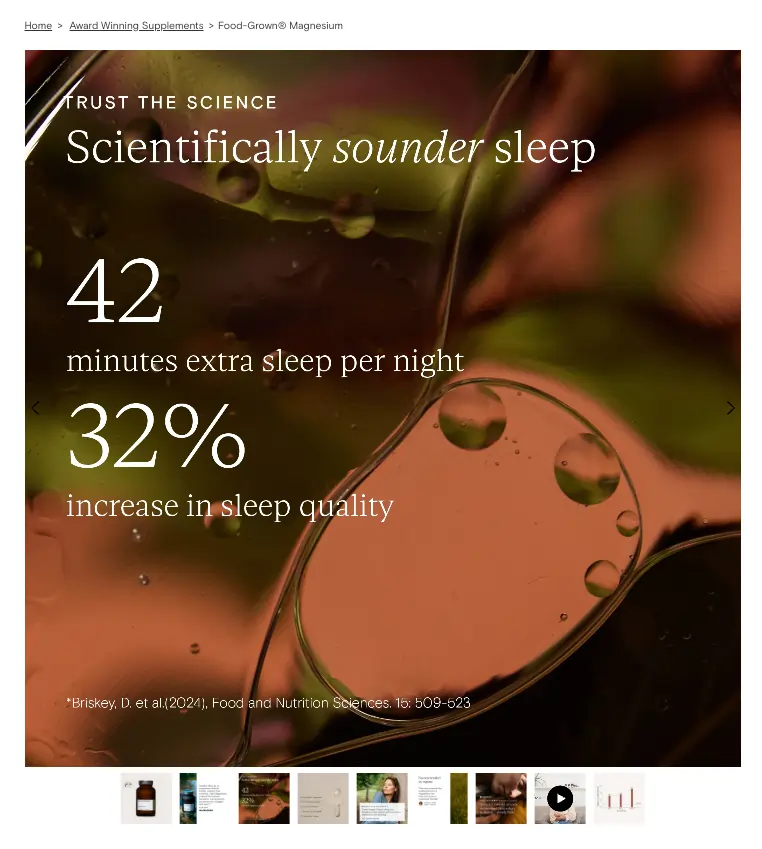
Please just don’t turn it into a wall of text; again, keep it simple with one clear point in a larger font.
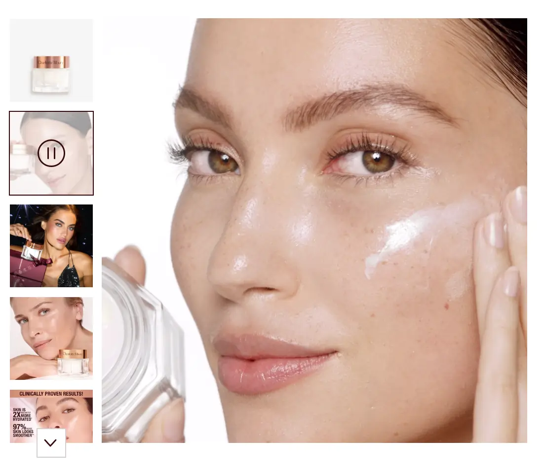
7. Consider testing short videos
Video can be brilliant if you do it right.
Videos are especially useful when static images don’t fully explain your product. A few rules of thumb:
- Keep it short: 5-30 seconds (to reduce load time and speed impact)
- Make it understandable without sound
- Think loop/GIF vibes, not a brand film
Some ideas I’ve seen work well:
- Rotating review snippets to pack in social proof without extra swiping
- Quick step-by-step “how to use it” demos for complex products
- Classic lifestyle shots in motion
For example, Charlotte Tilbury includes a video of someone using their Magic Cream, showing the product in action right on the PDP.
There are exceptions. The earlier example of The Ordinary had a two-minute video for their toner. For complex products or users who like to do extensive research, test longer videos. Just watch your load times; The Ordinary hosts theirs on YouTube to reduce loading times.
How to test product carousels in Shopify (without creating a mess)
Hopefully by now, you have a ton of ideas to improve your carousel, but now comes the slightly trickier part: testing it.
Because Shopify manages carousel media directly within the product, you can’t just upload Variant A and Variant B and call it a day. You’ve got three realistic ways to handle it.
Option 1: JavaScript-based image swapping (best for clean testing)
This is the cleanest way to A/B test carousel images:
- One product
- One SKU
- One inventory source
- One set of reviews
Images (or their order) are swapped client-side for a randomly assigned audience split. The main downside? If it’s poorly implemented, it can slow down page load, so monitor performance closely.
Option 2: Duplicate the product (not recommended)
This feels “server-side-ish,” but it quickly creates chaos:
- Inventory splits
- Reviews split
- Analytics becomes annoying
- Maintenance becomes everyone’s problem
It might look like a clean workaround until you’re actually managing it, especially if you want to test hundreds of images.
Option 3: Sequential testing (practical for smaller brands)
Run one version, then switch to the other, and compare results. Just be honest about factors that could influence outcomes:
- Promotions
- Seasonality
- Traffic source mix
Make the change big enough to measure, but not so big that you can’t tell what actually drove the result.
What should you measure?
When testing product carousels, your primary metrics are:
- Revenue per session/user
And supporting metrics to monitor:
- Conversion rate
- Average Order Value
Especially adding lifestyle shoots and more trust to your carousel can drive up AOV. Interaction metrics (swipes/clicks) are useful supporting evidence, but they’re not the goal.
If you’re testing images beyond the hero (slots 2+), consider analyzing the segment that actually interacted with the carousel (clicked or swiped). Including users who never saw the change will dilute your signal.
Option 4: Heatmaps and recordings can tell you what to fix next
Heatmaps and session recordings do more than show that “the carousel is being used.” They reveal:
- Which images get the most engagement
- Where people pause
- What gets ignored
- Where people stop swiping
That’s absolute gold for guiding experiments around:
- Reordering (put the high-interest images earlier)
- Removing weak images
- Rewriting/recreating benefit slides that are being skipped
How AI can help when you don’t have the images
Many brands underuse carousels because they lack the assets.
This is where AI becomes genuinely practical. I worked with a brand that had a gorgeous new silk sleep mask, but no budget or time for a studio shoot. The founder started with just two simple “base” shots:
- The sleep mask lying flat on a surface (clean lighting)
- A few shots of someone wearing it (straightforward angles)
Here are a few of the AI shots:

Then they used Nano Banana to generate variations: different models wearing the mask, new lifestyle contexts, and additional angles — all without reshooting.
Other useful tools to consider:
- PhotoRoom for background removal, shadows, quick product asset cleanup, and variations
- Midjourney for higher-end lifestyle scene generation (requires more prompt effort but gives excellent results)
- Pic Copilotis a mockup tool to provide quick contextual placements, especially useful if you sell anything “displayable.”
One word of caution: prompting can easily spiral out of control. If outputs start drifting, restart with a cleaner base prompt instead of endlessly patching a broken one.
This is your sign to fix your product carousel
If you’re looking for a high-leverage PDP improvement, this is it.
Start simple:
- Check how much your carousel is actually used via heatmaps and recordings
- Make sure it’s obvious there are more images
- Improve or test the hero image first
- Then fix the images people actually engage with (usually 2–5)
- Only after that, polish the rest
When a carousel is doing its job, it’s not decoration; it’s your fastest path to clarity, trust, and fewer “hmm… not sure” moments.


Written By
Daphne Tideman
Edited By
Carmen Apostu
