eCommerce Conversion Optimization 101
It seems there has never been a better time in history than now to start a business. An eCommerce store is an ideal choice for many. One reason is that you don’t require a store full of product to get started. One can drop ship products and still see a healthy profit with not a worry in the world about managing inventories or shipping the products yourself. But while the overheads are lower, it isn’t always possible for an entrepreneur to get the most out of their eCommerce site. That’s where Conversion Rate Optimization—CRO for short—comes in. It’s almost like magic.
Fergus Macdonald started his first eCommerce store while still a student at The University of Edinburgh studying for his degree in Business Studies. Fergus had noticed there was a demand for highland dress accessories on eBay, but at the time only used products were available. Seeing an opportunity, he established an account with a local wholesaler and began trading on eBay in 2004, making him one of the first Scottish highland dress retailers to do so.
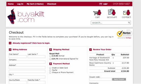
Fergus has come a long way since selling his first sporran on eBay. He and his partner Emma now run BuyAKilt.com with seven employees. Part of Fergus’ job is to optimize the website to increase revenues. One way he increased conversions was testing security badges in his checkout. His testing resulted in a 31.6% lift in orders placed and a six figure increase in revenue.
Looking to improve your own e-commerce store? In this post I will cover the specific changes you can make to get the most profits. Let’s begin:
What’s a Conversion Funnel?
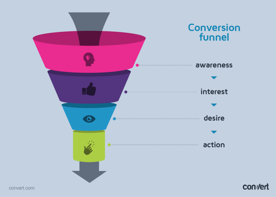
To improve conversions you need to know and understand what a conversion funnel is. To put it simply, it’s the flow or direction customers go through once they come to your landing page. If a customer makes it through the entire funnel you have a conversion. Here’s how a conversion funnel looks like:
Attracting the Right People to your Conversion Funnel
This is the first and the foremost step to making your conversion funnel a success. Where do you get your leads from? Do they come from Adwords? Is it from Facebook or Twitter advertising? You can do this by going over your Google Analytics data. Is it organic traffic that sends you leads? Make sure that you’re not overselling or targeting an unwanted audience.
What do I mean by Overselling?
Say you have a blog on your eCommerce site and you are writing many blog posts on maple wood furniture because it has a lot of monthly searches. Naturally, you’ll gain some long tail traffic because of the content. But the problem is that your store doesn’t sell maple wood furniture. Your visitors will be disappointed and will leave in droves.
Here’s another example—if your eCommerce store sells high-end women’s clothing, does it make sense to send male traffic to your site via Facebook ads? It doesn’t. It’s important to get your inbound marketing right. Otherwise a lot of the effort (and money) will be simply wasted.
To pique the interest of your ideal customer, you need high quality images in your ads. This should continue over to your website. The product images should be professional looking so that it interests people in buying those products. You can also use product videos to augment product images.
This should be accompanied by an engaging copy that describes the features and aspects of the product. Amazon generally goes for long form product descriptions. You can see an example below:
You can use something like Instapage or GetResponse’s landing page creator for creating long form landing pages with tons of graphics and you can also A/B test them.
Since design is important for eCommerce conversions, where a minor change can add or subtract millions, let’s look at some ways to improve design. If your eCommerce site has been using a single design for a long time then it’s essential to test new design options.
Andrew updated the design of his site Trollingmotors.net from a template to a custom made one. He spent over $5,000 on it.
For a time, everything worked out well. But then I needed to make some basic changes to the homepage and I had no idea how to accomplish it. First, I wasn’t familiar with the store template or layout because I hadn’t built it. And second, there were so many high-tech design elements (backgrounds, textures, etc.) that I wasn’t able to incorporate my changes cleanly.
He ultimately ditched the custom design for a stock template. Like Andrew learned, it’s not always necessary to go for a complete redesign to improve your current design. In fact, it’s best you make small changes to see what works and what doesn’t—something you can track without a full redesign.
Maybe the color of your CTA (Call to Action) button doesn’t stand out. It could be that the button isn’t big enough. What about your headline? Is it visible to users? Can they spot your value proposition from a distance and is it really unique? Make your design changes, split test and see which one increases your conversions.
Using Site Search Analytics to Improve eCommerce Conversions
The site search report shows you the pages where visitors begin site searching. Visitors often use this when they are unable to find out what they are looking for. In this example, ‘Christmas’ was the most searched term on the homepage:
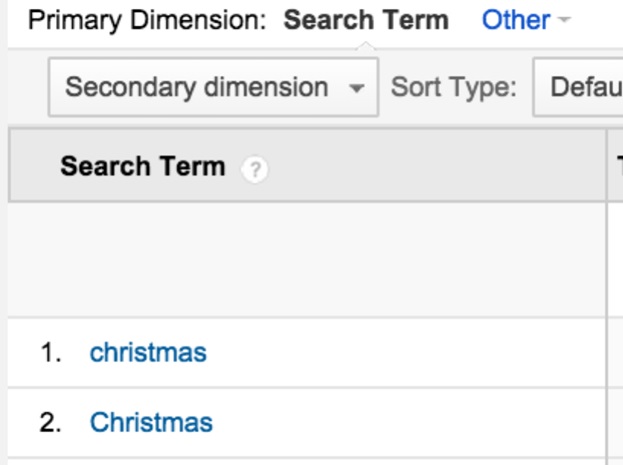
If customers are looking for Christmas products, the site should design the homepage to show more Christmas related items – possibly even add in a Christmas theme with jingle bells and reindeer. In this case study by IBM, Footsmart was able to improve on-site search conversion from 26.2 percent to 47.6 percent in one year—an 82 percent improvement. More than 50,000 unique searches are made each month on FootSmart’s site.
According to Osric Powell they achieved these results by monitoring campaigns of underperforming search terms, and adjusting the results accordingly:
Analysis of the language used by your visitors is one of the most powerful and freely available sources of information you can glean from the tools you use to measure site search performance. Furthermore, the findings from Site Search reports is easier to communicate to internal departments and managers for maximum overall benefit to the business.
Amazon uses site search to personalize their website for different customers. Not only is the website different for each user, it changes every time you shop. Whenever you search for something the site changes to fit your latest needs and brings even more suggestions with respect to what you searched earlier. Which brings me to my next point.
Dynamic Pages
Amy Kennedy of Wine.com realized that even though they brought the wine buying experience online they had a lot of work to do. A crucial part of wine buying is that people want opinions before they purchase.
In most local shops there’s an on-site expert present who helps with the choice. As such it was tough to compete with neighborhood wine shops. A cookie cutter approach to product recommendations wasn’t going to cut it here. They recommended best-selling or popular wines but these weren’t relevant enough. So they started a process of improvement with the following steps:
Step #1. Assess current system
Wine.com’s product recommendations were on the right hand side of the product details page. The recommendations were manually set for each product based on:
- Top sellers
- Wine region
- Wine type
- Price
This had several drawbacks—recommendations were not customized for each visitors and it relied too much on best sellers.
Step #2. Outline new system
The team worked on a new system that made recommendations based on more data
- Customer data
- Product data
To come up with relevant data Wine.com’s team started going through customer browsing and purchasing behavior data to discover trends. Each product was then compared to other products that were commonly paired with in purchases and in browsing.
All of the analysis birthed a new system that gave customers the following recommendations:
- Customers who bought this item also bought
- Products ultimately purchased by customers who viewed this item
- Top sellers in this price range
- Customers who searched for “xxxx” ultimately bought
- Items related to search “xxxx”
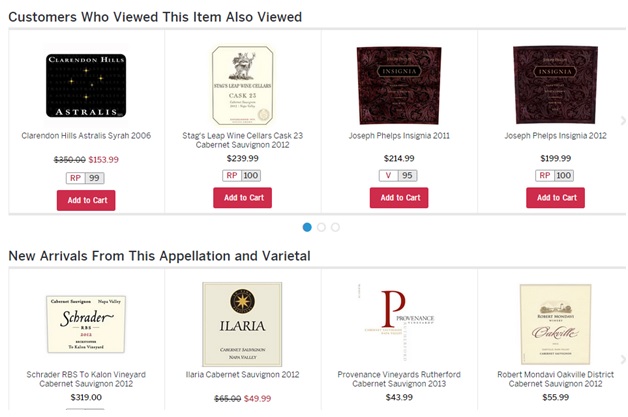
Wine.com also combined the geographical information of the buyer with the recommendations. Since they had different product inventory for different states, customers were offered only those products that were available in their region.
Monitor the Exit Pages
Exit pages are the pages where visitors leave your site. Your homepage is most likely to feature at the top of the list for exit pages. Exit pages present a problem only when a high rate of exits occur where they shouldn’t, like the contact us page or shopping cart page. If visitors are leaving before contacting you or completing their purchase, it’s time to try and improve the conversion rates and do some a/b testing for these pages.
Collect Email IDs
There are a lot of opportunities to capture visitor email addresses. While you can place opt-in forms at different places, it’s debatable if pop-ups convert that well for all eCommerce sites. Displaying the pop-over to the wrong types of visitors can be bad for conversions (for example, people entering your site from long-tail keywords are further down the funnel and less likely to be promo-code oriented than someone clicking from a banner ad).
The most important thing with opt-in pop-ups is the timing. For most cases don’t display an opt-in pop-up immediately after the website visitor lands on the site. A delay of 10 to 15 seconds is recommended. Studies show that if pop-ups are displayed after 5 seconds, the sign-ups are the highest. Thinking about it, if you slap a pop-up right off the bat, it may annoy people even more. Five seconds might just be the sweet spot between appearing aggressive and giving people time to get a feel of the site.
Create Urgency for the Product
There are various ways in which you can create urgency.
1. Limited stock
I have seen Amazon effectively employ this tactic. It isn’t merely a marketing gimmick. They are honest about it and display it prominently. You can use the same strategy and display on the product when it is going to be out of stock. In most cases, if a customer is interested he/she will buy immediately.
2. Limited time deals
Limited-time discounts, one-off deals, deals during holidays and special bundles all encourage more sales and effectively boost conversions. You will do well by highlighting the amount customers will save.
3. Special shipping offers
Special shipping offers work because people have a greater sense of loss aversion than gaining something. It works like this:
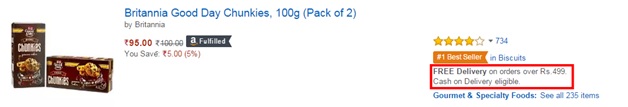
In the above example Rs 499 roughly amounts to $10. Just to save on shipping, customers may purchase multiple items to meet the threshold. So, if you offer free shipping for order amounts above a certain threshold it may increase your conversions.
Keeping a countdown timer to the daily delivery time cut-off is very clever thing you can do. For instance, let’s say that the delivery agent collects the goods at 6pm. What you need to do is let buyers know that the cut-off time is 5:30pm and all purchases made after that would be delivered the following day. You can see how The Workplace Depot website uses it for their site here. They also remove the countdown timer between the hours of 3pm (their cut-off time) and 7am. This way they do not discourage buyers from making purchases.
Concluding Thoughts
It doesn’t matter what kind of eCommerce store you own. Ultimately the profits determine whether you are successful and will stay in business. To do that you need to work on improving conversions, continuously A/B testing, testing different strategies such as free shipping and so on. These tips are a start to help you improve your conversions and increase profits.
Have you had success using Convert Experiences Experiments in optimizing your eCommerce store? Let us know and we may feature you as a case study in our blog.