Designing for Mobile First: Reasons, Challenges and Strategies
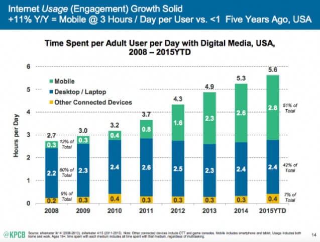
If you’ve been tracking the sources that send traffic to your website, the odds are that you’ve seen a steady rise in the numbers of mobile visitors. For some websites, mobile traffic surpassed desktop traffic long ago. According to Smart Insights research, people now spend significantly more digital media time (51%) on their mobiles compared to their laptops/desktops (42%).
In the UK, 45% of all eCommerce traffic now comes from smartphones and tablets. Many eCommerce retailers have seen their share of mobile sales double over the last couple of years. Mobile now accounts for 40% of all online retail sales in the UK. In fact, I could fill up this post with stats proving the criticality of mobile marketing. Optimising your checkout and website for mobile has never been more important.
These trends should compel any online business to seriously consider a mobile first strategy. Yet many of them still don’t have a responsive, nevermind a mobile-first, setup. Those that do offer some sort of mobile experience leave a lot to be desired.
Should You Really Put Mobile First?
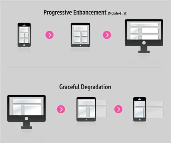
Adopting a mobile first strategy means designing your web experience for mobile phones and tablets, before scaling it up for larger display devices.
The term “mobile first” remains more of an enigma, because web designers have by and large shied away from the challenges that it presents. Moreover, skeptics say “mobile first” shifts focus away from the only thing that matters—customers. But the proponents say customers are the precise reason why a business should put mobile first. If you get it right, you can really start improving your conversion rates.
Although, I must stress from the outcome that a mobile first strategy is not necessarily the right way to go for every business. A 30 minute dive into Analytics will give you all the answers you need.
Mobile First for New Websites
A mobile first marketing strategy demands that you start designing the user experience for the small screen. In other words, you conceive a design keeping in mind the limitations of mobile media. The prototype only includes the bare-bone elements that would deliver a smooth and personalised mobile user experience.
For instance, you’ll avoid counting on HD video or heavy images, and prefer using lightweight technology to make the site perform better on smaller screens. Then, you can add value by implementing more detailed elements that enhance the experience on desktops and laptops. This approach is called progressive enhancement, and it’s the opposite of how most of designers approach the design process.
Most designers start with the big screen and the complete set of tools to design a great desktop user experience. When the desktop website is complete, it is made responsive and adaptive for mobile devices by “selectively degrading” the user experience. Certain heavier elements may need to be dropped and the design technologies not supported by (or useful to) mobile may need to be replaced.
Not only is this a lot of work, making a mobile version of your website often occurs as an afterthought. You’ve spent most of your energy in creating the perfect experience for the big screen, which is why the mobile version of your website can look a little lame. A mobile-first competitor can easily steal some of your share of mobile traffic.
Mobile First for Existing Websites
Google’s mobile-friendly algorithm update affected more than 80% of sites when it was rolled out. Almost one year later, there are still millions of websites that are not mobile friendly. They risk losing a big part of their sales, because a poor mobile user experience may turn away almost half of their visitors. They can also lose traffic, because Google ranks non-mobile-friendly sites poorly.
Of course, these losses won’t show anywhere on your profit and loss sheet or income statement, but these are opportunities lost. You are missing them because you haven’t really done anything to reign in the biggest and potentially most high converting chunk of your traffic.
Mobile friendliness, or rather, mobile-centeredness, is particularly essential for local and eCommerce businesses. It’s because mobile claims the highest share of local searches as well as the highest conversion rates. In short, if you have an old website that you’re looking to update to contemporary technology, mobile should be a top consideration for the revamp.
Is Mobile First Suitable for Your Business?
Clothing and apparel are amongst the most searched categories on mobile phones in the UK, followed by electronics, grocery and household products, home improvement, and health and beauty. Needless to say, you better have a mobile optimised site if you are doing business in any of these categories. This doesn’t mean the rest of the businesses can turn a blind eye to mobile, because the vast majority of your customers are glued to their small screen for most of their digital day.
Apart from driving business leads and sales, a smooth user experience on a cleverly designed mobile website also gives you a better image in the eyes of your customers. According to research by Barclays, more than 40% of all retail purchases are influenced by mobile in one way or the other. Almost half (48%) of UK millennials say they will be less likely to buy a company’s products if they have a poor experience with that company’s mobile app or website.
In many industries, ad spend on mobile is still low considering the traffic and sales that smartphones and tablets drive. However, it’s growing at a rate of 35% to 45% and is forecast to surpass print and TV advertising by the end of this year. As more and more “digital natives” grow up, the mobile trends are only going to get stronger.
The bottom line is, no business can afford to put mobile marketing in the bottom drawer. But should you put it on top? Probably yes, if most of your customers are already using mobile to access your services.
Challenges in Mobile First Strategy
When designing for mobile first, you’re designing for the vertical resolution. Your options are severely limited by the elements, navigation, content and tools that the mobile platform can support. The horizontal big screen is more flexible and feature-rich. Unless you know better, designing for mobile first may keep you from visualising the possibilities for your desktop user experience.
A hero image that looks impressive on desktop might eat up too much space on a smartphone’s screen. On the other hand, the designer might not pay adequate attention to high quality images or HD videos when designing the mobile experience first. Designing the desktop version first lets you create a more wholesome user experience, which may be lacking in the desktop version of mobile first websites.
Hence, designing for mobile first does not mean that you lose sight of the possible desktop user experience. Always remember that you’re focusing on small screen just because your customers use it. Your goal is to create a simple and enjoyable experience for your mobile users, while offering the best possible experience to your desktop users. You want to offer your customers what they want and not what technology can build.
Designing for Mobile First
Aligning Mobile Experience with User Intent
Before you start strategising and designing for mobile, you should know the reasons why someone will get out their smartphones and engage with your app or website. These reasons can fall in one or more of the following categories:
- Look Up or Find Something: Users want to find some information or answers urgently. Most of the time, this information is relevant to their location.
- Explore and Interact: Users have some time to kill and want to spend it playing a game, researching a product, or interacting with your content in a fun way.
- Check Status or Updates: There’s some information that keeps updating and your users are interested in staying on top of things, like live score updates during a football match. Create or Edit: Your users want to perform a micro action that cannot wait, for example, uploading a photo, making a reservation, or commenting on a blog post.
In order to create an intuitive mobile user experience, you have to align your website with the abovementioned user behaviors in the context of your own business. Because people can access your website from anywhere at any time, you need to think about optimising their experience across all locations.
When you take these factors into account, you’ll automatically prepare your mobile user experience for the real world. You’ll put upfront the information and features that your users want to see and use, instead of what you want to emphasise. Here’s a comic rendition of this philosophy to make things clearer.
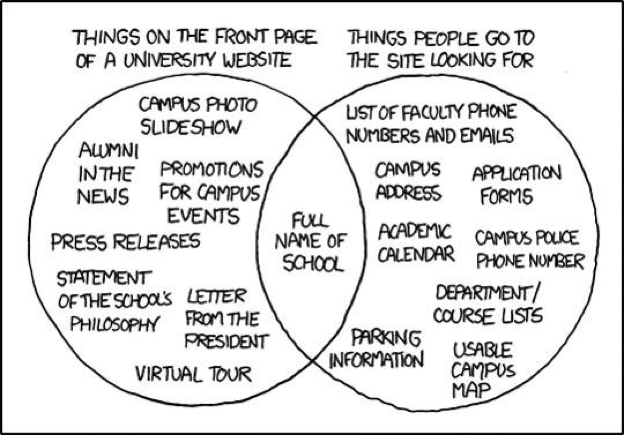
Do you see the disconnect between what people want to see and what’s usually on a university’s website? The circle on the right side shows precisely what should have been there on the site.
Minimal Navigation
On desktop, you can have top menu, side menu, and bottom menu. You can have different widgets or interactive modules to enrich the desktop experience. But when designing for mobile, you actually have to minimise menus and navigation.
With the network, screen size, and hardware restrictions that mobile has (compared to desktop or laptop), you don’t want to bury your content under layers of navigation. Your mobile users want relevant content to load on the front page in a flash. Each step of navigation that you add forces them to tap another time and wait for another page to load, which is terrible user experience; especially if they have a slow internet connection.
Synchronising Mobile and Desktop Experience
One of the risks in pursuing a mobile first strategy can be that your desktop site turns out to be inconsistent with your mobile app or website. This could perturb users who use both mobile and desktop to access your business. Moreover, it’s bad for branding. Hence, it’s essential that you take both mobile and desktop/laptop into consideration right from the outset.
Once again, your user (and not mobile or desktop) is at the centre of the experience that you are designing. The rule of thumb is to give your users what they want through the easiest and shortest possible route.
Responsive Vs Adaptive Web Design
Responsive or adaptive web design fluidly changes itself to fit the screen size being used to access it. To check whether your website is responsive/adaptive, you can simply shrink the browser window and see how the site changes to fit any screen size. Much of the difference between adaptive and responsive technologies lies in the HTML and CSS behind them, and the end results may look similar.
However, adaptive web design (AWD) requires less coding to implement than responsive web design (RWD). In adaptive design, it’s the server that does the heavy lifting to customise the experience according to the type of device that’s requesting access. In RWD, the whole page is sent to the device’s browser, which then modifies it according to the screen size and dimensions.
This means AWD can detect the type and features of the device and use them to provide a superior user experience. Adaptive websites are also a little faster to load than responsive sites. But they may have issues when loading on certain not-so-popular screen sizes. However, a lot depends on how the individual websites are designed.
Mobile Apps
Mobile apps provide a highly personalised user experience and put your loyal customers within arms-reach of your marketing. You can learn more about them by tracking their habits and needs, and offer them special deals and personalised content.
Amazon used its (now defunct) Underground app to promote free stuff. In the bargain, the brand stays in customers’ minds as well as their smartphones. What do you think is the first place they’ll think of when they actually need to buy something? Amazon is also hacking growth through the mobile app with a referral strategy, where you get a $5 credit each time someone you referred buys anything, and the buyer also gets $5 off.

This is just the tip of the iceberg considering what mobile apps can do. Businesses can also make mobile apps work for their employees and affiliates. Uber is an excellent example of this. On the other hand, desktop websites with extensive functionality and interactivity can utilise mobile apps to offer a scaled down version of the experience for the small screen. For example, Basecamp has a nifty app to let people stay on top of their projects when they’re on the go.

Google Vs Yahoo—Two Different Mobile Experiences
To better understand what we have discussed so far, let’s compare the desktop and mobile versions of Yahoo and Google.
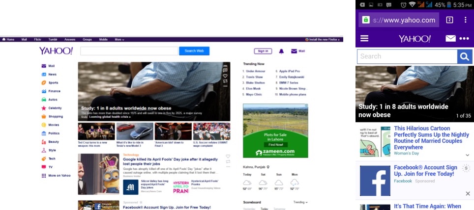
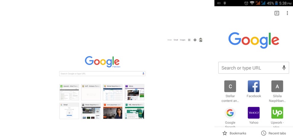
It’s plain to see that both search giants are following radically different strategies here. Yahoo’s desktop front page is cluttered with information, probably because the people at Yahoo think their users want more than just search from the interface. The mobile front page is nothing more than a severely watered down version of the desktop, which appears to pay little regard to mobile user experience. Almost half of the space is occupied by a big image, which doesn’t make much sense unless you’re looking for latest news.
Google, on the other hand, has a much more consistent mobile and desktop experience. They are focusing on one thing—search. At the same time, Google allows people to access all of its products with a single tap on the toolbox icon. Here’s the screen that pops up.
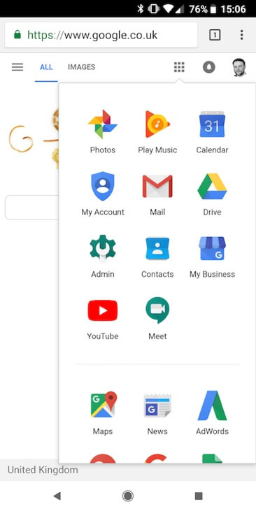
The comparison also reveals the difference in targeting strategy. Yahoo has a much broader offering that comprises news, finance, weather, mail, movies, beauty, politics, and tons of other products. Google is primarily focusing on search and using it to push its gradually expanding arsenal of nicely targeted tools. Can you see that Google is apparently following a mobile first strategy, whereas Yahoo’s mobile website is more of an afterthought, just a degraded version of its desktop website?
The point is that mobile experience, like everything, should be rooted in your overall marketing strategy. It’s not just about manipulating elements and changing font sizes, but about how well you understand your customers.
Future of Mobile
With digital natives growing up, smartphones getting smarter, and network speeds getting faster, mobile media growth shows no signs of diminishing. Actually, mobile appears to be taking the center stage in our daily lives, just as a flood of smart objects and virtual reality suits prepare to enter the digital marketplace. The ubiquity and timelessness of mobile make it a perfect platform for marketing all kinds of products and services. And, it’s much less cluttered so far and has a lot of space for new players. Long story short, the time to act is now.
Written By
Matt Janaway


