8 Conversion-Killing Landing Page Mistakes You Can Fix in 20 minutes
So you’re looking for some easy conversion wins.
Shame on you—you know better.
Because if you listen closely, you can hear the chorus of boo’s now.
“Hey!” they say “There are no easy conversion wins. You have to test everything. Best practices might not be best for your audience.”
Ugh, I know.
I so know.
It’s practically tattooed on my lower back.
So let’s be honest, huge conversion upticks don’t usually come from changing a button color. I mean, it might matter—but that’s already if you’ve done a lot right.
If you have a page that’s not converting—you have to do substantive tests, work harder to understand your audience, look at your messaging hierarchy, and solidify the relationship between your ads and your landing page.
But if you have a page that’s doing “kind of okay” and you want it to convert at its potential—here are some things you can fix in an afternoon that may boost your sign ups, registrations, or purchases.
Problem #1: Your page has more than one goal.
Skip this if you’ve heard it before.
Because if you’ve talked to any CRO-minded copywriter, and you’ve violated this rule, lord knows you will have heard it.
They may have begged you, they may have pleaded with you. “One page, one goal,” we all cry helplessly, while our clients continue to say “but wait, what if…”
And I get it. “Mac,” you say. “My page is different. To convert, my audience might need more information. Or access to our social accounts. Or a puppy and an icecream cone.”
No, new internet friend. They don’t. If they do, you need to write better copy—the kind that gives them all the info they need on this page to convert, without going elsewhere first.
Don’t believe me? Listen to these folks. And these. And these and these and these.
Side note: if it’s clickable, and doesn’t lead to your visitor to take your intended action, it’s another goal.
Social media icons are another goal.
Your “subtle” footer menu is another goal.
Your link out to that important, topic-relevant, well-crafted blog post, is definitely another goal.
Scrap it. All of it. Please. I beg you. I’ll give you a puppy and an icecream cone. Anything.
Problem #2: Your call to action expects a lot from me.
There are two major problems you’ll come across with CTAs, and they’re kind of like the two problematic relationships you had in college. One got a little high maintenance. And one got a little…well, weird.
High maintenance button copy is kind of a let down. You were on the same page, you liked where things were going, and you were about to take the next step when…wow, they sure seem to be expecting a lot of you, all of a sudden.
In other words, you have a super compelling landing page, and your site visitor was pretty convinced. But the call-to-action hints that they’ll have to go through a complicated install, or a difficult sign up process, or go to brunch with him and his mom on Saturday when you already had plans and…
You won’t click it. That was the point.
Quick example. The team at Gocardless has a solid case study, where they saw a 139% conversion increase—just by switching “Request a Demo” to “Watch a Demo” on their buttons.
And it makes sense doesn’t it?
What does “request” mean? Do I have to talk to someone? Do I have to wait? Do I have to beg or compose an ode or submit a credit rating—what does this request entail!?!
I don’t want any of nonsense. I want to watch a demo and I want to watch it now. Set me up with a play button, stat!
Pro tip here: one of the biggest mistakes I see in button copy is that it tells your visitors what they have to do—not what they get. Would you rather “submit your email” or “download your free guide?”
Give the people what they want.
Keep your CTA copy focused on the benefit.
Problem #3: Your call-to-action is just confusing.
And then, on other hand, you have your “weird” button copy.
Pretend you’re a potential lead, and this landing page and you are on your first date. At first, you’re excited. All things indicate that things are going well—your visions seem aligned, you’re headed the same direction.
Then all of a sudden, something seems off. You’re a bit confused as to what you’re getting into. You’re not sure what they want from you, you’re not clear where this is headed, they listen to a lot of ska music, they’re a cat person.
In other words: the button copy doesn’t tell you, clearly, and easily, what happens when you click.
You see this all the time. “Check it out,” “Discover Whatever.” The straight up, no context: “Do it!”
I don’t want to “discover” anything with you. What do you mean “discover?” Do I have to bring bug spray? Will there be WiFi there?
No, what I want to do is “Start my Free Trial.” And your button’s only job is to make that next step sound clear, and painless.
Problem #4: Yo, where even is your call-to-action?
Marketers, meet the fold. There are some things that should just be above it.
I’m going to be honest with you, as a copywriter—this best practice didn’t initially make sense to me.
“Why push my audience to convert, before they’ve sifted through all my fancy persuasion copy?”
“My benefit statements are so pretty. They should come first.”
HUBRIS.
Vanity doesn’t sell. Guesswork is for chumps. Here, we talk studies. Here, we talk testing.
And there’s a fair bit evidence, that your CTA should come before the fold.
Why? Maybe because people will see it right away. Because this section of a page grabs 80% of our attention. Because the “how” will stick in their head, as copy compels us to scroll down and read “why.”
Whatever the reason, having a button before the fold, can work wonders.
So go ahead, push it up. Give it a test.
But don’t kill your other buttons.
People hate scrolling. People hate effort.
Always have a CTA within a reach.
Problem #5: Your hero section just needs to chill out for a second.
Why. Do. You. Still. Have. A. Slider?
I know, I know. Every WordPress demo comes with one. But they’re confusing. They split your audience’s attention. They hurt you. And because of that—they hurt me.
There are all sorts of case studies on this (our friends over at ConversionXL pulled a few of them here). And they found that, across the board, and across industries—slider headers make your audience say “goodbye forever.”
So pick your strongest image. Pick your strongest headline. Pick your strongest subhead. Test it. Trust it. Let it do your heavy lifting. And give your audience the chance to soak it up.
Problem #6: Your headline and subhead need to get to the point.
Speaking of that headline and subhead: what’s yours up to?
This is complicated. This could be a whole book on it’s own. (In fact, there are several). But in a nutshell, these two crazy important lines of text need to:
- Remind your reader that they’re in the right place.
- Give them a taste as to why they should stick around.
Old school copywriters (the Ogilvys, the Caples, the king himself—Eugene M. Schwartz)—devote more than half of their teachings to headlines. Because it’s more than half the battle.
One of the easiest ways to do this is to make sure your hero section contains your unique value proposition.
Because in a perfect world, your UVP is what your ideal prospect should be interested in—and it should already be phrased specifically, enticingly, and directly.
Because, really, the first thing I want to know when I land on a page is—what makes you so special?
The internet is full of adorable babies playing with cats.
Why is this more worth my time?
And please dear god, don’t say because your product or service is “fast” and “easy” and “affordable.”
We’ve heard that. You’re better than that.
A few tricks if you’re stuck on a headline.
- Steal from your reviews (and your competitor reviews). When you’re writing copy, you’re mostly trying to pull out “what do my prospects want from me!?!?”. Almost no one can describe that better than your customers.
- Start with a formula. It’s not cheating. It works. And no one is here to give you bonus points for creativity. We’re here for conversions—and tried and true methods often beat reinventing the wheel.
- Write it last. Your headline has one job: to make someone read your subhead. Your subhead has one job: to push people to your body paragraph. And so on and so on until your call-to-action. If it helps—focus on your body copy. Get your benefits out on the page. Then come back to your headline, and ask yourself, “What would push a reader to read on?”
Problem #7: Your images weird me out a little.
That professional stock photo you bought for your hero image. The guy in a button up who’s way too excited about a graph. Or the back of someone’s head looking at a mountain.
What does it communicate to the people on your page?
Remember, one person’s: “woman grinning about your award winning customer service team” is another’s: “woman laughing menacingly about the threatening email she sent to your customer service team.”
Test. Your. Images.
You want to know what impression they’re making. So rev up your A/B testing software. Or spend a few bucks on a 5 second, impression test.
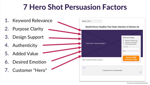
In case you’re wondering “Where do I start, though. What do I test first”: I’m obsessed with Angie Schottmuller’s 7 Factors for Persuasive Hero Shot Images.
Here’s an explainer for the folks too lazy to read at the link:
Problem #8: Your form is a pain in the butt to fill out.
Humans are lazy. If someone would pay me to sit on the couch forever and watch Friends reruns—I wouldn’t have written this post. To make people click, don’t make them work.
There. Are. Exceptions. To. This. Rule.
Sometimes, having more questions in your form increases your credibility. For example: if you’re promising to send someone a detailed quote, but all you ask for is their email….that seems off.
Sometimes, you might want to qualify your prospect. You might not want anyone who can let autofill sign over their name and contact info to end up on your list. More fields = more invested leads.
But if you’re looking to see a conversion uptick, stop collecting phone numbers you don’t need. Or asking a company name if you don’t use it. Because there’s a decent amount of evidence to suggest—the easier is to fill out a form, the more likely people are to do it.
Psssst…Are you in Europe, or marketing to Europe? Or are you in general concerned about data privacy laws? GDPR has some rules about using forms to collect email addresses. You can read them here.
To sum it up:
Really, it’s simple.
Think about your prospect, and be nice to them.
They don’t want to hear your sales pitch; they want to invest in a thing that’ll make their life better.
They want you to tell them what they’re getting.
They want you to be specific, direct, and interesting.
They want to be able fill out your form fast. They want to find your dang button. And they want your dang button to remind them of why they’re bothering to click.
So give them that. Do those things. It’ll take less than an afternoon. And it might make a world of difference.
Written By
Mac Hasley
