Some of the Best Qualitative Research That Almost No One Does.
When done right, a website survey can be one of the most powerful ways to understand the intent of users on a website.
But why are they hardly ever used? And when they are, they are usually executed poorly. (Think NPS surveys where you care more about using the results for marketing than the actual responses, or surveys with leading questions such as ‘To what extent does pricing play a role in your decision making?’ – which assumes pricing plays a role at all.) And in turn, the results are far from “insightful” or actionable.
I think we (the “CRO” and “Experimentation” community) need to come up with a better word for “survey”. It can have a lot of pre-conceived bias built in and as a result, not get stakeholders as excited as they should be to leverage them.
There are lots of different types of surveys you can use on your site/product/user journey. This one should be your first because of how actionable the learnings can be.
For now, I’m going to refer to this survey technique as “TriFecta Intent Mapping”. (If you/your generative AI model of choice come up with better ones, please let me know!)
Starting With “The What”
The “TriFecta” comes from the 3 questions you should be asking with this technique (and in that order):
- What brings you to our website today?
- Were you able to complete your task?
- How can we create a more delightful experience? (this one is conditional based on their answer to #2)
The idea is users come to your website/product for many, many reasons. Very few come to convert straight away. This is a fantastic reason to go through this process to show your boss “We have more important things to focus on than overall website conversion rate” which always gets the headline for CRO work 🙃
Where Do They See the Survey At?
My favorite places to show this survey would be on exit intent or confirmation/TY pages.
You could also show it based off of other engagement signals, like longer than average session time and/or more pages per session than average. I would stick to the first two triggers, however.
Note: Check your analytics tool of choice and see what are the most common exit pages and focus there, since the whole concept here is we want to catch users “on the way out” and ask them if they were able to do what they came to.
Enhanced Triggers for Product Teams
There are usually many more triggering options for product teams to leverage since there should be a healthy amount of segmentation criteria that will make this even more useful (use that zero party data!). And it’s more than likely closer to the “bottom of the funnel” or “towards the end of the loop” (Loops > Funnels) and will probably get more “revenue attention” this way.
Best Practices for Avoiding “Survey Fatigue”
How do you make sure you aren’t introducing “survey fatigue” to your website visitors? Focus on these metrics:
- Keep your surveys to one user seeing it per session
- Response rates should be within the 2-5% range
- Segment your audience by surveys seen compared to not seeing a survey and then look at engagement and conversion-related metrics… are there any trends or patterns?
- Look at: Pages/session, time on site, engagement rate, various conversions
What the Experience Looks Like
Here is an example of a pop up modal that I have on my site with the 1st question:
My site is less complex than most other websites out there.
This is the hardest part (and it’s not that hard) – figuring out the core “jobs” there are for the user to do on your website and making the categories here as options. This should be fairly easy to do… if you are working with a new website it still shouldn’t be hard, look at the Hero CTAs across the main pages on the site/in the navigation.
Lead Gen Site Example:

Ecommerce Site Example:

If you must, pull the top 25 pages from GA4 (make sure they aren’t just blogs) and feed it to Generative AI to have it tell you the top actions for users to do on the site.
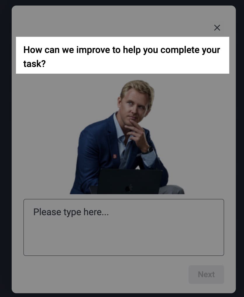
…and then the next 2 questions (and slightly different wording based on the responses):

In case you missed the last screen showing there, just make sure you are altering the language so that it’s more “How can we improve” language if the user didn’t find what they were looking for.

Visualizing Your Responses

I love it when no matter what data visualization you use the action you should be doing is obvious. Is there any confusion about what I should be doing here? NO! I need to have more videos on the site about me, my process, how I like to work, why my dog is still an intern, etc.
Taking It One Step Further
If you are using something like Hotjar (probably the best option out there for unifying the data together without getting too technical), then you can integrate video recordings based on these responses. So you could watch a handful of those Learn About Rednavel Consulting responses that said “no” that they couldn’t find out more to see where they were looking. And, where the ones who said yes did look 🙂
You should also be connecting these session replays (session IDs) into your analytics tool(s) so that you can gain deeper insights and at better scale.


Written By
Ryan Levander
Edited By
Carmen Apostu
